How To Visualize Cycles

Reposted from April 2022

Every organization experiences cyclical or seasonal patterns. Understanding how funding, participation, volunteering, and other factors change in predictable ways over time can help us to plan for the future. The problem is that we don’t always see these patterns. We get caught up in current issues and crises, and it’s hard to step back and see what’s coming next. Visualizing your data can reveal cyclical or seasonal patterns in helpful ways. This often involves aggregating data from multiple years by specific time periods such as season, quarter, or day of the week. Here are some examples.

Working with a statistician named William Farr in the 1800s, Florence Nightingale analyzed mortality rates during the Crimean War. She and Farr discovered that most of the soldiers who died in the conflict perished not in combat but as a result of “preventable diseases” caused by bad hygiene. Nightingale invented the polar area chart (shown below), a variant of the pie chart, meant “to affect thro’ the Eyes what we fail to convey to the public through their word-proof ears.” Each pie represented a twelve-month period of the war, with each slice showing the number of deaths per month, growing outward if the number increased, and color-coded to show the causes of death (blue: preventable, red: wounds, black: other). The New York Times showed the seasonal pattern of COVID cases using a somewhat similar chart.

Source: Wikipedia

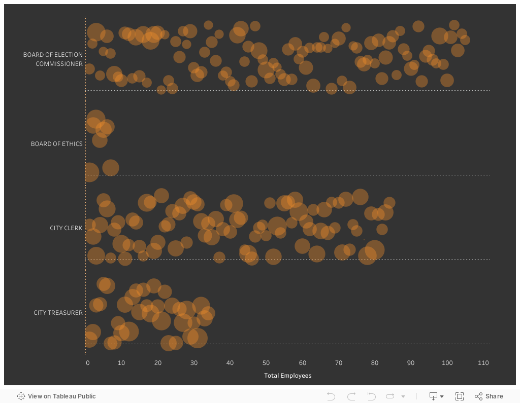
In the dashboard below, Curtis Harris reveals not only patterns in taxi rides by time of day but also by day of the week. We can see, for example, that few people are using taxis between 2 and 3 am, particularly at the beginning of the week. (Click on this viz to see interactive version.)

Source: Curtis Harris on Tableau Public

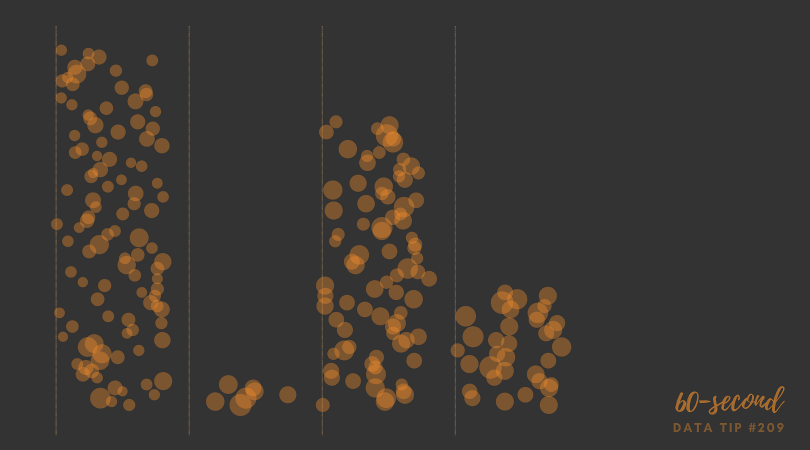
This varsity-level viz (below) by Lindsay Betzendahl shows the seasonality of the flu. Each dot represents one week in a particular year. Each “ray” consists of dots for the same week of different years. So the ray at the 12:00 position represents the first week in January for each year between 2007 to 2018. The size of the dots show the number of influenza cases. So we can see that cases surge during the winter weeks, in general, but we also can see outbreaks during other seasons in particular years. Betzendahl explains how to create such a chart in Tableau here.

Source: Lindsay Betzendahl on Tableau Public


Let’s talk about YOUR data!

Got the feeling that you and your colleagues would use your data more effectively if you could see it better? Data Viz for Nonprofits (DVN) can help you get the ball rolling with an interactive data dashboard and beautiful charts, maps, and graphs for your next presentation, report, proposal, or webpage. Through a short-term consultation, we can help you to clarify the questions you want to answer and goals you want to track. DVN then visualizes your data to address those questions and track those goals.


How To Visualize What Could Have Been or Might Be

In English, there are three verbal moods:

  • The indicative used to express factual statements or positive beliefs;

  • The imperative used to express direct commands, requests, and prohibitions; and

  • The subjunctive used to express hypothetical situations or conditions which are contrary to fact or uncertain.

When we are visualizing data, we often settle into the indicative, the realm of facts. But what if we want to show what might happen if action is not taken or what might have been had action not been taken? In other words, how can we visualize the subjunctive? I’d like to offer up four examples to inspire you. The Flattening The Curve chart shows the impact of COVID mitigation (social distancing, masking, etc.) on the healthcare system and should bring back memories of 2020. The other charts may be new to you.


To see past data tips, click HERE.


Let’s talk about YOUR data!

Got the feeling that you and your colleagues would use your data more effectively if you could see it better? Data Viz for Nonprofits (DVN) can help you get the ball rolling with an interactive data dashboard and beautiful charts, maps, and graphs for your next presentation, report, proposal, or webpage. Through a short-term consultation, we can help you to clarify the questions you want to answer and goals you want to track. DVN then visualizes your data to address those questions and track those goals.


This Is A Teenager: Showing The People Behind The Data

My tip this week is to check out This Is A Teenager by Alvin Chang at The Pudding. It’s a visual essay that traces the paths of hundreds of teenagers, starting in 1997, to see how their childhood experiences relate to their life outcomes. You can view it in video form (see below) or as a scrolling visualization HERE. The actual teenagers behind the data* don’t get lost in aggregates represented by bars, lines, and circles. Instead, we see them as individuals whose lives tend to follow the paths of other individuals with similar childhood experiences.

* The data is from the National Longitudinal Survey of Youth.

Source: The Pudding

To see past data tips, click HERE.


Let’s talk about YOUR data!

Got the feeling that you and your colleagues would use your data more effectively if you could see it better? Data Viz for Nonprofits (DVN) can help you get the ball rolling with an interactive data dashboard and beautiful charts, maps, and graphs for your next presentation, report, proposal, or webpage. Through a short-term consultation, we can help you to clarify the questions you want to answer and goals you want to track. DVN then visualizes your data to address those questions and track those goals.


How To Create More Diverse, Equitable, and Inclusive Data Visualizations

Reposted from February 2022

When we visualize information, we make a series of decisions which affect the way that viewers process the information in our charts, maps, and graphs. Sometimes they don’t feel like decisions at all. We go with the default settings in the application we are using. Or we just do something the way it’s usually done. But a more diverse, equitable, and inclusive approach to presenting and visualizing data requires us to make those decisions more consciously and deliberately. Jonathan Schwabish and Alice Feng of the Urban Institute provide some helpful tips, based on the Urban Institute’s own style guide, which you can apply the next time you present data.

Here is a summarized version of Schwabish and Feng’s article.* And here is my 60-second version of their recommendations:

  • Use people-first language in titles, text, and labels associated with charts, maps, and graphs. For example, use “people with disabilities” rather than “disabled people.” Also the Urban Institute does not refer strictly to skin color. For example, they refer to “Black people” not “Blacks.”

  • Order and present groups purposefully. The first group shown in a table or the first bar in a chart can affect how readers perceive the relationship or hierarchy among groups. For example, if the first group is “Men,” then it may appear that men are the default group against which other groups should be compared. One way to prevent viewers from making certain comparisons is to display groups in side-by-side charts (aka “small multiples” charts) rather than on a single chart. In general, make ordering and grouping decisions to promote certain comparisons and prevent others.

  • Point to missing groups. If certain groups are missing from the data, explain why in text boxes or footnotes. Also add information on groups included in “Other” categories and consider providing a more specific label than “Other” which can have an exclusionary connotation.

  • Do not use color palettes that reinforce gender or racial stereotypes. This one may seem obvious, but it bears repeating. Also, the Urban Institute’s color palette is accessible to people with certain color vision deficiencies, and the contrast between those colors and white and black text meet basic accessibility guidelines.

  • Depict a variety of races and genders when using icons and avoid icons that make inappropriate depictions of people or communities or reinforce stereotypes such as showing traditionally feminine icons to depict nurses or traditionally masculine icons to depict bosses.

  • Find ways to show the people behind the data. Data visualizations are, by definition, abstractions of larger realities. But in the process of abstracting, we may obscure the lived experiences of the real people whom the data represent. Visualizations can remind viewers about the individuals behind the data by, for example, depicting them as individual circles rather than aggregating them in a single bar.

* The full paper has been published as an OSF Preprint and can be accessed here.


Let’s talk about YOUR data!

Got the feeling that you and your colleagues would use your data more effectively if you could see it better? Data Viz for Nonprofits (DVN) can help you get the ball rolling with an interactive data dashboard and beautiful charts, maps, and graphs for your next presentation, report, proposal, or webpage. Through a short-term consultation, we can help you to clarify the questions you want to answer and goals you want to track. DVN then visualizes your data to address those questions and track those goals.


The Power of Substraction

“Perfection is achieved, not when there is nothing more to add, but when there is nothing left to take away.”

―Antoine de Saint-Exupéry, Airman's Odyssey

If you have heard of any data viz guru, it’s probably Edward Tufte. And if you know one thing about Tufte, it’s probably the data-to-ink ratio. The data-to-ink ratio is the amount of ink (or pixels) that convey the data divided by the total ink (or pixels) used in the entire chart. The ratio, according to Tufte, should be as close to one as possible. In other words, most of the ink/pixels should be conveying data, and you should remove as much non-data ink/pixels as possible. Click through Joey Cherdarchuk’s slides below for a great example of what Tufte is talking about.

Source: Darkhorse Analytics

To see past data tips, click HERE.


Let’s talk about YOUR data!

Got the feeling that you and your colleagues would use your data more effectively if you could see it better? Data Viz for Nonprofits (DVN) can help you get the ball rolling with an interactive data dashboard and beautiful charts, maps, and graphs for your next presentation, report, proposal, or webpage. Through a short-term consultation, we can help you to clarify the questions you want to answer and goals you want to track. DVN then visualizes your data to address those questions and track those goals.


How To Present Data on Slides

“It’s not the mere presence of data that gives the presenter power,” notes Joel Schwartzberg in his Harvard Business Review article on presenting data, “It’s how that data is presented.” Below is my 60-second review of Schwartzberg’s helpful tips. But before you scroll down, see how much you already know. Take a look at the “Before” slide below and consider what changes you would make to it. Then advance to the “After” slide (by clicking on the right side of the image) to see a revised version that follows Schwartzberg’s guidelines.

  • One point per slide. Have one key takeaway for each slide and write a slide title that reinforces your point rather than something generic like “Performance by Quarter in 2023.”

  • Visually highlight “Aha” zones. Use a bright color to direct attention to a key data point and gray out the rest.

  • Make charts readable from across the room. If you have to say “You probably can’t read this but it shows that . . . “ then it needs revision. Don’t use font sizes smaller than 18 points.

  • Labels are clear and intuitive. Your audience needs to decode your chart in a few seconds. Make sure axis and data labels are understandable.

To see past data tips, click HERE.


Let’s talk about YOUR data!

Got the feeling that you and your colleagues would use your data more effectively if you could see it better? Data Viz for Nonprofits (DVN) can help you get the ball rolling with an interactive data dashboard and beautiful charts, maps, and graphs for your next presentation, report, proposal, or webpage. Through a short-term consultation, we can help you to clarify the questions you want to answer and goals you want to track. DVN then visualizes your data to address those questions and track those goals.


How and Why to Visualize Variability

Every dataset includes variability. The people and things we measure differ from one another in many ways. And visualizing data always involves some decisions about how much of that variability to show. There are tradeoffs:

  1. If you show too much variability, you obscure patterns and trends. To understand anything with data, we usually need to reduce its complexity. We can’t extract meaning from a table full of numbers and letters. So we summarize the data through such activities as grouping people, concepts, and time periods; calculating averages; or organizing individuals or groups in a rank order. This process allows us to detect patterns and trends within the data. Patterns and trends become even more apparent when we visualize the data in the form charts, maps, and graphs by assigning visual cues such as color, size, and shape to groups and values. However, too many colors, sizes, and shapes make discerning the patterns and trends more difficult.

  2. If you show too little variability, you obscure reality*. Overly simplified visualizations do not show just how complex and messy the data actually is. And the viewer may mistake the simplified, summarized version of the data as reality.

You can find a great example of problem #2 in Eli Holder’s article Divisive Dataviz: How Political Data Journalism Divides Our Democracy. He describes the danger of red and blue political maps in the U.S. in this way: “there’s no such thing as a “red state” or a “blue state.” Consider Texas, which is often called a “red” state. In the 2020 presidential election, more Texans voted for Joe Biden (5.26 million) than every other “blue” state, except for California. Even New York, a Democratic stronghold, had roughly 20,000 fewer Biden voters than Texas. . . . While popular election maps accurately reflect the ‘winner-take-all’ dynamic of the electoral college, they create the misimpression that state electorates are monolithic blocks of only-Republicans or only-Democrats.”

And the misimpressions such maps engender have real-world consequences. Holder describes an experiment in which people were shown either dichotomous maps or continuous maps (see examples below). Those shown dichotomous maps were more likely than those shown continuous maps to feel that their state was dominated by one party and thus that their votes mattered less because the election outcome was a foregone conclusion.

So when deciding how many shades of gray or circle sizes to show, consider how much summarization is needed to make patterns and trends perceptible without misleading the viewer with an oversimplified view of the data. Take, for example, these three versions of a map. They each show the same CDC chronic illness survey data with a “diverging color palette” in which blue states ranked high on health indexes; orange states ranked low; and gray states were in the middle. The maps differ in the degree of variability shown. Which map allows you to see corridors of good and bad health without oversimplifying the matter?

*More specifically, the full reality of the data. This 60-second data tip doesn’t get into the nature of reality in general!

To see past data tips, click HERE.


Let’s talk about YOUR data!

Got the feeling that you and your colleagues would use your data more effectively if you could see it better? Data Viz for Nonprofits (DVN) can help you get the ball rolling with an interactive data dashboard and beautiful charts, maps, and graphs for your next presentation, report, proposal, or webpage. Through a short-term consultation, we can help you to clarify the questions you want to answer and goals you want to track. DVN then visualizes your data to address those questions and track those goals.


One Dataset, 100 visualizations

Today’s tip is to check out the 1 dataset, 100 visualizations project. It shows 100 different ways to visualize this simple dataset:


It’s fun to compare the different charts and see how they provide different perspectives on the data. For example, to visualize this data, many of us would create a stacked bar chart like this one and call it a day.


But look at how this chart allows you to better understand each country’s relative position in relation to number of world heritage sites between 2004 and 2022. We can more easily see, for example, that Denmark leapfrogged Norway.


These 100 charts make a strong case for visualizing your data in a number of different ways before selecting one which provides the perspective needed.


To see past data tips, click HERE.


Let’s talk about YOUR data!

Got the feeling that you and your colleagues would use your data more effectively if you could see it better? Data Viz for Nonprofits (DVN) can help you get the ball rolling with an interactive data dashboard and beautiful charts, maps, and graphs for your next presentation, report, proposal, or webpage. Through a short-term consultation, we can help you to clarify the questions you want to answer and goals you want to track. DVN then visualizes your data to address those questions and track those goals.


Top 10 Tips of 2023

Here are the top ten reader favorites in case you missed them . . .

To see past data tips, click HERE.


Let’s talk about YOUR data!

Got the feeling that you and your colleagues would use your data more effectively if you could see it better? Data Viz for Nonprofits (DVN) can help you get the ball rolling with an interactive data dashboard and beautiful charts, maps, and graphs for your next presentation, report, proposal, or webpage. Through a short-term consultation, we can help you to clarify the questions you want to answer and goals you want to track. DVN then visualizes your data to address those questions and track those goals.


Upcoming Data Viz Workshops


Let’s talk about YOUR data!

Got the feeling that you and your colleagues would use your data more effectively if you could see it better? Data Viz for Nonprofits (DVN) can help you get the ball rolling with an interactive data dashboard and beautiful charts, maps, and graphs for your next presentation, report, proposal, or webpage. Through a short-term consultation, we can help you to clarify the questions you want to answer and goals you want to track. DVN then visualizes your data to address those questions and track those goals.


The Pies That Bind

Reposted from November 2022

Rather than provide you with a tip, I thought I’d start this holiday week by offering you a little hope instead. It’s pie season, and folks are searching for pie recipes on Pinterest. According to this Food & Wine article, Pinterest analyzed internal search data to discover the most common pie recipe search terms in each state. I took that data and mapped it. As you can see below, pie preferences do not appear to fall along regional, ideological, or even agricultural lines. Minnesotans love lemon pie, and Floridians love pumpkin pie, although I’m guessing that more lemons are grown in Florida and pumpkins in Minnesota. Some states were idiosyncratic in their searches. Hello West Virginians who love no-bake peanut butter pies and Kentuckians who love pies made with cushaws, a type of squash I’d never heard of. But most states shared pie interests with other states. So this Thanksgiving, let’s be thankful for our shared love of pie. Scroll around on the vizes below and Happy Thanksgiving!


Let’s talk about YOUR data!

Got the feeling that you and your colleagues would use your data more effectively if you could see it better? Data Viz for Nonprofits (DVN) can help you get the ball rolling with an interactive data dashboard and beautiful charts, maps, and graphs for your next presentation, report, proposal, or webpage. Through a short-term consultation, we can help you to clarify the questions you want to answer and goals you want to track. DVN then visualizes your data to address those questions and track those goals.


Not Your Grandmother's Icons

We have all seen icon charts that look like this (even if our grandmother didn’t create them):

Want to make an icon chart that actually looks like real people as in the example below? Well, of course, you can just find some cool silhouette icons and use any graphic design program — such as Canva or Adobe Illustrator —  to layout and color icons as you wish. However, if you want the chart to be interactive, you will need to use a program like Tableau or Power BI. I created the chart below in Tableau. It provides more information when you scroll over the icons. Scroll down for Tableau instructions.

Here’s how I did it:

(Note: These directions assume basic knowledge of Tableau. If you don’t have that knowledge, here’s a good video on Tableau basics.)

  1. I selected 10 head silhouettes to use as icons. You can find great (free) icons on sites like flaticon , The Noun Project, or Canva. Be sure to save each icon as a separate PNG file with a transparent background.

  2. I added the icons to the shapes folder in my Tableau Repository. Here’s a short video on how to do that.

  3. I connected a data file (such as an Excel or CSV file) to Tableau Public (the free version of Tableau). The file included 40 rows, one for each applicant, and columns for:  a unique identifier for applicants (such as an ID number), selection status (whether applicants was or wasn’t selected to be a participant, and 3) the silhouette image assigned to the applicant.

  4. In Tableau, I started a new worksheet, changed the marks type to shape, and dragged:

    1. The ID number to the columns shelf (note that ID number should be a dimension not a measure);

    2. The selection status dimension to color on the marks card; and

    3. The silhouette dimension to shape on the marks card.

  5. I clicked on shape on the marks card, clicked on “Reload Shapes,” selected the shape palette that I added to my Tableau Repository in Step 2,  assigned head shapes to the various values for the silhouette dimension., and then clicked “OK.”

  6. I clicked on color on the marks card and adjusted the colors for the “selected” and “not selected” values.

  7. I dragged ID number to the filters shelf and selected ten ID numbers to show.

  8. I changed the view from standard to entire view and clicked on size on the marks card and adjusted the size of the heads as I preferred.

  9. I hid the header and title, duplicated the worksheet, and selected different IDs using the filter. I then repeated this step to create two more worksheets.

  10. I created a dashboard, added a vertical container, dragged the four worksheets into the container, clicked on the drop down menu for the container (in the upper right corner of the container) and selected to distribute contents evenly. I then adjusted the layout by adding outer padding and added in a text box.

To see past data tips, click HERE.


Let’s talk about YOUR data!

Got the feeling that you and your colleagues would use your data more effectively if you could see it better? Data Viz for Nonprofits (DVN) can help you get the ball rolling with an interactive data dashboard and beautiful charts, maps, and graphs for your next presentation, report, proposal, or webpage. Through a short-term consultation, we can help you to clarify the questions you want to answer and goals you want to track. DVN then visualizes your data to address those questions and track those goals.


Data Dashboard Treasure Hunt

Looking for a way to engage your staff, board members, and others in your data dashboard? Want them to understand how to use it and how it can inform their work? Here’s a great idea from MiraCosta College: a dashboard treasure hunt! Each page features one page of the dashboard along with questions that require the user to interact with the dashboard. Correct answers lead the user toward a hidden treasure. Try it for yourself:


Source: Treasure Hunt by MiraCosta College on Tableau Public

To see past data tips, click HERE.


Let’s talk about YOUR data!

Got the feeling that you and your colleagues would use your data more effectively if you could see it better? Data Viz for Nonprofits (DVN) can help you get the ball rolling with an interactive data dashboard and beautiful charts, maps, and graphs for your next presentation, report, proposal, or webpage. Through a short-term consultation, we can help you to clarify the questions you want to answer and goals you want to track. DVN then visualizes your data to address those questions and track those goals.


How to Extract Meaning from Survey Data

You just conducted a survey of your clients. participants, board members, visitors, or community members, and chances are you used some Likert Scales in that survey. In other words, you asked respondents to state their level of agreement or disagreement on a symmetric agree-disagree scale. A typical 5-level Likert scale is:

Strongly Disagree - Disagree - Neither Agree nor Disagree - Agree - Strongly Agree

Here’s a FAQ (which is more like a QYSA: Questions You Should Ask) on visualizing Likert Scale data to extract useful information.

Have you collected data just once or multiple times with this survey?

If this is a one-time deal, then I would suggest that you visualize the data using a stacked bar chart. Exactly which type of stacked bar chart depends on what you are trying to understand and show. Check out this Daydreamming With Numbers blog post: 4 ways to visualize Likert Scales. It walks you through various options. If you have collected the data two or more times, read on.

Should I calculate average scores and compare them?

A common way to look at change over time with Likert Scale data is to assign numerical values to each response (e.g. Strongly Disagree: 1, Disagree: 2, Neither Agree nor Disagree: 3, Agree: 4, Strongly Agree: 5) then calculate the average across respondents at two or more points in time and compare them. Some may even use a statistical test (such as a paired sample t-test) to assess whether the averages are “significantly” different. This may seem like an obvious way to deal with the data, but there are problems with it:

  • The distance between 4 and 5 is always the same as the distance between 2 and 3. However, the distance between Agree and Strongly Agree is not necessarily the same as the distance between Disagree and Neither Agree nor Disagree. So we may be distorting respondents’ opinions and emotions by assigning numbers to these response options.

  • Respondents are often reluctant to express strong opinions and thus gravitate to the middle options. Averaging a bunch of middle options (2, 3, and 4) only amplifies the impression that respondents are on the fence.

  • Averages do not give us a sense of the range of responses. The average of these 4 responses (5,1,1,1) is the same as the average of these 4 responses (2,3,2,1). Also averages result in fractional results which can be hard to interpret. Does an increase from 4.32 to 4.71, even if it’s statistically significant, really mean anything in the real world? At best, we can say that the aggregated results changed from somewhere between Agree and Strongly Agree to another place that is a little closer to Strongly Agree.

What are alternatives to calculating averages?

Visualize the spread of responses. If you don’t have too many questions (or can group questions together) some simple side-by-side stacked bar charts might do the trick. See sketch 1 below.

Use the mode or median rather than average.The mode is the number that occurs most often in a data set and may be a good way to describe the data if one response dominated. The median is the middle value when a data set is ordered from least to greatest. If responses tend toward one end of the scale (i.e. are skewed), it may be more reasonable to use the median rather than the average. If you feel that the assumption of equal spacing between response options is legit, then you might stick with the average.

Visualize average, mode, or median using one of the following chart types (see sketches 2-4) to understand and show change over time.

To see past data tips, click HERE.


Let’s talk about YOUR data!

Got the feeling that you and your colleagues would use your data more effectively if you could see it better? Data Viz for Nonprofits (DVN) can help you get the ball rolling with an interactive data dashboard and beautiful charts, maps, and graphs for your next presentation, report, proposal, or webpage. Through a short-term consultation, we can help you to clarify the questions you want to answer and goals you want to track. DVN then visualizes your data to address those questions and track those goals.


The Allure and Danger of Data Stories

Reposted from December 2018

I recently read Has Data Storytelling Reached Its Peak? in which Amanda Makulec suggests that we use the term “data storytelling” cautiously. “Not every piece of data needs to be communicated as a story,” Makulec notes. “Sometimes we need to start with story-finding or just a well structured chart, rather than a full narrative arc.” I’ve had my own concerns about the term “data storytelling” which I’m sharing with you (again) today.

***

“Data” and “storytelling” are an item. You see them together all the time lately. When I first came across the term “data storytelling,” it instantly appealed to me. “Data” suggests credibility, information that has some objective basis. But data, to many of us, is boring. Its meaning is often uncertain or unclear. Or, even worse, it’s both. “Storytelling,” by contrast, suggests clarity, a plot with both excitement and resolution. So, by coupling these two words, we seem to get the best of both worlds. Data lend credibility to stories. Stories lend excitement and clarity to data.

Indeed, that’s the point of data storytelling. As Brent Dykes, a data storytelling evangelist of sorts, noted in a 2016 Forbes article, “Much of the current hiring emphasis has centered on the data preparation and analysis skills—not the ‘last mile’ skills that help convert insights into actions.” That’s where data storytelling comes in, using a combination of narrative, images, and data to make things “clear.”

But let’s step back just a minute. Why are we so drawn to stories? According to Yuval Harari, author of Sapiens: A Brief History of Humankind, the answer is:  survival. Harari maintains that humans require social cooperation to survive and reproduce. And, he suggests that to maintain large social groups (think cities and nations), humans developed stories or “shared myths” such as religions and corporations and legal systems. Shared myths have no basis in objective reality. Reality includes animals, rivers, trees, stuff you can see, hear, and touch. Rather, stories are an imagined reality that governs how we behave. The U.S. Declaration of Independence states: “We hold these truths to be self-evident: that all men are created equal . . . “ Such “truths” may have seemed obvious to the framers, but Harari notes that there is no objective evidence for them in the outside world.  Instead, they are evident based on stories we have told and retold until they have the ring of truth.

So stories (in the past and present) are not about telling the whole truth and nothing but the truth. Instead, they are often about instruction: whom to trust, how to behave, etc. And we should keep this in mind when telling and listening to “data stories.” To serve their purpose, stories leave out a lot of data — particularly data that doesn’t fit the arc of the story. For example, you might not hear about a subgroup whose storyline is quite different from the majority. Or, indeed the story might focus exclusively on a subgroup, ignoring truths about the larger group.

Bottom line: listener beware. A story, whether embellished with data or not, is still just a story. And truth can lie both within and outside of that story.


Let’s talk about YOUR data!

Got the feeling that you and your colleagues would use your data more effectively if you could see it better? Data Viz for Nonprofits (DVN) can help you get the ball rolling with an interactive data dashboard and beautiful charts, maps, and graphs for your next presentation, report, proposal, or webpage. Through a short-term consultation, we can help you to clarify the questions you want to answer and goals you want to track. DVN then visualizes your data to address those questions and track those goals.


New and Improved Stacked Bar Chart

Here’s a simple solution to a problem with stacked bar charts. Yes, they allow you to compare the size of different groups as well as the subgroups within each group. But comparing the subgroups is tough because — for all but one of the subgroups — you have to compare the length of the bar segments without a common baseline.

The bar chart below, created with Tableau, solves that problem by adding a filter so that you can see the whole bars by selecting “All” but also see only one or more subgroups so you can easily make comparisons across just those subgroups. In this chart, I’ve also set the sort order so that it’s always in descending order regardless of the filter selections. See info below on how I set the sort order in Tableau.

See how this chart works by interacting with it yourself! Change the selections on the checkboxes.

To sort questions in descending order regardless of the response option chosen, click the dropdown arrow on Question in the rows shelf and select Sort . . .

. . . .Then choose to sort by Field in descending sort order and choose the name of the field that indicates number of respondents.

To see past data tips, click HERE.


Let’s talk about YOUR data!

Got the feeling that you and your colleagues would use your data more effectively if you could see it better? Data Viz for Nonprofits (DVN) can help you get the ball rolling with an interactive data dashboard and beautiful charts, maps, and graphs for your next presentation, report, proposal, or webpage. Through a short-term consultation, we can help you to clarify the questions you want to answer and goals you want to track. DVN then visualizes your data to address those questions and track those goals.


Jitter Your Charts

A jittered bar chart shows the individuals that make up the bar. In this example, each circle represents an employee within a given city department. Larger circles represent higher salaries and smaller circles lower salaries. You can scroll over each circle to learn more. It’s another great way to show the individuals within an aggregate. And it’s easy to create in Tableau (just watch this four-minute video) or in Excel (here are instructions).


Let’s talk about YOUR data!

Got the feeling that you and your colleagues would use your data more effectively if you could see it better? Data Viz for Nonprofits (DVN) can help you get the ball rolling with an interactive data dashboard and beautiful charts, maps, and graphs for your next presentation, report, proposal, or webpage. Through a short-term consultation, we can help you to clarify the questions you want to answer and goals you want to track. DVN then visualizes your data to address those questions and track those goals.


Interesting Versus Actionable Data

60-SECOND DATA TIP_4 (3).gif

Reposted from October 2021

It’s easy to get lost in a sea of interesting data when what you really need is actionable data. As Oracle’s Nate Mayfield points out, you know when you’ve presented only interesting data when you get this type of response: “Oh, cool. Yeah, that's great to know.” On the other hand, if you hear “Oh, okay. I can definitely decide what to do now,” then you’ve presented actionable data.

The key to presenting actionable data is to ask specific—rather than broad—questions. And then design your charts, maps, and graphs to answer those narrower questions. Mayfield’s article focuses on the types of questions a business might ask. Let’s consider the types of questions a nonprofit might ask:

Interesting Questions.png

Mayfield notes that data dashboards that are designed for a wide range of users tend to address only interesting questions. “Because they are intended for a broad set of users, with a lot of filters, you can in theory answer a lot of questions with these sprawling dashboards,” says Mayfield. “The problem is people quickly get lost in them and don’t spend the time required to answer their questions.” Instead, Mayfield advises us to create simple dashboards that answer quite specific questions such as the actionable questions above. So consider a series of simple dashboards, each designed to provide answers that prompt action for a particular type of user.

To see past data tips, including tips on other types of pantry staple data, click HERE.


Let’s talk about YOUR data!

Got the feeling that you and your colleagues would use your data more effectively if you could see it better? Data Viz for Nonprofits (DVN) can help you get the ball rolling with an interactive data dashboard and beautiful charts, maps, and graphs for your next presentation, report, proposal, or webpage. Through a short-term consultation, we can help you to clarify the questions you want to answer and goals you want to track. DVN then visualizes your data to address those questions and track those goals.


Before Showing A Percentage, Read This

Reposted from October 2021 (And yes, I know that the percentages > 100%, that’s the joke. . . .)

Here’s what I’m going to do in 60 seconds today:

  • Give you three percentages. They might be the type of percentages that you share in proposals, reports, your website, or in social media posts.

  • Give you the backstory on these percentages.

  • Convince you to think carefully next time you want to present a percentage.

Here goes.

#1: Two percent of clients in Program A dropped out in the first three days of the program.

#2: 60% of first time donors in March made a second gift.

#3: 25% of people who attended our XYZ event said that they were unlikely or very unlikely to recommend the event to others.

And here is the backstory on each of the percentages:

#1: Two percent of clients in Program A dropped out in the first three days of the program. Backstory: There were 50 participants in Program A. That means only one person dropped out.

#2: 60% of first time donors in March made a second gift. Backstory: There were 5 new donors in March. That means that 3 made second gifts.

#3: 25% of people who attended our XYZ event said that they were unlikely or very unlikely to recommend the event to others. Backstory: Eight people attended XYZ event. That means two people provided the low rating.

Did the backstories cast a different light on the percentages for you? Perhaps you were imagining more people were involved? When the numerator or the denominator is fairly small, it’s usually best to present both in raw numbers rather than give a percentage. The raw numbers present a clearer understanding of the situation that you’re trying to describe. In fact, when numbers are small, percentages can be downright misleading.


Let’s talk about YOUR data!

Got the feeling that you and your colleagues would use your data more effectively if you could see it better? Data Viz for Nonprofits (DVN) can help you get the ball rolling with an interactive data dashboard and beautiful charts, maps, and graphs for your next presentation, report, proposal, or webpage. Through a short-term consultation, we can help you to clarify the questions you want to answer and goals you want to track. DVN then visualizes your data to address those questions and track those goals.


9 Ways to Make Your Data Visualizations Stand Out

Data visualizers from around the world flex their muscles each week by creating charts, maps, and graphs using a common data set. It’s called Makeover Monday. Even if you don’t participate, it’s a great way to see the range of ways a single data set can be visualized and to consider the pros and cons of different approaches. Check out the Makeover Monday site which provides a wealth of information from past Makover Monday challenges including favorite vizes associated with each challenge. The Makeover Monday folks also shared this “Viz Checklist” with the world. And I’m offering it up as this week’s data tip. Use it next time you visualize data to ensure a polished result.

Source: https://www.makeovermonday.co.uk/

To see past data tips, click HERE.


Let’s talk about YOUR data!

Got the feeling that you and your colleagues would use your data more effectively if you could see it better? Data Viz for Nonprofits (DVN) can help you get the ball rolling with an interactive data dashboard and beautiful charts, maps, and graphs for your next presentation, report, proposal, or webpage. Through a short-term consultation, we can help you to clarify the questions you want to answer and goals you want to track. DVN then visualizes your data to address those questions and track those goals.