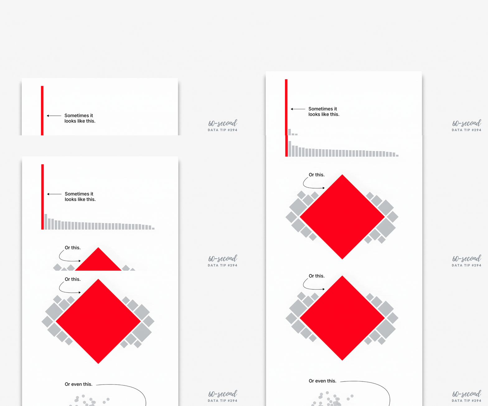
Every dataset includes variability. The people and things we measure differ from one another in many ways. And visualizing data always involves some decisions about how much of that variability to show. There are tradeoffs:
If you show too much variability, you obscure patterns and trends. To understand anything with data, we usually need to reduce its complexity. We can’t extract meaning from a table full of numbers and letters. So we summarize the data through such activities as grouping people, concepts, and time periods; calculating averages; or organizing individuals or groups in a rank order. This process allows us to detect patterns and trends within the data. Patterns and trends become even more apparent when we visualize the data in the form charts, maps, and graphs by assigning visual cues such as color, size, and shape to groups and values. However, too many colors, sizes, and shapes make discerning the patterns and trends more difficult.
If you show too little variability, you obscure reality*. Overly simplified visualizations do not show just how complex and messy the data actually is. And the viewer may mistake the simplified, summarized version of the data as reality.
You can find a great example of problem #2 in Eli Holder’s article Divisive Dataviz: How Political Data Journalism Divides Our Democracy. He describes the danger of red and blue political maps in the U.S. in this way: “there’s no such thing as a “red state” or a “blue state.” Consider Texas, which is often called a “red” state. In the 2020 presidential election, more Texans voted for Joe Biden (5.26 million) than every other “blue” state, except for California. Even New York, a Democratic stronghold, had roughly 20,000 fewer Biden voters than Texas. . . . While popular election maps accurately reflect the ‘winner-take-all’ dynamic of the electoral college, they create the misimpression that state electorates are monolithic blocks of only-Republicans or only-Democrats.”
And the misimpressions such maps engender have real-world consequences. Holder describes an experiment in which people were shown either dichotomous maps or continuous maps (see examples below). Those shown dichotomous maps were more likely than those shown continuous maps to feel that their state was dominated by one party and thus that their votes mattered less because the election outcome was a foregone conclusion.
Source: Divisive Dataviz: How Political Data Journalism Divides Our Democracy by Eli Holder
So when deciding how many shades of gray or circle sizes to show, consider how much summarization is needed to make patterns and trends perceptible without misleading the viewer with an oversimplified view of the data. Take, for example, these three versions of a map. They each show the same CDC chronic illness survey data with a “diverging color palette” in which blue states ranked high on health indexes; orange states ranked low; and gray states were in the middle. The maps differ in the degree of variability shown. Which map allows you to see corridors of good and bad health without oversimplifying the matter?
*More specifically, the full reality of the data. This 60-second data tip doesn’t get into the nature of reality in general!
To see past data tips, click HERE.
Let’s talk about YOUR data!
Got the feeling that you and your colleagues would use your data more effectively if you could see it better? Data Viz for Nonprofits (DVN) can help you get the ball rolling with an interactive data dashboard and beautiful charts, maps, and graphs for your next presentation, report, proposal, or webpage. Through a short-term consultation, we can help you to clarify the questions you want to answer and goals you want to track. DVN then visualizes your data to address those questions and track those goals.


