Nov
5
12:00 PM12:00

Plot Twist: Your Data Has a Story: Finding and Telling Data Stories

Data storytelling is the art of translating complex data into compelling narratives. It goes beyond a mere presentation of numbers and charts. It's about weaving data, visuals, and narrative into a cohesive story that resonates with your audience. Effective data storytelling makes information more accessible, memorable, and actionable. When done well, data storytelling is less like a novel and more like a choose-your-own-adventure. It takes your hand and leads you through the story but allows you to see that the data can tell any number of stories. It invites you in, orients you, and lets you explore.

Register For Event
View Event →
Nov
20
2:00 PM14:00

Data to Action: Making Data Visible and Useful

Almost every organization has two superpowers. The first is the data that they have packed away in databases and spreadsheets, often collecting virtual dust on their servers. The second is the visual faculties of their donors, clients, board members and staff members. While most of us glaze over at the sight of a spreadsheet, humans are wired to process visual information at lightning speed. By visualizing our data, we make it more accessible and usable.
You will leave this webinar with a clear understanding of:

  • The two superpowers organizations have and how to wield them more often and more effectively

  • How evaluators can use data visualization (aka data viz) to address key problems organizations face showing and evaluating their impact with a focus on visualizing survey data

  • The types of visualizations that work best for different purposes

  • How to turn a good viz into a great one.

Register For Event
View Event →
Dec
4
9:30 AM09:30

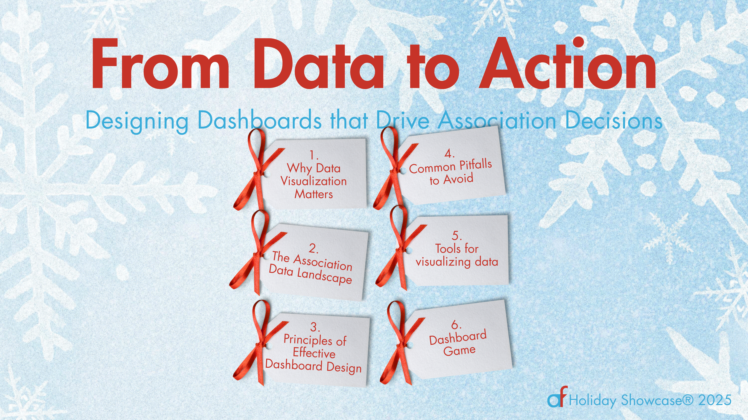
From Data to Action: Designing Dashboards that Drive Association Decisions (in Chicago)

Associations collect valuable data—on member engagement, event performance, revenue, and more—but too often that data stays locked in spreadsheets. Interactive dashboards can transform raw numbers into clear, visual insights that help staff, boards, and members make smarter decisions. When designed well, dashboards offer real-time views of progress and performance, surfacing trends and opportunities that might otherwise go unnoticed. But not all dashboards are created equal. Poorly designed dashboards can be cluttered, confusing, or just plain ignored. In this session, Amelia Kohm will unpack the key elements of effective dashboard design. You’ll learn how to create dashboards that are not only visually engaging but also intuitive, purposeful, and actionable. Whether you’re building a dashboard from scratch or refining one you already use, this session will give you practical guidance to make your data more accessible, meaningful, and impactful.

Register For Event
View Event →

Jul
31
11:00 AM11:00

How To Present Data More Effectively For Your Audience

We hear a lot about applying data to action. But for data to make an impact, it must first take a journey through the human mind. Understanding the challenges of that journey helps us to present data so that the mind can actually see, grasp, remember, and apply it.

Register For Event
View Event →
Jun
2
11:00 AM11:00

How To Present Data More Effectively For Your Audience

We hear a lot about applying data to action. But for data to make an impact, it must first take a journey through the human mind. Understanding the challenges of that journey helps us to present data so that the mind can actually see, grasp, remember, and apply it.

Register For Event
View Event →
Mar
17
11:00 AM11:00

How To Present Data More Effectively For Your Audience

We hear a lot about applying data to action. But for data to make an impact, it must first take a journey through the human mind. Understanding the challenges of that journey helps us to present data so that the mind can actually see, grasp, remember, and apply it.

Register For This Event
View Event →
Jan
29
11:00 AM11:00

How to Create Data Stories That Actually Engage People

Here are the problems: 1) You need to get a group of humans interested in an important topic. 2) The topic is complex. 3) There's a lot of data to share. 4) Human brains have limitations. So the challenge is to tell a story in a way that humans can understand and get behind. To do this, we need to first understand human's powers and challenges when it comes to consuming data. Then we can make better charts, maps, and graphs (aka data visualizations) given what we know about the human brain. And finally, we can present charts in a way that humans can absorb.

Register For This Event
View Event →
Sep
26
11:00 AM11:00

How to Create Data Stories That Actually Engage People

Here are the problems: 1) You need to get a group of humans interested in an important topic. 2) The topic is complex. 3) There's a lot of data to share. 4) Human brains have limitations. So the challenge is to tell a story in a way that humans can understand and get behind. To do this, we need to first understand human's powers and challenges when it comes to consuming data. Then we can make better charts, maps, and graphs (aka data visualizations) given what we know about the human brain. And finally, we can present charts in a way that humans can absorb.

Register For This Event
View Event →
Jul
18
11:00 AM11:00

How To Create Data Stories That Actually Engage People

Here are the problems: 1) You need to get a group of humans interested in an important topic. 2) The topic is complex. 3) There's a lot of data to share. 4) Human brains have limitations. So the challenge is to tell a story in a way that humans can understand and get behind. To do this, we need to first understand human's powers and challenges when it comes to consuming data. Then we can make better charts, maps, and graphs (aka data visualizations) given what we know about the human brain. And finally, we can present charts in a way that humans can absorb.

Register For This Event
View Event →
Apr
15
12:00 PM12:00

Data To Action: Making Your Data Useful And Visible

Almost every organization has two superpowers. The first is the data that they have packed away in databases and spreadsheets, often collecting virtual dust on their servers. The second is the visual faculties of their donors, clients, board members and staff members. While most of us glaze over at the sight of a spreadsheet, humans are wired to process visual information at lightning speed. By visualizing our data, we make it more accessible and usable.

You will leave this webinar with a clear understanding of:

  • The two superpowers organizations have and how to wield them more often and more effectively;

  • How you can use data visualization (aka data viz) to address key problems you face showing and evaluating your impact;

  • The types of visualizations that work best for different purposes; and

  • How to turn a good viz into a great one.

Register For This Event

Use code “friend10” for $10 off registration.

View Event →
Feb
5
12:00 PM12:00

Data To Action: Making Your Data Useful And Visible

Almost every organization has two superpowers. The first is the data that they have packed away in databases and spreadsheets, often collecting virtual dust on their servers. The second is the visual faculties of their donors, clients, board members and staff members. While most of us glaze over at the sight of a spreadsheet, humans are wired to process visual information at lightning speed. By visualizing our data, we make it more accessible and usable.

You will leave this webinar with a clear understanding of:

  • The two superpowers organizations have and how to wield them more often and more effectively;

  • How you can use data visualization (aka data viz) to address key problems you face showing and evaluating your impact;

  • The types of visualizations that work best for different purposes; and

  • How to turn a good viz into a great one.

Register For This Event

Use code “friend10” for $10 off registration.
View Event →
Dec
13
12:00 PM12:00

Data To Action: Making Your Data Useful And Visible

Almost every organization has two superpowers. The first is the data that they have packed away in databases and spreadsheets, often collecting virtual dust on their servers. The second is the visual faculties of their donors, clients, board members and staff members. While most of us glaze over at the sight of a spreadsheet, humans are wired to process visual information at lightning speed. By visualizing our data, we make it more accessible and usable.

You will leave this webinar with a clear understanding of:

  • The two superpowers organizations have and how to wield them more often and more effectively;

  • How you can use data visualization (aka data viz) to address key problems you face showing and evaluating your impact;

  • The types of visualizations that work best for different purposes; and

  • How to turn a good viz into a great one.

Register For This Event

Use code “friend10” for $10 off registration.

View Event →
Nov
9
2:00 PM14:00

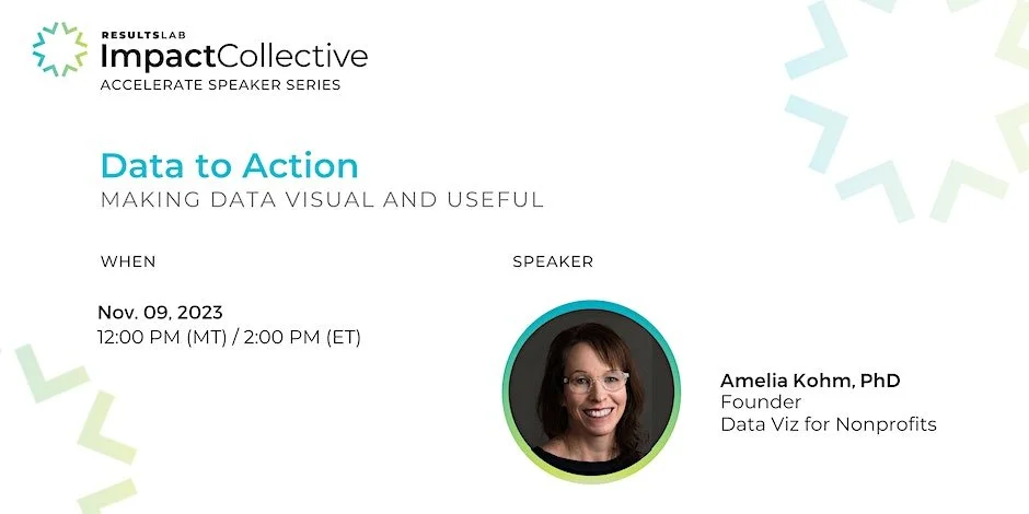
Data to Action: Making Data Visual and Useful

Almost every Nonprofit organization has two superpowers. The first is the data that they have packed away in databases and spreadsheets, often collecting virtual dust on their servers. The second is the visual faculties of their donors, board members and staff members. While most of us glaze over at the sight of a spreadsheet, humans are wired to process visual information at lightning speed. By showing data in engaging visual formats, we can conquer common nonprofit challenges.

Register for this free event
View Event →
May
9
10:00 AM10:00

How To Build An Effective Data Dashboard

More and more organizations are using data dashboards to show their progress in engaging participants, raising funds, imparting knowledge, etc. A data dashboard is a tool that provides a means of monitoring, measuring, and extracting meaning from data. Dashboards display information in an interactive and visual way, but not all dashboards are effective. Join us for this free webinar with Data visualizer, Amelia Kohm, who will share the key elements of powerful data dashboards.

Register for this free event
View Event →
Feb
14
10:00 AM10:00

DATA TO ACTION

Almost every nonprofit has two “secret” weapons, so secret that even those on staff might not be fully aware of them: 1) the data that they have packed away in databases and spreadsheets, often collecting virtual dust on their servers, and 2) the visual faculties of donors, board members, and staff members. While most of us glaze over at the sight of a spreadsheet, humans are wired to process visual information at lightning speed. By showing data in engaging visual formats, we can help our clients conquer common nonprofit challenges.

Register For This Event
View Event →
Nov
30
12:00 PM12:00

Data To Action

Almost every organization has two superpowers. The first is the data that they have packed away in databases and spreadsheets, often collecting virtual dust on their servers. The second is the visual faculties of their donors, clients, board members and staff members. While most of us glaze over at the sight of a spreadsheet, humans are wired to process visual information at lightning speed. By visualizing our data, we make it more accessible and usable.

You will leave this webinar with a clear understanding of:

  • The two superpowers organizations have and how to wield them more often and more effectively;

  • How you can use data visualization (aka data viz) to address key problems you face showing and evaluating your impact;

  • The types of visualizations that work best for different purposes; and

  • How to turn a good viz into a great one.

Register For This Free Event
View Event →
Aug
17
3:00 PM15:00

How To Make Your Data More Beautiful and Engaging

Data visualization is like one of those unlikely couples. One partner is outgoing and a great storyteller. The other is introverted and sticks to the facts. To make great charts, maps, and graphs, you need to channel both partners in this odd couple: the artist and the analyst. In this workshop, I will offer up 10 key rules about composition that artists know and that analysts (and the rest of us) can apply when presenting data. This presentation will be at 3 pm CST on August 17, 2022.

This workshop is being presented at Donor Experience Week 2022, a free virtual conference for nonprofit professionals.

Register For This Free Event
View Event →
Jul
20
3:00 PM15:00

Data To Action

Almost every organization has two superpowers. The first is the data that they have packed away in databases and spreadsheets, often collecting virtual dust on their servers. The second is the visual faculties of their donors, clients, board members and staff members. While most of us glaze over at the sight of a spreadsheet, humans are wired to process visual information at lightning speed. By visualizing our data, we make it more accessible and usable.

You will leave this webinar with a clear understanding of:

  • The two superpowers organizations have and how to wield them more often and more effectively;

  • How you can use data visualization (aka data viz) to address key problems you face showing and evaluating your impact;

  • The types of visualizations that work best for different purposes; and

  • How to turn a good viz into a great one.

Register For This Free Event
View Event →
Jun
22
11:00 AM11:00

Data Makeovers

Data visualization is like one of those unlikely couples. One partner is outgoing and a great storyteller. The other is introverted and sticks to the facts. To make great charts, maps, and graphs, you need to channel both partners in this odd couple: the artist and the analyst. In this workshop, I will offer up 10 key rules about composition that artists know and that analysts (and the rest of us) can apply when presenting data.

Register for this free event
View Event →
Jan
21
11:30 AM11:30

Visualize Your Data: From Data To Action with Charts, Maps, and Graphs

Data visualization mastermind Amelia Kohm will reveal how to unlock the secrets in your databases and spreadsheets. You will learn how to use data visualization to improve your organization’s results.

What You'll Learn

  • How can your organization wield your data superpower?

  • How can data visualization assess and boost effectiveness?

  • What techniques will enable you to use data to improve fundraising results?

  • What types of visualizations should you use?

  • How can you turn a good data viz into a great one?

Webinar brought to you by Nonprofit WebAdvisor.

Learn more and register
View Event →
Dec
13
11:30 AM11:30

Create An Interactive Map To Show Your Organization’s Reach

Data visualization guru Amelia Kohm will share a powerful data visualization application that your organization can use at no charge. You will learn how to create an interactive map dashboard in less than an hour, embed it on your website, or share it with select stakeholders.

What You'll Learn

  • Why does visualizing data make it more accessible?

  • What tools can you use to create a map dashboard?

  • How should you link your data to generate maps and charts?

  • How can you add interactivity for users?

Webinar brought to you by Nonprofit WebAdvisor.

Learn more and register
View Event →