How to Make Your Data More Accessible & Inclusive

When your charts are hard to read, navigate, or interpret, you may unintentionally exclude people with visual, cognitive, or physical differences. The good news? A few simple tweaks can make your visualizations dramatically more inclusive—without sacrificing impact. Below are three practical ways to start, each with links to deeper dives from past 60-Second Data Tips.

1. Design with Color Blindness in Mind

About 1 in 20 people live with some form of color vision deficiency. Relying solely on color to differentiate data points leaves these viewers behind. Use texture, shape, or labels—not just color—to distinguish categories. Also, tools like Color Oracle can help simulate how those with color blindness see your work, and you can generate an accessible color palette using an online tool like this one from Venngage.

Read more: How To Make Your Data Viz More Accessible: Color Blindness

2. Size Text for Readability

Small fonts and tight spacing are common in data visuals—but they create major accessibility barriers, especially for older adults or users with low vision. The rule of thumb is: Text must not be smaller than 9 points in size. And always test readability at 100% zoom—especially on dashboards.

Read more: What's The Right Text Size to Make Data Viz Accessible?

3. Structure for Screen Readers & Keyboard Navigation

If your charts are embedded in websites or reports, they should be usable by people who rely on screen readers or keyboard controls. You can make your data visualizations more screen reader- and keyboard-friendly by reducing the number of marks and adding text that clarifies the content of the visualization.

Read more: How To Make Your Data Viz More Accessible: Screen Readers and Keyboard Navigation


Let’s talk about YOUR data!

Got the feeling that you and your colleagues would use your data more effectively if you could see it better? Data Viz for Nonprofits (DVN) can help you get the ball rolling with an interactive data dashboard and beautiful charts, maps, and graphs for your next presentation, report, proposal, or webpage. Through a short-term consultation, we can help you to clarify the questions you want to answer and goals you want to track. DVN then visualizes your data to address those questions and track those goals.


How to Put The Viewer In The Viz

Reposted from May 2021

Here’s a surefire way to engage your donors, staff, board members, and others in your data: put them in it. This series of interactive visualizations from The New York Times shows you, right out of the gates, whether you live in a Democratic or Republican bubble. Then it zooms out to zip code areas near you and finally focuses on the segregated political landscape in the U.S. more generally.

Think about how you can engage various stakeholders in your data by using a similar technique. For example, show viewers . . .

  • How close they are to a problem. Rather than present statistics on food insecurity in your region, ask viewers to enter their zip code to see how many families near them don’t have consistent access to healthy food.

  • How accurate their understanding of an issue is. Ask them how many women experience domestic violence or how many children experience poverty, and then show them how far off the mark they are. Check out this example!

  • How their habits or lifestyle contribute to—or help to reduce—a problem. Check out this Carbon Footprint Calculator for a great example.

  • What category they fall into. We all love to discover groups we belong to. Think of Harry Potter’s sorting hat. Consider elucidating an issue by showing viewers where they fall in relation to that issue. That’s what I did with this data personality viz.

And no, you don’t need to be a tech wiz to make these types of interactive visualizations. You can make them using Tableau Public, the free version of Tableau (or a similar data viz application) and embed them in your website. I’m also happy to create something like this for you.


Let’s talk about YOUR data!

Got the feeling that you and your colleagues would use your data more effectively if you could see it better? Data Viz for Nonprofits (DVN) can help you get the ball rolling with an interactive data dashboard and beautiful charts, maps, and graphs for your next presentation, report, proposal, or webpage. Through a short-term consultation, we can help you to clarify the questions you want to answer and goals you want to track. DVN then visualizes your data to address those questions and track those goals.


Data Viz Mini Courses

Quick tip today: Data viz guru Ann Emery is in the process of making a dozen "mini courses" (1-2 hours about 1 specific topic, $97). Check them out.


Let’s talk about YOUR data!

Got the feeling that you and your colleagues would use your data more effectively if you could see it better? Data Viz for Nonprofits (DVN) can help you get the ball rolling with an interactive data dashboard and beautiful charts, maps, and graphs for your next presentation, report, proposal, or webpage. Through a short-term consultation, we can help you to clarify the questions you want to answer and goals you want to track. DVN then visualizes your data to address those questions and track those goals.


Guinea Pig Your Data Viz

Reposted from October 2018

Let’s say you have a well-designed chart, graph, or map. Now it’s time to find some humans (preferably those similar to your intended users), show them the visualization (aka viz), and do the following:

  • Ask them what they think the viz is about and what question(s) it is trying to answer.

  • Then ask them to try to answer several specific questions using the viz. These questions should focus on the key information you want users to easily extract from the viz.

  • Take notes. What was difficult for them to figure out? Did they miss any critical aspects of the viz? Did they come to any incorrect conclusions or interesting conclusions you didn’t expect?

Use your notes to revise:

  • Make some aspects of the viz more prominent using color,

  • Fade other aspects to the background,

  • Add a better title or more captions,

  • Remove confusing or distracting elements, and even

  • Add new data to make clearer comparisons.


Let’s talk about YOUR data!

Got the feeling that you and your colleagues would use your data more effectively if you could see it better? Data Viz for Nonprofits (DVN) can help you get the ball rolling with an interactive data dashboard and beautiful charts, maps, and graphs for your next presentation, report, proposal, or webpage. Through a short-term consultation, we can help you to clarify the questions you want to answer and goals you want to track. DVN then visualizes your data to address those questions and track those goals.


Nonprofits Need This Dashboard

Reposted from November 2023

Does your nonprofit have participants (or volunteers or clients or human beings of another sort) in various programs? If so, you could benefit from a dashboard like this one (see below). Give it a spin. Select a program at the top to highlight participants in that program in the charts. This dashboard allows for easy comparisons across programs, across statuses (e.g. enrolled, waitlisted, and withdrawn), and across time. Scroll over charts to learn more.

My inspiration for this dashboard came from Eve Thomas at The Data School. Check out Eve’s article, which includes instructions for creating this type of dashboard with Tableau (assuming basic Tableau knowledge.)


Let’s talk about YOUR data!

Got the feeling that you and your colleagues would use your data more effectively if you could see it better? Data Viz for Nonprofits (DVN) can help you get the ball rolling with an interactive data dashboard and beautiful charts, maps, and graphs for your next presentation, report, proposal, or webpage. Through a short-term consultation, we can help you to clarify the questions you want to answer and goals you want to track. DVN then visualizes your data to address those questions and track those goals.


What You Should Know About Word Clouds

Reposted from November 2020

This tip is a warning. In other tips, I have encouraged you to use a particular type of chart for specific purposes. But in this tip, I’ll suggest that you NEVER use this chart under ANY circumstance. I’m not alone in my aversion to word clouds. Plenty of others, including Jacob Harris, a senior software architect at The New York Times, have articulated their distaste. This tip is basically the 60-second version of Harris’ article on the topic.

Active Ingredients (What is a word cloud?)

A word cloud shows how many times various words in a document are used. More common words are larger. Less common ones are smaller. The varying sized words are arranged “into some vaguely artistic arrangement,” as Harris puts it.

Uses

There are no good uses of the word cloud. As its name suggests, it clouds meaning rather than clarifies it. I created the word cloud above using one of the many online word cloud generators. It shows the frequency of various words in “Goldilocks and the Three Bears.” Does it provide any insight into the story for you?

Sometimes organizations create word clouds not to convey insight but because they want a graphic on a topic and can’t think of what else to use. But photos or illustrations of anything are almost always going to be more engaging than a bunch of words floating around in a cloud.

Warnings

The number of times a word is used tells us nothing about the meaning of the text. Different words can have the same meaning and, conversely, the same word can have different meanings in different contexts. To get to meaning, you need to look at the frequency of concepts or themes, not words.

Word clouds aren’t the best tool even when the point is to analyze word usage. Check out the series of simple bar charts below. They provide more insight than any word cloud could because they allow us to easily discern the most/least popular words.

(Sort of) Fun Fact

The word cloud technique originated online in the 1990s when they were called “tag clouds” and were used to show the popularity of keywords in bookmarks.

To see past data tips, including those about other chart types, click HERE.


Let’s talk about YOUR data!

Got the feeling that you and your colleagues would use your data more effectively if you could see it better? Data Viz for Nonprofits (DVN) can help you get the ball rolling with an interactive data dashboard and beautiful charts, maps, and graphs for your next presentation, report, proposal, or webpage. Through a short-term consultation, we can help you to clarify the questions you want to answer and goals you want to track. DVN then visualizes your data to address those questions and track those goals.


Why You Should Know About Venn Diagrams

Reposted from October 2020

This week, I give you yet another useful-if-done-right chart, the Venn diagram.

Active Ingredients (What is a Venn Diagram?)

ICYMI, a Venn diagram shows overlapping categories or sets usually represented by circles.

Uses

These diagrams are great for showing the degree to which categories or sets overlap and what elements fall inside/outside of each set and each overlapping portion. The take home message is usually the shaded area where all of the circles intersect. So make that area easy to locate using color and labels. You can use a venn diagram to:

  • Show Program Overlaps: Illustrate how different programs or services intersect—for example, where housing and mental health services support the same clients.

  • Highlight Shared Needs: Compare the needs of different populations served (e.g., youth and seniors) to show common areas like transportation or access to healthcare.

  • Map Partnerships: Show where missions or activities of partner organizations align with your own. Great for grant proposals and collaboration pitches.

  • Visualize Strategic Fit: Depict the overlap between your organization’s strengths, community needs, and funding opportunities—helpful in strategic planning.

This example shows how an organization bridges the gap among three different types of organizations working on foreign policy.

Source: Network 20/20

Warnings

For me, Venn-diagram-fatigue sets in early. I get tired of discerning the meaning of each overlapping area pretty quickly. So I’d suggest limiting the number of circles. And, more importantly, clearly labeling the sets.

Here’s one that I gave up on after about 15 seconds:

Source: @DanNeidle

Source: @DanNeidle

On the other hand, this Venn diagram works even with four sets because the sets (orphaned, wealthy, sidekick, and masked) are clearly marked and the intersection labels are simple.

Source: gliffy.com

Source: gliffy.com

Fun Fact

English mathematician John Venn is credited with inventing the Venn diagram in the 1860s, and, according to Phil Plait, there are two kinds of people in the world . . .

To see past data tips, including those about other chart types, click HERE.


Let’s talk about YOUR data!

Got the feeling that you and your colleagues would use your data more effectively if you could see it better? Data Viz for Nonprofits (DVN) can help you get the ball rolling with an interactive data dashboard and beautiful charts, maps, and graphs for your next presentation, report, proposal, or webpage. Through a short-term consultation, we can help you to clarify the questions you want to answer and goals you want to track. DVN then visualizes your data to address those questions and track those goals.


How To Choose The Right Chart

Copy of 60-SECOND DATA TIP.png

Reposted from September 2018 with updates!

There are many chart choosing tools out there. You can find online tools: just Google “chart chooser.” You also can use tools built into data visualization applications like Tableau or, of course, ask your friendly AI. But I still like this simple one: Andrew Abela’s decision tree called Chart Suggestions—A Thought-Starter.  It’s based on Gene Zelazny's classic work Say It With Charts. I like that it focuses on what you are aiming to show and gets you thinking about that. Indeed, it prompts thinking, as the name suggests, and thinking is a good activity to do before visualizing data!

The decision tree starts with the basic question: “What would you like to show?” And provides four options:

Comparison. You have two or more groups of things or people and you want to see which group is largest/smallest or highest/lowest (or somewhere in between) on some measure. You also may want to see how these groups compare on the measure overtime.

Distribution. You have a bunch of data points (e.g. the ages of participants in a program or test scores of students in a class) and you want to know how spread out or bunched up they are. Are most of the ages, test scores (whatever) near the average? Or is there a wide range? Are there some extreme outliers?

Composition. You want to understand who or what makes up a larger group such as how many of the participants in a program are in different age brackets or how many have been in the program for different lengths of time.

Relationship. You want to know if one thing is related to another, either at one point in time or overtime. Does more participation in a mental health program correlate with less distress over time? Do those with lower incomes have higher heart rates?

Once you answer this basic question, the decision tree helps you to choose a specific chart based on the type of data you have. Abela’s chart chooser includes the types of charts you are most likely to select. But there are more rare species out there. To learn more about the wide array of ways to visualize data, check out the Data Visualisation Catalog.

However, I will leave you with a word of caution. And that word is: “Xenographphobia” or fear of weird charts. It’s a thing. And you should be aware of it. Although we might like the look of sexy charts, we don’t usually have the time or patience to figure them out. So in the interest of creating a positive and productive user experience, consider sticking with the charts folks already know how to read or are self-explanatory.


Let’s talk about YOUR data!

Got the feeling that you and your colleagues would use your data more effectively if you could see it better? Data Viz for Nonprofits (DVN) can help you get the ball rolling with an interactive data dashboard and beautiful charts, maps, and graphs for your next presentation, report, proposal, or webpage. Through a short-term consultation, we can help you to clarify the questions you want to answer and goals you want to track. DVN then visualizes your data to address those questions and track those goals.


Column chart with line chart by HLD, Line Graph by Creative Stall, Pie Chart by frederick allen, Radar Chart by Agus Purwant, and sankey diagram by Rflor (from the Noun Project)

What's The Difference Between An Infographic and A Data Visualization?

Reposted from April 2018

Infographic and data visualization often are used interchangeably. And, indeed, the distinction is not hard and fast. They both focus on showing rather than telling. They explain something using more visual cues than words or numbers and so take advantage of our visual superpowers. (For more on these superpowers, see Tip #1.) The difference is that an infographic is more of a story, and a data visualization is more of a tool.

An infographic typically uses images to lead the viewer through a story. Some of those images might be visualizations of data. For example, the point of this infographic is to highlight aspects of a nonprofit workforce shortage. Infographics are usually meant to explain or show something to people who are not all that familiar with the topic.

A data visualization, unlike an infographic, uses visual cues (shape, color, size, etc.) primarily to represent data. Think bar chart, line graph, pie chart, and maps. And though the creators of the data visualization may have a story they want to tell, the viewer can use the visualization to discern any number of stories.

For example, on the quadrants chart below, each circle represents an educational strategy. The strategies are plotted along two measures: how much importance educators place on the strategies and how often they put these strategies into practice. We can use this chart as a tool to decide what to do next. Clearly, most of the educators represented in the data already feel these strategies are important. But they use most of the tactics less than 50 percent of the time. So we need not waste time explaining the value of the strategies to them. Instead, we should determine what is preventing them from implementing the strategies.

If you are looking to tell a specific story particularly to an outside audience, consider an infographic. If you are looking for a tool to explore data, consider a data visualization.


Let’s talk about YOUR data!

Got the feeling that you and your colleagues would use your data more effectively if you could see it better? Data Viz for Nonprofits (DVN) can help you get the ball rolling with an interactive data dashboard and beautiful charts, maps, and graphs for your next presentation, report, proposal, or webpage. Through a short-term consultation, we can help you to clarify the questions you want to answer and goals you want to track. DVN then visualizes your data to address those questions and track those goals.


Why You Should Know About Span Charts

Reposted from March 2022

Tired of bar and pie charts but not sure what your other options may be? Meet the simple and friendly span chart.*

Active Ingredients (What is a span chart?)

A span chart shows the range between a minimum value and a maximum value. Check out the example below which displays the salaries of full-time employees of the City of Chicago in various departments. The chart on top shows the range between the lowest and highest salaries in each department, and when you click on a bar, the chart below shows the salaries of individual employees in that department (which you can see by scrolling over the circles). So we can see, for example, that although the public library department has a wide range of salaries, the large majority of employees earn less than $100K per year.

Uses

Span charts provide the extreme values. So if you want your viewer to appreciate the range of values and compare the range of different subgroups, as the example above does, it can be quite effective. In addition to salary ranges, a nonprofit organization might use a span chart to show the range between:

  1. The largest and smallest donation amounts per person by year or by subgroup.

  2. The highest and lowest grade point average of students in a tutoring program by semester or by subgroup.

  3. The most and least days of participation among adults in a job training program by month or by subgroup.

Here are instructions for creating a span chart with Tableau and Excel.

Warnings

Span charts do not show the values in between the minimum and maximum or the average value. So you have no sense of the distribution of data points. Are the values evenly distributed or are most at the high or low end? If understanding the distribution is important, you can pair a span chart with a chart that provides more information on the in-between values, as the example above does. Other chart types which show distribution include: histograms, scatter charts, and box plots.

Fun Fact

Span charts go by a variety of names including range bar/column graph, floating bar graph, difference graph, and high-low graph.

*This is one in a series of tips on different chart types. In each tip, l give you need-to-know information in a format akin to the “Drug Facts” on the back of medication boxes: active ingredients (what the chart is), uses (when to use it), and warnings (what to look out for when creating the chart). The idea is to fill up your toolbox with a variety of tools for making sense of data. And the span chart is a simple tool you can put to good use!

Sources: The Data Visualisation Catalogue


Let’s talk about YOUR data!

Got the feeling that you and your colleagues would use your data more effectively if you could see it better? Data Viz for Nonprofits (DVN) can help you get the ball rolling with an interactive data dashboard and beautiful charts, maps, and graphs for your next presentation, report, proposal, or webpage. Through a short-term consultation, we can help you to clarify the questions you want to answer and goals you want to track. DVN then visualizes your data to address those questions and track those goals.


Understand Your Volunteers Using "Pantry Staple" Data

If your organization is like most nonprofits, you rely on volunteers to get the job done. And you probably have at least some basic “pantry staple” data on volunteers.

Pantry Staple Data: Volunteer Data

The volunteer data you already have can be leveraged to:

  • Impress funders, donors, and other stakeholders. Show them how you are using this free resource to move the needle.

  • Recruit new volunteers. As we have discussed in this blog before, we are all influenced by peers. So show how many volunteers you have to attract even more.

  • Manage volunteers more effectively. Seeing clearly what’s going on with your volunteers will help you to retain them, make better use of them, and recruit new ones. This is the subject of today’s tip.

Use Case: Maximizing Volunteer Time and Value

This volunteer data dashboard uses a variety of charts to answer the who, what, where, and when questions that you may have about your volunteers. With this detailed view of volunteers, an organization can start thinking about how to activate inactive volunteers, what types of new volunteers to target, and when during the year to deploy volunteers.

Source: Jin Tat on Tableau Public

Source: Jin Tat on Tableau Public

This simple map dashboard provides insight into the distribution of volunteers—and volunteer hours—among sites. This understanding can help you decide if and how to redistribute volunteers. Both this dashboard and the one above can be created using Tableau Public, the free version of Tableau.

Source:CCE on Tableau Public

Source:CCE on Tableau Public

To see past data tips, click HERE.


Let’s talk about YOUR data!

Got the feeling that you and your colleagues would use your data more effectively if you could see it better? Data Viz for Nonprofits (DVN) can help you get the ball rolling with an interactive data dashboard and beautiful charts, maps, and graphs for your next presentation, report, proposal, or webpage. Through a short-term consultation, we can help you to clarify the questions you want to answer and goals you want to track. DVN then visualizes your data to address those questions and track those goals.


A Simple Way to Improve Nonprofit Charts

Sometimes showing whether something happened or not is more powerful than showing how much it changed over time. A recent Grist article highlights this idea through a striking example: instead of showing gradual temperature shifts over time (see the lefthand chart below), scientists simply showed whether a lake froze each winter—yes or no—across several decades (see righthand chart below). People who saw the righthand chart were more likely to perceive climate change as causing more abrupt changes.

Source: Grist

This binary approach—did/didn’t, yes/no, on/off—turns complex data into clear signals. And it’s not just for climate science. Nonprofits can use it to communicate impact in a way that’s instantly understood. Long-term trends are easier to see, and it evokes a stronger emotional response.

Try this in your nonprofit work:

  • Show which years a program met its goals and which it didn’t.

  • Visualize which communities have (or don’t have) access to a key service.

  • Use a yes/no timeline to highlight when a resource was available.

Binary visuals don’t oversimplify—they clarify. Read the full story here: Grist – Scientists just found a way to break through climate apathy.

To see past data tips, click HERE.


Let’s talk about YOUR data!

Got the feeling that you and your colleagues would use your data more effectively if you could see it better? Data Viz for Nonprofits (DVN) can help you get the ball rolling with an interactive data dashboard and beautiful charts, maps, and graphs for your next presentation, report, proposal, or webpage. Through a short-term consultation, we can help you to clarify the questions you want to answer and goals you want to track. DVN then visualizes your data to address those questions and track those goals.


How To Balance Your Information Diet

Reposted from January 2024

Here’s a question for you. And don’t go Googling. Just make your best guess.

Have the number of people experiencing homelessness in the U.S. increased or decreased since 2007?

Whatever your answer, you likely drew on your own personal experience as well as images and information from the media when guessing at the answer. Perhaps you drew on some statistics too. But, unless you have expertise in this area, probably not. Stick with me for a minute, and I’ll not only provide an answer to the question but also some insight into how we consume information.

Personal experience, media, and statistics affect how we understand any issue, and there are limits to each of these inputs. So we would do well to understand those limits before acting on our understanding by voting, donating, or making decisions about programs that our organizations operate. Max Roser’s article in Our World in Data (The limits of our personal experience and the value of statistics) walks us through some of those limitations:

Personal Experience

“The world is large, and we can experience only very little of it personally,” Roser notes. “For every person you know, there are ten million people you do not know.” Even the most social and well-traveled among us can have only a limited understanding of the world through personal experience. I, for example, do not know anyone personally who has been unhoused, and most of my interactions with people in this situation occur on the street when someone asks me for money. This experience provides no information about the breadth of the problem or the range of experiences with this issue over time.

Media

“This fact is so obvious that it is easy to miss how important it is: everything you hear about anyone who is more than a few dozen meters away, you know through some form of media,” Roser points out. “The news reports on the unusual things that happen on a particular day, but the things that happen every day never get mentioned. This gives us a biased and incomplete picture of the world; we are inundated with detailed news on terrorism but hardly ever hear of everyday tragedies like the fact that 16,000 children die every single day.” If I recently heard a story about a city clearing homeless encampments, I may assess the problem as larger, and if I haven’t heard about anything on the issue in awhile, I may assess it as smaller.

Statistics

“The collection and production of good statistics is a major challenge,” writes Roser. “Data might be unrepresentative in some ways, it might be mismeasured, and some data might be missing entirely.” But, unlike personal experience and the media, it provides a way of assessing the full range of an issue. So it’s important to add statistics, along with personal experience and the media, to our information diet.

To add some statistics to your understanding of homelessness, the number of people experiencing homelessness in the U.S. decreased from about 650,000 in 2007 to about 580,000 (about 18 of every 10,000 people) in 2022 according to The 2022 Annual Homelessness Assessment Report to Congress.

We should not discount personal experience, the media, or statistics because of their limitations. But we should appreciate their limitations when forming opinions and taking actions based on them. As Roser notes: “Each way of learning about the world has its value. It’s about how we bring them together: the in-depth understanding that only personal interaction can give us, the focus on the powerful and unusual that the news offers, and the statistical view that gives us the opportunity to see everyone.” As described in many tips in this blog, well-designed charts make data/statistics more accessible to everyone and thus allow everyone to see everyone.


Let’s talk about YOUR data!

Got the feeling that you and your colleagues would use your data more effectively if you could see it better? Data Viz for Nonprofits (DVN) can help you get the ball rolling with an interactive data dashboard and beautiful charts, maps, and graphs for your next presentation, report, proposal, or webpage. Through a short-term consultation, we can help you to clarify the questions you want to answer and goals you want to track. DVN then visualizes your data to address those questions and track those goals.


3 PowerPoint Laws to Always Obey

60-SECOND DATA TIP_3 (1).png

Reposted from April 2019

Charts, graphs, and maps often make their debut in PowerPoint presentations (or the like.) This is a problem. A bad PowerPoint can kill even a great data visualization.

We already know PowerPoints are a problem. We have napped through many of them in our careers. And we even know, when we are on the creating end, that they shouldn’t be text heavy. But we don’t know what else to do besides typing in a few bullet points and pasting in some bad clip art.

Since I’m committed to giving you something useful in 60-second portions, this week I give you my top three PowerPoint laws (yes laws – you might not take mere recommendations as seriously, and this is important!)

Law #1: Slides are for seeing. Think about the last subtitled movie you saw. Did you miss a lot of the action while reading? Research shows we are quite good at simultaneously processing pictures and spoken words. But our brains go on overdrive when processing pictures plus written text – like during subtitled movies. And our brains can completely shut down when processing written text plus spoken words, which is what we ask audiences to do during our Powerpoints.* So move those bullet points to your script or speaking notes and use a well-designed data visualization or a great photo.

Law #2: Portion control. The hard truth is that our audience members are going to walk away from our presentation retaining just a few ideas whether we like it or not. If we shower them with ten, twenty, thirty ideas, we don’t control which ones they retain. So choose just a few and weed out the rest. Then feature only one idea per slide. And go easy on the charts, maps, and graphs. They are more difficult to process than photos or illustrations, so give your viewers a cognitive break between charts.

Law #3: Obey visual hierarchy. Remember what Antoine de Saint-Exupery said: “Perfection is achieved, not when there is nothing more to add, but when there is nothing left to take away.” Simplify your slides with one compelling image or one chart, map, or graph (which, itself, has been stripped down to what is necessary). Make sure there is plenty of empty space around the image or chart to give it prominence. Then enlarge only the most important elements while reducing the size of the rest. Similarly, use color sparingly to draw attention to the most important aspects of the slide. And for much more on visual hierarchy, check out this great article on Canva.

* For more on this, check out Moreno and Mayer’s studies on multimedia learning.

Photos by NeONBRAND and Cody Davis on Unsplash


Let’s talk about YOUR data!

Got the feeling that you and your colleagues would use your data more effectively if you could see it better? Data Viz for Nonprofits (DVN) can help you get the ball rolling with an interactive data dashboard and beautiful charts, maps, and graphs for your next presentation, report, proposal, or webpage. Through a short-term consultation, we can help you to clarify the questions you want to answer and goals you want to track. DVN then visualizes your data to address those questions and track those goals.


Lighten Cognitive Load, Boost Clarity: Smarter Data Visualizations for Nonprofits

When visualizing data, we should always consider cognitive load. What’s that? It’s the mental effort required to process information. There are two types of cognitive load: extraneous and intrinsic. Let's consider each in relation to data visualizations.

  • Extraneous cognitive load concerns how information is presented. There's a lot we can do to reduce the extraneous cognitive load of a chart.

  • Intrinsic cognitive load concerns the complexity of the information being shared. You can reduce intrinsic load only by altering what is being learned or by changing the knowledge levels of learners.

We can reduce the extraneous cognitive load of any chart through careful choices about titles, annotations, colors, use of white space, etc. But we are much more limited in what we can do to reduce the intrinsic cognitive load of a chart. I’d argue that the primary thing we can do is to choose a chart type that does not increase the intrinsic load by requiring the viewer to learn how to read the chart. So familiar or intuitive chart types usually work best.

Let's consider this data dashboard in terms of cognitive load. It has several different chart types.

The bar charts impose a fairly low intrinsic and extraneous cognitive load. We already know how to read a bar chart. They each show one measure which we probably can understand, such as C02 global share or CO2 per GDP across several years. And the compositions and colors aid interpretation. The cumulative carbon clock, however, is a different story. It may grab our attention with its novelty. It's a radial column chart (aka circular column graph or star graph.) But most of us will have to figure out how to read this chart using the color and shape legends to understand what the chart is showing and how it is showing it. I also find the circular shape, which usually suggests some type of cycle, confusing because there is no cycle inherent to this data. I think the costs of the radial column chart outweigh its benefits.


Let’s talk about YOUR data!

Got the feeling that you and your colleagues would use your data more effectively if you could see it better? Data Viz for Nonprofits (DVN) can help you get the ball rolling with an interactive data dashboard and beautiful charts, maps, and graphs for your next presentation, report, proposal, or webpage. Through a short-term consultation, we can help you to clarify the questions you want to answer and goals you want to track. DVN then visualizes your data to address those questions and track those goals.


What Is Data, How Do You Say It, and Is It Singular or Plural? (Asking for a Friend)

Feel free to share this with your “friend.”

What is data?
Data is raw information—facts, numbers, or observations that haven't been analyzed yet. For nonprofits, this can take many forms, such as:

  • The number of attendees at your last fundraising event,

  • Donation amounts,

  • Volunteer hours logged, or

  • Survey responses from program participants

These are all data points. On their own, they don’t say much. But when you organize and analyze them, they become information—like knowing that donations spike after your newsletter goes out, or that volunteers stay longer when they receive training.

How do you pronounce it?
Americans lean toward day-tuh while Brits and “serious science types” may prefer dah-tuh.

Is it singular or plural?
Purists say data is plural (the singular is datum, a word used only by archaeologists and robots). But in everyday English, data acts like a singular noun. Example: “The data is confusing.” Also valid: “The data are confusing.”


Let’s talk about YOUR data!

Got the feeling that you and your colleagues would use your data more effectively if you could see it better? Data Viz for Nonprofits (DVN) can help you get the ball rolling with an interactive data dashboard and beautiful charts, maps, and graphs for your next presentation, report, proposal, or webpage. Through a short-term consultation, we can help you to clarify the questions you want to answer and goals you want to track. DVN then visualizes your data to address those questions and track those goals.


The 10-Charts Strategy

I’ve been noticing a possible trend among news outlets: covering an issue, often a complex one, using ten charts. Here’s an example. This strategy could work well for nonprofits. Organizations can explain a need they are addressing or show their impact during the past year in ten charts. I can see it elevating presentations, websites, and reports because:

  • Just alerting folks that you are going to explain, explore, or enlighten in ten charts seems to pique interest in reviewing each one of the charts, at least briefly.

  • The strategy allows you to shed light on an issue or topic from different angles.

  • Numbered subtitles allow you to provide ten key takeaways with the charts providing more detail for interested readers.

Of course, the charts should be well-designed so that their meaning can be easily extracted and digested. Give it a try. And let me know if you’d like some help with it.


Let’s talk about YOUR data!

Got the feeling that you and your colleagues would use your data more effectively if you could see it better? Data Viz for Nonprofits (DVN) can help you get the ball rolling with an interactive data dashboard and beautiful charts, maps, and graphs for your next presentation, report, proposal, or webpage. Through a short-term consultation, we can help you to clarify the questions you want to answer and goals you want to track. DVN then visualizes your data to address those questions and track those goals.


Avoid This Danger When Choosing Metrics

Reposted from July 2019

I’m all about making data clear and easy-to-digest. But there is a danger in it. The clarity may cause you to accept what the data seems to tell you. You may not linger. You may not reflect.

Writer Margaret J. Wheatley warns us that “without reflection, we go blindly on our way, creating more unintended consequences, and failing to achieve anything useful.”

Economist Charles Goodhart recognized this danger in the metrics we create to measure our progress. At first, a certain metric may seem like a good indicator of progress. If we want kids in an after-school track program to increase their endurance, we might measure how far they run at the beginning of the program and then again at the end.  Makes sense, right? We might then try to motivate students by offering them free running shorts if they increase their miles by a certain amount. But, that’s when students might start gaming the system. They can increase their miles not only by training hard and running farther over time but also by running very short distances at the start. This is the kind of unintended consequence that Goodhart warned us about. His law states: “When a measure becomes a target, it ceases to be a good measure.” 

The solution? First, reflection. Consider the potential unintended consequences of each of your metrics, particularly those tied to incentives. Second, use multiple metrics to provide a more balanced understanding of progress.  In our running example, in addition to the change in miles participants run, you might also measure resting heart rates at the beginning and end of the program, knowing that a lower resting heart rate generally indicates a higher level of cardiovascular fitness.


Let’s talk about YOUR data!

Got the feeling that you and your colleagues would use your data more effectively if you could see it better? Data Viz for Nonprofits (DVN) can help you get the ball rolling with an interactive data dashboard and beautiful charts, maps, and graphs for your next presentation, report, proposal, or webpage. Through a short-term consultation, we can help you to clarify the questions you want to answer and goals you want to track. DVN then visualizes your data to address those questions and track those goals.

How to Make Charts That Are Not Confusing

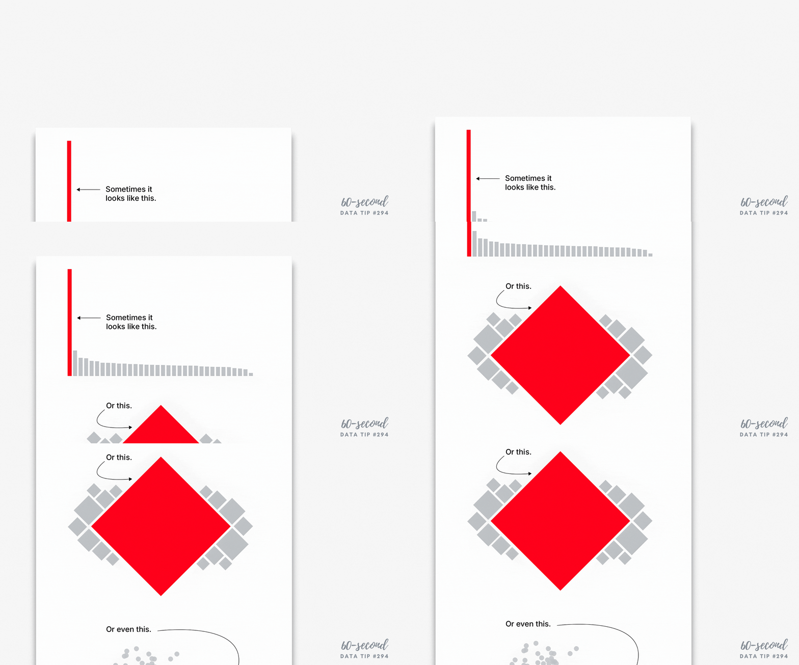
When clients ask me for a better way to show their data, it often becomes clear that they want something other than a bar chart. They hope that I will offer them some cool-looking chart that will captivate their stakeholders. There are, indeed, many interesting charts out there such as the ones pictured here.

Sources: APT: Voices For Human Dignity (1984-2024) | #VFSG | #VOTD by Arshi Saleh, Violin Chart Demo by Chinmay Jain, Parallel Coordinates Radar Chart by Andy Kriebel

But I always encourage my clients to consider how long it will take folks to learn how to read the chart using instructions and legends, then grasp the data in the chart, and finally remember what they saw. Unless the chart type is familiar or highly intuitive, it’s probably not worth it. Instead, I encourage them to focus on well-designed, visually-engaging charts that are also intuitive or familiar. Here are some 60-second data tips that can help:

  • How to hack a bar chart: I offer up eight bar chart hacks that make this trusty yet (sometimes) boring chart more interesting. See links below.

  • Data viz makeovers. Here are 10 art rules that elevate any data viz.

  • Chart types. To explore different chart types and what they are each good for, check out tips under “Chart Types” on the index/search page on the website.

I recently watched “Charts That Confuse Us” from a great series called “Chart Chat.” You might want to check that out too.

Bar Chart Hacks

Bar Chart Hack #1: The Divergent Stacked Bar Chart

Bar Chart Hack #2: The Icon Bar Chart

Bar Chart Hack #3: The Combo Chart

Bar Chart Hack #4: Radial Charts

Bar Chart Hack #5: Fine Tuning

Bar Chart Hack #6: The Funnel Chart

Bar Chart Hack #7: The Lollipop Chart

Bar Chart Hack #8: Double Duty Stacked Bars


Let’s talk about YOUR data!

Got the feeling that you and your colleagues would use your data more effectively if you could see it better? Data Viz for Nonprofits (DVN) can help you get the ball rolling with an interactive data dashboard and beautiful charts, maps, and graphs for your next presentation, report, proposal, or webpage. Through a short-term consultation, we can help you to clarify the questions you want to answer and goals you want to track. DVN then visualizes your data to address those questions and track those goals.

Wait, What? Numbers That Bewilder

60-SECOND DATA TIP_3 (1).png

Reposted from July 2019

Numbers can bewilder our hunter-gatherer brains. For more than 95 percent of human history, folks were not processing written numbers or words. But they were processing visual information in the form of color, shape, and size. It’s not surprising that our brains, evolved over many thousands of years, are better at understanding data in visual form than in word and number form. So when numbers confuse, try “translating” them to the visual.

Here’s a great example of a number that makes me scratch my head: “54% more students with monitors improved attendance than students without monitors.” The statement relates to a fictional program that (like some non-fictional programs) pairs students with monitors to boost their attendance. At first blush, to me, that sounds pretty impressive. It sounds like this: if 10% of the students without monitors improved their attendance, then 64% (10% + 54%) with monitors improved their attendance. Or, put another way, six times as many kids with monitors improved their attendance as kids without monitors.

But my brain just made a wrong turn. That 54% is showing what statisticians call “relative difference.” And the problem with this type of stat is that indicators with low values have a tendency to produce large relative differences even when the “absolute difference” is small.

Okay, still bewildered? No worries, I give you now a picture for your primitive brain. Let’s say, in our fictional program, there are 10 students per class. In one class, all of the kids got paired with monitors. In the other class, none of the kids did. The picture below shows how many kids in each class improved their attendance.


So the difference (aka “absolute difference”) is 1.4 (4.0-2.6) which means that 1.4 more kids in the class with monitors improved their attendance. How did that measly 1.4 become 54%? Well, relative difference is calculated as the absolute difference divided by the “standard” which, in this case, is the class without monitors. So 4.0 minus 2.6 divided by 2.6 or .54, which when expressed as a percentage is 54%.

If relative difference requires varsity level processing for many of us, then percentages are junior varsity. So if I were visualizing the difference between the two groups, I would stay away from both and use an icon chart, like the one above. I might make it even more concrete by showing 25 person icons in each group since the typical elementary school classroom has 25 students. I would then use color to show that 6.5 students out of 25 without monitors had improved attendance and 10 students out of 25 with monitors had improved attendance. So, if you bring the program to a typical classroom, you might expect it to improve the attendance of an additional 3 to 4 kids.

Bottom line? Numbers can be like road signs pointing us in the wrong direction. To move folks in the right direction, make your message concrete and visible.

See other data tips in this series for more information on how to effectively visualize and make good use of your organization's data.


Let’s talk about YOUR data!

Got the feeling that you and your colleagues would use your data more effectively if you could see it better? Data Viz for Nonprofits (DVN) can help you get the ball rolling with an interactive data dashboard and beautiful charts, maps, and graphs for your next presentation, report, proposal, or webpage. Through a short-term consultation, we can help you to clarify the questions you want to answer and goals you want to track. DVN then visualizes your data to address those questions and track those goals.