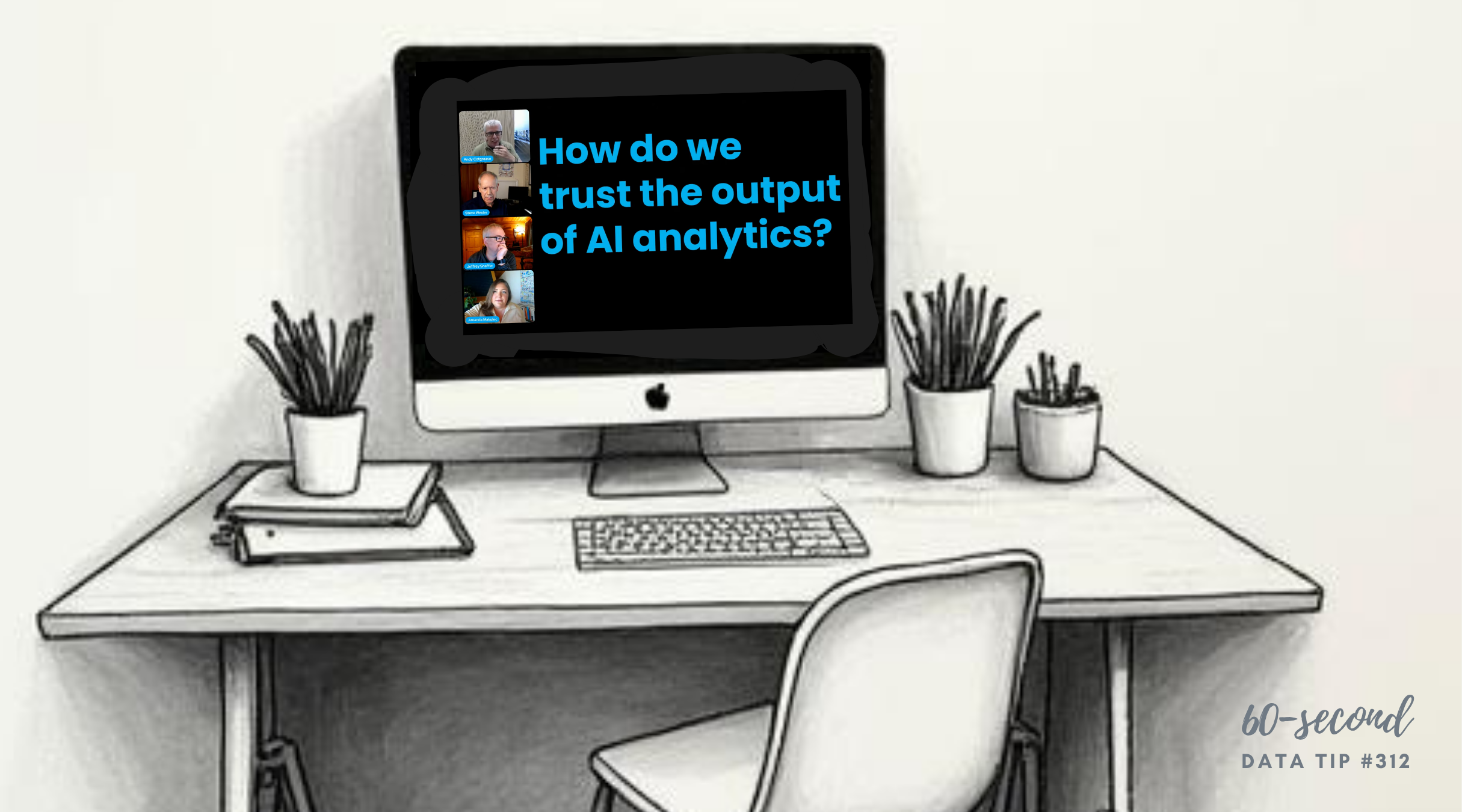
Here's a new addition to my highly-curated resources list: Chart Chat. I occasionally write a 60-second data tip describing a particular resource, including why I think it’s cool. And I link each of these tips to a resources list on my website.
What is it?
Chart Chat is a free, monthly live video podcast in which four leading data visualization experts (Jeffrey Shaffer, Steve Wexler, Amanda Makulec, and Andy Cotgreave) debate the good, the bad, and the contentious in data visualization. Episodes run about 45 minutes and cover everything from chart makeovers to AI to box plots. Past guests include Alberto Cairo, Cole Nussbaumer Knaflic, Tim Harford, and Seth Godin. Chart Chat won the Data Literacy Award for Most Interesting Podcast in 2021.
Who's it for?
Anyone who wants to think more deeply about data visualization, stay current on trends and debates in the field, and learn from practitioners who have seen it all. You don't need to be a data expert to follow along. The hosts are opinionated, funny, and surprisingly accessible.
Who's behind it?
The four co-hosts are all authors of data visualization books and have decades of combined experience helping organizations see and understand their data. Together they also co-authored Dashboards That Deliver.
Why I think it's cool
Chart Chat models exactly the kind of critical thinking about data and visualization that I want nonprofits to develop. The hosts disagree with each other, catch each other's mistakes, and change their minds in real time. That's rare, and it's worth watching.
Let’s talk about YOUR data!
Got the feeling that you and your colleagues would use your data more effectively if you could see it better? Data Viz for Nonprofits (DVN) can help you get the ball rolling with an interactive data dashboard and beautiful charts, maps, and graphs for your next presentation, report, proposal, or webpage. Through a short-term consultation, we can help you to clarify the questions you want to answer and goals you want to track. DVN then visualizes your data to address those questions and track those goals.