"The less you judge things—including the contents of your mind—the more clearly you'll see them." — Robert Wright in Why Buddhism Is True
Buddhism teaches us to see the world as it actually is. Most of the time, we don't.
We perceive the world around us filtered through layers of thought, assumption, and learned concept. These filters serve a purpose: they are shortcuts that allow us to process information quickly and efficiently. But they come with a cost. We don't experience a tree; we experience our idea of a tree. We don't listen to a song; we hear our memory of every other time we've heard it. The practice of mindfulness is, at its core, an invitation to set those filters aside and perceive what is actually there, directly and freshly.
Data comes to us encoded in words and numbers, a format most of us, who don’t have a statistics degree, find bewildering. So our impulse might be to hand it over to AI and ask it to explain what's going on. But here's the catch: your questions are limited by your knowledge and experience. And AI’s answers are limited to it’s model training. You're seeing your data through filters that you may not be aware of.
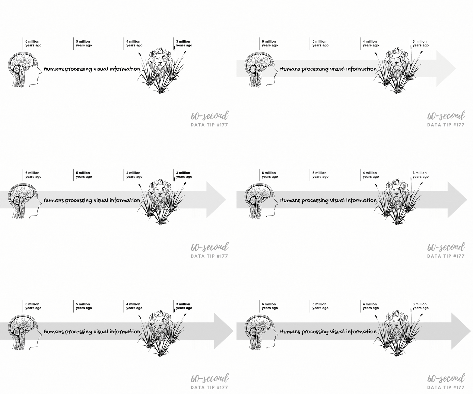
Data visualization provides a less filtered view of the data that you can actually understand. Charts encode information in color, shape, position, and size. Whereas our brains slog through words and numbers, they process these visual cues almost instantaneously. So well-designed charts allow you to explore the data rather than just confirm what you or anyone else suspected. You arrive at ideas you can trust because they came from a more direct, personal encounter with the data itself.
Of course, no chart provides an entirely unfiltered view of data*. Data visualizers make decisions about what data to show and how to show it which influence how others see it. But thoughtfully-designed charts offer something closer to what Buddhism has always pointed toward: a way to see what is more clearly.
* Here, I’m talking about understanding and seeing data clearly. Of course, whether the data, in turn, offers a clear understanding of what’s happening in the world is a whole other (incredibly important) story. Here’s an overview of how to assess data quality.
Let’s talk about YOUR data!
Got the feeling that you and your colleagues would use your data more effectively if you could see it better? Data Viz for Nonprofits (DVN) can help you get the ball rolling with an interactive data dashboard and beautiful charts, maps, and graphs for your next presentation, report, proposal, or webpage. Through a short-term consultation, we can help you to clarify the questions you want to answer and goals you want to track. DVN then visualizes your data to address those questions and track those goals.