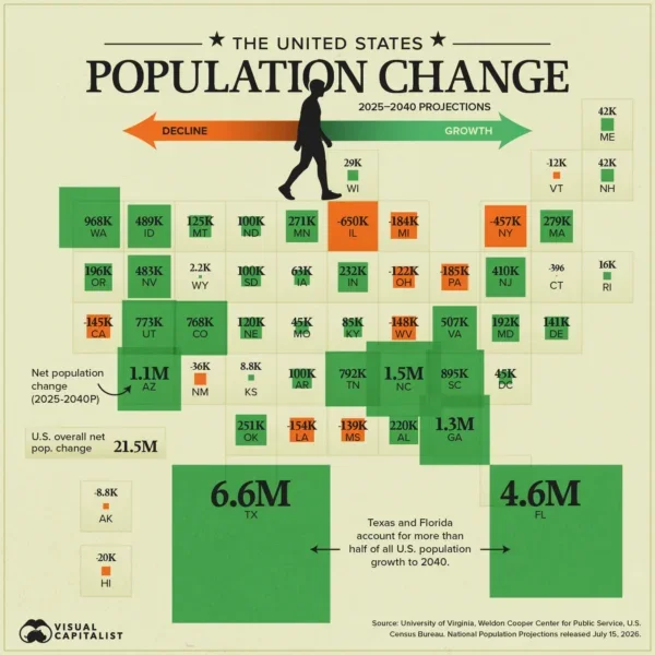
A recent Visual Capitalist map projects U.S. population change by state through 2040. It's a good occasion to revisit a classic data question: should you display raw numbers or percentages? Here’s the map:
Source: Visual Capitalist
The map shows projected net population change in raw numbers. New Jersey is projected to gain about 410,000 people. Idaho is projected to gain about 489,000 people. In raw numbers, those states look quite similar. Idaho edges ahead by fewer than 80,000 people. But look at the percentages: New Jersey is growing at 4.3%, Idaho at 24.1%. Idaho is growing nearly six times faster relative to its size. Raw numbers buried that story completely.
New Jersey’s population is much larger than Idaho’s. If your goal is to compare groups of different sizes fairly, percentages are usually the right choice.
One important exception: when your numbers are small, stick with raw numbers. Percentages become misleading and even absurd at low counts. If three people out of ten completed your program last year and five did this year, saying you achieved "67% growth" creates a false impression of scale. As a rough rule, be cautious with percentages when your base is below 30 or so.
The general rule: use raw numbers when the actual count is what matters (how many people will need services, how many units to build), or when your numbers are too small for percentages to be meaningful. Use percentages when you want to make fair comparisons across groups of different sizes.
For nonprofits, this distinction comes up constantly. Your program served 200 more youth this year than last. Great but is that 2% growth or 40%? The raw number tells funders how many people you reached. The percentage tells them whether you're scaling.
When in doubt, show both.
To see past data tips, click HERE.
Let’s talk about YOUR data!
Got the feeling that you and your colleagues would use your data more effectively if you could see it better? Data Viz for Nonprofits (DVN) can help you get the ball rolling with an interactive data dashboard and beautiful charts, maps, and graphs for your next presentation, report, proposal, or webpage. Through a short-term consultation, we can help you to clarify the questions you want to answer and goals you want to track. DVN then visualizes your data to address those questions and track those goals.