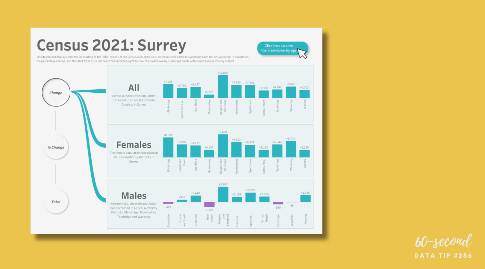
Data Viz Resources You Should Know: Data.gov

Here’s a new addition to my highly-curated resources list: Data.gov. I occasionally write a 60-second data tip describing a particular resource, including why I think it’s cool. And I link each of these tips to a resources list on my website.

What is it?

Data.gov is the United States government’s open data site. Open data is data that can be freely used, re-used, and redistributed by anyone - subject only, at most, to the requirement to attribute and sharealike. Data.gov is designed to “unleash the power of government open data to inform decisions by the public and policymakers, drive innovation and economic activity, achieve agency missions, and strengthen the foundation of an open and transparent government.”

Who’s it for?

It’s for the general public.

Who’s behind it?

The U.S. government. More specifically, The U.S. General Services Administration, working with the Office of Management and Budget and other agency partners, launched Data.gov in 2009. Government agencies compile metadata such as title, description, keywords, and links for accessing their datasets, and the Data.gov catalog automatically “harvests” that metadata to populate a continually updated catalog.

Why I think it’s cool

Unlike many other open data catalogs, you can find and download data quickly and visualize it. You can begin by searching for keywords in the search box. And there are helpful filters to narrow the results by, for example, topic categories, location, and agency. This is a great place to find data to show the need for your organization’s services and the problems you and your colleagues are working to address.


Let’s talk about YOUR data!

Got the feeling that you and your colleagues would use your data more effectively if you could see it better? Data Viz for Nonprofits (DVN) can help you get the ball rolling with an interactive data dashboard and beautiful charts, maps, and graphs for your next presentation, report, proposal, or webpage. Through a short-term consultation, we can help you to clarify the questions you want to answer and goals you want to track. DVN then visualizes your data to address those questions and track those goals.

Why You Should Know About Cycle Plots

If you are looking to explore patterns in participation or giving, a cycle plot can get you there.

This is a new addition to a series of tips on different chart types. In each tip, l give you need-to-know information in a format akin to the “Drug Facts” on the back of medication boxes: active ingredients (what the chart is), uses (when to use it), and warnings (what to look out for when creating the chart). The idea is to fill up your toolbox with a variety of tools for making sense of data. To learn about other chart types, check out this index of data tips.

Active Ingredients (What is a cycle plot?)

A cycle plot shows how a trend or cycle changes over time. We can use them to see seasonal patterns. Typically, a cycle plot shows a measure on the Y-axis and then shows a time period (such as months or seasons) along the X-axis. For each time period, there is a trend line across a number of years. In the example below, we see that, on average (black lines show averages across years), there were the most travelers from Greece in August between 2001 and 2011, but we can also see that the number of travelers varied greatly from year to year. Use the filter to see trends for travelers from other countries.

Source: Travellers by Month Cycle Plot by Tai Shi Ling on Tableau Public

Uses

Cycle plots can help identify periods of time when the best or worst results are recorded. For example, you want to see trends in participation in your summer programs or patterns in year-end giving over the years. Cycle plots can be created in a number of data viz applications including Excel and Tableau.

Warnings

The range of years shown in each trendline can be shown on the X-axis or in the subtitle to the the chart, but the range should be clear and consistent across trendlines.

Fun Fact

William S. Cleveland and Irma J. Terpenning introduced the cycle plot in Graphical Methods for Seasonal Adjustment (1982) In their example below, we see that number of telephone installations are highest in late summer/early fall.

To see past data tips, including those about other chart types, scroll down or click HERE.

Title Image Source: Seasonality with Cycle Plots by Vladimir Trkulja on Tableau Public


Let’s talk about YOUR data!

Got the feeling that you and your colleagues would use your data more effectively if you could see it better? Data Viz for Nonprofits (DVN) can help you get the ball rolling with an interactive data dashboard and beautiful charts, maps, and graphs for your next presentation, report, proposal, or webpage. Through a short-term consultation, we can help you to clarify the questions you want to answer and goals you want to track. DVN then visualizes your data to address those questions and track those goals.


10 Essential Data Facts For Non-Data People: The Cheat Sheet

Reposted from January 2022

Here are ten data facts for non-data people who, nevertheless, have to deal with data sometimes (i.e. most of us). This is the cheat sheet. Click on the “Learn More” buttons for additional information served up in comic strip format!


Let’s talk about YOUR data!

Got the feeling that you and your colleagues would use your data more effectively if you could see it better? Data Viz for Nonprofits (DVN) can help you get the ball rolling with an interactive data dashboard and beautiful charts, maps, and graphs for your next presentation, report, proposal, or webpage. Through a short-term consultation, we can help you to clarify the questions you want to answer and goals you want to track. DVN then visualizes your data to address those questions and track those goals.


The Power of Substraction

“Perfection is achieved, not when there is nothing more to add, but when there is nothing left to take away.”

―Antoine de Saint-Exupéry, Airman's Odyssey

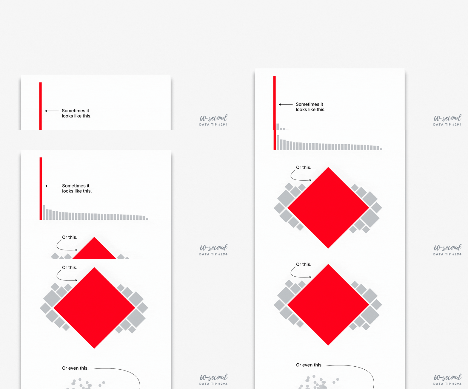
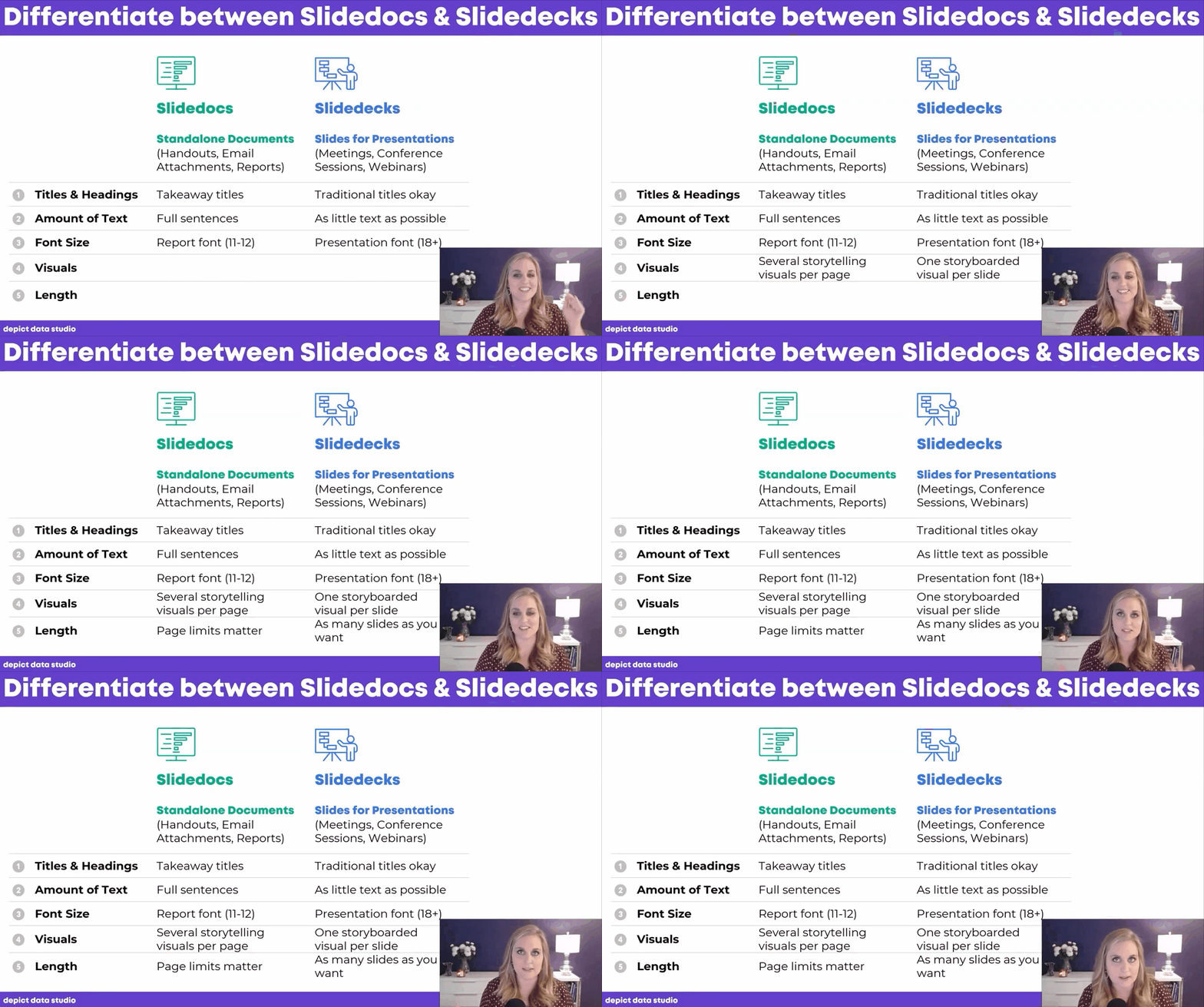
If you have heard of any data viz guru, it’s probably Edward Tufte. And if you know one thing about Tufte, it’s probably the data-to-ink ratio. The data-to-ink ratio is the amount of ink (or pixels) that convey the data divided by the total ink (or pixels) used in the entire chart. The ratio, according to Tufte, should be as close to one as possible. In other words, most of the ink/pixels should be conveying data, and you should remove as much non-data ink/pixels as possible. Click through Joey Cherdarchuk’s slides below for a great example of what Tufte is talking about.

Source: Darkhorse Analytics

To see past data tips, click HERE.


Let’s talk about YOUR data!

Got the feeling that you and your colleagues would use your data more effectively if you could see it better? Data Viz for Nonprofits (DVN) can help you get the ball rolling with an interactive data dashboard and beautiful charts, maps, and graphs for your next presentation, report, proposal, or webpage. Through a short-term consultation, we can help you to clarify the questions you want to answer and goals you want to track. DVN then visualizes your data to address those questions and track those goals.


Presenting Data Fast and Slow

Reposted from May 2022

Sometimes we approach the challenge of sharing data with others as if we were trying to con a pet into taking a pill. We think that our audience is too busy, disinterested, or distracted to focus on the data. So we wrap it in something that attracts their attention and feed it to them as quickly as possible. The problem with this approach is that it may get the data into their brains—momentarily—but it won’t stay there long. See where the pill ends up in this video.

If we want others to LEARN from the data — which involves not only retaining it but also drawing knowledge from it and applying that knowledge in the future — then we need a different approach. Daniel Kahneman’s Thinking Fast and Slow can help us.

First a little background on how the brain works, according to the evidence Kahneman presents. For learning to happen, information first must get past System 1 of our brains. This is where fast thinking happens. System 1 is the harried gate keeper, madly processing all of the information that comes in through our senses, pitching most of it, keeping only what is deemed necessary. But making it through the gate is only half the battle. Once in, information confronts System 2. This is the part of the brain that allows for conscious thought or slow thinking. The problem is that System 2 is lazy. Conscious thought is hard, and System 2 is always looking for an excuse to avoid it. However, if System 2 engages with information, the resulting knowledge can find its way to long-term memory and learning happens.

So the challenge when presenting data is to make it past System 1 AND engage System 2. Let’s consider a series of vizes from Harvard Business Review (HBR) that I think meets both parts of this challenge. Yes, it’s an example from the for-profit world, but could easily work with nonprofit data. See snapshot of the first viz in the series below .

How to get data past System 1

Getting data past the System 1 fast-thinking gate keeper is all about grabbing attention. We process images much more quickly than words and numbers, so images are a great foot-in-the-door. The HBR viz does it with bright colors and a cool-looking, somewhat unusual chart. There’s plenty of information out there about how to attract attention, including the use of images with:

  • Stand out colors and textures

  • Human faces (we are wired to focus on them)

  • Novelty (images that are unusual in size, placement, etc.)

Data visualizations can use color as well as images to draw attention. But getting past System 1 is not nearly enough. For learning to happen, the viz also has to engage System 2.

How to engage System 2

System 2 is smart but lazy. So we need to pique its interest. The HBR viz starts with a title that poses a question. When confronted with an interesting question, we may be more likely to stick around for an answer. Then the viz leads you through the answer in a visually engaging way (see interactive version of the viz HERE). These are two great ways to slow down and engage the brain with data. Here’s a list of ways to engage System 2:

  • Ask a question in the title as the HBR viz does—questions beg answers.

  • Make it personal. We may be more likely to engage with data when we have a personal connection with it. This New York Times viz, for example, allows you to enter in your county to see what the barriers to COVID vaccination are in your area.

  • Highlight a surprising finding. Many of us love the counterintuitive and the creative. If you draw attention to something new that the data suggests, you may have a better chance at hooking System 2. For example, this viz from The Economist shows that China emits far less greenhouse gas per person than Western countries at the same stage of economic development. Or check out this viz by Dimiter Toshkov showing that small countries can be big players in development and good governance.

  • Hand draw it. There is some evidence that making information harder to consume, for example by presenting it with harder-to-read fonts, makes the brain slow down and engage in effortful and analytic processing. Although the jury is still out on this, I do find myself more likely to engage in hand-drawn vizes like two of the winners of the World Data Visualization Prize in 2019. Perhaps it’s simply the novelty of hand-drawn charts that engages me. Anyway, it’s something you might consider, and all you need is a pen and paper.

  • Walk them through it. A great way to slow down your viewers is to set the pace by walking them through the data as HBR does in the example. I love how HBR presents what the data might look like if our assumptions were confirmed followed by what it actually looks like.

Sources: Veritasium, Visual Content Space, MIT News, Springer Link,


Let’s talk about YOUR data!

Got the feeling that you and your colleagues would use your data more effectively if you could see it better? Data Viz for Nonprofits (DVN) can help you get the ball rolling with an interactive data dashboard and beautiful charts, maps, and graphs for your next presentation, report, proposal, or webpage. Through a short-term consultation, we can help you to clarify the questions you want to answer and goals you want to track. DVN then visualizes your data to address those questions and track those goals.


Don't Measure Impact . . . Wait, What?

Reposted from September 2022

Ghost of Christmas Yet To Come in The Chrismas Carol by Charles Dickens, Illustration by J. Leech, Source: Flickr

Most organizations should not waste time and money on impact evaluations. Measuring impact is difficult and expensive. It’s difficult because you need a good counterfactual. A counterfactual is what Dickens’s Ghost of Christmas Yet to Come shows Ebenezer Scrooge: what would happen if you did not change anything. The impact of an intervention or program is the difference between what happened and what would have happened without the intervention. Since, in the real world, you can’t observe the same group of beneficiaries with and without the intervention (as we do when we watch The Christmas Carol), you need a good proxy for the would-have-been condition. The best proxy is a group of potential beneficiaries that were randomly selected from a larger group of potential beneficiaries. These folks do not get the intervention. Then you can compare those who did and did not receive the intervention over time to estimate the impact of the intervention. This is called a randomized control trial or RCT.

Of course, withholding an intervention from potential beneficiaries can be a difficult and morally-questionable pursuit. And tracking a large group of beneficiaries and non-beneficiaries over time is expensive. This usually requires a team of skilled data collectors and analysts. Non-randomly-selected comparison groups are not nearly as good because they may differ from the intervention group in known or unknown ways. So it’s difficult to determine if the outcomes observed are due to the intervention itself or to pre-existing biases or characteristics. This costly and challenging process is further complicated by the need to start with a well-established intervention, one that has already worked out the kinks.

Due to the many challenges of measuring impact, most organizations should not waste time and money on impact evaluations. Instead, they should consider interventions that already have a strong research base, ideally because they have been rigorously tested with RCTs. (Check out: Where to Search for Evidence of Effective Programs.)

In a Stanford Social Innovation Review article, Mary Kay Gugerty and Dean Karlan suggest that, before beginning a new program, organizations ask: “What do other evaluations say about it? How applicable is the context under which those studies were done, and how similar is the intervention? Study the literature to see if there is anything that suggests your approach might be effective.”

Rather than assessing impact, your limited resources are better spent assessing implementation. You can do this by collecting data that shows whether what you planned is actually happening. If you can pinpoint where the problems are, you are in a better position to make fixes, alter plans, refine processes.  Many organizations make their plans using a logic model (aka theory of change). A logic model is a flow chart with inputs and outputs. The best logic models draw on past impact evaluations to determine what inputs are most likely to lead to what outputs. And organizations can easily assess progress to date by plugging their logic models into real time data. Interested? Read more about “living logic models” HERE.

To see past data tips, click HERE.


Let’s talk about YOUR data!

Got the feeling that you and your colleagues would use your data more effectively if you could see it better? Data Viz for Nonprofits (DVN) can help you get the ball rolling with an interactive data dashboard and beautiful charts, maps, and graphs for your next presentation, report, proposal, or webpage. Through a short-term consultation, we can help you to clarify the questions you want to answer and goals you want to track. DVN then visualizes your data to address those questions and track those goals.


It's Love Data Week!

What’s that?

Love Data Week is an international celebration of data, taking place every year during the week of Valentine's Day. Nonprofit organizations, universities, government agencies, corporations and individuals are encouraged to host and participate in data-related events and activities.

What’s in it for me?

Lots of free online events, many of which are relevant to nonprofit work such as workshops on data visualization, infographics, data resources, data privacy, etc. See a full list of events HERE.

Where can I learn more?

HERE.

To see past data tips, click HERE.


Let’s talk about YOUR data!

Got the feeling that you and your colleagues would use your data more effectively if you could see it better? Data Viz for Nonprofits (DVN) can help you get the ball rolling with an interactive data dashboard and beautiful charts, maps, and graphs for your next presentation, report, proposal, or webpage. Through a short-term consultation, we can help you to clarify the questions you want to answer and goals you want to track. DVN then visualizes your data to address those questions and track those goals.


How and Why to Visualize Variability

Every dataset includes variability. The people and things we measure differ from one another in many ways. And visualizing data always involves some decisions about how much of that variability to show. There are tradeoffs:

  1. If you show too much variability, you obscure patterns and trends. To understand anything with data, we usually need to reduce its complexity. We can’t extract meaning from a table full of numbers and letters. So we summarize the data through such activities as grouping people, concepts, and time periods; calculating averages; or organizing individuals or groups in a rank order. This process allows us to detect patterns and trends within the data. Patterns and trends become even more apparent when we visualize the data in the form charts, maps, and graphs by assigning visual cues such as color, size, and shape to groups and values. However, too many colors, sizes, and shapes make discerning the patterns and trends more difficult.

  2. If you show too little variability, you obscure reality*. Overly simplified visualizations do not show just how complex and messy the data actually is. And the viewer may mistake the simplified, summarized version of the data as reality.

You can find a great example of problem #2 in Eli Holder’s article Divisive Dataviz: How Political Data Journalism Divides Our Democracy. He describes the danger of red and blue political maps in the U.S. in this way: “there’s no such thing as a “red state” or a “blue state.” Consider Texas, which is often called a “red” state. In the 2020 presidential election, more Texans voted for Joe Biden (5.26 million) than every other “blue” state, except for California. Even New York, a Democratic stronghold, had roughly 20,000 fewer Biden voters than Texas. . . . While popular election maps accurately reflect the ‘winner-take-all’ dynamic of the electoral college, they create the misimpression that state electorates are monolithic blocks of only-Republicans or only-Democrats.”

And the misimpressions such maps engender have real-world consequences. Holder describes an experiment in which people were shown either dichotomous maps or continuous maps (see examples below). Those shown dichotomous maps were more likely than those shown continuous maps to feel that their state was dominated by one party and thus that their votes mattered less because the election outcome was a foregone conclusion.

So when deciding how many shades of gray or circle sizes to show, consider how much summarization is needed to make patterns and trends perceptible without misleading the viewer with an oversimplified view of the data. Take, for example, these three versions of a map. They each show the same CDC chronic illness survey data with a “diverging color palette” in which blue states ranked high on health indexes; orange states ranked low; and gray states were in the middle. The maps differ in the degree of variability shown. Which map allows you to see corridors of good and bad health without oversimplifying the matter?

*More specifically, the full reality of the data. This 60-second data tip doesn’t get into the nature of reality in general!

To see past data tips, click HERE.


Let’s talk about YOUR data!

Got the feeling that you and your colleagues would use your data more effectively if you could see it better? Data Viz for Nonprofits (DVN) can help you get the ball rolling with an interactive data dashboard and beautiful charts, maps, and graphs for your next presentation, report, proposal, or webpage. Through a short-term consultation, we can help you to clarify the questions you want to answer and goals you want to track. DVN then visualizes your data to address those questions and track those goals.


How To Balance Your Information Diet

Here’s a question for you. And don’t go Googling. Just make your best guess.

Have the number of people experiencing homelessness in the U.S. increased or decreased since 2007?

Whatever your answer, you likely drew on your own personal experience as well as images and information from the media when guessing at the answer. Perhaps you drew on some statistics too. But, unless you have expertise in this area, probably not. Stick with me for a minute, and I’ll not only provide an answer to the question but also some insight into how we consume information.

Personal experience, media, and statistics affect how we understand any issue, and there are limits to each of these inputs. So we would do well to understand those limits before acting on our understanding by voting, donating, or making decisions about programs that our organizations operate. Max Roser’s article in Our World in Data (The limits of our personal experience and the value of statistics) walks us through some of those limitations:

Personal Experience

“The world is large, and we can experience only very little of it personally,” Roser notes. “For every person you know, there are ten million people you do not know.” Even the most social and well-traveled among us can have only a limited understanding of the world through personal experience. I, for example, do not know anyone personally who has been unhoused, and most of my interactions with people in this situation occur on the street when someone asks me for money. This experience provides no information about the breadth of the problem or the range of experiences with this issue over time.

Media

“This fact is so obvious that it is easy to miss how important it is: everything you hear about anyone who is more than a few dozen meters away, you know through some form of media,” Roser points out. “The news reports on the unusual things that happen on a particular day, but the things that happen every day never get mentioned. This gives us a biased and incomplete picture of the world; we are inundated with detailed news on terrorism but hardly ever hear of everyday tragedies like the fact that 16,000 children die every single day.” If I recently heard a story about a city clearing homeless encampments, I may assess the problem as larger, and if I haven’t heard about anything on the issue in awhile, I may assess it as smaller.

Statistics

“The collection and production of good statistics is a major challenge,” writes Roser. “Data might be unrepresentative in some ways, it might be mismeasured, and some data might be missing entirely.” But, unlike personal experience and the media, it provides a way of assessing the full range of an issue. So it’s important to add statistics, along with personal experience and the media, to our information diet.

To add some statistics to your understanding of homelessness, the number of people experiencing homelessness in the U.S. decreased from about 650,000 in 2007 to about 580,000 (about 18 of every 10,000 people) in 2022 according to The 2022 Annual Homelessness Assessment Report to Congress.

We should not discount personal experience, the media, or statistics because of their limitations. But we should appreciate their limitations when forming opinions and taking actions based on them. As Roser notes: “Each way of learning about the world has its value. It’s about how we bring them together: the in-depth understanding that only personal interaction can give us, the focus on the powerful and unusual that the news offers, and the statistical view that gives us the opportunity to see everyone.” As described in many tips in this blog, well-designed charts make data/statistics more accessible to everyone and thus allow everyone to see everyone.


Let’s talk about YOUR data!

Got the feeling that you and your colleagues would use your data more effectively if you could see it better? Data Viz for Nonprofits (DVN) can help you get the ball rolling with an interactive data dashboard and beautiful charts, maps, and graphs for your next presentation, report, proposal, or webpage. Through a short-term consultation, we can help you to clarify the questions you want to answer and goals you want to track. DVN then visualizes your data to address those questions and track those goals.


Why You Should Know About Beeswarm Charts

If you are looking to compare individuals, programs, locations, events, etc. on one or more measures, a beeswarm chart could be just the ticket.

This is a new addition to a series of tips on different chart types. In each tip, l give you need-to-know information in a format akin to the “Drug Facts” on the back of medication boxes: active ingredients (what the chart is), uses (when to use it), and warnings (what to look out for when creating the chart). The idea is to fill up your toolbox with a variety of tools for making sense of data. To learn about other chart types, check out this index of data tips.

Active Ingredients (What is a beeswarm chart?)

A beeswarm chart (or swarmplot) is a type of data visualization that displays individual data points so that they don't completely overlap, resulting in a "swarming" effect. The beeswarm chart is related to strip plots and jittered strip plots, both of which are scatter plots with a measure on the vertical axis and a category on the horizontal axis. Strip plots become less useful when tightly packed data points start to overlap too much, obscuring patterns in the data. The jitter plot partly solves the problem but not as well as the beeswarm chart.

Uses

Beeswarm charts are useful to highlight individual categories or entities while still showing a distribution as a whole. In the example above, you can see that family events and smaller events were the most highly rated, while health events and larger events generally got lower ratings and that the distribution of average ratings was similar for introduction, beginner, intermediate, and advanced level events.

This type of chart is not native to most data viz applications but happily there is a free online tool called AdvViz that allows you to upload a CSV file to create a basic beeswarm chart and then download it as a Tableau file. From there, you can open it in Tableau Desktop and make adjustments to the formatting. That’s how I created the beeswarm chart above. You can also create this type of chart in Flourish and RAWGraphs.

Warnings

In the example above, I used color to distinguish different event types and circle size to show the number of participants in each event. When using color coding, make sure the colors contrast enough so that viewers can easily discern one category from another. Also, reducing the opacity of the color allows viewers to see overlapping circles. When using size to show a measure, make sure that the range of the measure is wide enough that the viewer can easily discern small from large. Small differences in size can be hard to detect.

Fun Fact

A beeswarm chart is a great way to show stressors on bee colonies! See chart below.


To see past data tips, including those about other chart types, scroll down or click HERE.

Sources: The Data Visualisation Catalogue


Let’s talk about YOUR data!

Got the feeling that you and your colleagues would use your data more effectively if you could see it better? Data Viz for Nonprofits (DVN) can help you get the ball rolling with an interactive data dashboard and beautiful charts, maps, and graphs for your next presentation, report, proposal, or webpage. Through a short-term consultation, we can help you to clarify the questions you want to answer and goals you want to track. DVN then visualizes your data to address those questions and track those goals.


Best Data Viz of 2023

Looking for a fun (if somewhat geeky) study/work break? Check out these best-of lists for 2023:

New York Times

Visual Capitalist

538/ABC News

FlowingData

To see past data tips, click HERE.


Let’s talk about YOUR data!

Got the feeling that you and your colleagues would use your data more effectively if you could see it better? Data Viz for Nonprofits (DVN) can help you get the ball rolling with an interactive data dashboard and beautiful charts, maps, and graphs for your next presentation, report, proposal, or webpage. Through a short-term consultation, we can help you to clarify the questions you want to answer and goals you want to track. DVN then visualizes your data to address those questions and track those goals.


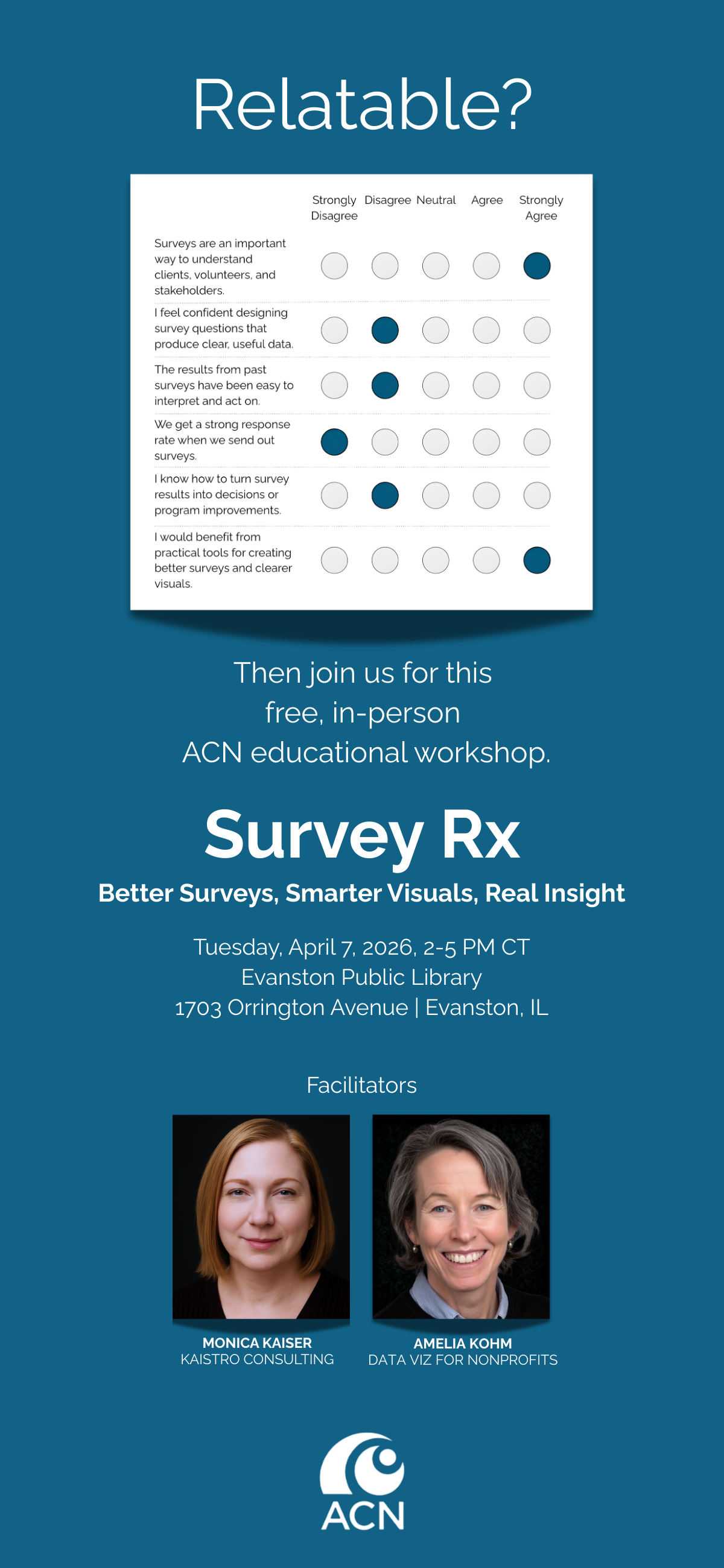
Upcoming Data Viz Workshops


Let’s talk about YOUR data!

Got the feeling that you and your colleagues would use your data more effectively if you could see it better? Data Viz for Nonprofits (DVN) can help you get the ball rolling with an interactive data dashboard and beautiful charts, maps, and graphs for your next presentation, report, proposal, or webpage. Through a short-term consultation, we can help you to clarify the questions you want to answer and goals you want to track. DVN then visualizes your data to address those questions and track those goals.


Free Interactive Viz For You: Giving in the U.S.

As we move into gifting season, I thought I’d toss out a gift to you. It’s a quick interactive viz that you can employ however you see fit. Use it in a website, presentation, or social media post to rightsize folks’ understanding about the state of charitable giving in the U.S. and, perhaps, help to turn the tide. For the link address or embed code, click on the share icon below.


Let’s talk about YOUR data!

Got the feeling that you and your colleagues would use your data more effectively if you could see it better? Data Viz for Nonprofits (DVN) can help you get the ball rolling with an interactive data dashboard and beautiful charts, maps, and graphs for your next presentation, report, proposal, or webpage. Through a short-term consultation, we can help you to clarify the questions you want to answer and goals you want to track. DVN then visualizes your data to address those questions and track those goals.

Nonprofits Need This Dashboard

Does your nonprofit have participants (or volunteers or clients or human beings of another sort) in various programs? If so, you could benefit from a dashboard like this one (see below). Give it a spin. Select a program at the top to highlight participants in that program in the charts. This dashboard allows for easy comparisons across programs, across statuses (e.g. enrolled, waitlisted, and withdrawn), and across time. Scroll over charts to learn more.

My inspiration for this dashboard came from Eve Thomas at The Data School. Check out Eve’s article, which includes instructions for creating this type of dashboard with Tableau (assuming basic Tableau knowledge.)


Let’s talk about YOUR data!

Got the feeling that you and your colleagues would use your data more effectively if you could see it better? Data Viz for Nonprofits (DVN) can help you get the ball rolling with an interactive data dashboard and beautiful charts, maps, and graphs for your next presentation, report, proposal, or webpage. Through a short-term consultation, we can help you to clarify the questions you want to answer and goals you want to track. DVN then visualizes your data to address those questions and track those goals.
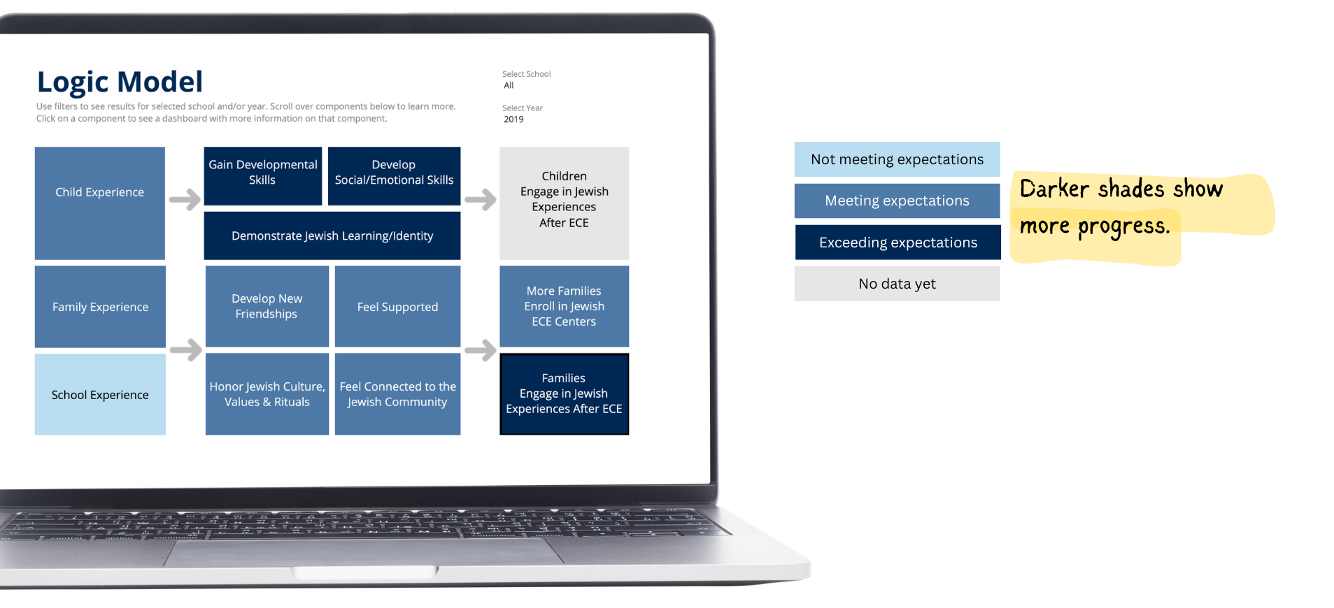

Ideas You Should Steal From This Viz (Installment 10)

Here’s another steal-worthy viz to inspire you. There’s so much I like about this data dashboard created by Alessia Musìo on Tableau Public. In the Information is Beautiful Awards submission for this dashboard, Musìo notes: “Simplicity, coherence, and clarity are the words that have guided me in the development of the project.”

Here’s what I especially like and suggest you apply to your own dashboards:

  • User friendly: There’s no need for a user guide for this dashboard. The simple left-hand panel tells you all you need to know: how to navigate to other pages, how to filter the data, and how to interpret the color coding.

  • Limited views of data: There are only two ways of looking at the data contained in the dashboard: in a map which allows you to make comparisons across regions and countries or in a chart showing change over time. And there are limited ways to filter the data. This simplicity makes the dashboard more approachable and instantly usable.

  • Methodology and sources page: For those interested, the methods and sources are presented in an organized way with links.

Take the dashboard out for a spin. Be sure to hover over the circular elements on the single country charts to see comparisons with countries of the same continent.


Let’s talk about YOUR data!

Got the feeling that you and your colleagues would use your data more effectively if you could see it better? Data Viz for Nonprofits (DVN) can help you get the ball rolling with an interactive data dashboard and beautiful charts, maps, and graphs for your next presentation, report, proposal, or webpage. Through a short-term consultation, we can help you to clarify the questions you want to answer and goals you want to track. DVN then visualizes your data to address those questions and track those goals.
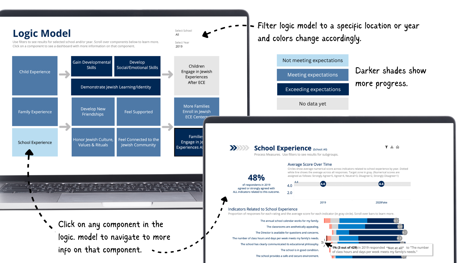

Data Viz Resources You Should Know: Our World In Data

Our World in Data is a new addition to my highly-curated resources list. I occasionally write a 60-second data tip describing a particular resource, including why I think it’s cool. And I link each of these tips to a resources list on my website.

What is it?

Our World in Data is a collection of charts and articles on “the world’s largest problems”. They believe making knowledge, which “is often stored in inaccessible databases, locked away behind paywalls and buried under jargon in academic papers” more accessible to foster progress.

Who’s it for?

Anyone trying to better understand the world and how it’s changing including individuals, journalists, researchers, and policymakers. Our World in Data’s charts and data can be freely downloaded and embedded in others’ work.

Who’s behind it?

Our World in Data is a collaborative effort between researchers at the University of Oxford, who are the scientific editors of the website content, and the non-profit organization Global Change Data Lab (GCDL) which publishes and maintains the website. Max Roser is the founder and director of Our World in Data. He began the project in 2011 and for several years was the sole author until receiving funding for the formation of a team.

Why I think it’s cool

Their charts and articles help to correct our misperceptions that all global living conditions are getting worse. In their words, “historical data and research shows that it is possible to change the world. Historical research shows that until a few generations ago around half of all newborns died as children. Since then the health of children has rapidly improved around the world and life expectancy has doubled in all regions. . . . Progress is possible, but it is not a given. If we want to know how to reduce suffering and tackle the world’s problems we should learn from what was successful in the past.”


Let’s talk about YOUR data!

Got the feeling that you and your colleagues would use your data more effectively if you could see it better? Data Viz for Nonprofits (DVN) can help you get the ball rolling with an interactive data dashboard and beautiful charts, maps, and graphs for your next presentation, report, proposal, or webpage. Through a short-term consultation, we can help you to clarify the questions you want to answer and goals you want to track. DVN then visualizes your data to address those questions and track those goals.
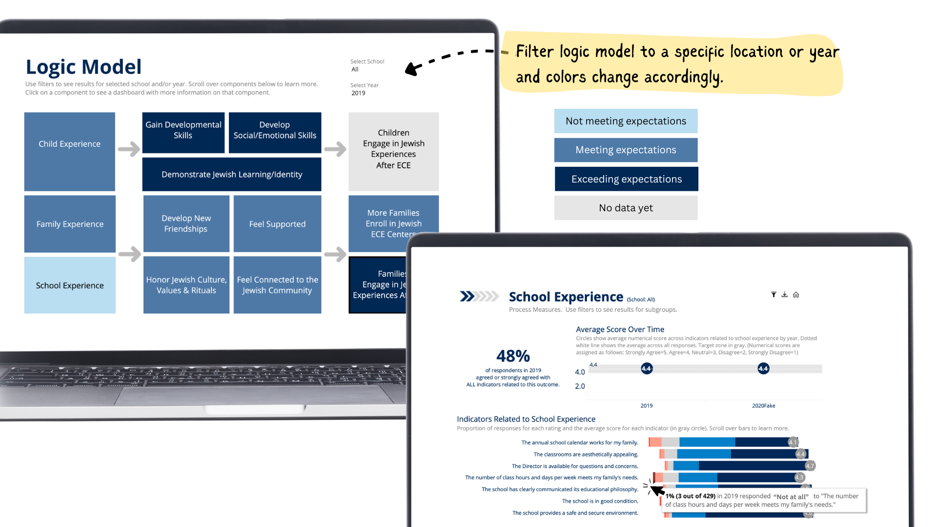

Without Data Viz, You Can Get It All Wrong

The aim of today’s tip is to remind you of the importance of visualizing data. Without charts, maps, and graphs, we can get it all wrong. We base our understanding on a few stories in the media, on the experience of someone we know, or on what we hear most often about the topic rather than on what is actually happening. More on this in a moment. First, please take this short pop quiz and then scroll down.


“Stories about individual people are much more engaging – our minds like these stories – but they cannot be representative for how the world has changed,” writes Max Roser. “To achieve a representation of how the world has changed at large you have to tell many, many stories all at once. . . .“

Roser made the series of charts below to tell all of those stories in a way that we can understand. It shows the number of people out of 100 with various experiences over the course of 200 years. It’s worth checking out Roser’s whole article entitled “The short history of global living conditions and why it matters that we know it.

I’ll leave you with one more quote from Roser: “The result of a media – and education system – that fails to present quantitative information on long-run developments is that the huge majority of people is very ignorant about global development and has little hope that progress against serious problems is even possible. Even the decline of global extreme poverty – by any standard one of the most important developments in our lifetime – is only known by a small fraction of the population of the UK (10%) or the US (5%). “


Let’s talk about YOUR data!

Got the feeling that you and your colleagues would use your data more effectively if you could see it better? Data Viz for Nonprofits (DVN) can help you get the ball rolling with an interactive data dashboard and beautiful charts, maps, and graphs for your next presentation, report, proposal, or webpage. Through a short-term consultation, we can help you to clarify the questions you want to answer and goals you want to track. DVN then visualizes your data to address those questions and track those goals.
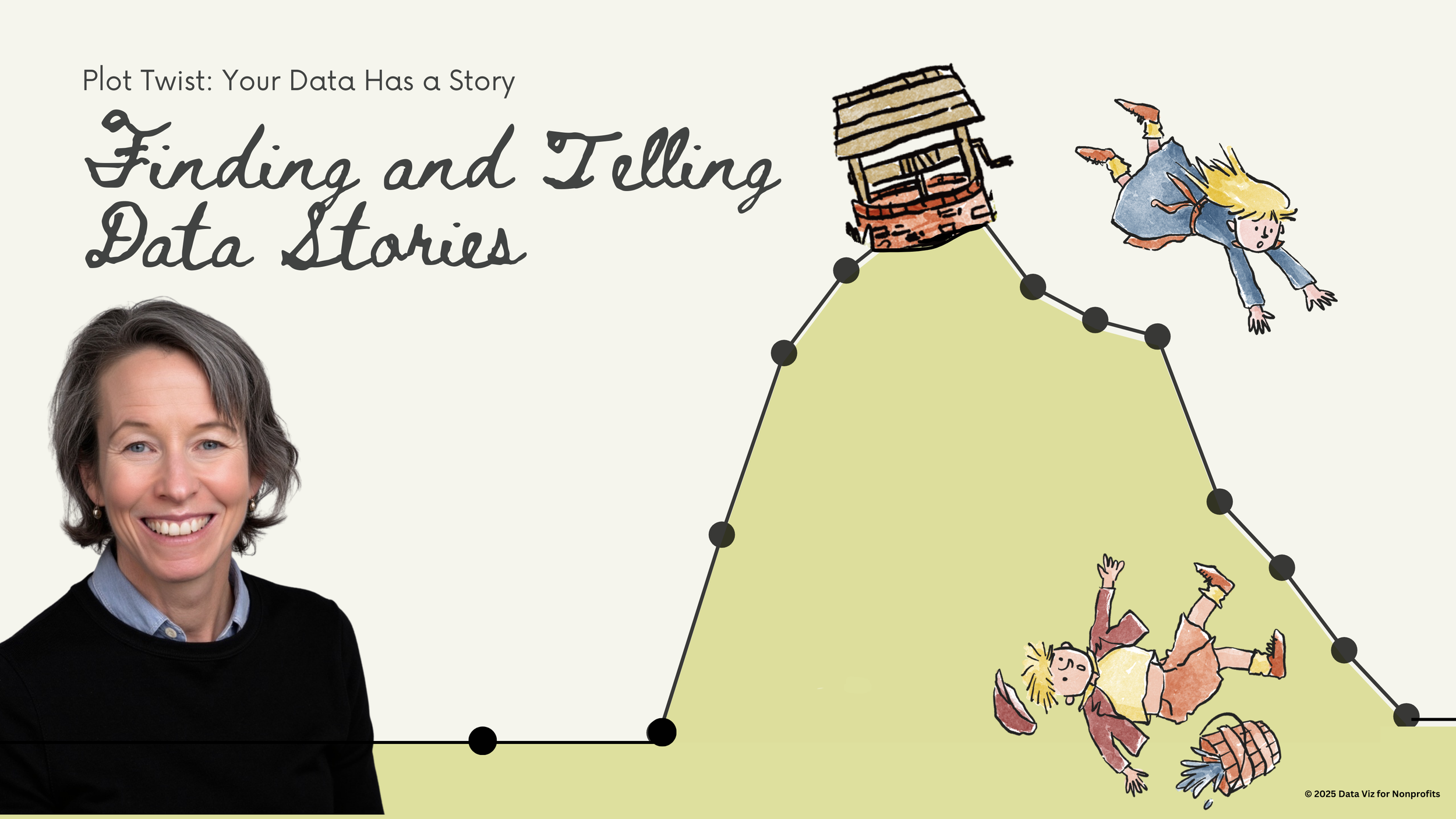

Ideas You Should Steal From This Viz (Installment 9)

Source: Source: Yusuke Nakanishi on Tableau Public

Here’s another steal-worthy viz to inspire you. This one is from Yusuke Nakanishi on Tableau Public. Filling the numbers to show the percent is cool, particularly because the chart is about drinking and the numbers appear to be filled like a glass. Nakanishi created the chart in Tableau by making a simple bar chart and then placing a virtual stencil (i.e. numbers with a transparent fill) over the chart. The best place to make this type of stencil is probably Adobe Illustrator. But if you don’t have an Adobe subscription, you can do it for free in Canva. I created this image in Canva as indicated below.

  1. Open Canva and click on “Create a design” in upper right corner of the screen. Select a size (I chose presentation).

  2. Select “Background” on left side of screen and then choose a background.

  3. Select “Elements” on left side of screen and enter' “number frames” in the search window. Number frames look like numbers filled with an illustration of grass and sky. Click on the numbers you want and place and size them on the slide as you wish.

  4. Select “Elements” on left side of screen and enter search terms in the search window to find a photo with one color on the bottom and another color on the top. I entered “oil” and used a photo with oil on the bottom and white on the top.

  5. Drag that image over each number frame until it fills the frame.

  6. Double click on the filled number and resize and move the image until the bottom color fills the number frame to the right height. To determine the height, you can use Canva’s rulers and guides.


Let’s talk about YOUR data!

Got the feeling that you and your colleagues would use your data more effectively if you could see it better? Data Viz for Nonprofits (DVN) can help you get the ball rolling with an interactive data dashboard and beautiful charts, maps, and graphs for your next presentation, report, proposal, or webpage. Through a short-term consultation, we can help you to clarify the questions you want to answer and goals you want to track. DVN then visualizes your data to address those questions and track those goals.

Do nonprofits have the necessary data to make good use of AI?

This is a question that I’ve been wondering about. Maybe you have too? So I used AI (artificial intelligence) to find an answer! Here is what ChatGPT spit out in a few seconds with my commentary on the side.


Let’s talk about YOUR data!

Got the feeling that you and your colleagues would use your data more effectively if you could see it better? Data Viz for Nonprofits (DVN) can help you get the ball rolling with an interactive data dashboard and beautiful charts, maps, and graphs for your next presentation, report, proposal, or webpage. Through a short-term consultation, we can help you to clarify the questions you want to answer and goals you want to track. DVN then visualizes your data to address those questions and track those goals.

Is The Chihuahua Syndrome Infecting Your Data?

This “sketchplanation” gives a name to a familiar problem.* Chihuahua is challenging to spell. If humans are entering dog breeds into a database or spreadsheet, chances are there are going to be spelling errors unless they can select from a list of breeds or there is another sort of data validation. It’s hard to extract meaning from data that is inaccurate. “Capitals, spaces, misspellings, hyphens, numbers stored as text, numbers entered as letters (I, O), accents, straight/curly apostrophes, dates out of order, languages, dialects, abbreviations, and more are all routes for misleading your analysis.” So make a plan to clean your dirty data and to keep it clean over time. Also, when visualizing data in programs like Tableau, you can group common misspellings into one new field. In this way, the misspelled entry will be automatically corrected in visualizations that use the new field. Also, Tableau Prep Builder comes with most subscriptions to Tableau and allows for easier data preparation including combining, shaping, and cleaning data for analysis within Tableau.

To see past data tips, click HERE.

*Chihuahua Syndrome” was coined by Edward Tufte.


Let’s talk about YOUR data!

Got the feeling that you and your colleagues would use your data more effectively if you could see it better? Data Viz for Nonprofits (DVN) can help you get the ball rolling with an interactive data dashboard and beautiful charts, maps, and graphs for your next presentation, report, proposal, or webpage. Through a short-term consultation, we can help you to clarify the questions you want to answer and goals you want to track. DVN then visualizes your data to address those questions and track those goals.