Showing and telling isn’t enough. Remember to also ask and listen.
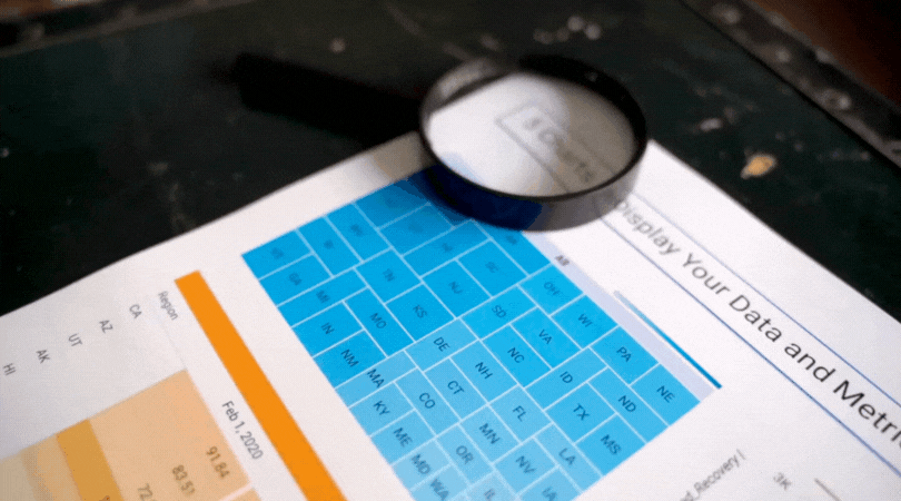
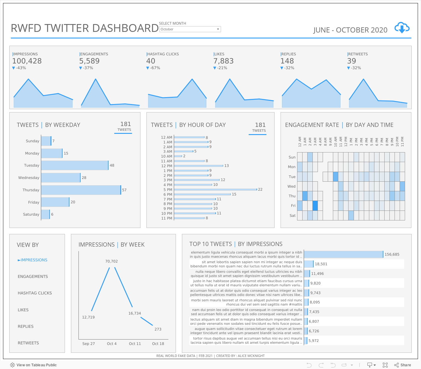
I talk a lot about showing and telling with data visualization including choosing the right chart, emphasizing what matters, and clearly explaining what the data says.
That’s essential, but it’s not sufficient. Just as important is listening and asking.
If your goal is communication (not just display), you need to know whether your visualization is actually landing. After sharing a chart or dashboard, try asking:
What stands out to you here?
What questions does this raise?
What feels confusing or unclear?
What would you want to know next?
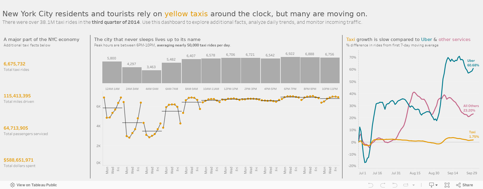
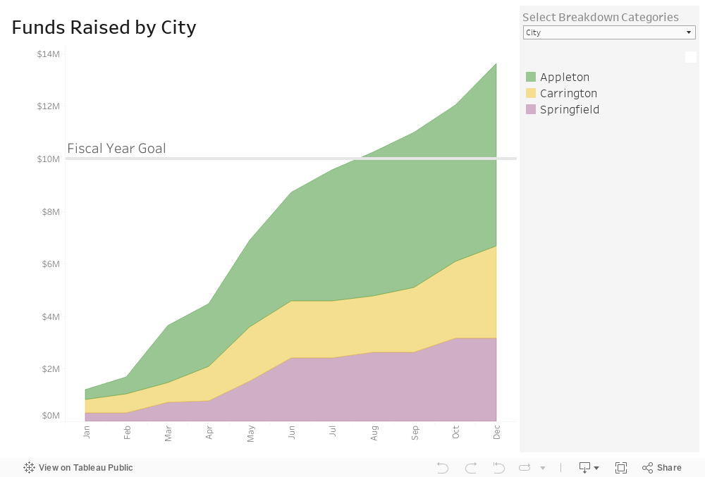
For example, imagine a nonprofit shares a dashboard showing program participation is up 20%. Leadership celebrates. But program staff ask why certain neighborhoods didn’t see growth. A funder wonders whether outcomes improved, not just counts. Same chart. Very different readings.
Those reactions are data, too. They tell you whether your visualization is:
communicating clearly,
answering the right questions,
sparking curiosity, and
supporting real decisions.
Use the answers to these questions to hone your charts.

Let’s talk about YOUR data!
Got the feeling that you and your colleagues would use your data more effectively if you could see it better? Data Viz for Nonprofits (DVN) can help you get the ball rolling with an interactive data dashboard and beautiful charts, maps, and graphs for your next presentation, report, proposal, or webpage. Through a short-term consultation, we can help you to clarify the questions you want to answer and goals you want to track. DVN then visualizes your data to address those questions and track those goals.