
Social media data is another staple in our data pantries. Your organization probably has it. But you might not make good use of it. Why? Well, social media analytics come in many flavors and can bewilder. Posts are like bait. The better the bait, the more nibbles and bites leading to website traffic and eventually to more donations, volunteers, participation, and other types of engagement. But we need a way to easily decipher which types of bait are working best. And drawing this information out of the data can be a challenge.
Need some inspiration? Check out Alice McKnight’s dashboard below. It provides a broad array of social media data in an appealing and accessible format. We can see how effective social media posts are at various times. The charts along the top give us the basic trends over the last several months. It also shows us what topics are drawing attention. Give it a try. Check out the “View By” options which filter the two charts at the bottom. Then consider how you might visualize your own social media data using similar charts.
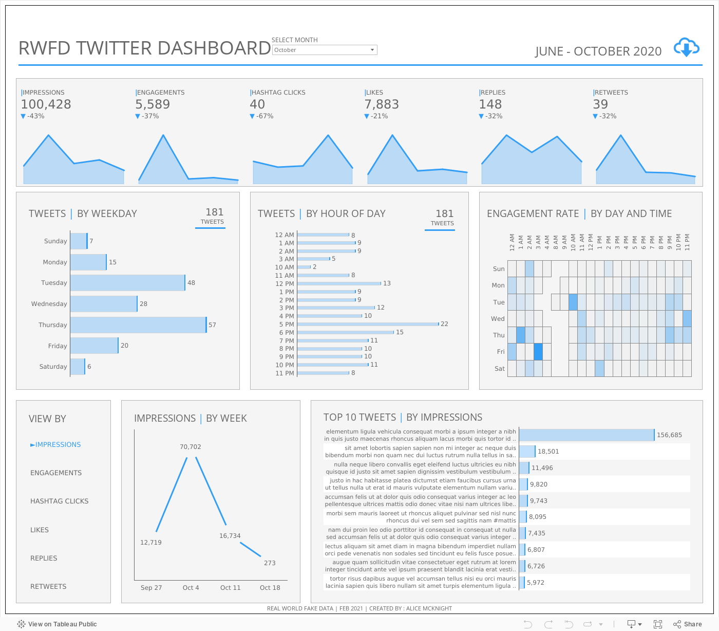
Source: Alice McKnight on Tableau Public
To see past data tips, including tips on other types of pantry staple data, click HERE.
Let’s talk about YOUR data!
Got the feeling that you and your colleagues would use your data more effectively if you could see it better? Data Viz for Nonprofits (DVN) can help you get the ball rolling with an interactive data dashboard and beautiful charts, maps, and graphs for your next presentation, report, proposal, or webpage. Through a short-term consultation, we can help you to clarify the questions you want to answer and goals you want to track. DVN then visualizes your data to address those questions and track those goals.


