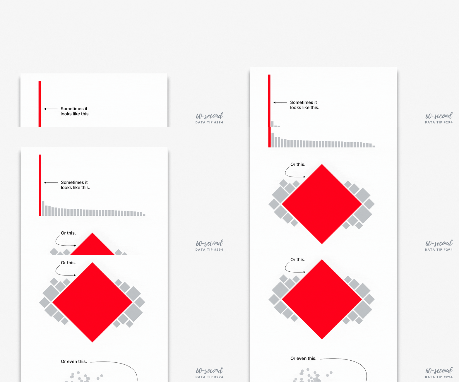
Sometimes showing whether something happened or not is more powerful than showing how much it changed over time. A recent Grist article highlights this idea through a striking example: instead of showing gradual temperature shifts over time (see the lefthand chart below), scientists simply showed whether a lake froze each winter—yes or no—across several decades (see righthand chart below). People who saw the righthand chart were more likely to perceive climate change as causing more abrupt changes.
Source: Grist
This binary approach—did/didn’t, yes/no, on/off—turns complex data into clear signals. And it’s not just for climate science. Nonprofits can use it to communicate impact in a way that’s instantly understood. Long-term trends are easier to see, and it evokes a stronger emotional response.
Try this in your nonprofit work:
Show which years a program met its goals and which it didn’t.
Visualize which communities have (or don’t have) access to a key service.
Use a yes/no timeline to highlight when a resource was available.
Binary visuals don’t oversimplify—they clarify. Read the full story here: Grist – Scientists just found a way to break through climate apathy.
To see past data tips, click HERE.
Let’s talk about YOUR data!
Got the feeling that you and your colleagues would use your data more effectively if you could see it better? Data Viz for Nonprofits (DVN) can help you get the ball rolling with an interactive data dashboard and beautiful charts, maps, and graphs for your next presentation, report, proposal, or webpage. Through a short-term consultation, we can help you to clarify the questions you want to answer and goals you want to track. DVN then visualizes your data to address those questions and track those goals.


