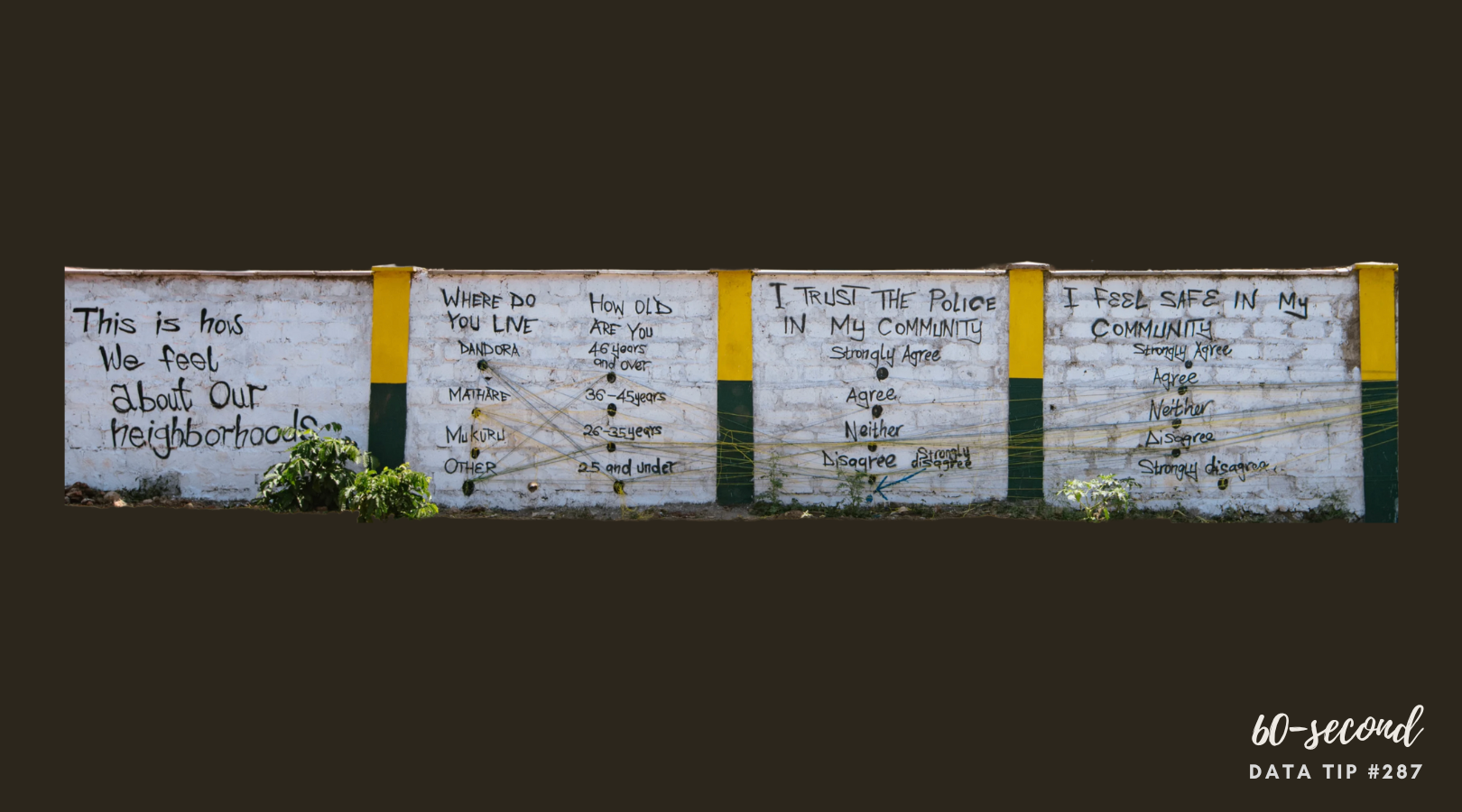
Here’s an idea for transforming statistics into interactive street art—making data both beautiful and deeply personal. It also fosters community ownership and dialogue. Take a look at this video about a project that made abstract data accessible to the community using paint and colored string. As Legal Coordinator Stephen Kinuthia Mwangi explained: “Instead of people publishing books that community members are not able to access or read, we put these books on walls, and people can now read them and share the knowledge.”
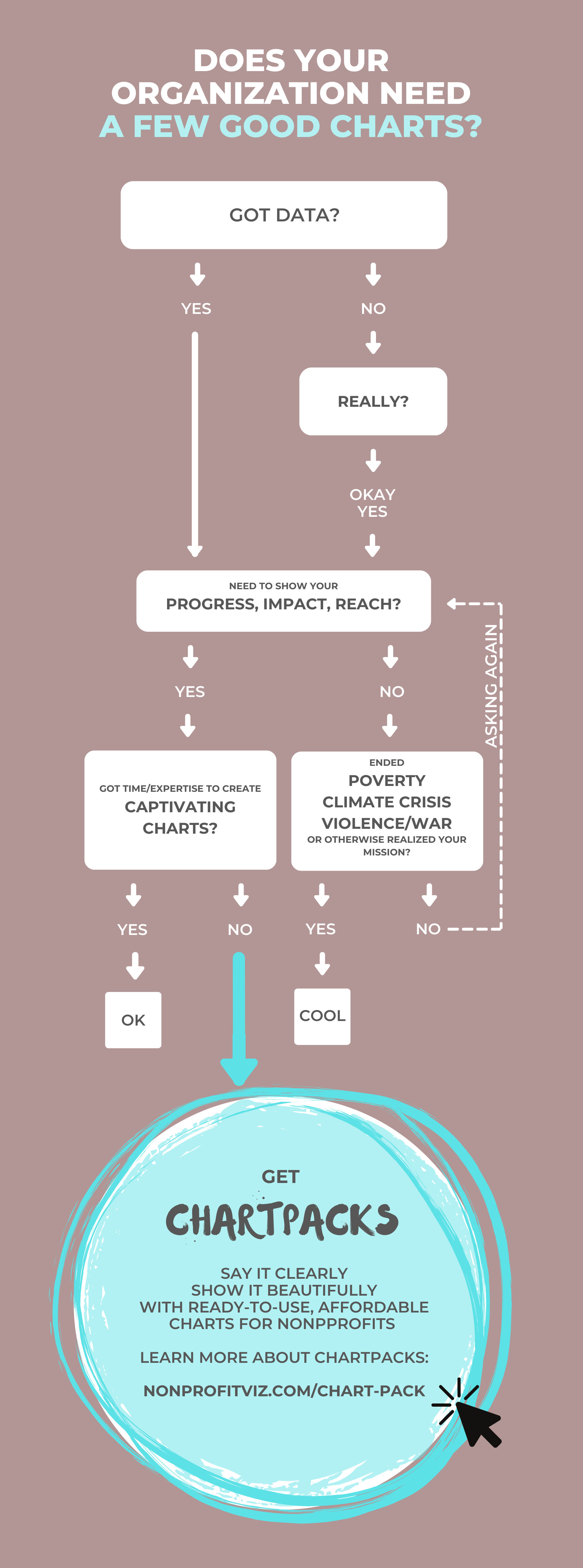
Let’s talk about YOUR data!
Got the feeling that you and your colleagues would use your data more effectively if you could see it better? Data Viz for Nonprofits (DVN) can help you get the ball rolling with an interactive data dashboard and beautiful charts, maps, and graphs for your next presentation, report, proposal, or webpage. Through a short-term consultation, we can help you to clarify the questions you want to answer and goals you want to track. DVN then visualizes your data to address those questions and track those goals.