Reposted from September 2024
“All creative work builds on what came before.” —Austin Kleon in Steal Like An Artist.
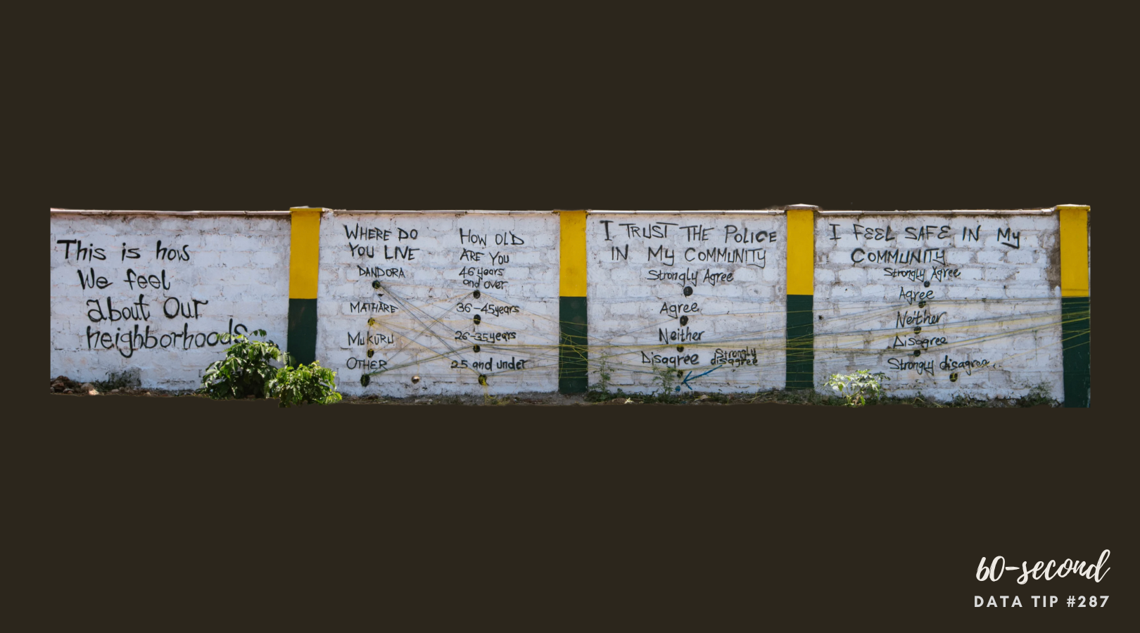
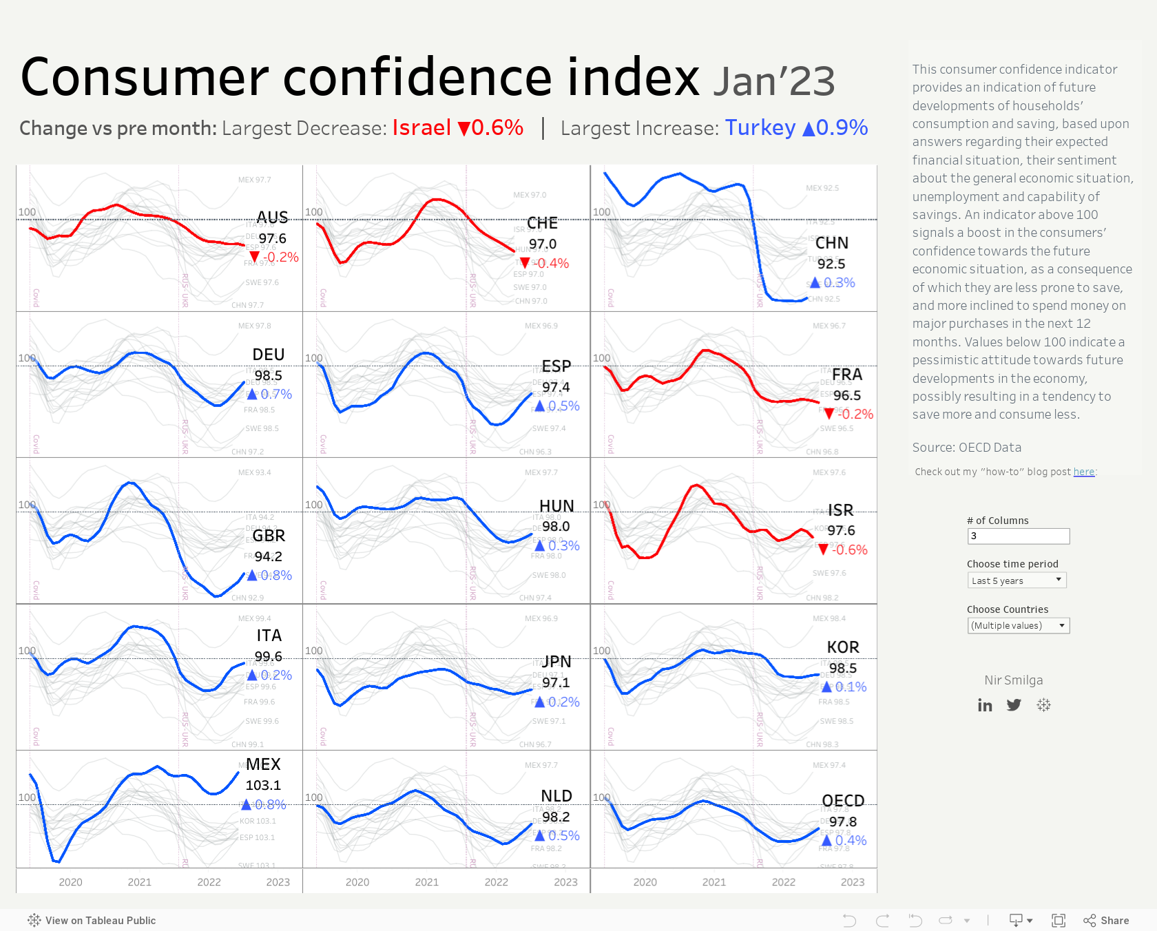
Today I offer up another steal-worthy interactive viz that I came across in the Tableau Public Gallery. Scroll down to see what you should steal from it.

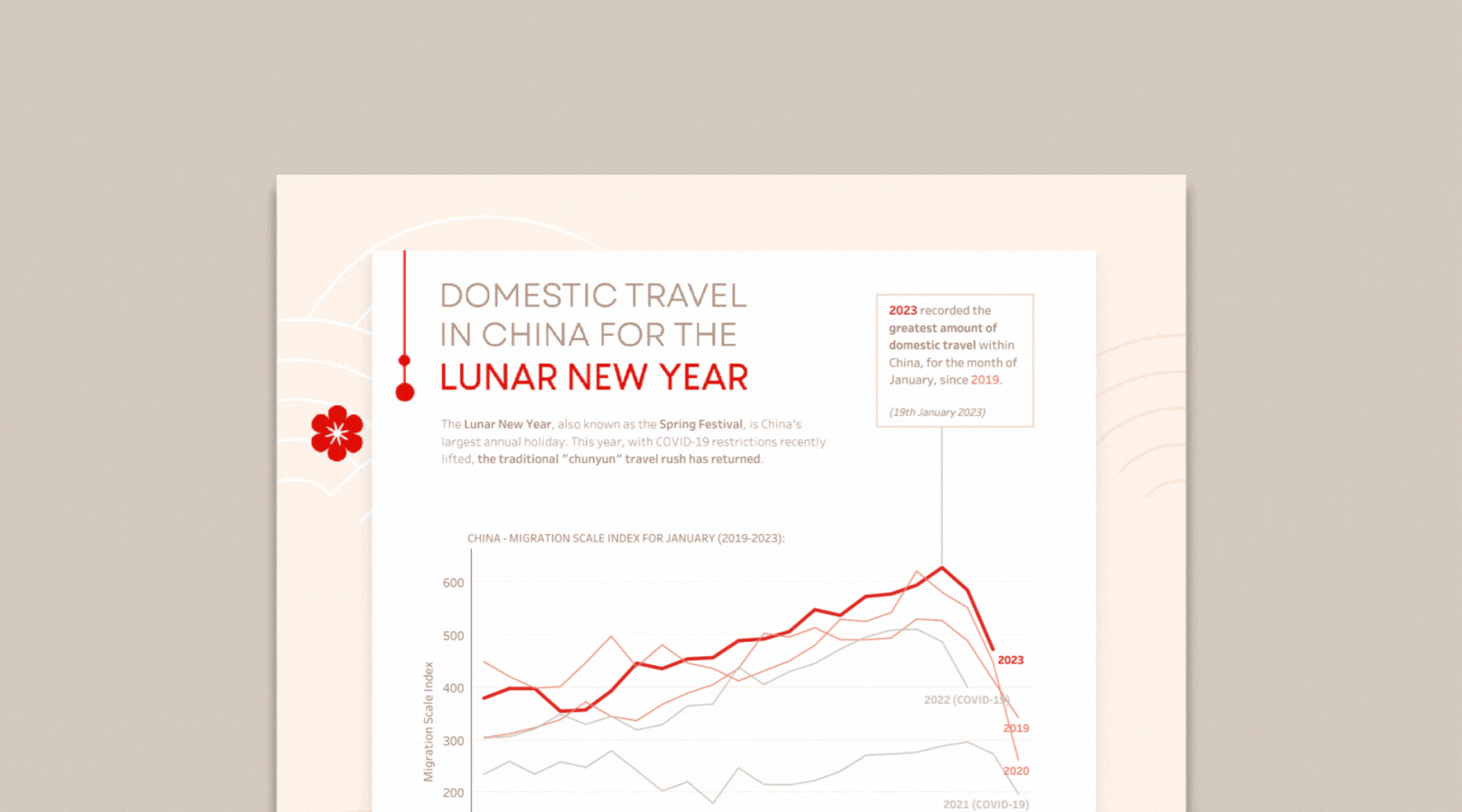
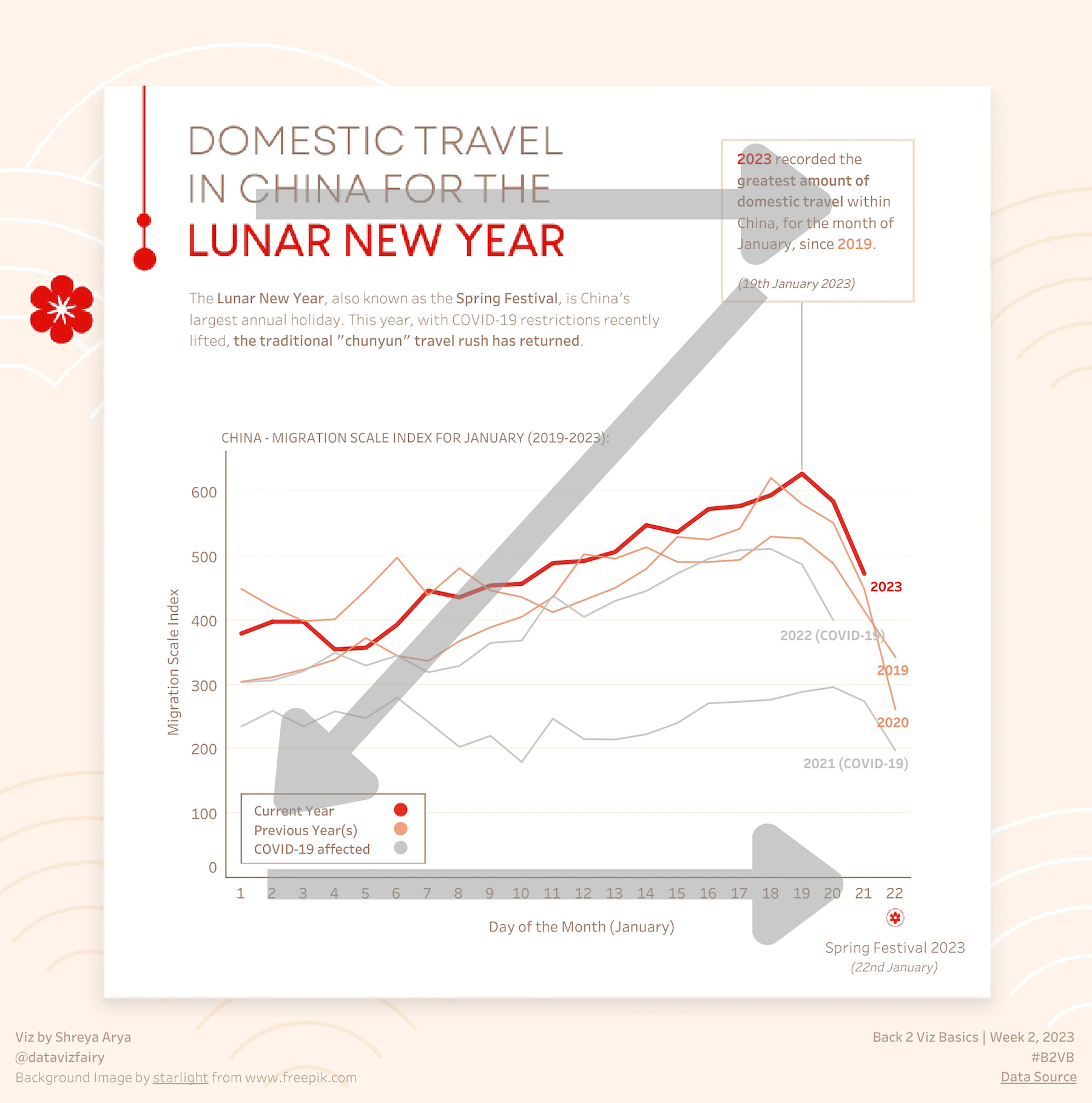
Source: Nir Smilga on Tableau Public
Here’s what I suggest you steal from this viz:
Small Multiples. To highlight each country and to allow for easy comparisons across countries, Smilga created one small chart per country and placed them alongside each other, aka a “small multiples chart.”
Gray comparison trends. While Smilga highlights the trend for the featured country in each chart using color, the trends for other countries are also in each chart but in a light gray. This allows us to easily compare the trend for the featured country to that of others in general.
Color distinguishes trend types. Recent downward trends are highlighted in red, and recent upward trends are highlighted in blue.
Choose your view. Smilga allows the viewer to customize the view by selecting the number of columns, time period, and countries shown.
To see past data tips, click HERE.
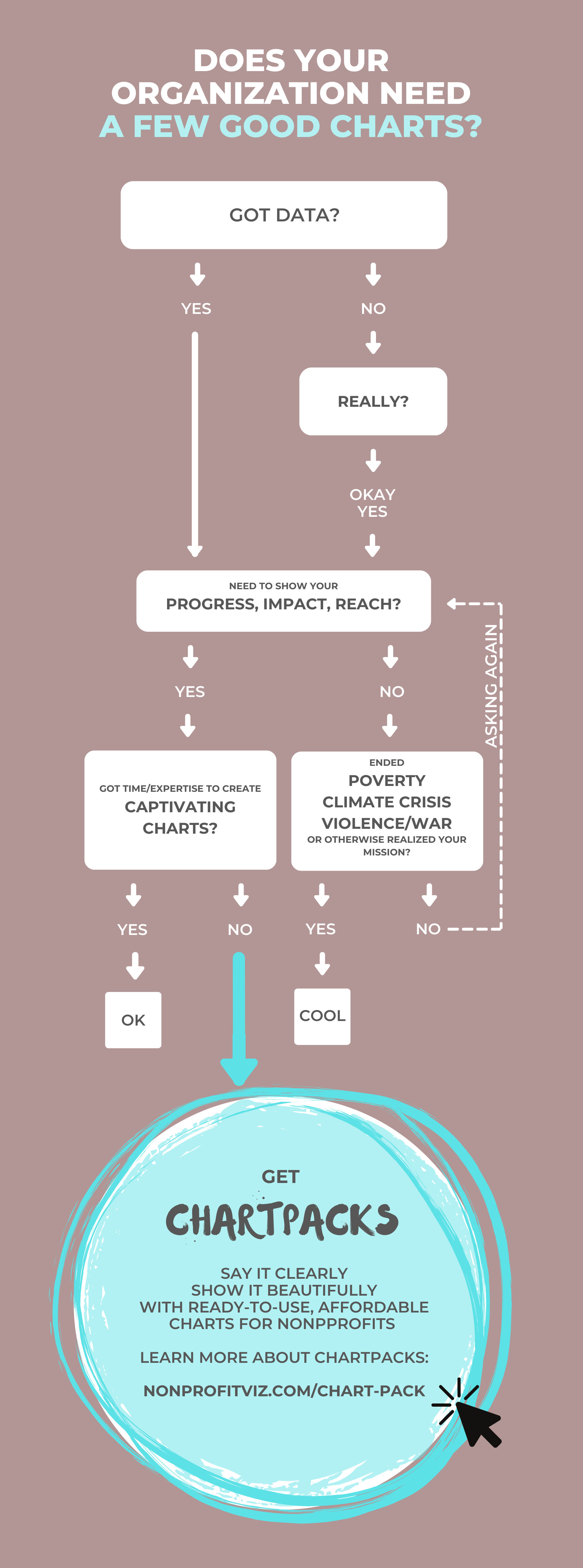
Let’s talk about YOUR data!
Got the feeling that you and your colleagues would use your data more effectively if you could see it better? Data Viz for Nonprofits (DVN) can help you get the ball rolling with an interactive data dashboard and beautiful charts, maps, and graphs for your next presentation, report, proposal, or webpage. Through a short-term consultation, we can help you to clarify the questions you want to answer and goals you want to track. DVN then visualizes your data to address those questions and track those goals.