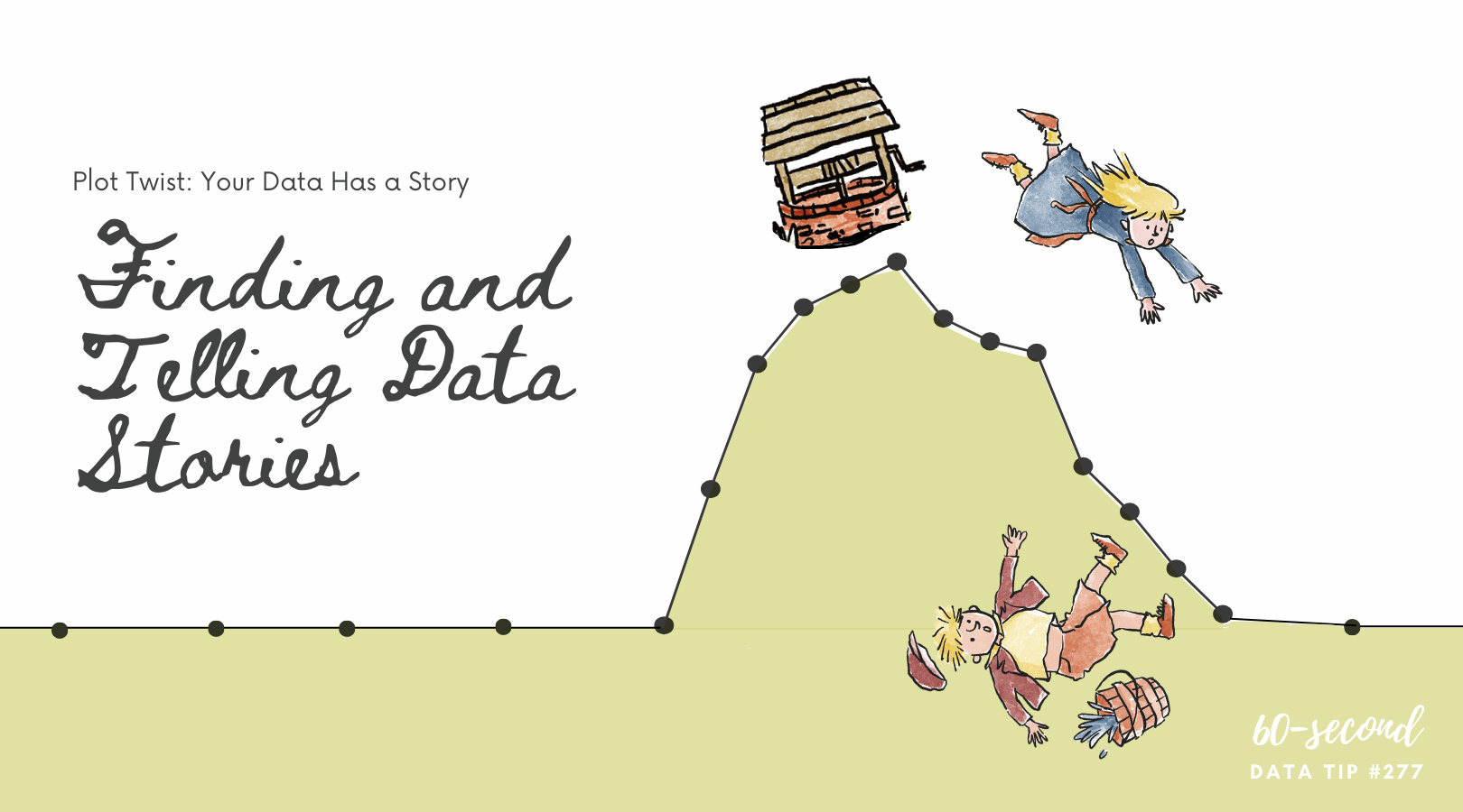
Here’s the first tip in a mini-series on three simple ways to use AI to make better charts. I begin each of these tips with a caution on how NOT to use AI when visualizing data.
Don’t Use AI to make charts. As data viz guru Stephanie Evergreen says: “AI just makes it easier to make bad graphs” — those that are hard to decipher, poorly designed, and even show incorrect data. And with the amount of prompting that is needed to get a passable chart, current AI tools don’t save you much or any time. Humans are still better at visualizing data, bringing important knowledge to the game. This includes knowledge of the data itself, the intended audiences, and the contexts that help us to understand the significance of the data. Of course, AI is a young and developing tool. But it seems to me that as it gets better, humans just become more important. AI requires us to think more deeply so that we ask better questions of AI and can assess its output.
Do Use AI to suggest chart types.
AI can help you avoid the “default bar chart” trap. Instead of showing a simple bar chart of membership over time, AI might suggest a slope chart that highlights the rate of growth more clearly. For example, an environmental nonprofit tracking carbon reduction could use a line or slope chart to spotlight year-over-year progress in emissions reductions.
In your prompt, be sure to describe the type of data you have and what you hope to show with the chart. But be careful: AI doesn’t always understand your audience. What looks like an interesting chart may confuse stakeholders who aren’t used to certain chart types. Always ask: “Will my board, funders, or community partners recognize and interpret this visual correctly?” Use AI suggestions as a starting point, not the final word.
Look for two more tips in this mini-series on using AI to make better charts in the coming weeks.

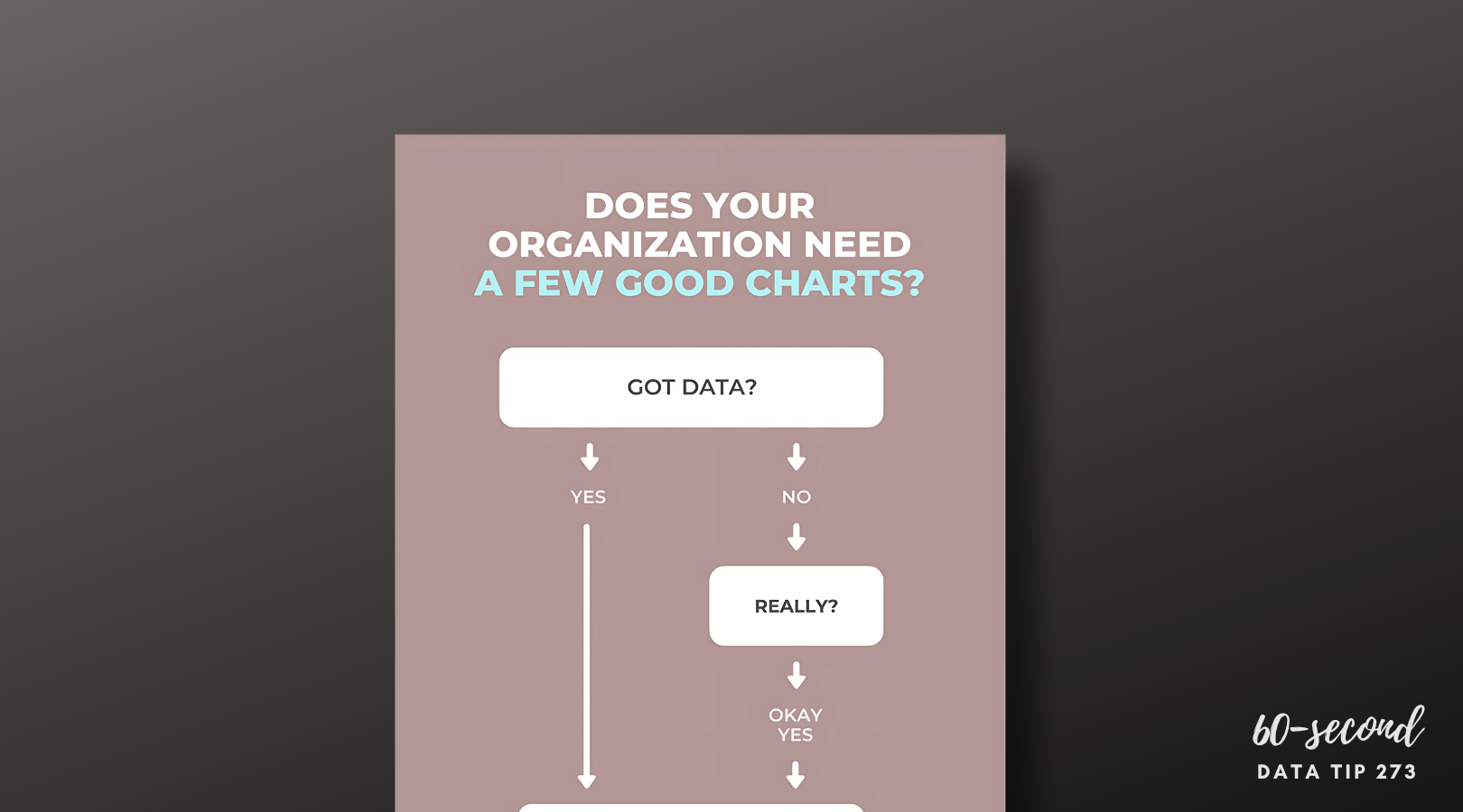
Let’s talk about YOUR data!
Got the feeling that you and your colleagues would use your data more effectively if you could see it better? Data Viz for Nonprofits (DVN) can help you get the ball rolling with an interactive data dashboard and beautiful charts, maps, and graphs for your next presentation, report, proposal, or webpage. Through a short-term consultation, we can help you to clarify the questions you want to answer and goals you want to track. DVN then visualizes your data to address those questions and track those goals.