Reposted from September 2025
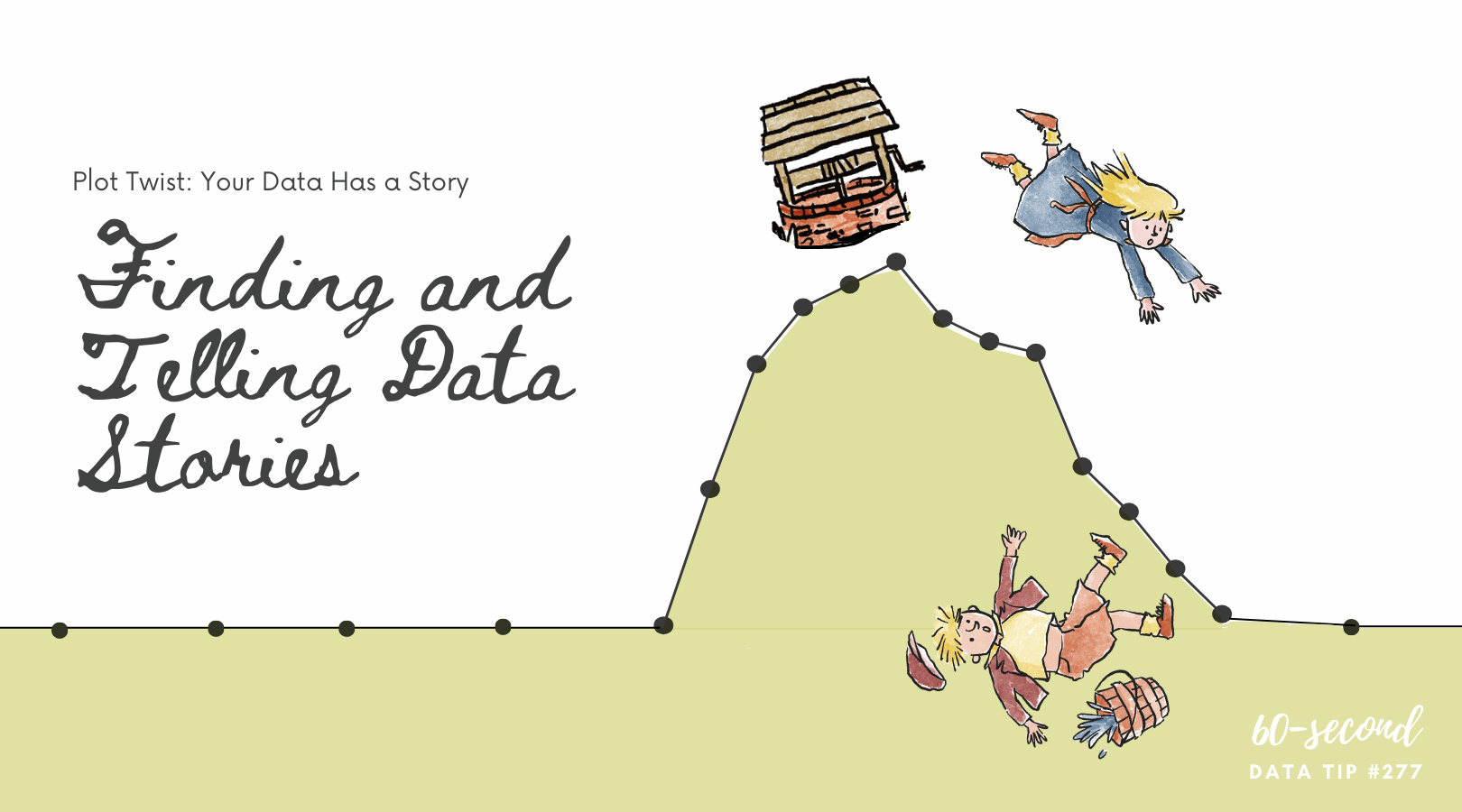
Numbers show scale. Stories show stakes.
If your chart says “12% of local teens have dropped out of school,” that’s powerful. But you add meaning with a face, a voice, or a name, something like: “That 12% includes Kofi, age 15, who left school to support his family.”
Here’s how to do it:
Pick one stat. Choose a single data point that’s easy to grasp.
Pair it with a single person. Feature a short quote, photo, or name (with permission) that represents the data. One real voice can speak volumes.
Let them speak. Keep the story in their own words if possible.
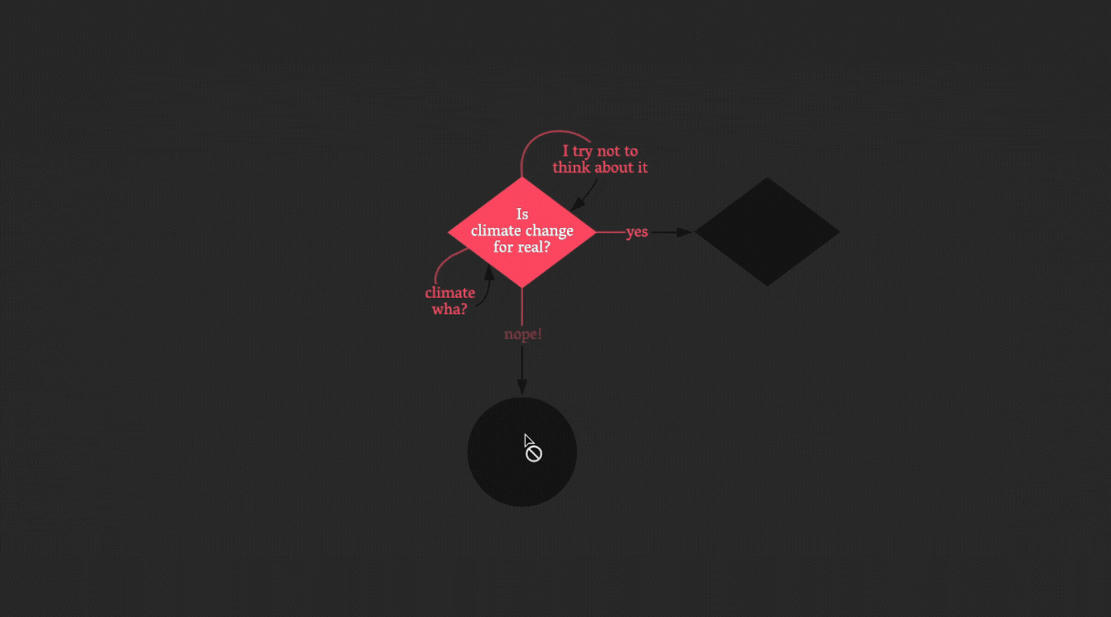
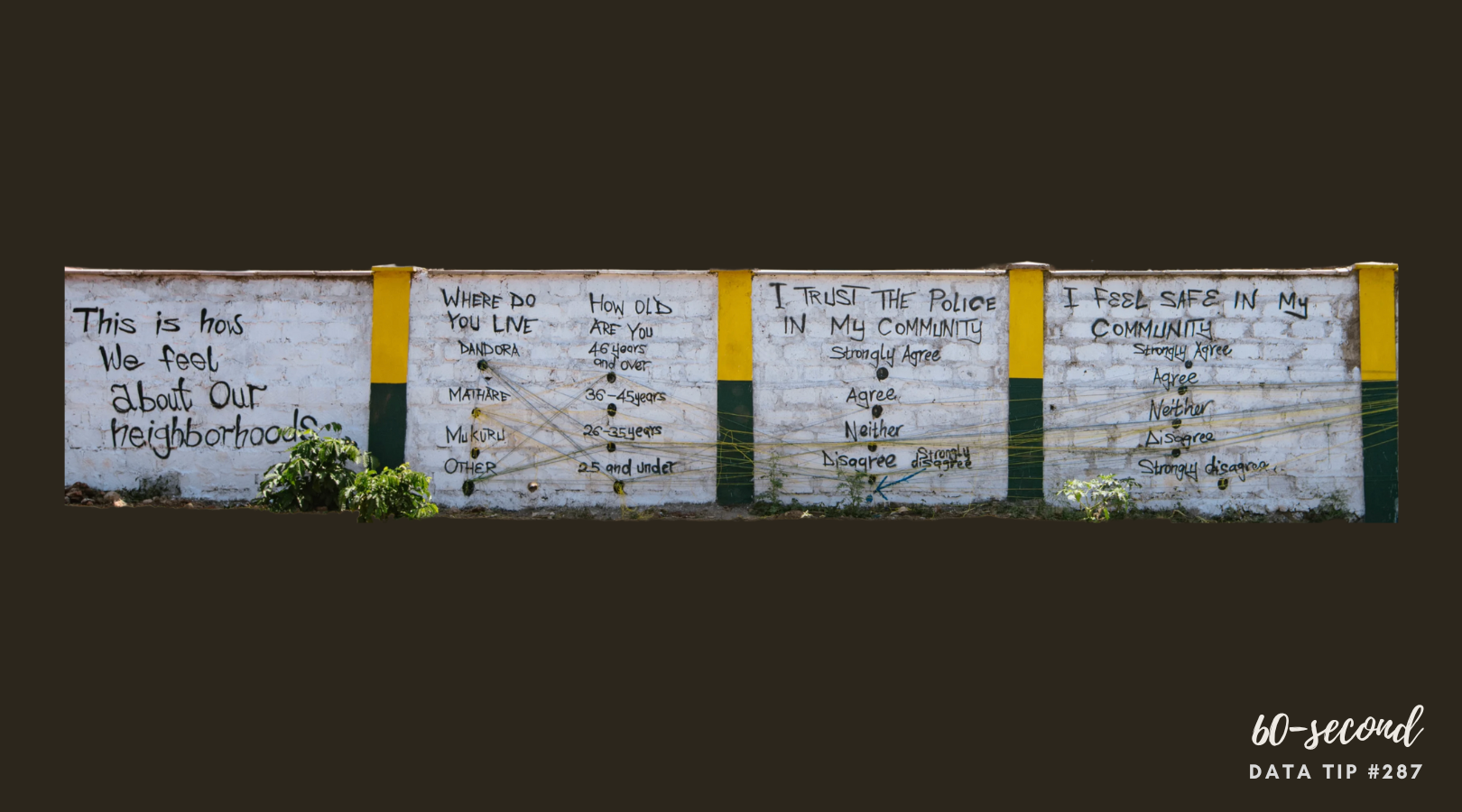
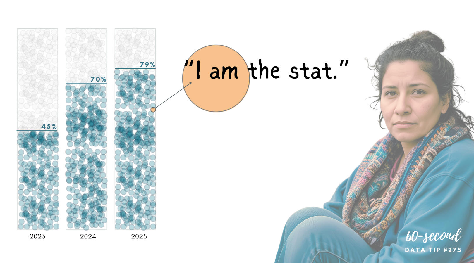
This simple formula may create what behavioral scientists call identifiable victim effect. This is the tendency of individuals to offer greater aid when a specific, identifiable person is observed under hardship, as compared to a large, vaguely defined group with the same need. What makes an individual “identifiable”? Personal data such as names, ages, and photos, according to research, are deemed identifiable. And the effect appears stronger when only one person is identified. Check out this example:


Let’s talk about YOUR data!
Got the feeling that you and your colleagues would use your data more effectively if you could see it better? Data Viz for Nonprofits (DVN) can help you get the ball rolling with an interactive data dashboard and beautiful charts, maps, and graphs for your next presentation, report, proposal, or webpage. Through a short-term consultation, we can help you to clarify the questions you want to answer and goals you want to track. DVN then visualizes your data to address those questions and track those goals.