Reposted from February 2022
When we visualize information, we make a series of decisions which affect the way that viewers process the information in our charts, maps, and graphs. Sometimes they don’t feel like decisions at all. We go with the default settings in the application we are using. Or we just do something the way it’s usually done. But a more diverse, equitable, and inclusive approach to presenting and visualizing data requires us to make those decisions more consciously and deliberately. Jonathan Schwabish and Alice Feng of the Urban Institute provide some helpful tips, based on the Urban Institute’s own style guide, which you can apply the next time you present data.
Here is a summarized version of Schwabish and Feng’s article.* And here is my 60-second version of their recommendations:
Use people-first language in titles, text, and labels associated with charts, maps, and graphs. For example, use “people with disabilities” rather than “disabled people.” Also the Urban Institute does not refer strictly to skin color. For example, they refer to “Black people” not “Blacks.”
Order and present groups purposefully. The first group shown in a table or the first bar in a chart can affect how readers perceive the relationship or hierarchy among groups. For example, if the first group is “Men,” then it may appear that men are the default group against which other groups should be compared. One way to prevent viewers from making certain comparisons is to display groups in side-by-side charts (aka “small multiples” charts) rather than on a single chart. In general, make ordering and grouping decisions to promote certain comparisons and prevent others.
Point to missing groups. If certain groups are missing from the data, explain why in text boxes or footnotes. Also add information on groups included in “Other” categories and consider providing a more specific label than “Other” which can have an exclusionary connotation.
Do not use color palettes that reinforce gender or racial stereotypes. This one may seem obvious, but it bears repeating. Also, the Urban Institute’s color palette is accessible to people with certain color vision deficiencies, and the contrast between those colors and white and black text meet basic accessibility guidelines.
Depict a variety of races and genders when using icons and avoid icons that make inappropriate depictions of people or communities or reinforce stereotypes such as showing traditionally feminine icons to depict nurses or traditionally masculine icons to depict bosses.
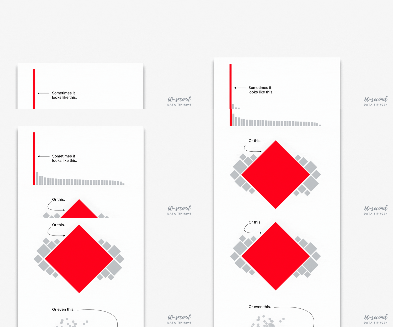
Find ways to show the people behind the data. Data visualizations are, by definition, abstractions of larger realities. But in the process of abstracting, we may obscure the lived experiences of the real people whom the data represent. Visualizations can remind viewers about the individuals behind the data by, for example, depicting them as individual circles rather than aggregating them in a single bar.
* The full paper has been published as an OSF Preprint and can be accessed here.
Let’s talk about YOUR data!
Got the feeling that you and your colleagues would use your data more effectively if you could see it better? Data Viz for Nonprofits (DVN) can help you get the ball rolling with an interactive data dashboard and beautiful charts, maps, and graphs for your next presentation, report, proposal, or webpage. Through a short-term consultation, we can help you to clarify the questions you want to answer and goals you want to track. DVN then visualizes your data to address those questions and track those goals.


