
For the past several years, at this time of year, I’ve shared this map:

Data drawn from this 2022 Food & Wine article
According to a 2022 Food & Wine article, Pinterest analyzed internal search data to discover the most common pie recipe search terms in each state. I took that data and mapped it. As you can see below, pie preferences do not appear to fall along regional, ideological, or even agricultural lines. Minnesotans love lemon pie, and Floridians love pumpkin pie, although I’m guessing that more lemons are grown in Florida and pumpkins in Minnesota.
Wondering if preferences have changed since 2022, I looked for updated data. But I could not find a more recent analysis of pie recipe searches on Pinterest or elsewhere. What I did find was this map showing Instacart data on pie ordering.
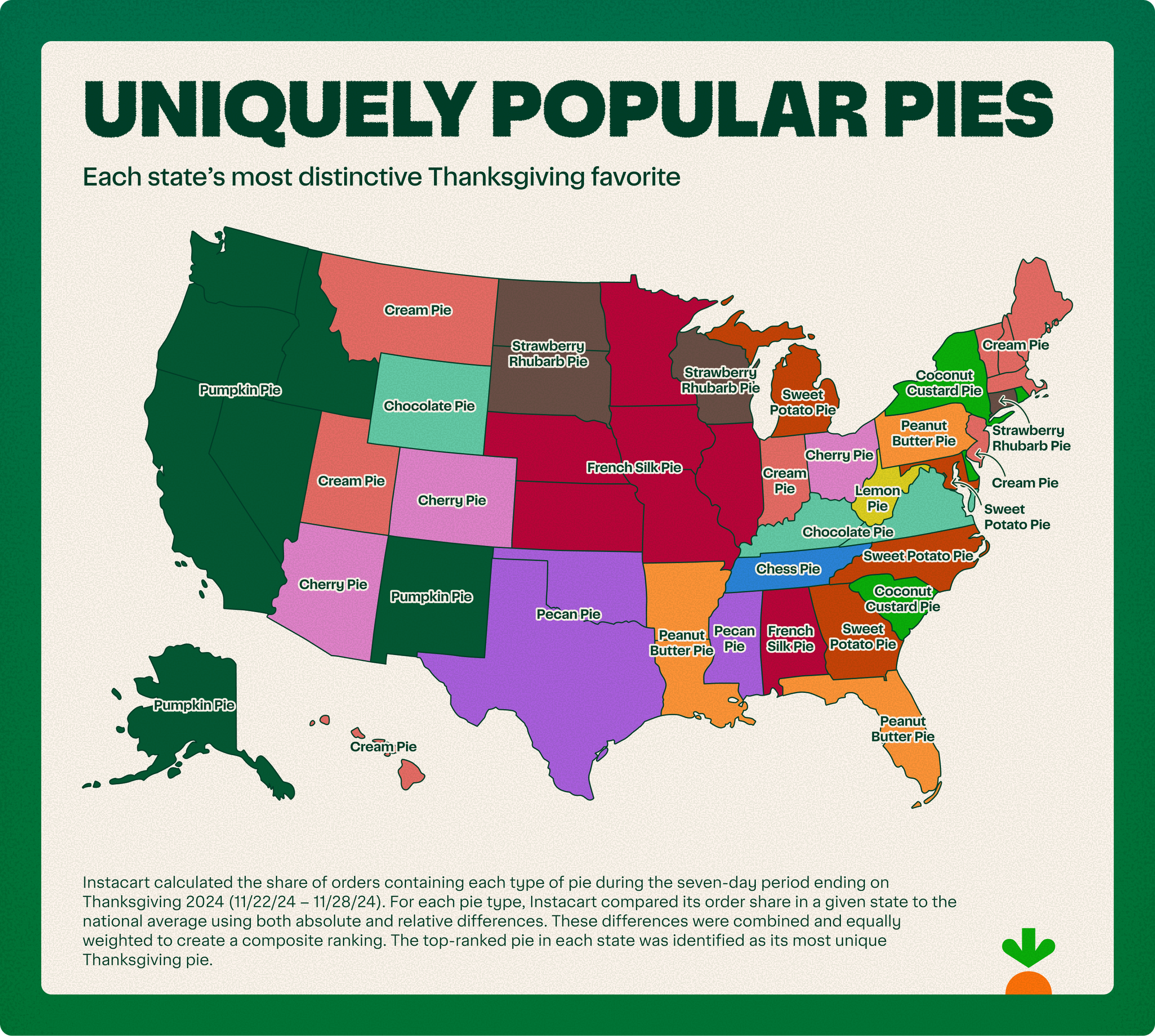
Source: Instacart Data and Trends
This map doesn’t show each state’s most popular pie order but rather its most distinctive one. Turns out I live in the french silk pie region of the country, where Instacart orders for this type of pie beat national averages. So it seems that while many of my neighbors are searching for (and possibly baking) berry pies, many are ordering chocolate ones.
What does this all mean? Well, probably not much. But it does provide some evidence that, while we may be divided in other ways, the American pie map doesn’t look anything like an electoral map. So this Thanksgiving, let’s be thankful for our shared love of pie.

Let’s talk about YOUR data!
Got the feeling that you and your colleagues would use your data more effectively if you could see it better? Data Viz for Nonprofits (DVN) can help you get the ball rolling with an interactive data dashboard and beautiful charts, maps, and graphs for your next presentation, report, proposal, or webpage. Through a short-term consultation, we can help you to clarify the questions you want to answer and goals you want to track. DVN then visualizes your data to address those questions and track those goals.


