
Next time you create a chart, try this approach: start by creating a title that includes a key takeaway that matters to your audience and then design the chart to show it. Why? Because viewers don’t read charts like books—they scan for meaning. And eye-tracking studies show that people spend the most time looking at the chart’s title. It’s the anchor of understanding.
So how do you write a strong title?
Say what happened, not just what’s shown, such as “Volunteer Retention Rose 20% After Mentorship Launch” rather than “Volunteer Retention by Year”.
Include a number when possible. Specific figures build credibility and draw attention such as “1 in 3 Clients Report Food Insecurity.”
Drop the jargon. Keep it accessible to board members, funders, and frontline staff with titles like “More Families Getting Help—But Fewer Are Returning.”
Once your title is set, use color, annotations, and layout to back it up. Highlight the key bar, darken the relevant trend, or add a short annotation to explain a sudden change. Every design choice should make it easier for your audience to see the story your title is telling.
When you lead with a clear, compelling title—and support it with thoughtful design—you make meaning.
Tip inspired by John Burn-Murdoch of the Financial Times and research on how we read charts.
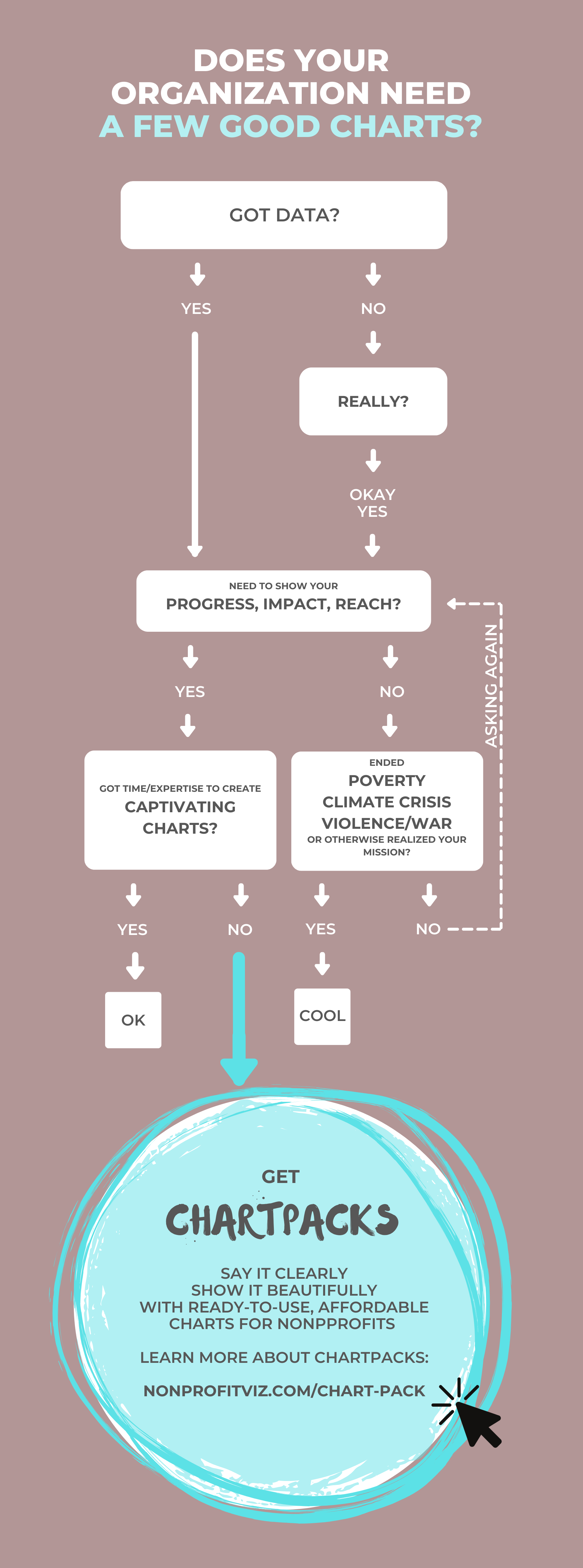
Let’s talk about YOUR data!
Got the feeling that you and your colleagues would use your data more effectively if you could see it better? Data Viz for Nonprofits (DVN) can help you get the ball rolling with an interactive data dashboard and beautiful charts, maps, and graphs for your next presentation, report, proposal, or webpage. Through a short-term consultation, we can help you to clarify the questions you want to answer and goals you want to track. DVN then visualizes your data to address those questions and track those goals.


