Data Viz Resources You Should Know: Data.gov

Here’s a new addition to my highly-curated resources list: Data.gov. I occasionally write a 60-second data tip describing a particular resource, including why I think it’s cool. And I link each of these tips to a resources list on my website.

What is it?

Data.gov is the United States government’s open data site. Open data is data that can be freely used, re-used, and redistributed by anyone - subject only, at most, to the requirement to attribute and sharealike. Data.gov is designed to “unleash the power of government open data to inform decisions by the public and policymakers, drive innovation and economic activity, achieve agency missions, and strengthen the foundation of an open and transparent government.”

Who’s it for?

It’s for the general public.

Who’s behind it?

The U.S. government. More specifically, The U.S. General Services Administration, working with the Office of Management and Budget and other agency partners, launched Data.gov in 2009. Government agencies compile metadata such as title, description, keywords, and links for accessing their datasets, and the Data.gov catalog automatically “harvests” that metadata to populate a continually updated catalog.

Why I think it’s cool

Unlike many other open data catalogs, you can find and download data quickly and visualize it. You can begin by searching for keywords in the search box. And there are helpful filters to narrow the results by, for example, topic categories, location, and agency. This is a great place to find data to show the need for your organization’s services and the problems you and your colleagues are working to address.


Let’s talk about YOUR data!

Got the feeling that you and your colleagues would use your data more effectively if you could see it better? Data Viz for Nonprofits (DVN) can help you get the ball rolling with an interactive data dashboard and beautiful charts, maps, and graphs for your next presentation, report, proposal, or webpage. Through a short-term consultation, we can help you to clarify the questions you want to answer and goals you want to track. DVN then visualizes your data to address those questions and track those goals.


Ideas You Should Steal From This Viz (Installment 11)

“Every artist gets asked the question: ‘Where do you get your ideas?’ The honest artist answers, ‘I steal them.’ . . . What a good artist understands is that nothing comes from nowhere. All creative work builds on what came before.” —Austin Kleon in Steal Like An Artist.

Today I offer up another steal-worthy interactive viz that I came across in the Tableau Public Gallery.

Source: Kizley Benedict on Tableau Public

Here’s what I suggest you steal from this viz:

  • Beeswarm Chart. The beeswarm chart at the top allows you to easily compare several countries and to see the overall distribution along the Gender Inequality Index among large and small countries. For more on beeswarm charts, see this tip.

  • Highlight a Country. For users who want to know about a particular country, the dashboard provides a search tool which highlights the selected country.

  • Overall Then Zoom In. After getting a sense of the overall distribution from the beeswarm chart, the user can zoom in and make comparisons among and within regions with the maps along the bottom of the dashboard.

To see past data tips, click HERE.


Let’s talk about YOUR data!

Got the feeling that you and your colleagues would use your data more effectively if you could see it better? Data Viz for Nonprofits (DVN) can help you get the ball rolling with an interactive data dashboard and beautiful charts, maps, and graphs for your next presentation, report, proposal, or webpage. Through a short-term consultation, we can help you to clarify the questions you want to answer and goals you want to track. DVN then visualizes your data to address those questions and track those goals.


How To Balance Your Information Diet

Here’s a question for you. And don’t go Googling. Just make your best guess.

Have the number of people experiencing homelessness in the U.S. increased or decreased since 2007?

Whatever your answer, you likely drew on your own personal experience as well as images and information from the media when guessing at the answer. Perhaps you drew on some statistics too. But, unless you have expertise in this area, probably not. Stick with me for a minute, and I’ll not only provide an answer to the question but also some insight into how we consume information.

Personal experience, media, and statistics affect how we understand any issue, and there are limits to each of these inputs. So we would do well to understand those limits before acting on our understanding by voting, donating, or making decisions about programs that our organizations operate. Max Roser’s article in Our World in Data (The limits of our personal experience and the value of statistics) walks us through some of those limitations:

Personal Experience

“The world is large, and we can experience only very little of it personally,” Roser notes. “For every person you know, there are ten million people you do not know.” Even the most social and well-traveled among us can have only a limited understanding of the world through personal experience. I, for example, do not know anyone personally who has been unhoused, and most of my interactions with people in this situation occur on the street when someone asks me for money. This experience provides no information about the breadth of the problem or the range of experiences with this issue over time.

Media

“This fact is so obvious that it is easy to miss how important it is: everything you hear about anyone who is more than a few dozen meters away, you know through some form of media,” Roser points out. “The news reports on the unusual things that happen on a particular day, but the things that happen every day never get mentioned. This gives us a biased and incomplete picture of the world; we are inundated with detailed news on terrorism but hardly ever hear of everyday tragedies like the fact that 16,000 children die every single day.” If I recently heard a story about a city clearing homeless encampments, I may assess the problem as larger, and if I haven’t heard about anything on the issue in awhile, I may assess it as smaller.

Statistics

“The collection and production of good statistics is a major challenge,” writes Roser. “Data might be unrepresentative in some ways, it might be mismeasured, and some data might be missing entirely.” But, unlike personal experience and the media, it provides a way of assessing the full range of an issue. So it’s important to add statistics, along with personal experience and the media, to our information diet.

To add some statistics to your understanding of homelessness, the number of people experiencing homelessness in the U.S. decreased from about 650,000 in 2007 to about 580,000 (about 18 of every 10,000 people) in 2022 according to The 2022 Annual Homelessness Assessment Report to Congress.

We should not discount personal experience, the media, or statistics because of their limitations. But we should appreciate their limitations when forming opinions and taking actions based on them. As Roser notes: “Each way of learning about the world has its value. It’s about how we bring them together: the in-depth understanding that only personal interaction can give us, the focus on the powerful and unusual that the news offers, and the statistical view that gives us the opportunity to see everyone.” As described in many tips in this blog, well-designed charts make data/statistics more accessible to everyone and thus allow everyone to see everyone.


Let’s talk about YOUR data!

Got the feeling that you and your colleagues would use your data more effectively if you could see it better? Data Viz for Nonprofits (DVN) can help you get the ball rolling with an interactive data dashboard and beautiful charts, maps, and graphs for your next presentation, report, proposal, or webpage. Through a short-term consultation, we can help you to clarify the questions you want to answer and goals you want to track. DVN then visualizes your data to address those questions and track those goals.


Free Interactive Viz For You: Giving in the U.S.

As we move into gifting season, I thought I’d toss out a gift to you. It’s a quick interactive viz that you can employ however you see fit. Use it in a website, presentation, or social media post to rightsize folks’ understanding about the state of charitable giving in the U.S. and, perhaps, help to turn the tide. For the link address or embed code, click on the share icon below.


Let’s talk about YOUR data!

Got the feeling that you and your colleagues would use your data more effectively if you could see it better? Data Viz for Nonprofits (DVN) can help you get the ball rolling with an interactive data dashboard and beautiful charts, maps, and graphs for your next presentation, report, proposal, or webpage. Through a short-term consultation, we can help you to clarify the questions you want to answer and goals you want to track. DVN then visualizes your data to address those questions and track those goals.


Nonprofits Need This Dashboard

Does your nonprofit have participants (or volunteers or clients or human beings of another sort) in various programs? If so, you could benefit from a dashboard like this one (see below). Give it a spin. Select a program at the top to highlight participants in that program in the charts. This dashboard allows for easy comparisons across programs, across statuses (e.g. enrolled, waitlisted, and withdrawn), and across time. Scroll over charts to learn more.

My inspiration for this dashboard came from Eve Thomas at The Data School. Check out Eve’s article, which includes instructions for creating this type of dashboard with Tableau (assuming basic Tableau knowledge.)


Let’s talk about YOUR data!

Got the feeling that you and your colleagues would use your data more effectively if you could see it better? Data Viz for Nonprofits (DVN) can help you get the ball rolling with an interactive data dashboard and beautiful charts, maps, and graphs for your next presentation, report, proposal, or webpage. Through a short-term consultation, we can help you to clarify the questions you want to answer and goals you want to track. DVN then visualizes your data to address those questions and track those goals.


Ideas You Should Steal From This Viz (Installment 10)

Here’s another steal-worthy viz to inspire you. There’s so much I like about this data dashboard created by Alessia Musìo on Tableau Public. In the Information is Beautiful Awards submission for this dashboard, Musìo notes: “Simplicity, coherence, and clarity are the words that have guided me in the development of the project.”

Here’s what I especially like and suggest you apply to your own dashboards:

  • User friendly: There’s no need for a user guide for this dashboard. The simple left-hand panel tells you all you need to know: how to navigate to other pages, how to filter the data, and how to interpret the color coding.

  • Limited views of data: There are only two ways of looking at the data contained in the dashboard: in a map which allows you to make comparisons across regions and countries or in a chart showing change over time. And there are limited ways to filter the data. This simplicity makes the dashboard more approachable and instantly usable.

  • Methodology and sources page: For those interested, the methods and sources are presented in an organized way with links.

Take the dashboard out for a spin. Be sure to hover over the circular elements on the single country charts to see comparisons with countries of the same continent.


Let’s talk about YOUR data!

Got the feeling that you and your colleagues would use your data more effectively if you could see it better? Data Viz for Nonprofits (DVN) can help you get the ball rolling with an interactive data dashboard and beautiful charts, maps, and graphs for your next presentation, report, proposal, or webpage. Through a short-term consultation, we can help you to clarify the questions you want to answer and goals you want to track. DVN then visualizes your data to address those questions and track those goals.


Data Viz Resources You Should Know: Our World In Data

Our World in Data is a new addition to my highly-curated resources list. I occasionally write a 60-second data tip describing a particular resource, including why I think it’s cool. And I link each of these tips to a resources list on my website.

What is it?

Our World in Data is a collection of charts and articles on “the world’s largest problems”. They believe making knowledge, which “is often stored in inaccessible databases, locked away behind paywalls and buried under jargon in academic papers” more accessible to foster progress.

Who’s it for?

Anyone trying to better understand the world and how it’s changing including individuals, journalists, researchers, and policymakers. Our World in Data’s charts and data can be freely downloaded and embedded in others’ work.

Who’s behind it?

Our World in Data is a collaborative effort between researchers at the University of Oxford, who are the scientific editors of the website content, and the non-profit organization Global Change Data Lab (GCDL) which publishes and maintains the website. Max Roser is the founder and director of Our World in Data. He began the project in 2011 and for several years was the sole author until receiving funding for the formation of a team.

Why I think it’s cool

Their charts and articles help to correct our misperceptions that all global living conditions are getting worse. In their words, “historical data and research shows that it is possible to change the world. Historical research shows that until a few generations ago around half of all newborns died as children. Since then the health of children has rapidly improved around the world and life expectancy has doubled in all regions. . . . Progress is possible, but it is not a given. If we want to know how to reduce suffering and tackle the world’s problems we should learn from what was successful in the past.”


Let’s talk about YOUR data!

Got the feeling that you and your colleagues would use your data more effectively if you could see it better? Data Viz for Nonprofits (DVN) can help you get the ball rolling with an interactive data dashboard and beautiful charts, maps, and graphs for your next presentation, report, proposal, or webpage. Through a short-term consultation, we can help you to clarify the questions you want to answer and goals you want to track. DVN then visualizes your data to address those questions and track those goals.


Ideas You Should Steal From This Viz (Installment 9)

Source: Source: Yusuke Nakanishi on Tableau Public

Here’s another steal-worthy viz to inspire you. This one is from Yusuke Nakanishi on Tableau Public. Filling the numbers to show the percent is cool, particularly because the chart is about drinking and the numbers appear to be filled like a glass. Nakanishi created the chart in Tableau by making a simple bar chart and then placing a virtual stencil (i.e. numbers with a transparent fill) over the chart. The best place to make this type of stencil is probably Adobe Illustrator. But if you don’t have an Adobe subscription, you can do it for free in Canva. I created this image in Canva as indicated below.

  1. Open Canva and click on “Create a design” in upper right corner of the screen. Select a size (I chose presentation).

  2. Select “Background” on left side of screen and then choose a background.

  3. Select “Elements” on left side of screen and enter' “number frames” in the search window. Number frames look like numbers filled with an illustration of grass and sky. Click on the numbers you want and place and size them on the slide as you wish.

  4. Select “Elements” on left side of screen and enter search terms in the search window to find a photo with one color on the bottom and another color on the top. I entered “oil” and used a photo with oil on the bottom and white on the top.

  5. Drag that image over each number frame until it fills the frame.

  6. Double click on the filled number and resize and move the image until the bottom color fills the number frame to the right height. To determine the height, you can use Canva’s rulers and guides.


Let’s talk about YOUR data!

Got the feeling that you and your colleagues would use your data more effectively if you could see it better? Data Viz for Nonprofits (DVN) can help you get the ball rolling with an interactive data dashboard and beautiful charts, maps, and graphs for your next presentation, report, proposal, or webpage. Through a short-term consultation, we can help you to clarify the questions you want to answer and goals you want to track. DVN then visualizes your data to address those questions and track those goals.


Do nonprofits have the necessary data to make good use of AI?

This is a question that I’ve been wondering about. Maybe you have too? So I used AI (artificial intelligence) to find an answer! Here is what ChatGPT spit out in a few seconds with my commentary on the side.


Let’s talk about YOUR data!

Got the feeling that you and your colleagues would use your data more effectively if you could see it better? Data Viz for Nonprofits (DVN) can help you get the ball rolling with an interactive data dashboard and beautiful charts, maps, and graphs for your next presentation, report, proposal, or webpage. Through a short-term consultation, we can help you to clarify the questions you want to answer and goals you want to track. DVN then visualizes your data to address those questions and track those goals.


Interesting Versus Actionable Data

60-SECOND DATA TIP_4 (3).gif

Reposted from October 2021

It’s easy to get lost in a sea of interesting data when what you really need is actionable data. As Oracle’s Nate Mayfield points out, you know when you’ve presented only interesting data when you get this type of response: “Oh, cool. Yeah, that's great to know.” On the other hand, if you hear “Oh, okay. I can definitely decide what to do now,” then you’ve presented actionable data.

The key to presenting actionable data is to ask specific—rather than broad—questions. And then design your charts, maps, and graphs to answer those narrower questions. Mayfield’s article focuses on the types of questions a business might ask. Let’s consider the types of questions a nonprofit might ask:

Interesting Questions.png

Mayfield notes that data dashboards that are designed for a wide range of users tend to address only interesting questions. “Because they are intended for a broad set of users, with a lot of filters, you can in theory answer a lot of questions with these sprawling dashboards,” says Mayfield. “The problem is people quickly get lost in them and don’t spend the time required to answer their questions.” Instead, Mayfield advises us to create simple dashboards that answer quite specific questions such as the actionable questions above. So consider a series of simple dashboards, each designed to provide answers that prompt action for a particular type of user.

To see past data tips, including tips on other types of pantry staple data, click HERE.


Let’s talk about YOUR data!

Got the feeling that you and your colleagues would use your data more effectively if you could see it better? Data Viz for Nonprofits (DVN) can help you get the ball rolling with an interactive data dashboard and beautiful charts, maps, and graphs for your next presentation, report, proposal, or webpage. Through a short-term consultation, we can help you to clarify the questions you want to answer and goals you want to track. DVN then visualizes your data to address those questions and track those goals.


Ideas You Should Steal From This Viz (Installment 8)

Today I offer up yet another steal-worthy viz. The Racial Wealth Gap viz uses data from the U.S. Federal Reserve’s Survey of Consumer Finances to show the proportion of households that own different kinds of assets by racial group. Here’s what I like about this chart (and what you should steal from it):

  1. The use 100 families in addition to percentages. We can wrap our brains around 100 families. We can imagine it.

  2. The use of icons that help tell the story and also remind us of Monopoly pieces.

  3. Highlighting the gaps between the White group and other racial groups. The pink squares help us to appreciate how large the gaps are and how they compare across different asset groups.

To see past data tips, click HERE.


Let’s talk about YOUR data!

Got the feeling that you and your colleagues would use your data more effectively if you could see it better? Data Viz for Nonprofits (DVN) can help you get the ball rolling with an interactive data dashboard and beautiful charts, maps, and graphs for your next presentation, report, proposal, or webpage. Through a short-term consultation, we can help you to clarify the questions you want to answer and goals you want to track. DVN then visualizes your data to address those questions and track those goals.


And Here's A Bonus: A Bar Chart Catalogue

I thought I had wrapped up my miniseries on bar charts when I came across this excellent bar chart catalogue by Rosa Mariana de Leon-E. It includes 27 variations on the bar chart with links to instructions for creating them with Tableau. Enjoy!


Let’s talk about YOUR data!

Got the feeling that you and your colleagues would use your data more effectively if you could see it better? Data Viz for Nonprofits (DVN) can help you get the ball rolling with an interactive data dashboard and beautiful charts, maps, and graphs for your next presentation, report, proposal, or webpage. Through a short-term consultation, we can help you to clarify the questions you want to answer and goals you want to track. DVN then visualizes your data to address those questions and track those goals.


Bar Chart Hack #8: Double Duty Stacked Bars

This week I offer up my last bar chart hack. I came across this hack just recently in Philip Bump’s excellent Washington Post newsletter, How To Read This Chart. In the newsletter, he shares a chart from his book: The Aftermath: The Last Days of The Baby Boom and The Future of Power in America. The chart, shown below, is a sort of double-duty stacked bar chart. It not only makes use of the length of the bar segments to convey meaning, it also makes use of the width of the bars.

Here’s how Bump describes the chart: “The width of each column reflects the total percentage of the population for that generational group. The colored sections are the percentage that is each racial group. Black, Asian and Hispanic Americans of every age vote more heavily Democratic than Republican. It’s not just White young people who are more Democratic (though, among women, that is the case.) It’s that young people are less likely to be White and also more likely to vote against Republicans. The thesis of my book is that the baby boom (which backed Donald Trump by 3 points in 2020) is seeing its political and economic power fade, contributing to a number of the tensions we see in the moment. Between 2016 and 2020, the percentage of the presidential electorate that was baby-boom-aged or older went from 52 to 44 percent; the percent that was millennial or Gen Z went from 23 to 30 percent.”

Had Bump shown the percent of the population in different racial groups in one chart and the percent of the population in different generations in another chart, he would have provided fewer insights.

I encourage you to explore your data with this type of chart, showing the percent of your participants, donors, locations, etc. according to two different dimensions such as age group and zip code or giving level and giving history (recurring, one-time, major gift). It might yield important insights and help you to communicate them to others.


Let’s talk about YOUR data!

Got the feeling that you and your colleagues would use your data more effectively if you could see it better? Data Viz for Nonprofits (DVN) can help you get the ball rolling with an interactive data dashboard and beautiful charts, maps, and graphs for your next presentation, report, proposal, or webpage. Through a short-term consultation, we can help you to clarify the questions you want to answer and goals you want to track. DVN then visualizes your data to address those questions and track those goals.


Ideas You Should Steal From This Viz (Installment 7)

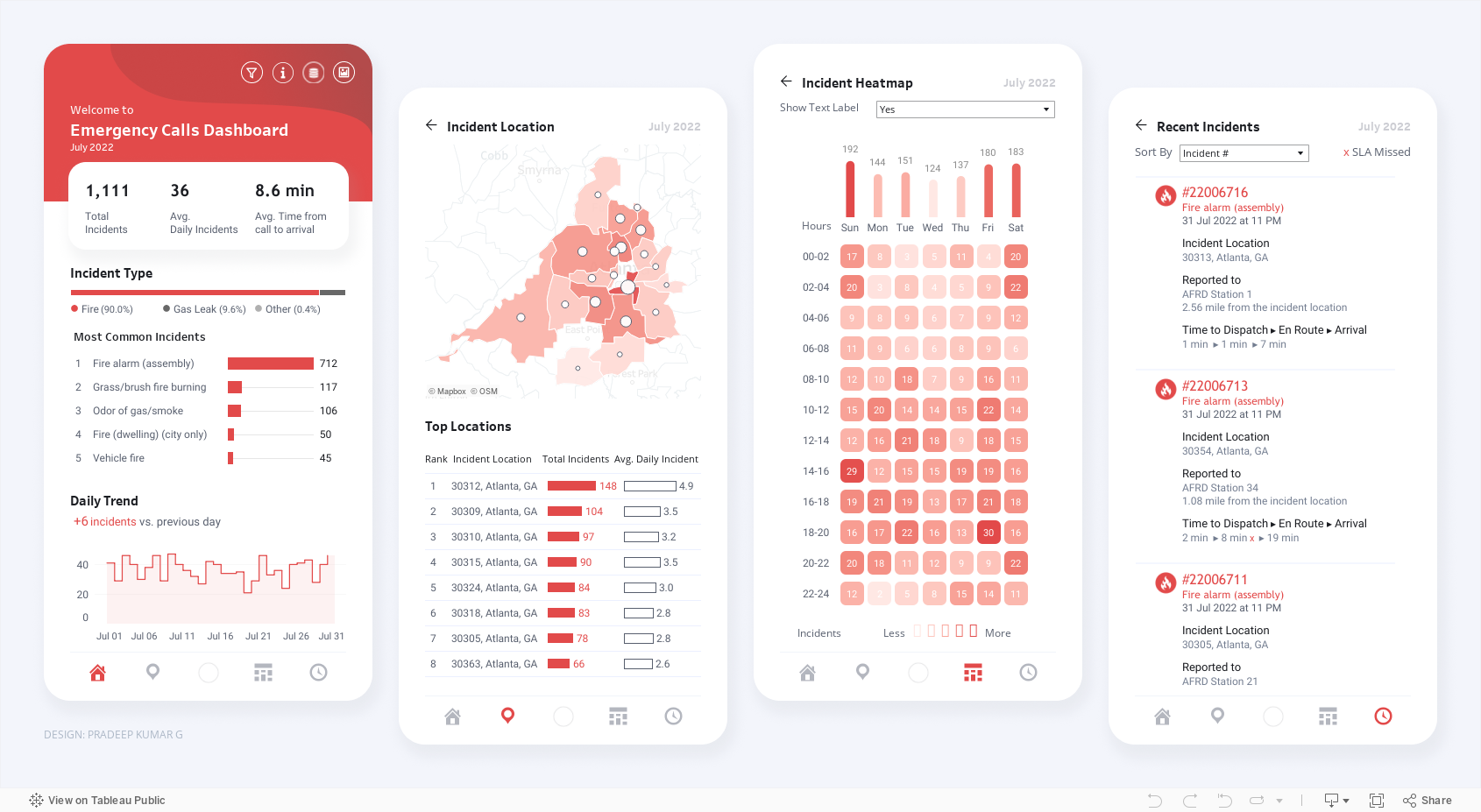
Today I offer up yet another steal-worthy viz: Emergency Calls Dashboard created with Tableau by Pradeep Kumar G. This one is genius. It seems to defy basic graphic design rules. It includes many charts and lots of small text and numbers and yet it’s readable and not overwhelming.

As you can see, the charts are contained within four rectangular views, each with the dimensions of a phone screen. Tableau dashboards can include layouts for different types of devices with varying screen sizes. When you publish these layouts, people viewing your dashboard experience a design optimized for their device (phone, tablet, or desktop.)

If you view the Emergency Calls Dashboard with a phone, you will see just one of the four views and can use the icons at the bottom of the screen to navigate to the other views, as shown in the image to the right.

Effective phone layouts usually:

  • Limit a dashboard’s focus and content (you can only get so much on this small canvas),

  • Reduce interactivity (dealing with filters on a phone can be annoying*), and

  • Use a vertical orientation (vertical scrolling is easier than horizontal scrolling).

The Emergency Calls Dashboard has all of these features, so the phone view works quite well. Indeed, these phone views are so effective that they also work when laid out side-by-side in the desktop view.

When building dashboards for multiple device types, dashboard designers often start with the desktop view and then simplify that larger, more detailed design for the phone view. The Emergency Calls Dashboard demonstrates the benefit of beginning with the phone view. If you design a simple, readable phone view that makes effective use of its limited canvas, you can use this design to fit more information in the desktop or tablet layout. Even if you aren’t designing for multiple screen sizes, following the tips for effective phone layouts will serve you well, opening up possibilities for including more data in one view without overwhelming the user.

I’ve embedded the dashboard below so that you can interact with it.

*The Tableau Mobile app optimises filters for phones, making them pop and easier to use. It also allows for logical scrolling, swiping, pinching, and zooming. However, some of your users may not use the app.


Let’s talk about YOUR data!

Got the feeling that you and your colleagues would use your data more effectively if you could see it better? Data Viz for Nonprofits (DVN) can help you get the ball rolling with an interactive data dashboard and beautiful charts, maps, and graphs for your next presentation, report, proposal, or webpage. Through a short-term consultation, we can help you to clarify the questions you want to answer and goals you want to track. DVN then visualizes your data to address those questions and track those goals.


Data Viz Resources You Should Know: Data Visualisation Catalogue

Here’s a new addition to my highly-curated resources list: the Data Visualisation Catalogue. I occasionally write a 60-second data tip describing a particular resource, including why I think it’s cool. And I link each of these tips to a resources list on my website.

What is it?

It’s simply a list of chart types with definitions. You can use it like you would a bird guide: you come across a chart you’ve never seen before in the wild and want to know more about it. In this case, you can review the chart icons in the “View by List” page to find one that looks like the one you’ve encountered. Or you can use it like you would a menu: you want a chart but are not sure what your options are. In this case, you can use the “Search by Function” page to find chart that best suits your purpose.

Who’s it for?

Anyone who wants to know more about charts.

Who’s behind it?

Severino Ribecca, a freelance designer in Poland, built and maintains the catalogue along with a blog on various data viz topics.

Why I think it’s cool

I love the simplicity of this site. There are other chart choosers online (easily found with a little Googling) but I find myself going back to this catalogue again and again when I need more information on a chart because it’s so user-friendly.


Let’s talk about YOUR data!

Got the feeling that you and your colleagues would use your data more effectively if you could see it better? Data Viz for Nonprofits (DVN) can help you get the ball rolling with an interactive data dashboard and beautiful charts, maps, and graphs for your next presentation, report, proposal, or webpage. Through a short-term consultation, we can help you to clarify the questions you want to answer and goals you want to track. DVN then visualizes your data to address those questions and track those goals.


Data Viz Resources You Should Know: Tableau Tim

Here’s a new addition to my highly-curated resources list: Tableau Tim. I occasionally write a 60-second data tip describing a particular resource, including why I think it’s cool. And I link each of these tips to a resources list on my website.

What is it?

Tableau Tim and Tableau Tim You Tube are treasure troves of videos on Tableau, a powerful tool for visualizing data in the form of interactive charts, graphs, and maps. These collections include how-tos, introductions to new functions in Tableau, quick tips, etc.

Who’s it for?

It’s really for anyone interested in learning more about Tableau, from the absolute beginner to the absolute veteran.

Who’s behind it?

Tim Ngwena is an analytics professional based at The Information Lab in the UK and a Tableau Ambassador from 2020-21.

Why I think it’s cool

Tim is what’s cool. He is an extremely good explainer. If you don’t know anything about Tableau, check out his video called Tableau explained in under 10 mins! And if you are looking for free Tableau training, you might check out his Tableau Desktop Crash Course which takes you for zero to a published dashboard in three hours.


Let’s talk about YOUR data!

Got the feeling that you and your colleagues would use your data more effectively if you could see it better? Data Viz for Nonprofits (DVN) can help you get the ball rolling with an interactive data dashboard and beautiful charts, maps, and graphs for your next presentation, report, proposal, or webpage. Through a short-term consultation, we can help you to clarify the questions you want to answer and goals you want to track. DVN then visualizes your data to address those questions and track those goals.


9 Ways to Make Your Data Visualizations Stand Out

Data visualizers from around the world flex their muscles each week by creating charts, maps, and graphs using a common data set. It’s called Makeover Monday. Even if you don’t participate, it’s a great way to see the range of ways a single data set can be visualized and to consider the pros and cons of different approaches. Check out the Makeover Monday site which provides a wealth of information from past Makover Monday challenges including favorite vizes associated with each challenge. The Makeover Monday folks also shared this “Viz Checklist” with the world. And I’m offering it up as this week’s data tip. Use it next time you visualize data to ensure a polished result.

Source: https://www.makeovermonday.co.uk/

To see past data tips, click HERE.


Let’s talk about YOUR data!

Got the feeling that you and your colleagues would use your data more effectively if you could see it better? Data Viz for Nonprofits (DVN) can help you get the ball rolling with an interactive data dashboard and beautiful charts, maps, and graphs for your next presentation, report, proposal, or webpage. Through a short-term consultation, we can help you to clarify the questions you want to answer and goals you want to track. DVN then visualizes your data to address those questions and track those goals.


How To Make More "Fragrant" Data Visualizations

Whether we are trying to find a certain address as we walk down a street, to purchase clothes online, or to extract meaning from a chart, map, or graph, we foraging for information. I recently came across the idea of “information foraging” and following “an information scent” in this article on web user behavior. It got me thinking about how to boost the information scent in a data visualization. “A strong information scent is found,” according to the article, “when an element within the design suggests the user is moving nearer to their goal.” On an e-commerce website, a button that takes you to your shopping cart has a strong information scent. Below are a couple of data dashboards that I came across on the Tableau Public site that I think give off a strong information scent. See if you agree and consider using these strategies in your own data presentations.

The Potential of Female Wealth

In this dashboard, Jennifer Dawes provides a strong information scent using color, starting at the title. If you simply follow the color purple — which always means female — through the title, subtitles, and chart marks, you get a high-level understanding of where, when, and how females have accumulated wealth. I also like how the dots along the right border pique your curiosity and draw you through the dashboard to explore the wealthiest individuals in the world. Scroll around on the dashboard to learn more.

Source: Jennifer Dawes on Tableau Public

Is India Nearing A Water Crisis?

This dashboard begins with a “fragrant” table of contents. It’s visually engaging. It provides a summary of all the information included in the dashboard. And clicking on a number on the table of contents brings you to a page with more charts and maps on the topic noted. Additionally, the detail pages each include a prominent conclusion that can be drawn from the data on that page such as “Groundwater across India is at critical levels due to excessive usage.” These conclusions provide a scent or clue about what to explore in the adjacent charts.

Source: Varun Jain on Tableau Public

To see past data tips, click HERE.


Let’s talk about YOUR data!

Got the feeling that you and your colleagues would use your data more effectively if you could see it better? Data Viz for Nonprofits (DVN) can help you get the ball rolling with an interactive data dashboard and beautiful charts, maps, and graphs for your next presentation, report, proposal, or webpage. Through a short-term consultation, we can help you to clarify the questions you want to answer and goals you want to track. DVN then visualizes your data to address those questions and track those goals.


Ideas You Should Steal From This Viz (Installment 5)

Today I offer up yet another steal-worthy viz that I came across in the Tableau Public Gallery. Take a look:

Source: Vignesh Suresh on Tableau Public

Source: Vignesh Suresh on Tableau Public

The goal is to highlight the mismatch between the percentage of websites using a language and the share of the world’s population speaking that language. As we can see, there’s a mismatch for all languages except Polish. Using partial shapes for each of the two metrics works so well. It’s easy to see where there is more or less of a mismatch.

Creating such a chart in Tableau involves some varsity-level skills including the trigonometric functions of sine and cosine. But if you are just as happy with diamonds as circles, you can easily steal the basic idea for this chart and create a much simpler chart in Tableau. The example below compares the percent of residents in a community in need of a particular service and the percent of program slots providing that service. Want to know how I did it? Check out these instructions which assume basic knowledge of Tableau.


To see past data tips, click HERE.


Let’s talk about YOUR data!

Got the feeling that you and your colleagues would use your data more effectively if you could see it better? Data Viz for Nonprofits (DVN) can help you get the ball rolling with an interactive data dashboard and beautiful charts, maps, and graphs for your next presentation, report, proposal, or webpage. Through a short-term consultation, we can help you to clarify the questions you want to answer and goals you want to track. DVN then visualizes your data to address those questions and track those goals.


Ideas You Should Steal From This Viz (Installment 4)

“Every artist gets asked the question: ‘Where do you get your ideas?’ The honest artist answers, ‘I steal them.’ . . . What a good artist understands is that nothing comes from nowhere. All creative work builds on what came before.” —Austin Kleon in Steal Like An Artist.

Today I offer up another steal-worthy interactive viz that I came across in the Tableau Public Gallery. Scroll down for ideas to steal from this viz.


Source: Ethan Lang on Tableau Public


Here’s what I suggest you steal from this viz:

  • Side-by-side comparisons. It’s simple to compare states to one another since they are arrayed alongside each other.

  • Good news/bad news colors. The red/blue color coding makes it easy to discern states with decreased rates of homelessness from those with increased rates both in the national map and in the individual state charts.

  • Easy look up. If you want to dig into one state’s data, you can select it on the map and get more detail on the charts in the upper left hand panel.

To see past data tips, click HERE.


Let’s talk about YOUR data!

Got the feeling that you and your colleagues would use your data more effectively if you could see it better? Data Viz for Nonprofits (DVN) can help you get the ball rolling with an interactive data dashboard and beautiful charts, maps, and graphs for your next presentation, report, proposal, or webpage. Through a short-term consultation, we can help you to clarify the questions you want to answer and goals you want to track. DVN then visualizes your data to address those questions and track those goals.