How to Extract Meaning from Survey Data

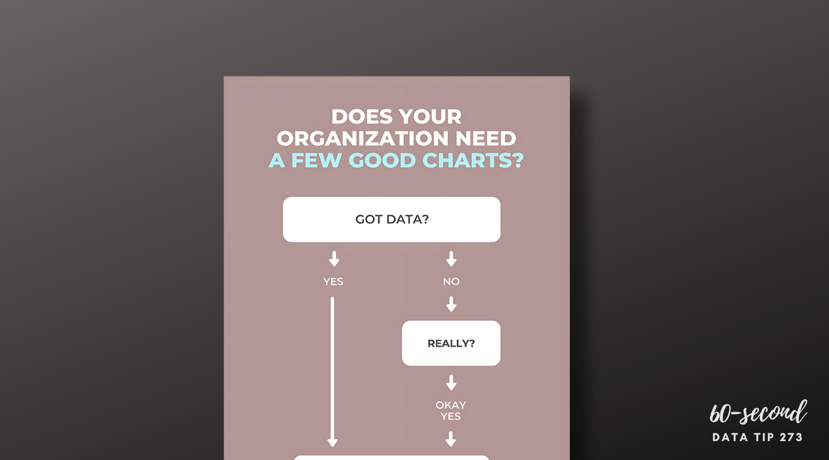
You just conducted a survey of your clients. participants, board members, visitors, or community members, and chances are you used some Likert Scales in that survey. In other words, you asked respondents to state their level of agreement or disagreement on a symmetric agree-disagree scale. A typical 5-level Likert scale is:

Strongly Disagree - Disagree - Neither Agree nor Disagree - Agree - Strongly Agree

Here’s a FAQ (which is more like a QYSA: Questions You Should Ask) on visualizing Likert Scale data to extract useful information.

Have you collected data just once or multiple times with this survey?

If this is a one-time deal, then I would suggest that you visualize the data using a stacked bar chart. Exactly which type of stacked bar chart depends on what you are trying to understand and show. Check out this Daydreamming With Numbers blog post: 4 ways to visualize Likert Scales. It walks you through various options. If you have collected the data two or more times, read on.

Should I calculate average scores and compare them?

A common way to look at change over time with Likert Scale data is to assign numerical values to each response (e.g. Strongly Disagree: 1, Disagree: 2, Neither Agree nor Disagree: 3, Agree: 4, Strongly Agree: 5) then calculate the average across respondents at two or more points in time and compare them. Some may even use a statistical test (such as a paired sample t-test) to assess whether the averages are “significantly” different. This may seem like an obvious way to deal with the data, but there are problems with it:

  • The distance between 4 and 5 is always the same as the distance between 2 and 3. However, the distance between Agree and Strongly Agree is not necessarily the same as the distance between Disagree and Neither Agree nor Disagree. So we may be distorting respondents’ opinions and emotions by assigning numbers to these response options.

  • Respondents are often reluctant to express strong opinions and thus gravitate to the middle options. Averaging a bunch of middle options (2, 3, and 4) only amplifies the impression that respondents are on the fence.

  • Averages do not give us a sense of the range of responses. The average of these 4 responses (5,1,1,1) is the same as the average of these 4 responses (2,3,2,1). Also averages result in fractional results which can be hard to interpret. Does an increase from 4.32 to 4.71, even if it’s statistically significant, really mean anything in the real world? At best, we can say that the aggregated results changed from somewhere between Agree and Strongly Agree to another place that is a little closer to Strongly Agree.

What are alternatives to calculating averages?

Visualize the spread of responses. If you don’t have too many questions (or can group questions together) some simple side-by-side stacked bar charts might do the trick. See sketch 1 below.

Use the mode or median rather than average.The mode is the number that occurs most often in a data set and may be a good way to describe the data if one response dominated. The median is the middle value when a data set is ordered from least to greatest. If responses tend toward one end of the scale (i.e. are skewed), it may be more reasonable to use the median rather than the average. If you feel that the assumption of equal spacing between response options is legit, then you might stick with the average.

Visualize average, mode, or median using one of the following chart types (see sketches 2-4) to understand and show change over time.

To see past data tips, click HERE.


Let’s talk about YOUR data!

Got the feeling that you and your colleagues would use your data more effectively if you could see it better? Data Viz for Nonprofits (DVN) can help you get the ball rolling with an interactive data dashboard and beautiful charts, maps, and graphs for your next presentation, report, proposal, or webpage. Through a short-term consultation, we can help you to clarify the questions you want to answer and goals you want to track. DVN then visualizes your data to address those questions and track those goals.


Do nonprofits have the necessary data to make good use of AI?

This is a question that I’ve been wondering about. Maybe you have too? So I used AI (artificial intelligence) to find an answer! Here is what ChatGPT spit out in a few seconds with my commentary on the side.


Let’s talk about YOUR data!

Got the feeling that you and your colleagues would use your data more effectively if you could see it better? Data Viz for Nonprofits (DVN) can help you get the ball rolling with an interactive data dashboard and beautiful charts, maps, and graphs for your next presentation, report, proposal, or webpage. Through a short-term consultation, we can help you to clarify the questions you want to answer and goals you want to track. DVN then visualizes your data to address those questions and track those goals.


Mock Up Your Dashboards (Easily)

When I’m starting a new dashboard, I usually make some sketches to help me think about what charts to include, how I’m going to lay it out, how the pages are going to relate to each other, etc. The problem is that my sketches aren’t so good. I end up scratching out a lot and then not being able to interpret it later. Recently, I started using Canva whiteboards for my mock-ups. This free tool has a bunch of features that I like:

  • Large virtual “canvases” with the ability to zoom in on particular items or zoom way out to see the whole thing.

  • Various whiteboard templates which can easily be adapted to data dashboard design or just start with a blank board.

  • Virtual post-it notes, lines, arrows, circles and other elements to annotate the design.

  • Lots of free chart images to use as placeholders.

  • The upload feature which allows you to bring in images of dashboards you might want to riff on.

  • The ability to share and collaborate with others on a design.

Check out this mock-up I created which includes design ideas for various pages of a data dashboard.

CYDI Mock Up by Amelia Kohm World!


Let’s talk about YOUR data!

Got the feeling that you and your colleagues would use your data more effectively if you could see it better? Data Viz for Nonprofits (DVN) can help you get the ball rolling with an interactive data dashboard and beautiful charts, maps, and graphs for your next presentation, report, proposal, or webpage. Through a short-term consultation, we can help you to clarify the questions you want to answer and goals you want to track. DVN then visualizes your data to address those questions and track those goals.


A Better Alternative to Surveys?

When organizations want to understand the concerns, opinions, beliefs, or needs of their communities, clientele, or participants, they often turn to surveys. But I probably don’t have to tell you that surveys have many downsides. To name just a few:

  • The difficulty of asking the right questions in the right ways to really understand issues accurately and fully.

  • The difficulty of getting a decent response rate so that you can feel at least somewhat confident that responders’ viewpoints reflect those of the larger group.

  • The difficulty of extracting actionable knowledge from survey responses without a degree in data analysis.

I recently read about a tool that addresses some of the downsides of surveys. Polis is an open-source, real-time system for gathering, analyzing and understanding what large groups of people think in their own words.

Surveys present people with questions like this:

Source: https://www.examples.com/business/assessment/community-needs-assessment.html

By contrast, Polis allows participants to submit their own short comments on a topic specified by the “conversation” creator. Comments are then sent out semi-randomly to other participants to vote on by clicking agree, disagree or pass.

Most interesting to me are the visualizations that Polis generates in a report, which can be shared with all participants. The report includes, a viz like this:

Source: Polis

Each dot represents a comment or statement and is placed along a continuum to show the degree of agreement with the statement. In this conversation, you can see that there were many more consensus statements than divisive statements. And Polis says that’s usually the case. Polis can make consensus visible and thus may be a powerful tool when division so dominates our attention that we may be skeptical that any consensus among diverse groups exists.

When you scroll over a dot, the related statement appears below with stacked bar charts showing the amount of agreement (green), disagreement (red) and passes (gray) among participants overall and by opinion groups. An opinion group is made up of participants who tended to vote similarly on multiple statements and also have voted distinctly differently from other groups. Because the statement shown above (represented by the red dot in the chart) is toward the consensus end of the spectrum, the majority of participants in both opinion groups A and B agreed with the statement. That wasn’t the case for the statement shown below. Participants in opinion group A were much more likely to agree with this statement than those in opinion group B.

Source: Polis

The report also includes a summary of all of the consensus statements. (See example below.)

I can’t vouch for Polis — never used it myself — but I find its basic idea intriguing. If your organization is looking for a better way to understand a large group of people and is particularly interested in finding consensus hidden among all the noisy division, you may want to look into it.

Source: Polis


Let’s talk about YOUR data!

Got the feeling that you and your colleagues would use your data more effectively if you could see it better? Data Viz for Nonprofits (DVN) can help you get the ball rolling with an interactive data dashboard and beautiful charts, maps, and graphs for your next presentation, report, proposal, or webpage. Through a short-term consultation, we can help you to clarify the questions you want to answer and goals you want to track. DVN then visualizes your data to address those questions and track those goals.


What To Do With Incomplete Data

Reposted from March 29, 2021

Here’s the super short version of this data tip: when designing data viz, don’t mix complete and incomplete data. Below is the somewhat-longer-but-still-60-seconds version of this data tip.

The graphs below were on the Chicago Public Schools (CPS) website and show the number of confirmed COVID-19 cases associated with CPS buildings. I’ve added the pink lines and captions to direct your attention to the last two data points. The first image shows what the graph looked like on Monday, January 18, 2021 and the second image shows what the graph looked like 5 days later on Saturday, January 23rd.

If you went to this website on January 18th and looked that this graph, you might very well have concluded that cases had recently plummeted. But you’d be wrong. To understand what was really going on, you’d have to notice that the last data point (1/23) was in the future and put that information together with a caption saying “Case counts are updated Monday through Friday (excluding holidays) after impacted individuals are notified.” So the graph shows complete data for past weeks but incomplete data for the current week. The last data point shows week-to-date data.

Unless your aim is to confuse or deceive, why present data in this way? Instead, when you have complete data for various time periods or groups and incomplete data for other time periods or groups, consider the following:

  • If you are updating data on a daily basis, then show day intervals (rather than week intervals as in the graphs above) on the X-axis.

  • Create a separate chart showing a running total for the incomplete time period or group and place it alongside the graph showing complete data.

  • If neither of the solutions above work for you, at least color the dots, lines, or other marks representing the incomplete data in a color different from the complete data to alert the viewer to the difference and include a color legend to explain the difference.

Thanks to Carol White of CBWhite marketing research and strategy consulting for pointing out this graph to me! To see past data tips, click HERE.


Let’s talk about YOUR data!

Got the feeling that you and your colleagues would use your data more effectively if you could see it better? Data Viz for Nonprofits (DVN) can help you get the ball rolling with an interactive data dashboard and beautiful charts, maps, and graphs for your next presentation, report, proposal, or webpage. Through a short-term consultation, we can help you to clarify the questions you want to answer and goals you want to track. DVN then visualizes your data to address those questions and track those goals.


How To Make Big Numbers Tangible

We’ve talked about the problem with big numbers before. Most recently, we considered the difficulty humans have digesting large numbers and how “perspectives” — simple sentences that relate a large number to something more familiar to us — can help us to understand, assess, and recall numbers. (For more on this, check out the data tip.)

I’m returning to the big number problem today and offering up some new tips for dealing with them. The inspiration for these tips came from the data-driven documentaries of Neil Halloran, specifically his first documentary called The Fallen of World War II. If you have a few more minutes to spare after reading this 60-second tip (and are not among the 10 million + who have viewed it already), I highly recommend that you check it out. It’s 18 minutes long, but the techniques listed below all appear in the first 7 minutes.

Halloran uses the following techniques to make larger numbers understandable. And you don’t need to be a filmmaker to use them. You can apply them to simple data presentations on websites, reports, and PowerPoints.

  1. Use shapes or icons (rather than bars) to represent one or more people, programs, etc. Halloran uses a human figure shape to represent 1,000 people.

  2. Show an aggregate and then break it down by subgroups and time periods. Halloran shows aggregates, such as the total number of U.S. soldiers who died and then, using animation, redistributes the human figures to show how many soldiers died in the European and Pacific theaters and then how many died over time. The animation is cool but not necessary. You can do the same thing with a series of static images. See example below.

  3. Juxtapose photos and charts. To keep the discussion from becoming too abstract, Halloran reminds the audience what actual soldiers (rather than icons) look like by incorporating photos into his presentation. Again, animation is not necessary. Static photos can be placed along side charts.

  4. Walk audience through the data. To give the audience a sense of scale, the video progresses from smaller to larger numbers. Halloran first walks us through casualty stats for the U.S. and European countries. These numbers seem quite high so by the time Russian stats are shown, we are blown away.


Let’s talk about YOUR data!

Got the feeling that you and your colleagues would use your data more effectively if you could see it better? Data Viz for Nonprofits (DVN) can help you get the ball rolling with an interactive data dashboard and beautiful charts, maps, and graphs for your next presentation, report, proposal, or webpage. Through a short-term consultation, we can help you to clarify the questions you want to answer and goals you want to track. DVN then visualizes your data to address those questions and track those goals.


What To Do With Incomplete Data

60-SECOND DATA TIP_3.png

Here’s the super short version of this data tip: when designing data viz, don’t mix complete and incomplete data. Below is the somewhat-longer-but-still-60-seconds version of this data tip.

The graphs below were on the Chicago Public Schools (CPS) website and show the number of confirmed COVID-19 cases associated with CPS buildings. I’ve added the pink lines and captions to direct your attention to the last two data points. The first image shows what the graph looked like on Monday, January 18th, and the second image shows what the graph looked like 5 days later on Saturday, January 23rd.

If you went to this website on January 18th and looked that this graph, you might very well have concluded that cases had recently plummeted. But you’d be wrong. To understand what was really going on, you’d have to notice that the last data point (1/23) was in the future and put that information together with a caption saying “Case counts are updated Monday through Friday (excluding holidays) after impacted individuals are notified.” So the graph shows complete data for past weeks but incomplete data for the current week. The last data point shows week-to-date data.

Unless your aim is to confuse or deceive, why present data in this way? Instead, when you have complete data for various time periods or groups and incomplete data for other time periods or groups, consider the following:

  • If you are updating data on a daily basis, then show day intervals (rather than week intervals as in the graphs above) on the X-axis.

  • Create a separate chart showing a running total for the incomplete time period or group and place it alongside the graph showing complete data.

  • If neither of the solutions above work for you, at least color the dots, lines, or other marks representing the incomplete data in a color different from the complete data to alert the viewer to the difference and include a color legend to explain the difference.

Thanks to Carol White of CBWhite marketing research and strategy consulting for pointing out this graph to me! To see past data tips, click HERE.


Let’s talk about YOUR data!

Got the feeling that you and your colleagues would use your data more effectively if you could see it better? Data Viz for Nonprofits (DVN) can help you get the ball rolling with an interactive data dashboard and beautiful charts, maps, and graphs for your next presentation, report, proposal, or webpage. Through a short-term consultation, we can help you to clarify the questions you want to answer and goals you want to track. DVN then visualizes your data to address those questions and track those goals.


What Data Do You Absorb (And What Eludes You)?

60-SECOND DATA TIP #8.png

There is a certain breed of nonprofit staff who roll their eyes at the mention of “evidence-based practices” or “KPIs” or other data jargon. I myself have experienced mild nausea when listening to someone try to quantify what seems unquantifiable: what a child feels after learning to paint or what a homeless adult feels upon acquiring an apartment.

But I’m here to implore, beseech, even beg you to not write off data. Why? Because of how our brains work.

What we perceive is based not just on what we actually observe but also on what we expect to observe. This is how it works. First, the brain evaluates which of a variety of probable events are actually occurring. Then it uses this information, along with signals from the outside world (aka data), to decide what it is perceiving.  And here's the surprising news: there are far more signals coming from within the brain that affect our perception than data signals from the outside.

These inner brain signals or expectations can distort our understanding of a situation. Thus data are quite important to confirming or negating our expectations.  But you have to pay attention to data to make that happen. And that’s where things get tricky.

The esteemed philosopher and psychologist, William James, noted in The Principles of Psychology (1890): “Millions of items of the outward order are present to my senses which never properly enter into my experience. Why? Because they have no interest for me. My experience is what I agree to attend to. Only those items which I notice shape my mind .” 

So how can we see what we are not attending to, the stuff that eludes us? The answer is to think like a scientist. Rather than operating on assumption or instinct, form hypotheses about how your programs and services work and then gather data to test them. You might be surprised.

(And, if you missed it, check out last week's data tip on how data visualization can help correct misperceptions.)

See other data tips in this series for more information on how to effectively visualize and make good use of your organization's data.

Clean Data Tell Clear Stories

tip6.jpg

Many nonprofits have entry-level staff or multiple staff entering data into management information systems or spreadsheets. The result can be “dirty” data — data with a troubling level of inaccuracy because it has not been entered correctly and/or consistently. If, for example, Michael Smith is entered twice, once with a middle initial and once without, then tracking his progress through your program will be difficult.

To make sure data is accurate and thus of any value at all, it should be regularly "cleaned." A few simple procedures for cleaning data include:

  • Spell Check: Use a spell checker to find values that are not used consistently, such as a program name.

  • Remove Duplicate Rows or Entries: Sort data or use conditional formatting in Excel to find duplicates. Filter data for unique values to find near duplicates.

  • Find and Replace: Use find and replace function to correct data entered incorrectly in multiple rows or entries.

  • Use Upper Case and Trim: Change all text to upper case and remove extras spaces before and after values to ensure consistency. The UPPER(text) and TRIM(text) functions in Excel can do this.

  • Make Date Format Consistent: Make sure that dates are entered in a consistent format (such as MM/DD/YYYY). Excel has several functions that can help you convert date formats.

See other data tips in this series for more information on how to effectively visualize and make good use of your organization's data.