Reposted from March 2022
We’ve talked about the problem with big numbers before. Most recently, we considered the difficulty humans have digesting large numbers and how “perspectives” — simple sentences that relate a large number to something more familiar to us — can help us to understand, assess, and recall numbers. (For more on this, check out the data tip.)
I’m returning to the big number problem today and offering up some new tips for dealing with them. The inspiration for these tips came from the data-driven documentaries of Neil Halloran, specifically his first documentary called The Fallen of World War II. If you have a few more minutes to spare after reading this 60-second tip (and are not among the 13 million + who have viewed it already), I highly recommend that you check it out. It’s 18 minutes long, but the techniques listed below all appear in the first 7 minutes.
Halloran uses the following techniques to make large numbers understandable. And you don’t need to be a filmmaker to use them. You can apply them to simple data presentations on websites, reports, and PowerPoints.
Use shapes or icons (rather than bars) to represent one or more people, programs, etc. Halloran uses a human figure shape to represent 1,000 people.
Show an aggregate and then break it down by subgroups and time periods. Halloran shows aggregates, such as the total number of U.S. soldiers who died and then, using animation, redistributes the human figures to show how many soldiers died in the European and Pacific theaters and then how many died over time. The animation is cool but not necessary. You can do the same thing with a series of static images. See example below.
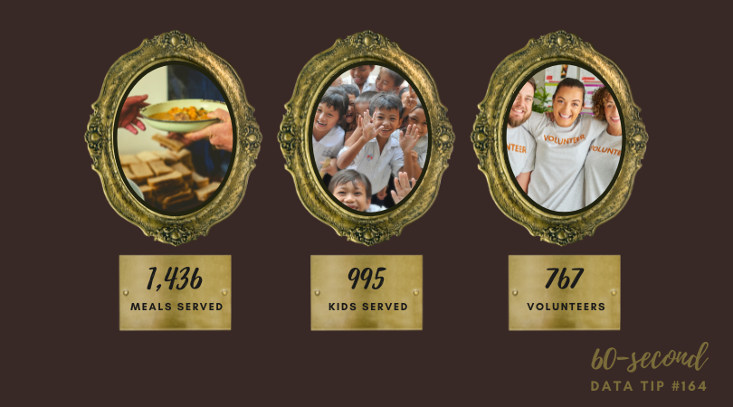
Juxtapose photos and charts. To keep the discussion from becoming too abstract, Halloran reminds the audience what actual soldiers (rather than icons) look like by incorporating photos into his presentation. Again, animation is not necessary. Static photos can be placed alongside charts.
Walk your audience through the data. To give the audience a sense of scale, the video progresses from smaller to larger numbers. Halloran first walks us through casualty stats for the U.S. and European countries. These numbers seem quite high so by the time Russian stats are shown, we are blown away.
Let’s talk about YOUR data!
Got the feeling that you and your colleagues would use your data more effectively if you could see it better? Data Viz for Nonprofits (DVN) can help you get the ball rolling with an interactive data dashboard and beautiful charts, maps, and graphs for your next presentation, report, proposal, or webpage. Through a short-term consultation, we can help you to clarify the questions you want to answer and goals you want to track. DVN then visualizes your data to address those questions and track those goals.