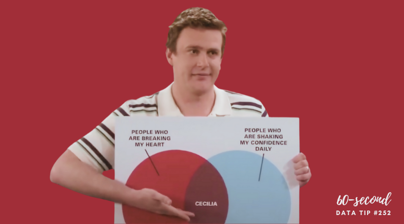
For my last post of the year, I give you 60 seconds of data viz humor. ICYMI, How I Met Your Mother did a great bit on charts and graphs back in 2009. If you like this, you might want to checkout Chart Chat’s recent discussion of the Top Ten Charts on TV.
To see past data tips, including those about other chart types, scroll down or click HERE.
Let’s talk about YOUR data!
Got the feeling that you and your colleagues would use your data more effectively if you could see it better? Data Viz for Nonprofits (DVN) can help you get the ball rolling with an interactive data dashboard and beautiful charts, maps, and graphs for your next presentation, report, proposal, or webpage. Through a short-term consultation, we can help you to clarify the questions you want to answer and goals you want to track. DVN then visualizes your data to address those questions and track those goals.


