The Average Nonprofit Overuses Averages

I’ve warned of the danger of averages before. Yet, I continue to see nonprofits defaulting to averages when they show data about their clients, participants, volunteers, fundraising, etc. So here’s another warning.

The visualization below (which, by the way, is called a bump chart), does a great job of illustrating the danger of averages. In this chart, average wealth is the wealth of a country’s people divided by the size of its population. The median is the middle value when everyone’s wealth is arranged in order. So billionaires have an outsized effect on the average, but the median is less affected by big outliers like billionaires. That’s why the U.S. ranks 4th in average wealth but 14th in median wealth.

Before you share an average with your board or on your website, consider what the median is. If it’s quite different from the average, you might consider showing both the average and the median or just the median.

To see past data tips, including those about other chart types, scroll down or click HERE.


Let’s talk about YOUR data!

Got the feeling that you and your colleagues would use your data more effectively if you could see it better? Data Viz for Nonprofits (DVN) can help you get the ball rolling with an interactive data dashboard and beautiful charts, maps, and graphs for your next presentation, report, proposal, or webpage. Through a short-term consultation, we can help you to clarify the questions you want to answer and goals you want to track. DVN then visualizes your data to address those questions and track those goals.


Data Viz Humor

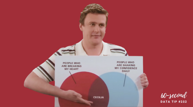
For my last post of the year, I give you 60 seconds of data viz humor. ICYMI, How I Met Your Mother did a great bit on charts and graphs back in 2009. If you like this, you might want to checkout Chart Chat’s recent discussion of the Top Ten Charts on TV.

To see past data tips, including those about other chart types, scroll down or click HERE.


Let’s talk about YOUR data!

Got the feeling that you and your colleagues would use your data more effectively if you could see it better? Data Viz for Nonprofits (DVN) can help you get the ball rolling with an interactive data dashboard and beautiful charts, maps, and graphs for your next presentation, report, proposal, or webpage. Through a short-term consultation, we can help you to clarify the questions you want to answer and goals you want to track. DVN then visualizes your data to address those questions and track those goals.

Data Viz Inspo

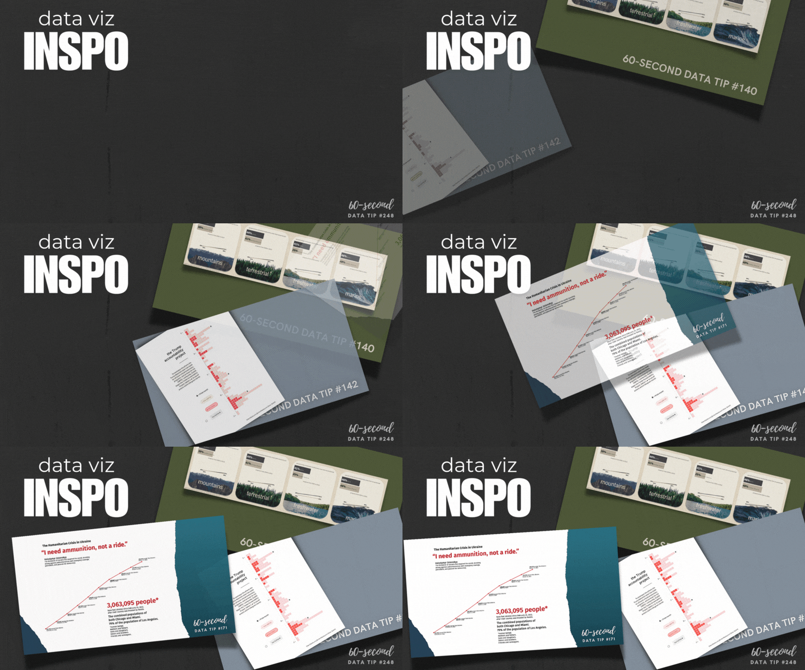
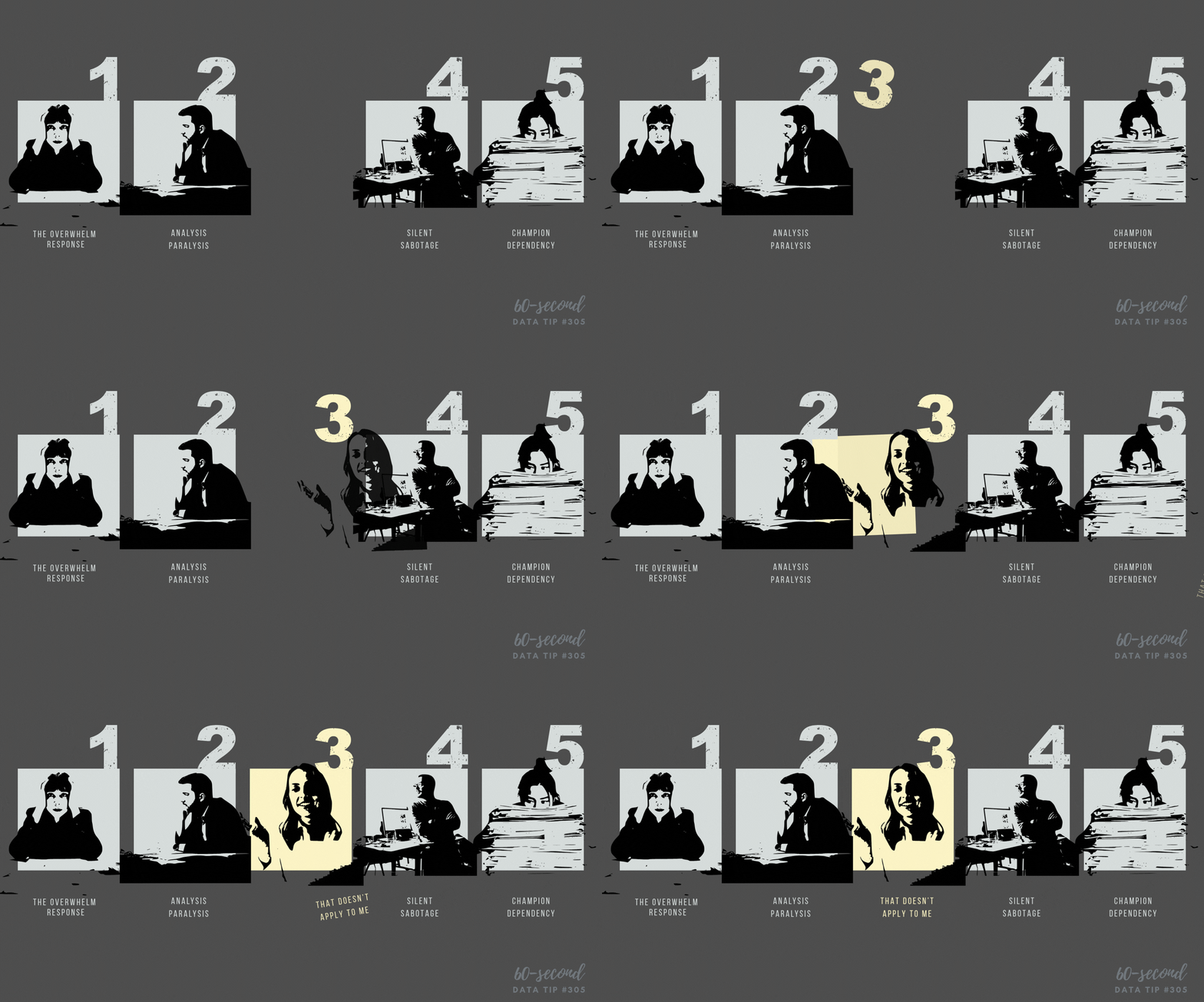
Looking for ways to make your data more engaging? Take inspiration from these data tips on steal-worthy visualizations. Click on the images below to see the whole visualization and get suggestions on what to steal from it.

To see past data tips, including those about other chart types, scroll down or click HERE.


Let’s talk about YOUR data!

Got the feeling that you and your colleagues would use your data more effectively if you could see it better? Data Viz for Nonprofits (DVN) can help you get the ball rolling with an interactive data dashboard and beautiful charts, maps, and graphs for your next presentation, report, proposal, or webpage. Through a short-term consultation, we can help you to clarify the questions you want to answer and goals you want to track. DVN then visualizes your data to address those questions and track those goals.


Why You Should Know About Calendar Heat Maps

Want to see patterns in participation, fundraising, volunteering, or social media measures across an entire year? A calendar heat map might do the trick.

This is a new addition to a series of tips on different chart types. In each tip, l give you need-to-know information in a format akin to the “Drug Facts” on the back of medication boxes: active ingredients (what the chart is), uses (when to use it), and warnings (what to look out for when creating the chart). The idea is to fill up your toolbox with a variety of tools for making sense of data. And the calendar heat map is a simple tool you can put to good use!

Active Ingredients (What is a calendar heat map?)

As in the example above, a calendar heat map shows a measure across days on a calendar. The measure might be the number of participants, dollars raised, volunteers recruited, social media engagement, etc.

Uses

Calendar heat maps provide a great way to see patterns in a measure over time, particularly if month and day of the week are important factors. For example, such a chart can help you detect whether participation is lagging on Mondays during summer months. In the example above, you can scroll over dates for more information and use the program filter to see participation for the selected program. Here are instructions for creating an interactive calendar heat map with Tableau and in Excel.

Warnings

Depending on your needs, other charts that show change over time may be more useful to you. For example, if you need to more clearly see the amount of change over time, a line graph might serve you better. For other chart types that show change over time, see below.

Fun Fact

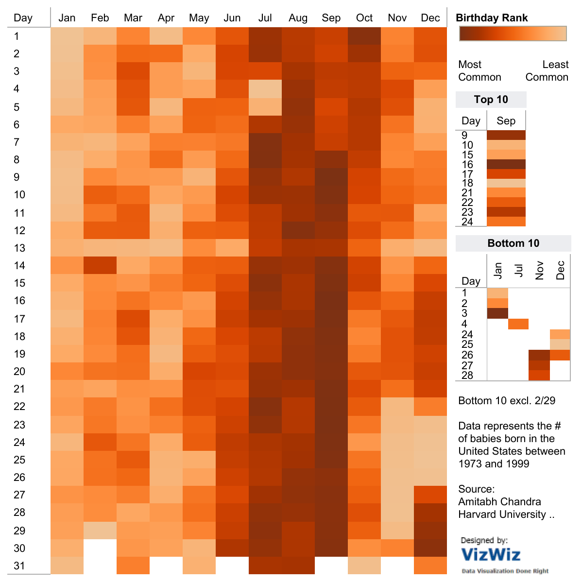
Here’s a fun calendar heat map showing more/less common birth dates.

Source: Amitabh Chandra on Tableau Public

To see past data tips, including those about other chart types, scroll down or click HERE.

Source: Visual Vocabulary by Andy Kriebel on Tableau Public


Let’s talk about YOUR data!

Got the feeling that you and your colleagues would use your data more effectively if you could see it better? Data Viz for Nonprofits (DVN) can help you get the ball rolling with an interactive data dashboard and beautiful charts, maps, and graphs for your next presentation, report, proposal, or webpage. Through a short-term consultation, we can help you to clarify the questions you want to answer and goals you want to track. DVN then visualizes your data to address those questions and track those goals.


Why You Should Know About Cycle Plots

If you are looking to explore patterns in participation or giving, a cycle plot can get you there.

This is a new addition to a series of tips on different chart types. In each tip, l give you need-to-know information in a format akin to the “Drug Facts” on the back of medication boxes: active ingredients (what the chart is), uses (when to use it), and warnings (what to look out for when creating the chart). The idea is to fill up your toolbox with a variety of tools for making sense of data. To learn about other chart types, check out this index of data tips.

Active Ingredients (What is a cycle plot?)

A cycle plot shows how a trend or cycle changes over time. We can use them to see seasonal patterns. Typically, a cycle plot shows a measure on the Y-axis and then shows a time period (such as months or seasons) along the X-axis. For each time period, there is a trend line across a number of years. In the example below, we see that, on average (black lines show averages across years), there were the most travelers from Greece in August between 2001 and 2011, but we can also see that the number of travelers varied greatly from year to year. Use the filter to see trends for travelers from other countries.

Source: Travellers by Month Cycle Plot by Tai Shi Ling on Tableau Public

Uses

Cycle plots can help identify periods of time when the best or worst results are recorded. For example, you want to see trends in participation in your summer programs or patterns in year-end giving over the years. Cycle plots can be created in a number of data viz applications including Excel and Tableau.

Warnings

The range of years shown in each trendline can be shown on the X-axis or in the subtitle to the the chart, but the range should be clear and consistent across trendlines.

Fun Fact

William S. Cleveland and Irma J. Terpenning introduced the cycle plot in Graphical Methods for Seasonal Adjustment (1982) In their example below, we see that number of telephone installations are highest in late summer/early fall.

To see past data tips, including those about other chart types, scroll down or click HERE.

Title Image Source: Seasonality with Cycle Plots by Vladimir Trkulja on Tableau Public


Let’s talk about YOUR data!

Got the feeling that you and your colleagues would use your data more effectively if you could see it better? Data Viz for Nonprofits (DVN) can help you get the ball rolling with an interactive data dashboard and beautiful charts, maps, and graphs for your next presentation, report, proposal, or webpage. Through a short-term consultation, we can help you to clarify the questions you want to answer and goals you want to track. DVN then visualizes your data to address those questions and track those goals.


Why You Should Know About Beeswarm Charts

If you are looking to compare individuals, programs, locations, events, etc. on one or more measures, a beeswarm chart could be just the ticket.

This is a new addition to a series of tips on different chart types. In each tip, l give you need-to-know information in a format akin to the “Drug Facts” on the back of medication boxes: active ingredients (what the chart is), uses (when to use it), and warnings (what to look out for when creating the chart). The idea is to fill up your toolbox with a variety of tools for making sense of data. To learn about other chart types, check out this index of data tips.

Active Ingredients (What is a beeswarm chart?)

A beeswarm chart (or swarmplot) is a type of data visualization that displays individual data points so that they don't completely overlap, resulting in a "swarming" effect. The beeswarm chart is related to strip plots and jittered strip plots, both of which are scatter plots with a measure on the vertical axis and a category on the horizontal axis. Strip plots become less useful when tightly packed data points start to overlap too much, obscuring patterns in the data. The jitter plot partly solves the problem but not as well as the beeswarm chart.

Uses

Beeswarm charts are useful to highlight individual categories or entities while still showing a distribution as a whole. In the example above, you can see that family events and smaller events were the most highly rated, while health events and larger events generally got lower ratings and that the distribution of average ratings was similar for introduction, beginner, intermediate, and advanced level events.

This type of chart is not native to most data viz applications but happily there is a free online tool called AdvViz that allows you to upload a CSV file to create a basic beeswarm chart and then download it as a Tableau file. From there, you can open it in Tableau Desktop and make adjustments to the formatting. That’s how I created the beeswarm chart above. You can also create this type of chart in Flourish and RAWGraphs.

Warnings

In the example above, I used color to distinguish different event types and circle size to show the number of participants in each event. When using color coding, make sure the colors contrast enough so that viewers can easily discern one category from another. Also, reducing the opacity of the color allows viewers to see overlapping circles. When using size to show a measure, make sure that the range of the measure is wide enough that the viewer can easily discern small from large. Small differences in size can be hard to detect.

Fun Fact

A beeswarm chart is a great way to show stressors on bee colonies! See chart below.


To see past data tips, including those about other chart types, scroll down or click HERE.

Sources: The Data Visualisation Catalogue


Let’s talk about YOUR data!

Got the feeling that you and your colleagues would use your data more effectively if you could see it better? Data Viz for Nonprofits (DVN) can help you get the ball rolling with an interactive data dashboard and beautiful charts, maps, and graphs for your next presentation, report, proposal, or webpage. Through a short-term consultation, we can help you to clarify the questions you want to answer and goals you want to track. DVN then visualizes your data to address those questions and track those goals.


Why You Should Know About Span Charts

Tired of bar and pie charts but not sure what your other options may be? Meet the simple and friendly span chart.

This is a new addition to a series of tips on different chart types. In each tip, l give you need-to-know information in a format akin to the “Drug Facts” on the back of medication boxes: active ingredients (what the chart is), uses (when to use it), and warnings (what to look out for when creating the chart). The idea is to fill up your toolbox with a variety of tools for making sense of data. And the span chart is a simple tool you can put to good use!

Active Ingredients (What is a span chart?)

A span chart shows the range between a minimum value and a maximum value. Check out the example below which displays the salaries of full-time employees of the City of Chicago in various departments. The chart on top shows the range between the lowest and highest salaries in each department, and when you click on a bar, the chart below shows the salaries of individual employees in that department (which you can see by scrolling over the circles). So we can see, for example, that although the public library department has a wide range of salaries, the large majority of employees earn less than $100K per year.

Uses

Span charts provide the extreme values. So if you want your viewer to appreciate the range of values and compare the range of different subgroups, as the example above does, it can be quite effective. In addition to salary ranges, a nonprofit organization might use a span chart to show the range between:

  1. The largest and smallest donation amounts per person by year or by subgroup.

  2. The highest and lowest grade point average of students in a tutoring program by semester or by subgroup.

  3. The most and least days of participation among adults in a job training program by month or by subgroup.

Here are instructions for creating a span chart with Tableau and Excel.

Warnings

Span charts do not show the values in between the minimum and maximum or the average value. So you have no sense of the distribution of data points. Are the values evenly distributed or are most at the high or low end? If understanding the distribution is important, you can pair a span chart with a chart that provides more information on the in-between values, as the example above does. Other chart types which show distribution include: histograms, scatter charts, and box plots.

Fun Fact

Span charts go by a variety of names including range bar/column graph, floating bar graph, difference graph, and high-low graph.

To see past data tips, including those about other chart types, scroll down or click HERE.

Sources: The Data Visualisation Catalogue


Let’s talk about YOUR data!

Got the feeling that you and your colleagues would use your data more effectively if you could see it better? Data Viz for Nonprofits (DVN) can help you get the ball rolling with an interactive data dashboard and beautiful charts, maps, and graphs for your next presentation, report, proposal, or webpage. Through a short-term consultation, we can help you to clarify the questions you want to answer and goals you want to track. DVN then visualizes your data to address those questions and track those goals.