
“Every artist gets asked the question: ‘Where do you get your ideas?’ The honest artist answers, ‘I steal them.’ . . . What a good artist understands is that nothing comes from nowhere. All creative work builds on what came before.” —Austin Kleon in Steal Like An Artist.
Today I offer up another steal-worthy interactive viz that I came across in the Tableau Public Gallery. Scroll down for ideas to steal from this viz.
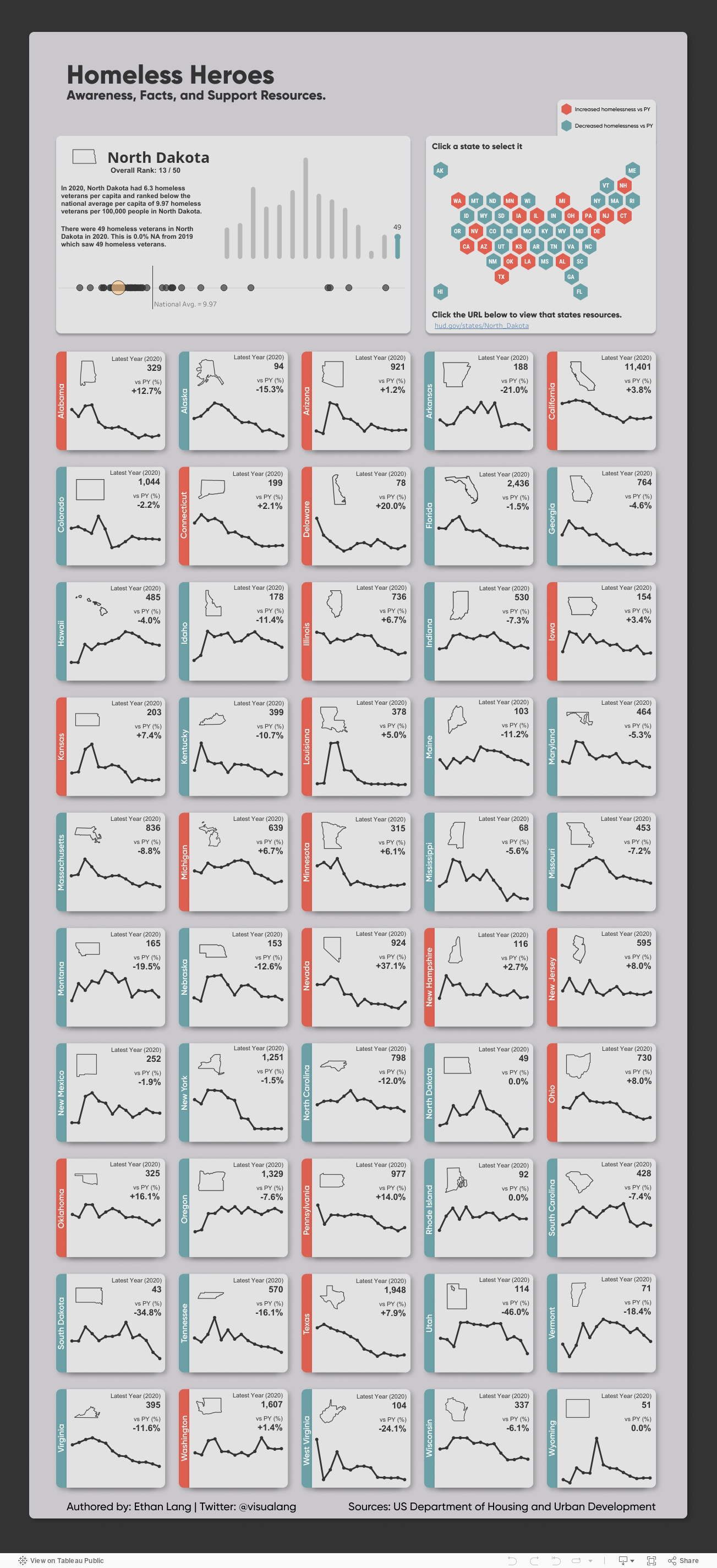
Source: Ethan Lang on Tableau Public
Here’s what I suggest you steal from this viz:
Side-by-side comparisons. It’s simple to compare states to one another since they are arrayed alongside each other.
Good news/bad news colors. The red/blue color coding makes it easy to discern states with decreased rates of homelessness from those with increased rates both in the national map and in the individual state charts.
Easy look up. If you want to dig into one state’s data, you can select it on the map and get more detail on the charts in the upper left hand panel.
To see past data tips, click HERE.
Let’s talk about YOUR data!
Got the feeling that you and your colleagues would use your data more effectively if you could see it better? Data Viz for Nonprofits (DVN) can help you get the ball rolling with an interactive data dashboard and beautiful charts, maps, and graphs for your next presentation, report, proposal, or webpage. Through a short-term consultation, we can help you to clarify the questions you want to answer and goals you want to track. DVN then visualizes your data to address those questions and track those goals.


