
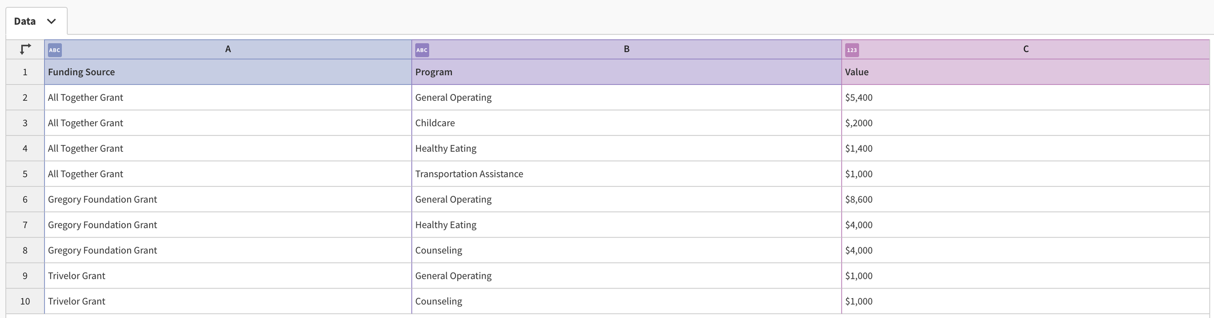
Here’s a helpful, easy, and even fun way to show where your organization’s money is coming from and where it’s going. It’s called a Sankey diagram. Creating a Sankey diagram with data viz tools that don’t have an express Sankey option (like Tableau) can be daunting. However, there are various websites that allow you to create them quite easily, including Flourish, which is where I created the diagram below for free. Give it a go by scrolling over the chart and using the filter.
I started by selecting a Sankey diagram template. Then I simply replaced the data in the template with my own data, which included three columns: funding source, program, and value. Flourish provides various options to customize the look of the diagram (font, color, etc.) And it gives you an embed code so that you can share it on your website.
To see past data tips, click HERE.
Let’s talk about YOUR data!
Got the feeling that you and your colleagues would use your data more effectively if you could see it better? Data Viz for Nonprofits (DVN) can help you get the ball rolling with an interactive data dashboard and beautiful charts, maps, and graphs for your next presentation, report, proposal, or webpage. Through a short-term consultation, we can help you to clarify the questions you want to answer and goals you want to track. DVN then visualizes your data to address those questions and track those goals.


