Here’s the second tip in a mini-series on three simple ways to use AI to make better charts. ICYMI, here’s the first tip in the series that I posted last week. I begin each of these tips with a caution on how NOT to use AI when visualizing data.
Don’t Use AI to make charts. As data viz guru Stephanie Evergreen says: “AI just makes it easier to make bad graphs” — those that are hard to decipher, poorly designed, and even show incorrect data. And with the amount of prompting that is needed to get a passable chart, current AI tools don’t save you much or any time. Humans are still better at visualizing data, bringing important knowledge to the game. This includes knowledge of the data itself, the intended audiences, and the contexts that help us to understand the significance of the data. Of course, AI is a young and developing tool. But it seems to me that as it gets better, humans just become more important. AI requires us to think more deeply in order to ask better questions of AI and to assess its output.
Do Use AI to clean and fill in missing data.
Nonprofit datasets often come from forms, spreadsheets, and surveys full of missing or inconsistent entries. Consider asking AI to clean and complete your data before visualizing it. AI tools can help you:
Spot duplicates or typos (e.g., “Chicago,” “chicago,” “Chi-town”).
Standardize formats (like dates or capitalization).
Remove unwanted columns/fields.
Sort the data by a particular field.
Add new data to the data file.
Suggest likely values for missing entries using simple patterns.
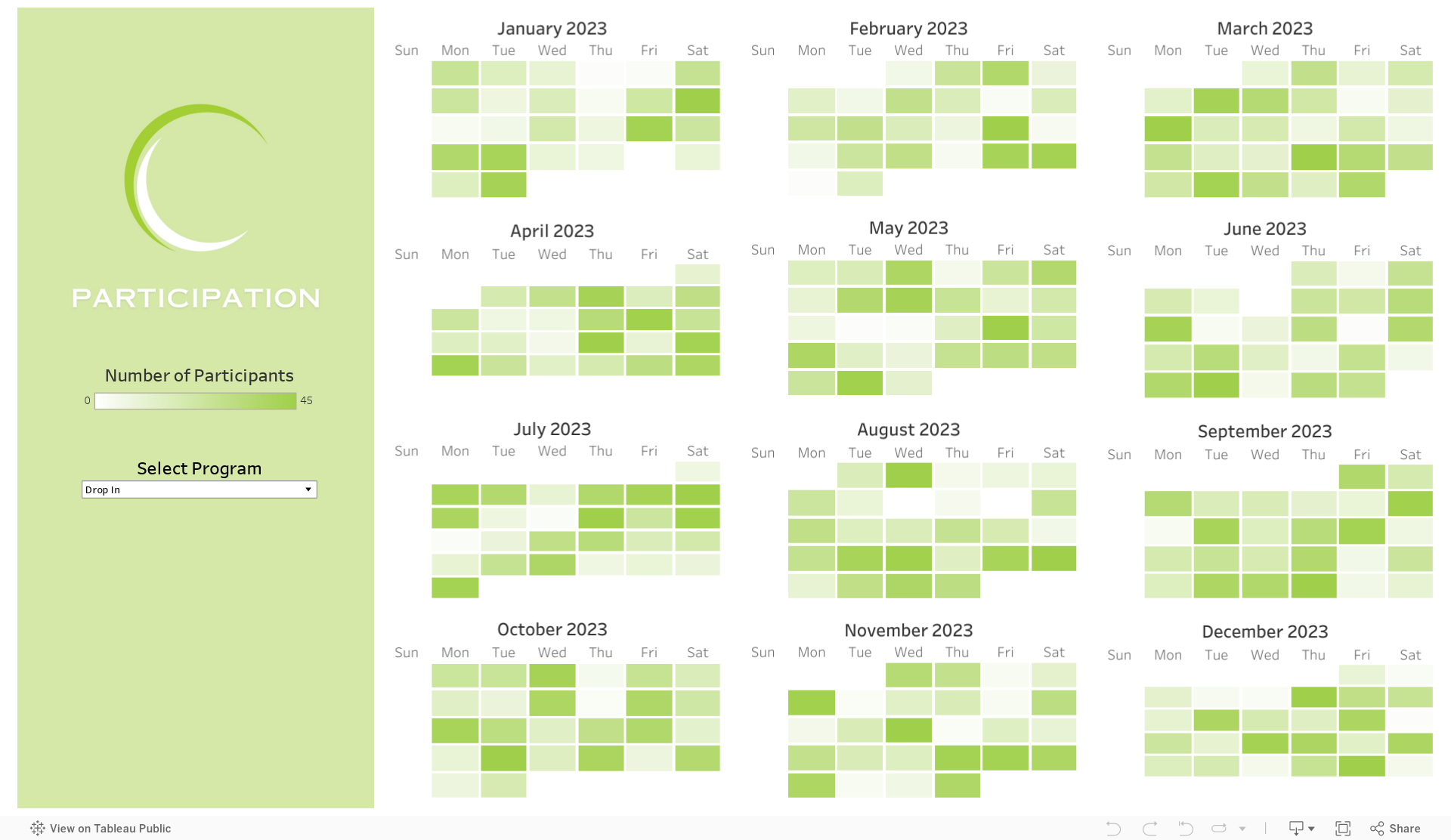
For example, a youth development organization might find that 30% of survey responses are missing participants’ ages. By asking an AI tool to infer likely age ranges based on program level (e.g., middle vs. high school program), the nonprofit can fill gaps responsibly—then flag those entries as estimates. That allows for a fuller, more accurate chart showing the age distribution of participants.
But be careful: AI guesses are still guesses. Always mark imputed values and verify patterns with human oversight—especially when sensitive demographic or personal data are involved.
Look for one more tip in this mini-series on using AI to make better charts in the coming weeks.

Let’s talk about YOUR data!
Got the feeling that you and your colleagues would use your data more effectively if you could see it better? Data Viz for Nonprofits (DVN) can help you get the ball rolling with an interactive data dashboard and beautiful charts, maps, and graphs for your next presentation, report, proposal, or webpage. Through a short-term consultation, we can help you to clarify the questions you want to answer and goals you want to track. DVN then visualizes your data to address those questions and track those goals.