
Reposted from February 2019
Today we arrive at Episode 6 of the 60-Second Data Tip series, “How to Hack a Bar Chart.” As we have discussed, bar charts are user-friendly and familiar, but familiarity can breed contempt. So this week we consider yet another variation of the bar chart called the funnel chart.
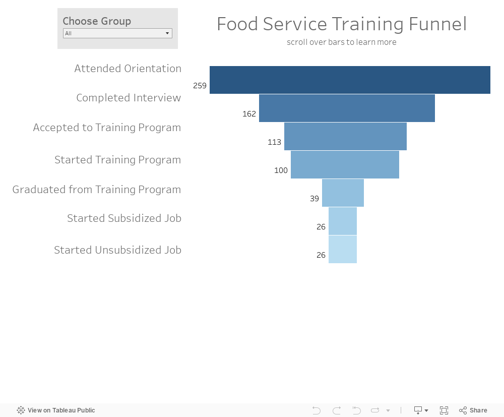
The funnel chart is used to visualize a process and how the amount of something decreases as it progresses from one phase to another. You might think of it as a pipeline.
The example below shows the decreasing number of participants at each stage of a food service training program. We can see that few of those who attend orientation make it all the way to a job. And we can see where there is the most/least drop off. This funnel is also interactive. You can see the funnels for particularly subgroups by changing the filter at the top.
It looks cool and makes intuitive sense, but a funnel chart is just a bar chart on its side with a mirror image. Check out these easy instructions for making funnel charts in Tableau and Excel.
To see past data tips, click HERE.
Let’s talk about YOUR data!
Got the feeling that you and your colleagues would use your data more effectively if you could see it better? Data Viz for Nonprofits (DVN) can help you get the ball rolling with an interactive data dashboard and beautiful charts, maps, and graphs for your next presentation, report, proposal, or webpage. Through a short-term consultation, we can help you to clarify the questions you want to answer and goals you want to track. DVN then visualizes your data to address those questions and track those goals.


