“All creative work builds on what came before.” —Austin Kleon in Steal Like An Artist.
Today I offer up another steal-worthy viz. This one is from the excellent Not-Ship blog in which Amanda Shendruk charts “the age of uncertainty.”
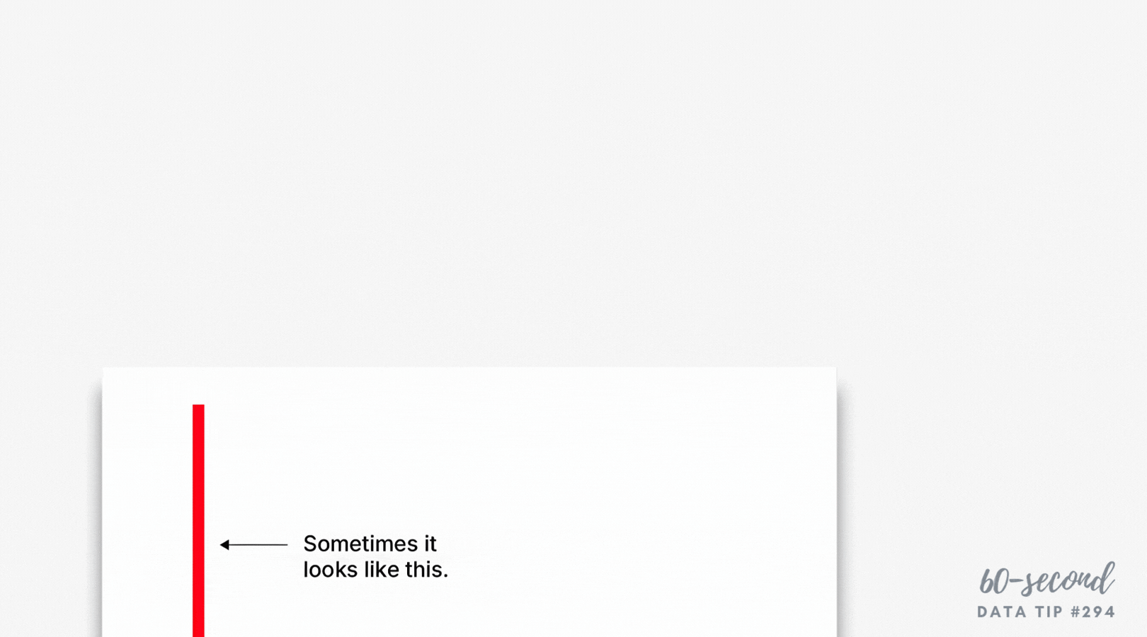
In the blog post, each of a series of charts positions a U.S. data point against a broader international comparison. The U.S. isn’t always the highest or lowest value, but by highlighting it consistently, readers can easily see how it compares and, in particular, where it diverges.
I recommend you steal this technique to:
Compare one key group (e.g., your organization, a target population, or a focal geographic area) to others.
Help viewers spot patterns across charts, not just within one chart.
Support a narrative about similarities, differences, or tradeoffs even when your focal group is not an outlier.
To see past data tips, click HERE.

Let’s talk about YOUR data!
Got the feeling that you and your colleagues would use your data more effectively if you could see it better? Data Viz for Nonprofits (DVN) can help you get the ball rolling with an interactive data dashboard and beautiful charts, maps, and graphs for your next presentation, report, proposal, or webpage. Through a short-term consultation, we can help you to clarify the questions you want to answer and goals you want to track. DVN then visualizes your data to address those questions and track those goals.


