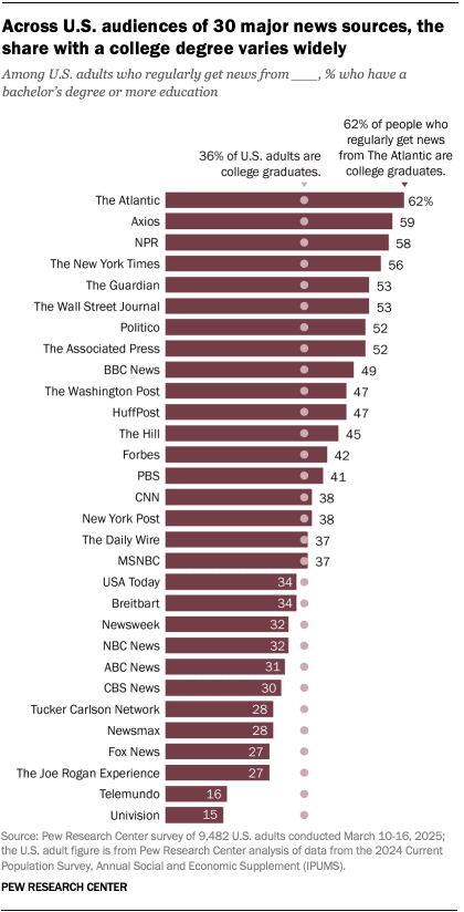
Source: Pew Research Center
In a Chart Chat video, data viz guru Jeffrey Shaffer critiques a Pew Research bar chart showing news outlets used by people with and without college degrees (shown to the right). At first glance, the chart seems to invite a clear ranking. As Shaffer points out, it would be easy to look at this chart and conclude that college-educated readers strongly prefer some outlets (like The Atlantic) over others (like Fox News). But that conclusion would be misleading.
Why? Because the bars represent outlets that differ in important, structural ways. For example, some outlets require subscriptions, while others are free.. They also vary in size. These issues may be driving what outlets people use more than — or in addition to — their level of education.
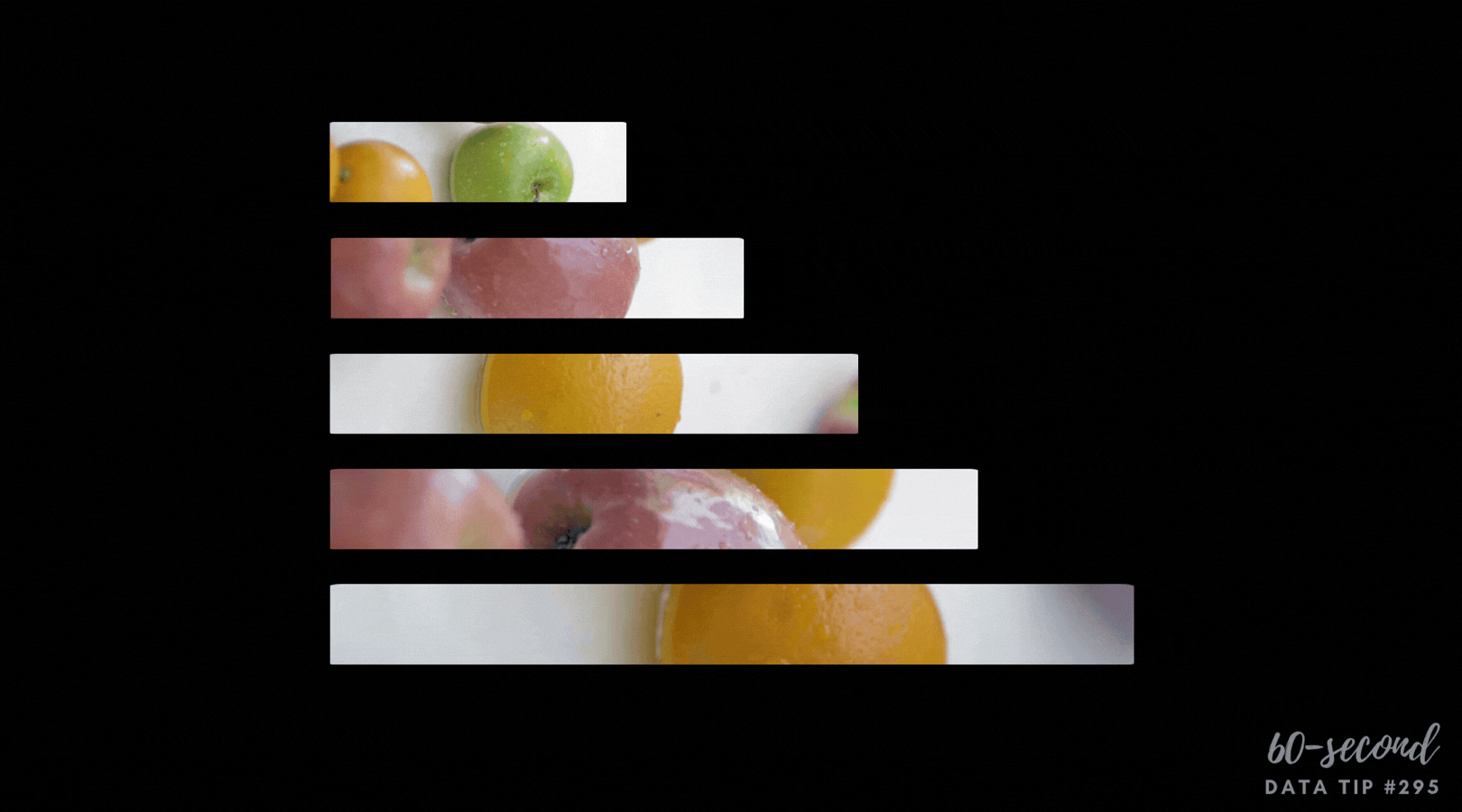
Why this matters for nonprofits: When nonprofits compare programs, clients, or partners in a bar chart, hidden differences can quietly distort the story. A chart may look clean, but the comparison may not be fair. Before sharing a bar chart, ask: Are these categories truly comparable — or are we accidentally comparing apples to oranges?

Let’s talk about YOUR data!
Got the feeling that you and your colleagues would use your data more effectively if you could see it better? Data Viz for Nonprofits (DVN) can help you get the ball rolling with an interactive data dashboard and beautiful charts, maps, and graphs for your next presentation, report, proposal, or webpage. Through a short-term consultation, we can help you to clarify the questions you want to answer and goals you want to track. DVN then visualizes your data to address those questions and track those goals.


