Looking for quick and powerful data-inspired ideas to energize your nonprofit communications or campaigns? Explore highlights from the 2024 Information is Beautiful Awards, where data storytelling shines—and learn how to bring similar clarity, impact, and beauty to your mission.
Humanitarian – Gold Winner
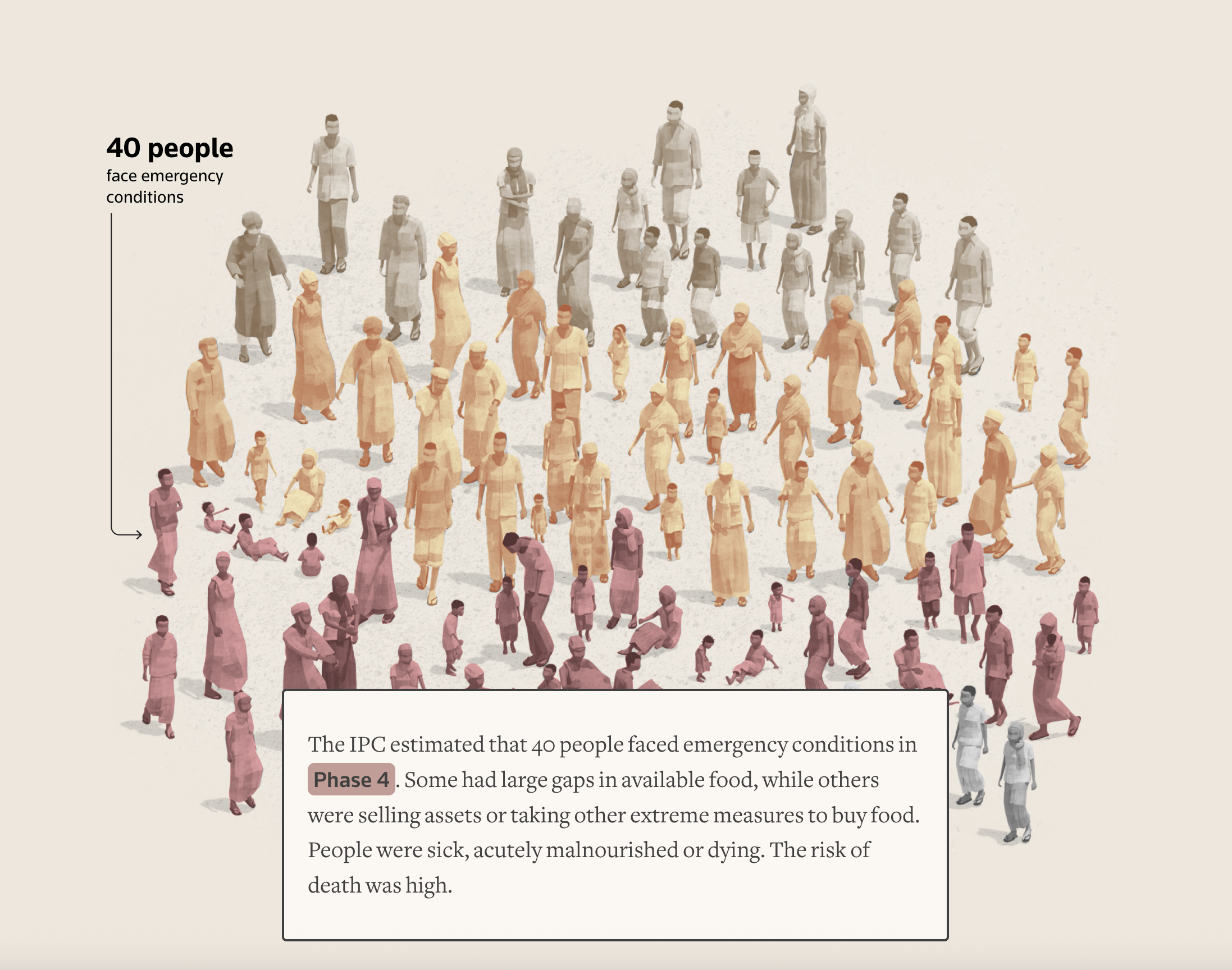
Source: Reuters
The world’s hunger watchdog warned of catastrophe in Sudan. Famine struck anyway. (Reuters)
This article leads you through a series of visualizations, to help you to understand a complex humanitarian crisis and how the world’s hunger monitoring-and-response system is falling short in addressing it. Visualizations, such as the one shown above, help you to comprehend the system’s classification of the problem by looking at a sample of 100 people living in Sudan’s Zamzam camp.
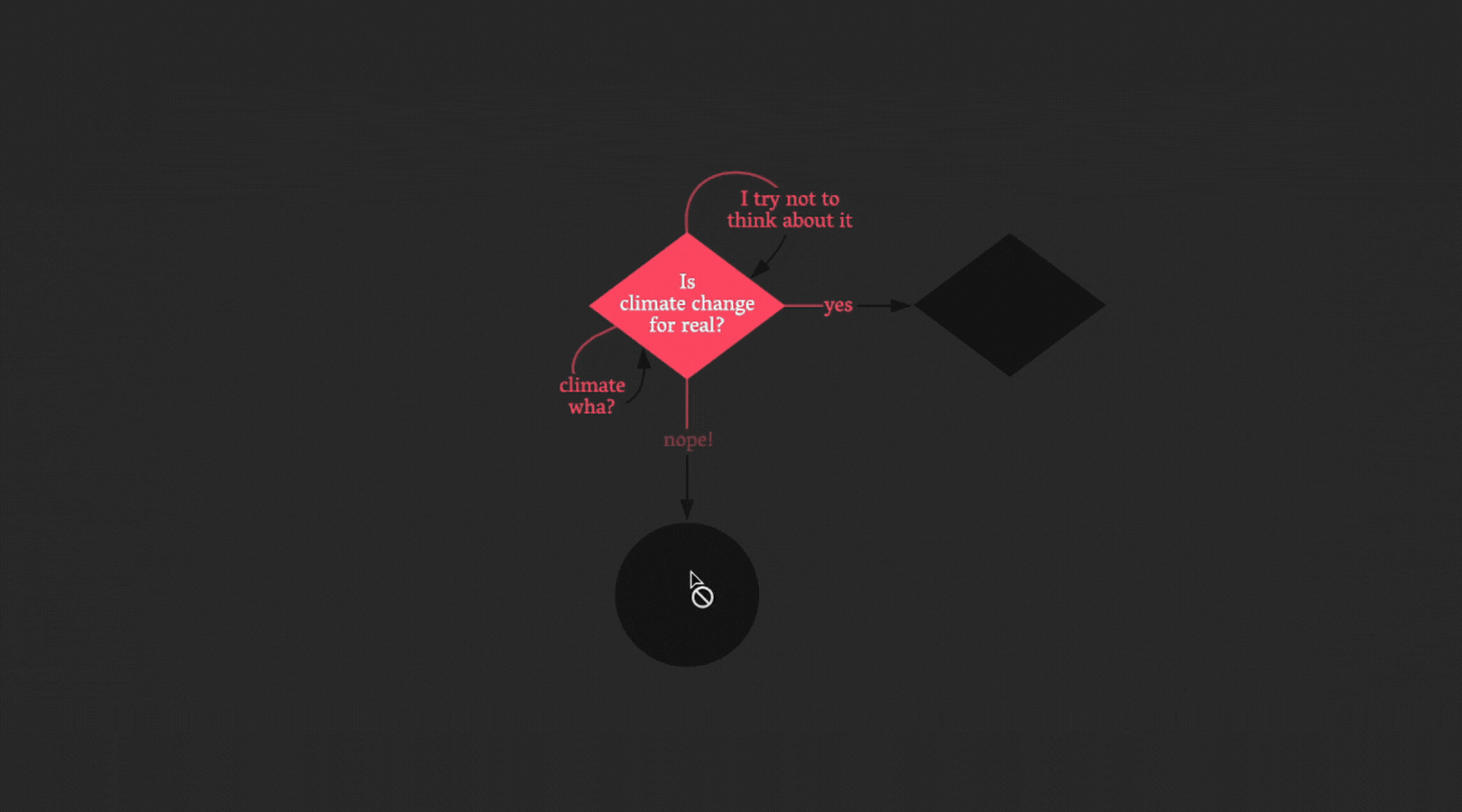
Places, Spaces & Environment – Gold Winner
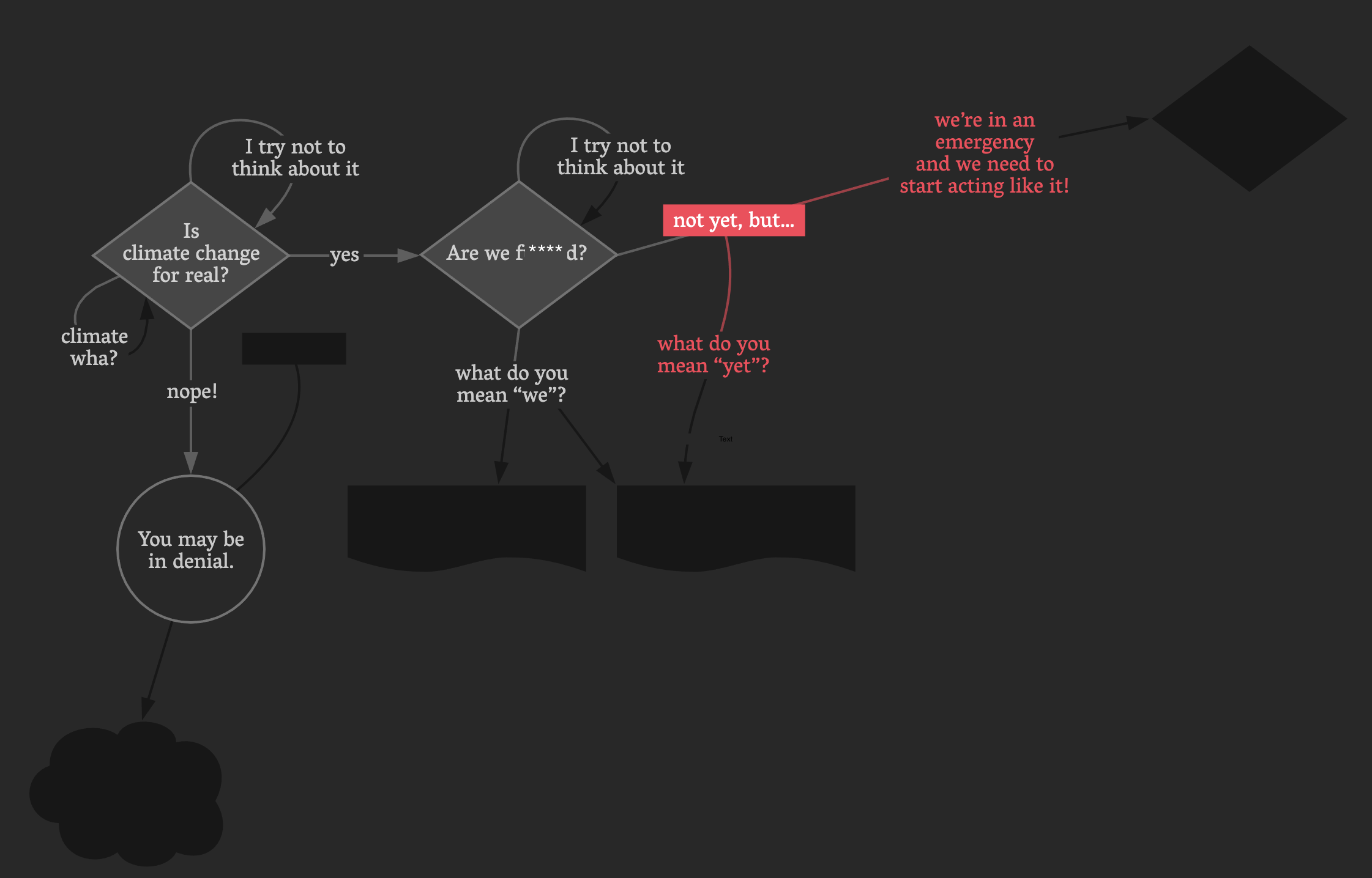
Source: I Want A Better Catastrophe
I Want a Better Catastrophe: A Flowchart for Navigating our Climate Predicament (University of Applied Sciences Potsdam)
This flowchart, which combines an audio narration with interactive elements, is an invitation to join Andrew Boyd, the designer, on his narrative path and explore the predicament on your own.
For more inspiration, check out other 2024 winners.
Let’s talk about YOUR data!
Got the feeling that you and your colleagues would use your data more effectively if you could see it better? Data Viz for Nonprofits (DVN) can help you get the ball rolling with an interactive data dashboard and beautiful charts, maps, and graphs for your next presentation, report, proposal, or webpage. Through a short-term consultation, we can help you to clarify the questions you want to answer and goals you want to track. DVN then visualizes your data to address those questions and track those goals.


