“All creative work builds on what came before.” —Austin Kleon in Steal Like An Artist.
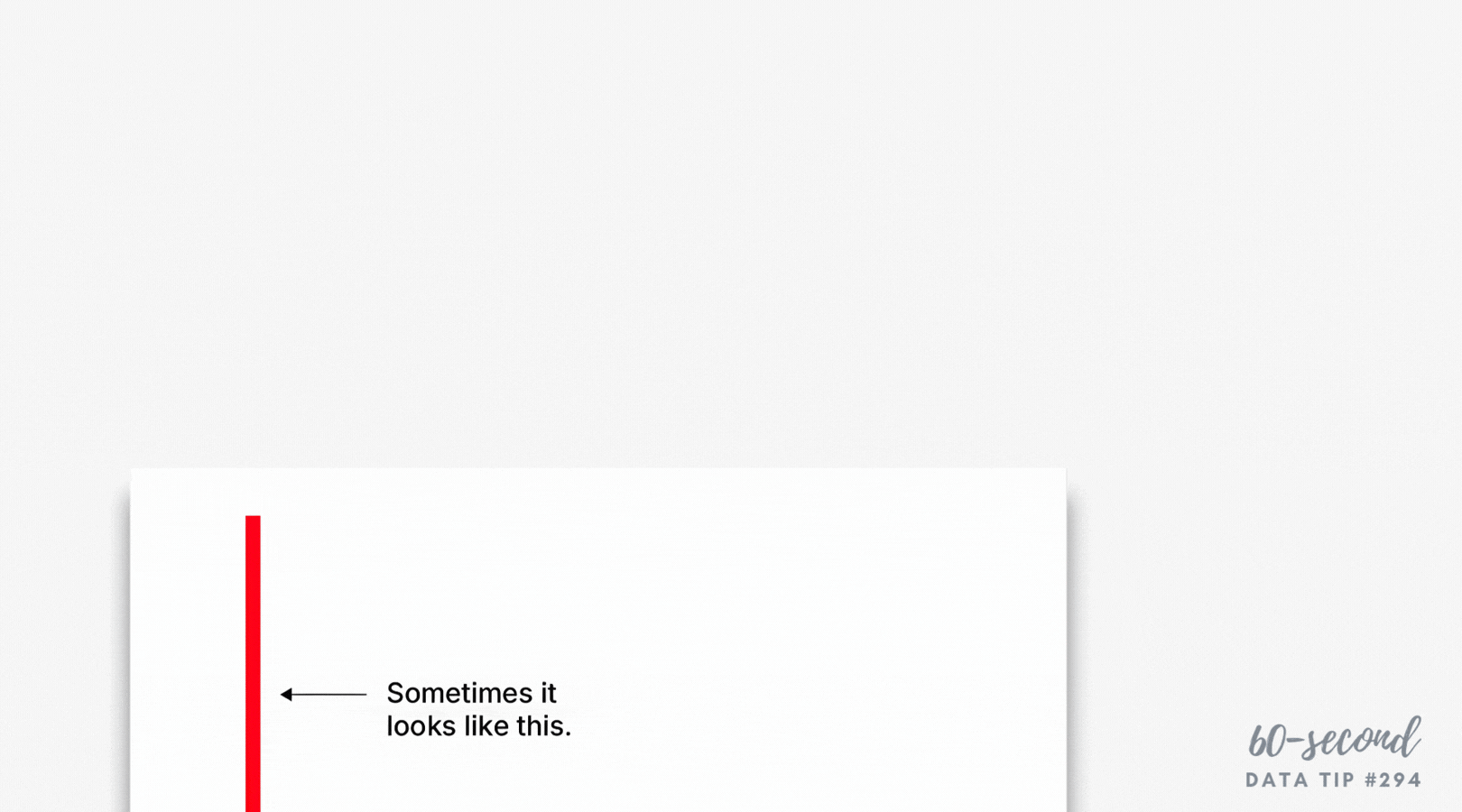
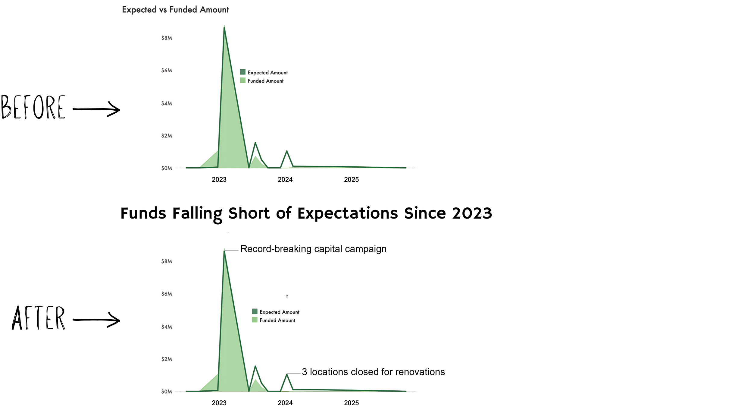
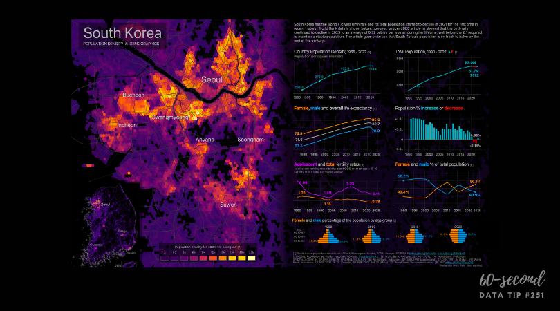
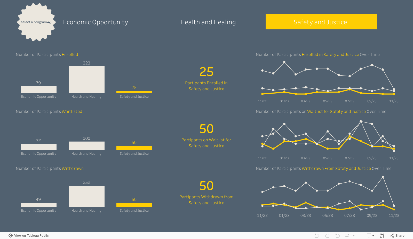
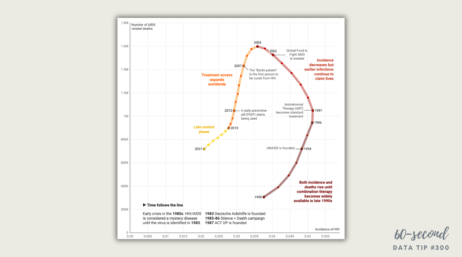
Today I offer up another steal-worthy viz. Luc Guillemot uses a connected scatterplot to show how the HIV/AIDS epidemic evolved over time.
Note: This is not a line chart! Here’s how to read it:
The X-axis (horizontal) shows the number of new HIV infections each year.
The Y-axis (vertical) shows the number of people dying from HIV/AIDS each year.
Time follows the line.
To understand it, start at the 1990 point in the bottom right, then follow the line year by year, reading the captions along the way.
Where the line turns from dark to medium red in the late 1990s, you’ll see something powerful: the line begins turning leftward because new infections begin falling. But deaths keep rising for years. The two measures are out of sync because people infected earlier were still dying before treatment became widely available.
A simple line chart wouldn’t show that relationship nearly as clearly. That’s why you should steal this approach. Use a connected scatterplot when:
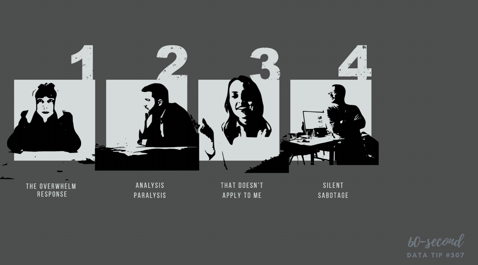
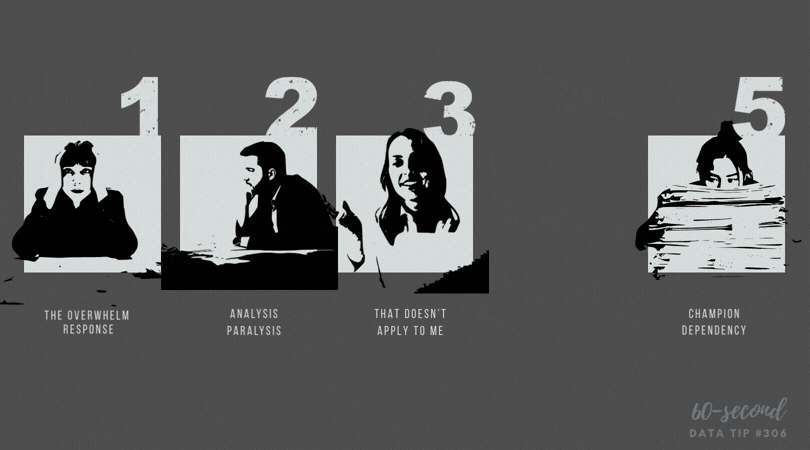
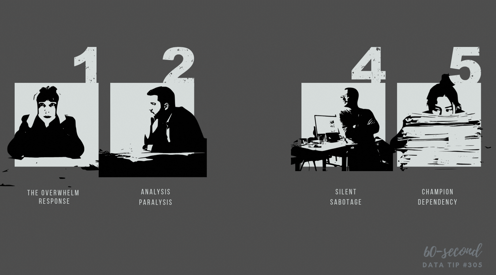
Results lag behind effort
Two metrics influence each other
Progress isn’t linear
For example: plot program participation (X) against successful outcomes (Y) over several years. If the line loops or bends, you may have uncovered delays between investment and impact.
When you want to show how two forces move together over time — not just whether they go up or down — connect the dots. Just make sure your audience knows where to start and what each axis means.
To see past data tips, including other steal-worthy data visualizations, click HERE.
Let’s talk about YOUR data!
Got the feeling that you and your colleagues would use your data more effectively if you could see it better? Data Viz for Nonprofits (DVN) can help you get the ball rolling with an interactive data dashboard and beautiful charts, maps, and graphs for your next presentation, report, proposal, or webpage. Through a short-term consultation, we can help you to clarify the questions you want to answer and goals you want to track. DVN then visualizes your data to address those questions and track those goals.