“All creative work builds on what came before.” —Austin Kleon in Steal Like An Artist.
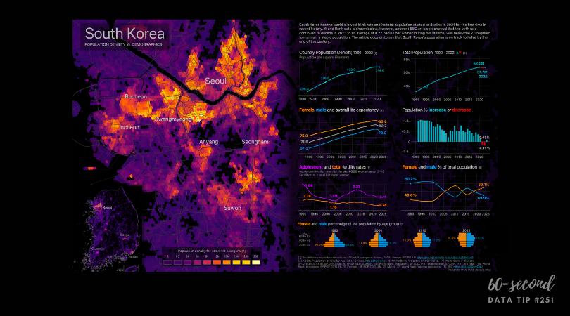
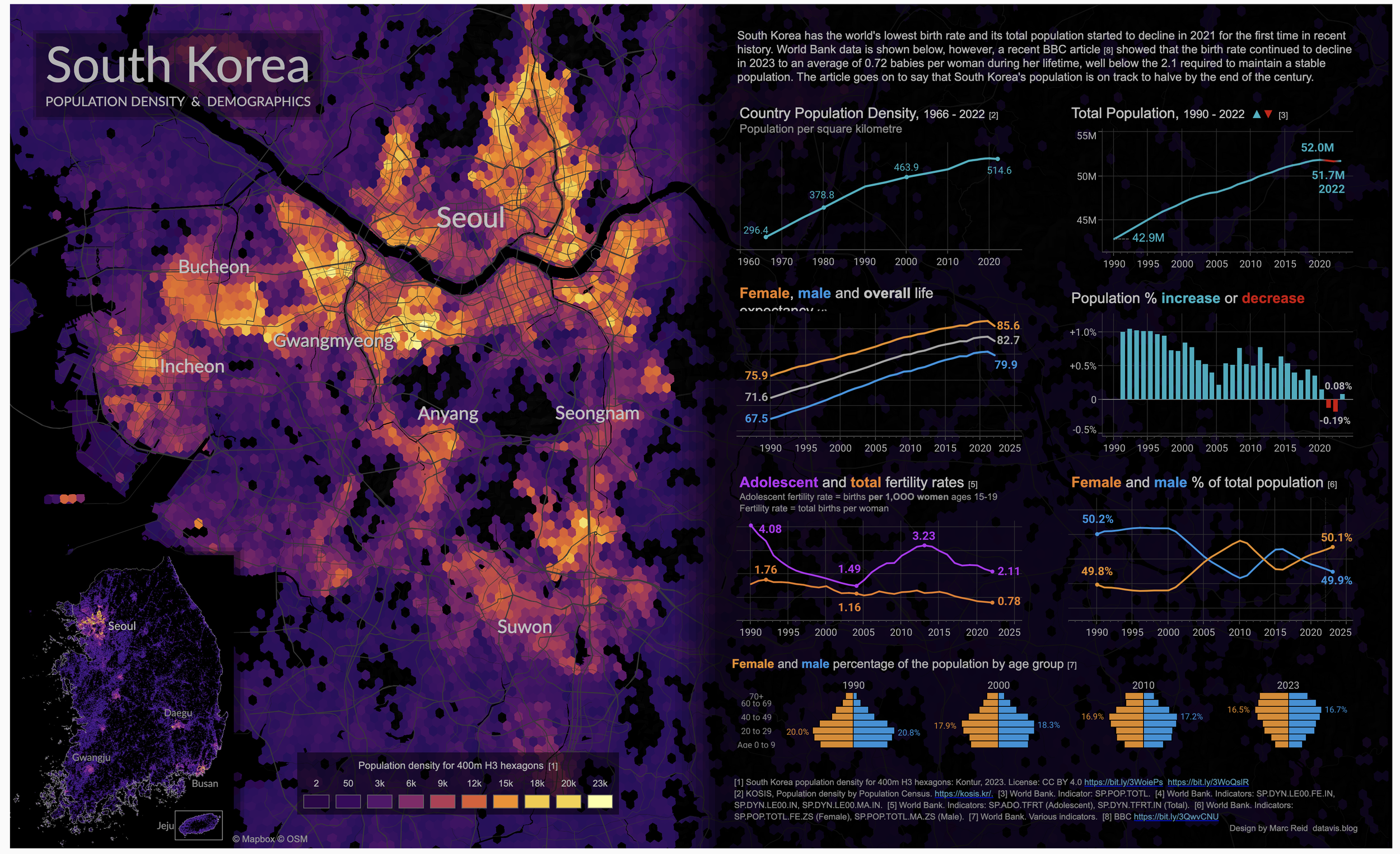
Today I offer up another steal-worthy viz that I came across in the Tableau Public Gallery. All nonprofits need to understand and show the demographics of their participants or the communities they serve. This dashboard of South Korea’s demographics uses some good strategies you can apply to your organization’s charts and maps. Keep scrolling to examine the dashboard and see my suggestions on what to steal from it.
Source: Marc Reid on Tableau Public
Here’s what I suggest you steal from this viz:
Heat = Density. The map uses warmer colors to show higher population density and cooler colors to show lower density. This makes finding the big population centers easy.
Charts for key demographics. A quick review of the charts on the right gives you a clear understanding of demographic trends over time.
Chart title as color legend. Using the chart title to explain the color coding in the chart is a great way to save space on small charts.
To see past data tips, click HERE.
Let’s talk about YOUR data!
Got the feeling that you and your colleagues would use your data more effectively if you could see it better? Data Viz for Nonprofits (DVN) can help you get the ball rolling with an interactive data dashboard and beautiful charts, maps, and graphs for your next presentation, report, proposal, or webpage. Through a short-term consultation, we can help you to clarify the questions you want to answer and goals you want to track. DVN then visualizes your data to address those questions and track those goals.


