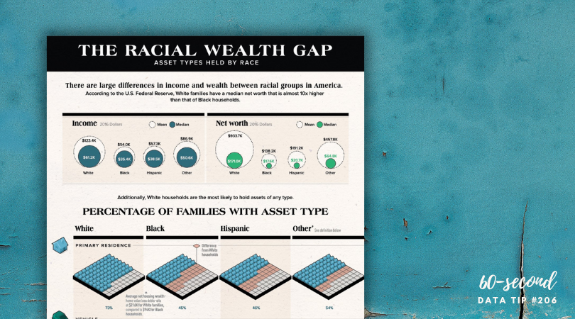
Today I offer up yet another steal-worthy viz. The Racial Wealth Gap viz uses data from the U.S. Federal Reserve’s Survey of Consumer Finances to show the proportion of households that own different kinds of assets by racial group. Here’s what I like about this chart (and what you should steal from it):
The use 100 families in addition to percentages. We can wrap our brains around 100 families. We can imagine it.
The use of icons that help tell the story and also remind us of Monopoly pieces.
Highlighting the gaps between the White group and other racial groups. The pink squares help us to appreciate how large the gaps are and how they compare across different asset groups.
To see past data tips, click HERE.
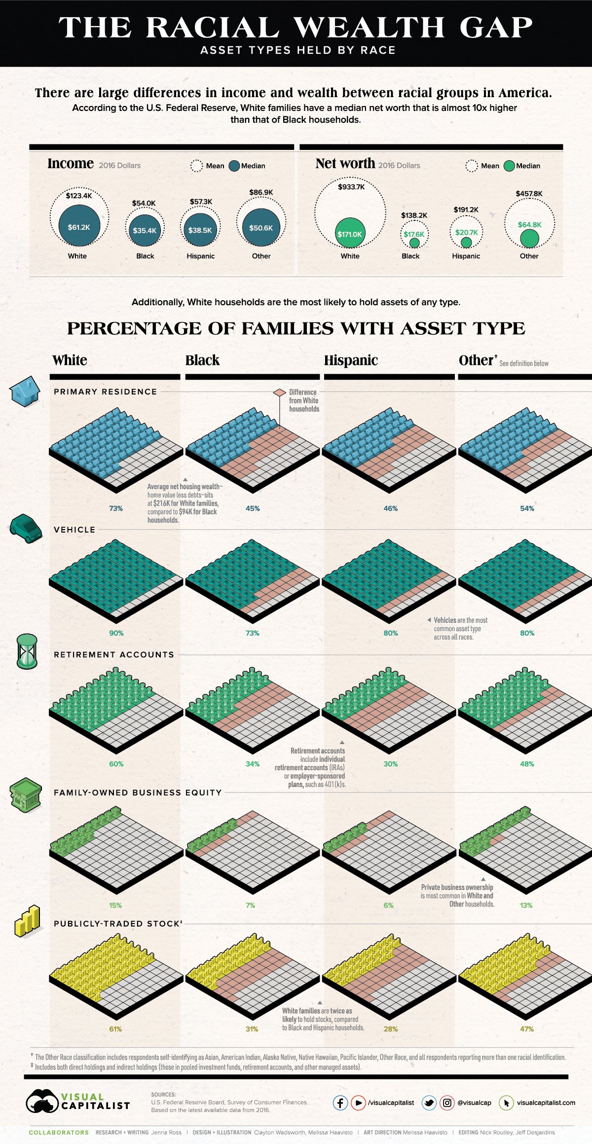
Source: The Visual Capitalist
Let’s talk about YOUR data!
Got the feeling that you and your colleagues would use your data more effectively if you could see it better? Data Viz for Nonprofits (DVN) can help you get the ball rolling with an interactive data dashboard and beautiful charts, maps, and graphs for your next presentation, report, proposal, or webpage. Through a short-term consultation, we can help you to clarify the questions you want to answer and goals you want to track. DVN then visualizes your data to address those questions and track those goals.


