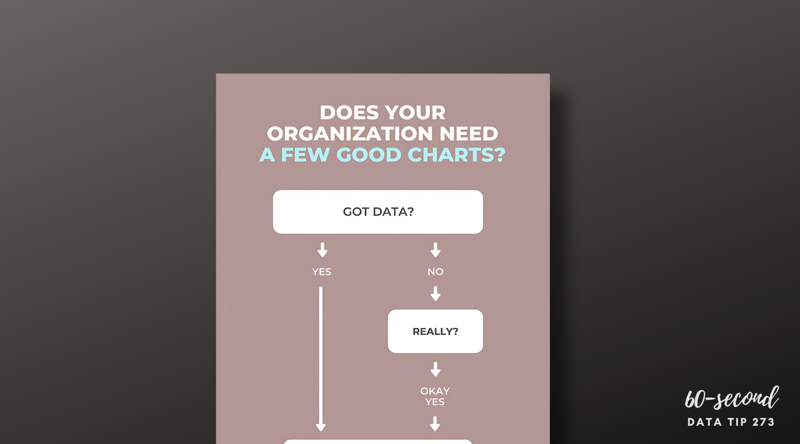
How To Choose The Right Chart

Copy of 60-SECOND DATA TIP.png

Reposted from September 2018 with updates!

There are many chart choosing tools out there. You can find online tools: just Google “chart chooser.” You also can use tools built into data visualization applications like Tableau or, of course, ask your friendly AI. But I still like this simple one: Andrew Abela’s decision tree called Chart Suggestions—A Thought-Starter.  It’s based on Gene Zelazny's classic work Say It With Charts. I like that it focuses on what you are aiming to show and gets you thinking about that. Indeed, it prompts thinking, as the name suggests, and thinking is a good activity to do before visualizing data!

The decision tree starts with the basic question: “What would you like to show?” And provides four options:

Comparison. You have two or more groups of things or people and you want to see which group is largest/smallest or highest/lowest (or somewhere in between) on some measure. You also may want to see how these groups compare on the measure overtime.

Distribution. You have a bunch of data points (e.g. the ages of participants in a program or test scores of students in a class) and you want to know how spread out or bunched up they are. Are most of the ages, test scores (whatever) near the average? Or is there a wide range? Are there some extreme outliers?

Composition. You want to understand who or what makes up a larger group such as how many of the participants in a program are in different age brackets or how many have been in the program for different lengths of time.

Relationship. You want to know if one thing is related to another, either at one point in time or overtime. Does more participation in a mental health program correlate with less distress over time? Do those with lower incomes have higher heart rates?

Once you answer this basic question, the decision tree helps you to choose a specific chart based on the type of data you have. Abela’s chart chooser includes the types of charts you are most likely to select. But there are more rare species out there. To learn more about the wide array of ways to visualize data, check out the Data Visualisation Catalog.

However, I will leave you with a word of caution. And that word is: “Xenographphobia” or fear of weird charts. It’s a thing. And you should be aware of it. Although we might like the look of sexy charts, we don’t usually have the time or patience to figure them out. So in the interest of creating a positive and productive user experience, consider sticking with the charts folks already know how to read or are self-explanatory.


Let’s talk about YOUR data!

Got the feeling that you and your colleagues would use your data more effectively if you could see it better? Data Viz for Nonprofits (DVN) can help you get the ball rolling with an interactive data dashboard and beautiful charts, maps, and graphs for your next presentation, report, proposal, or webpage. Through a short-term consultation, we can help you to clarify the questions you want to answer and goals you want to track. DVN then visualizes your data to address those questions and track those goals.


Column chart with line chart by HLD, Line Graph by Creative Stall, Pie Chart by frederick allen, Radar Chart by Agus Purwant, and sankey diagram by Rflor (from the Noun Project)

Understand Your Volunteers Using "Pantry Staple" Data

If your organization is like most nonprofits, you rely on volunteers to get the job done. And you probably have at least some basic “pantry staple” data on volunteers.

Pantry Staple Data: Volunteer Data

The volunteer data you already have can be leveraged to:

  • Impress funders, donors, and other stakeholders. Show them how you are using this free resource to move the needle.

  • Recruit new volunteers. As we have discussed in this blog before, we are all influenced by peers. So show how many volunteers you have to attract even more.

  • Manage volunteers more effectively. Seeing clearly what’s going on with your volunteers will help you to retain them, make better use of them, and recruit new ones. This is the subject of today’s tip.

Use Case: Maximizing Volunteer Time and Value

This volunteer data dashboard uses a variety of charts to answer the who, what, where, and when questions that you may have about your volunteers. With this detailed view of volunteers, an organization can start thinking about how to activate inactive volunteers, what types of new volunteers to target, and when during the year to deploy volunteers.

Source: Jin Tat on Tableau Public

Source: Jin Tat on Tableau Public

This simple map dashboard provides insight into the distribution of volunteers—and volunteer hours—among sites. This understanding can help you decide if and how to redistribute volunteers. Both this dashboard and the one above can be created using Tableau Public, the free version of Tableau.

Source:CCE on Tableau Public

Source:CCE on Tableau Public

To see past data tips, click HERE.


Let’s talk about YOUR data!

Got the feeling that you and your colleagues would use your data more effectively if you could see it better? Data Viz for Nonprofits (DVN) can help you get the ball rolling with an interactive data dashboard and beautiful charts, maps, and graphs for your next presentation, report, proposal, or webpage. Through a short-term consultation, we can help you to clarify the questions you want to answer and goals you want to track. DVN then visualizes your data to address those questions and track those goals.


A Simple Way to Improve Nonprofit Charts

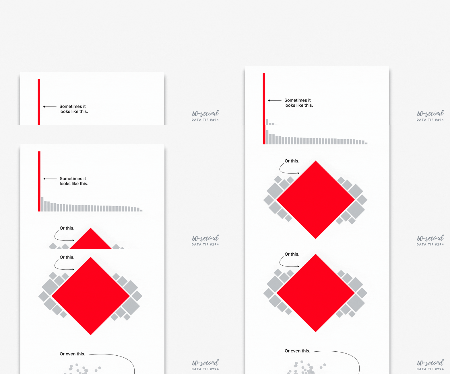
Sometimes showing whether something happened or not is more powerful than showing how much it changed over time. A recent Grist article highlights this idea through a striking example: instead of showing gradual temperature shifts over time (see the lefthand chart below), scientists simply showed whether a lake froze each winter—yes or no—across several decades (see righthand chart below). People who saw the righthand chart were more likely to perceive climate change as causing more abrupt changes.

Source: Grist

This binary approach—did/didn’t, yes/no, on/off—turns complex data into clear signals. And it’s not just for climate science. Nonprofits can use it to communicate impact in a way that’s instantly understood. Long-term trends are easier to see, and it evokes a stronger emotional response.

Try this in your nonprofit work:

  • Show which years a program met its goals and which it didn’t.

  • Visualize which communities have (or don’t have) access to a key service.

  • Use a yes/no timeline to highlight when a resource was available.

Binary visuals don’t oversimplify—they clarify. Read the full story here: Grist – Scientists just found a way to break through climate apathy.

To see past data tips, click HERE.


Let’s talk about YOUR data!

Got the feeling that you and your colleagues would use your data more effectively if you could see it better? Data Viz for Nonprofits (DVN) can help you get the ball rolling with an interactive data dashboard and beautiful charts, maps, and graphs for your next presentation, report, proposal, or webpage. Through a short-term consultation, we can help you to clarify the questions you want to answer and goals you want to track. DVN then visualizes your data to address those questions and track those goals.


3 PowerPoint Laws to Always Obey

60-SECOND DATA TIP_3 (1).png

Reposted from April 2019

Charts, graphs, and maps often make their debut in PowerPoint presentations (or the like.) This is a problem. A bad PowerPoint can kill even a great data visualization.

We already know PowerPoints are a problem. We have napped through many of them in our careers. And we even know, when we are on the creating end, that they shouldn’t be text heavy. But we don’t know what else to do besides typing in a few bullet points and pasting in some bad clip art.

Since I’m committed to giving you something useful in 60-second portions, this week I give you my top three PowerPoint laws (yes laws – you might not take mere recommendations as seriously, and this is important!)

Law #1: Slides are for seeing. Think about the last subtitled movie you saw. Did you miss a lot of the action while reading? Research shows we are quite good at simultaneously processing pictures and spoken words. But our brains go on overdrive when processing pictures plus written text – like during subtitled movies. And our brains can completely shut down when processing written text plus spoken words, which is what we ask audiences to do during our Powerpoints.* So move those bullet points to your script or speaking notes and use a well-designed data visualization or a great photo.

Law #2: Portion control. The hard truth is that our audience members are going to walk away from our presentation retaining just a few ideas whether we like it or not. If we shower them with ten, twenty, thirty ideas, we don’t control which ones they retain. So choose just a few and weed out the rest. Then feature only one idea per slide. And go easy on the charts, maps, and graphs. They are more difficult to process than photos or illustrations, so give your viewers a cognitive break between charts.

Law #3: Obey visual hierarchy. Remember what Antoine de Saint-Exupery said: “Perfection is achieved, not when there is nothing more to add, but when there is nothing left to take away.” Simplify your slides with one compelling image or one chart, map, or graph (which, itself, has been stripped down to what is necessary). Make sure there is plenty of empty space around the image or chart to give it prominence. Then enlarge only the most important elements while reducing the size of the rest. Similarly, use color sparingly to draw attention to the most important aspects of the slide. And for much more on visual hierarchy, check out this great article on Canva.

* For more on this, check out Moreno and Mayer’s studies on multimedia learning.

Photos by NeONBRAND and Cody Davis on Unsplash


Let’s talk about YOUR data!

Got the feeling that you and your colleagues would use your data more effectively if you could see it better? Data Viz for Nonprofits (DVN) can help you get the ball rolling with an interactive data dashboard and beautiful charts, maps, and graphs for your next presentation, report, proposal, or webpage. Through a short-term consultation, we can help you to clarify the questions you want to answer and goals you want to track. DVN then visualizes your data to address those questions and track those goals.


Lighten Cognitive Load, Boost Clarity: Smarter Data Visualizations for Nonprofits

When visualizing data, we should always consider cognitive load. What’s that? It’s the mental effort required to process information. There are two types of cognitive load: extraneous and intrinsic. Let's consider each in relation to data visualizations.

  • Extraneous cognitive load concerns how information is presented. There's a lot we can do to reduce the extraneous cognitive load of a chart.

  • Intrinsic cognitive load concerns the complexity of the information being shared. You can reduce intrinsic load only by altering what is being learned or by changing the knowledge levels of learners.

We can reduce the extraneous cognitive load of any chart through careful choices about titles, annotations, colors, use of white space, etc. But we are much more limited in what we can do to reduce the intrinsic cognitive load of a chart. I’d argue that the primary thing we can do is to choose a chart type that does not increase the intrinsic load by requiring the viewer to learn how to read the chart. So familiar or intuitive chart types usually work best.

Let's consider this data dashboard in terms of cognitive load. It has several different chart types.

The bar charts impose a fairly low intrinsic and extraneous cognitive load. We already know how to read a bar chart. They each show one measure which we probably can understand, such as C02 global share or CO2 per GDP across several years. And the compositions and colors aid interpretation. The cumulative carbon clock, however, is a different story. It may grab our attention with its novelty. It's a radial column chart (aka circular column graph or star graph.) But most of us will have to figure out how to read this chart using the color and shape legends to understand what the chart is showing and how it is showing it. I also find the circular shape, which usually suggests some type of cycle, confusing because there is no cycle inherent to this data. I think the costs of the radial column chart outweigh its benefits.


Let’s talk about YOUR data!

Got the feeling that you and your colleagues would use your data more effectively if you could see it better? Data Viz for Nonprofits (DVN) can help you get the ball rolling with an interactive data dashboard and beautiful charts, maps, and graphs for your next presentation, report, proposal, or webpage. Through a short-term consultation, we can help you to clarify the questions you want to answer and goals you want to track. DVN then visualizes your data to address those questions and track those goals.


Avoid This Danger When Choosing Metrics

Reposted from July 2019

I’m all about making data clear and easy-to-digest. But there is a danger in it. The clarity may cause you to accept what the data seems to tell you. You may not linger. You may not reflect.

Writer Margaret J. Wheatley warns us that “without reflection, we go blindly on our way, creating more unintended consequences, and failing to achieve anything useful.”

Economist Charles Goodhart recognized this danger in the metrics we create to measure our progress. At first, a certain metric may seem like a good indicator of progress. If we want kids in an after-school track program to increase their endurance, we might measure how far they run at the beginning of the program and then again at the end.  Makes sense, right? We might then try to motivate students by offering them free running shorts if they increase their miles by a certain amount. But, that’s when students might start gaming the system. They can increase their miles not only by training hard and running farther over time but also by running very short distances at the start. This is the kind of unintended consequence that Goodhart warned us about. His law states: “When a measure becomes a target, it ceases to be a good measure.” 

The solution? First, reflection. Consider the potential unintended consequences of each of your metrics, particularly those tied to incentives. Second, use multiple metrics to provide a more balanced understanding of progress.  In our running example, in addition to the change in miles participants run, you might also measure resting heart rates at the beginning and end of the program, knowing that a lower resting heart rate generally indicates a higher level of cardiovascular fitness.


Let’s talk about YOUR data!

Got the feeling that you and your colleagues would use your data more effectively if you could see it better? Data Viz for Nonprofits (DVN) can help you get the ball rolling with an interactive data dashboard and beautiful charts, maps, and graphs for your next presentation, report, proposal, or webpage. Through a short-term consultation, we can help you to clarify the questions you want to answer and goals you want to track. DVN then visualizes your data to address those questions and track those goals.


Wait, What? Numbers That Bewilder

60-SECOND DATA TIP_3 (1).png

Reposted from July 2019

Numbers can bewilder our hunter-gatherer brains. For more than 95 percent of human history, folks were not processing written numbers or words. But they were processing visual information in the form of color, shape, and size. It’s not surprising that our brains, evolved over many thousands of years, are better at understanding data in visual form than in word and number form. So when numbers confuse, try “translating” them to the visual.

Here’s a great example of a number that makes me scratch my head: “54% more students with monitors improved attendance than students without monitors.” The statement relates to a fictional program that (like some non-fictional programs) pairs students with monitors to boost their attendance. At first blush, to me, that sounds pretty impressive. It sounds like this: if 10% of the students without monitors improved their attendance, then 64% (10% + 54%) with monitors improved their attendance. Or, put another way, six times as many kids with monitors improved their attendance as kids without monitors.

But my brain just made a wrong turn. That 54% is showing what statisticians call “relative difference.” And the problem with this type of stat is that indicators with low values have a tendency to produce large relative differences even when the “absolute difference” is small.

Okay, still bewildered? No worries, I give you now a picture for your primitive brain. Let’s say, in our fictional program, there are 10 students per class. In one class, all of the kids got paired with monitors. In the other class, none of the kids did. The picture below shows how many kids in each class improved their attendance.


So the difference (aka “absolute difference”) is 1.4 (4.0-2.6) which means that 1.4 more kids in the class with monitors improved their attendance. How did that measly 1.4 become 54%? Well, relative difference is calculated as the absolute difference divided by the “standard” which, in this case, is the class without monitors. So 4.0 minus 2.6 divided by 2.6 or .54, which when expressed as a percentage is 54%.

If relative difference requires varsity level processing for many of us, then percentages are junior varsity. So if I were visualizing the difference between the two groups, I would stay away from both and use an icon chart, like the one above. I might make it even more concrete by showing 25 person icons in each group since the typical elementary school classroom has 25 students. I would then use color to show that 6.5 students out of 25 without monitors had improved attendance and 10 students out of 25 with monitors had improved attendance. So, if you bring the program to a typical classroom, you might expect it to improve the attendance of an additional 3 to 4 kids.

Bottom line? Numbers can be like road signs pointing us in the wrong direction. To move folks in the right direction, make your message concrete and visible.

See other data tips in this series for more information on how to effectively visualize and make good use of your organization's data.


Let’s talk about YOUR data!

Got the feeling that you and your colleagues would use your data more effectively if you could see it better? Data Viz for Nonprofits (DVN) can help you get the ball rolling with an interactive data dashboard and beautiful charts, maps, and graphs for your next presentation, report, proposal, or webpage. Through a short-term consultation, we can help you to clarify the questions you want to answer and goals you want to track. DVN then visualizes your data to address those questions and track those goals.


One Of The Most Popular Data Viz Technologies May Surprise You

According to the State of The Data Viz Industry Survey, the percent of respondents who used “pen and paper” to create charts, maps, and graphs ranged between 25 and 31 percent from 2019 to 2022 but then shot up to 58 percent in 2023 and 60 percent in 2024. This was the biggest increase of any of the technologies including Power BI, Tableau, and Excel. With so many applications out there to create sleek data visualizations, why are so many drawn to this low-tech, old-school technique?

The short answer is: I don’t know. But I have some ideas . . .

Hand-drawn visualizations are relatable.

We humans seem to be drawn to anything that suggests humanness. Pata Gogova’s What is (not) love? visualization mixes hand-drawn elements with charts created with Tableau to effectively draw our attention to certain aspects of the visualization. “A handmade visualisation can lend a feeling of friendliness to a story,” notes Amelia McNara, “Quite often, computer-generated visualisations feel sterile and can be inaccessible to certain audiences.”

Hand-drawn visualizations suggest uncertainty.

In her Ted Talk called 3 Ways To Spot A Bad Stat, Mona Chalabi emphasizes the importance of showing uncertainty when presenting data. She does that by using hand-drawn charts like the one below. Its unpolished look perhaps prevents viewers from unconsciously accepting what is shown. The result may appear more honest than a sleek presentation with all the requisite disclaimers about the limitations of the data in small type below the chart.

Hand-drawn visualizations aid exploration.

They aren’t limited by an application’s capabilities and thus allow you to think outside the box plot, bar chart, or line graph. And, as Stefani Posavec and Georgia Lupi (who have written several books on visualizing personal data by hand) note, drawing aids memory. Even if you end up visualizing your data digitally, beginning with a pen and paper will help you to explore and absorb your data.

Source: flickr

To see past data tips, click HERE.


Let’s talk about YOUR data!

Got the feeling that you and your colleagues would use your data more effectively if you could see it better? Data Viz for Nonprofits (DVN) can help you get the ball rolling with an interactive data dashboard and beautiful charts, maps, and graphs for your next presentation, report, proposal, or webpage. Through a short-term consultation, we can help you to clarify the questions you want to answer and goals you want to track. DVN then visualizes your data to address those questions and track those goals.


Top 10 Data Tips of 2024

Here are the top ten reader favorites of 2024, in case you missed them. Looking forward to sharing more 60-Second Data Tips with you in 2025.

To see past data tips, click HERE.


Let’s talk about YOUR data!

Got the feeling that you and your colleagues would use your data more effectively if you could see it better? Data Viz for Nonprofits (DVN) can help you get the ball rolling with an interactive data dashboard and beautiful charts, maps, and graphs for your next presentation, report, proposal, or webpage. Through a short-term consultation, we can help you to clarify the questions you want to answer and goals you want to track. DVN then visualizes your data to address those questions and track those goals.


Best Data Viz of 2024

Looking for a fun (if somewhat geeky) study/work break? Check out these best-of lists for 2024:

New York Times

Visual Capitalist

FlowingData

The Webby Awards

To see past data tips, click HERE.


Let’s talk about YOUR data!

Got the feeling that you and your colleagues would use your data more effectively if you could see it better? Data Viz for Nonprofits (DVN) can help you get the ball rolling with an interactive data dashboard and beautiful charts, maps, and graphs for your next presentation, report, proposal, or webpage. Through a short-term consultation, we can help you to clarify the questions you want to answer and goals you want to track. DVN then visualizes your data to address those questions and track those goals.


How To Present Diversity Data (or What To Steal From This Diversity Scorecard)

Reposted from February 2022

Today’s tip is to take inspiration from Chantilly Jaggernauth’s excellent diversity scoreboard displayed below. It shows diversity among employees in a company but can easily be applied to staff or participants in a nonprofit organization.

I suggest you steal the following ideas from Chantilly:

  • Metric Definitions. In a Tableau Conference session, Chantilly shares the pros and cons of the four metrics in the dashboard. See image of the slide below. None of the metrics are perfect. But together they provide an understanding of where an organization is in its diversity efforts. These definitions are not incorporated in the dashboard itself but could be added through a link or in a tooltip (scroll over) feature.*

  • Views of Diversity. The dashboard provides three views of diversity: overall, gender, and people of color (POC). By providing side-by-side charts with these three views, the dashboard allows users to see variations that overall diversity charts obscure.

  • Color Coding. Each type of diversity has its own color, which makes the comparison among overall, gender, and POC easy, even when you scroll down and can no longer see the column headers. Also the comparison groups (non-diversity, male, and non-POC) are represented by the same colors in lighter shades. This approach makes the dashboard easier to understand. Assigning three additional colors for the comparison groups could be confusing and require a color legend.

  • Simple Charts. These are all charts we all know how to read. So the scorecard is accessible immediately to anyone, even if they are not familiar with the data or the organization.

  • Also, note that the dashboard and the slide use different terms for two of the metrics.

Source: HR Diversity Scorecard on Tableau Public by Lovelytics

Image above from Tableau Conference session called “Next Gen Analytics for Your New Normal” on 11/10/21.


Let’s talk about YOUR data!

Got the feeling that you and your colleagues would use your data more effectively if you could see it better? Data Viz for Nonprofits (DVN) can help you get the ball rolling with an interactive data dashboard and beautiful charts, maps, and graphs for your next presentation, report, proposal, or webpage. Through a short-term consultation, we can help you to clarify the questions you want to answer and goals you want to track. DVN then visualizes your data to address those questions and track those goals.


Context is King

Reposted from July 2023

This “sketchplanation” elegantly demonstrates the importance of context in understanding anything. Since data visualizations are supposed to help people understand something, we should pay close attention to context when creating them, adding as much context as is needed for others to appreciate what’s going on and act on it. Considering the following charts . . .

Low-context chart

This is your garden variety chart. I see them all the time. Sure, it provides some context by comparing clients served in different zip code areas. But it doesn’t give me enough context to understand if these numbers are high, low, or somewhere in between. This chart needs more context.

Moderate-context chart

This chart is better than the one above. By providing the previous year’s numbers, we can see where there has been increases and decreases and how large and small they were as well as compare the number increases (3) to the number of decreases (1).

Moderate-context chart

This chart, too, allows for better assessment of the numbers than the first chart did. By simply adding a reference line for the goal, we have a better understanding of what’s going on and where we might need to take action. A reference line showing the average number of clients per zip code might also be helpful.

High-context chart

This “small multiples chart”* gives us much more context by showing how the current numbers compare to past years. Consider, for example, the trend for 60601. Just knowing the current and past years’ numbers would not give you an appreciation of the overall upward trend.

*Small multiples chart: a series of similar graphs or charts using the same scale and axes, allowing them to be easily compared


Let’s talk about YOUR data!

Got the feeling that you and your colleagues would use your data more effectively if you could see it better? Data Viz for Nonprofits (DVN) can help you get the ball rolling with an interactive data dashboard and beautiful charts, maps, and graphs for your next presentation, report, proposal, or webpage. Through a short-term consultation, we can help you to clarify the questions you want to answer and goals you want to track. DVN then visualizes your data to address those questions and track those goals.


Pop Quiz: Guess What This Chart Shows

Reposted from September 2022

Go ahead and make a guess from the options below. Then scroll down to see how your response compares with others’ and what the answer is!

Keep scrolling!

The answer: The decline in child poverty in the U.S.


As reported in The New York Times, “the sharp retreat of child poverty represents major progress and has drawn surprisingly little notice, even among policy experts.” Read the article (and view the detailed line chart) to learn more about the role of government aid in lifting children and families out of poverty.

I share this chart with you—in this way—for a couple of reasons:

1) It’s an engagement strategy you can use. Rather than present a list of stats to your audience, you can engage them in your data by first quizzing them on an interesting, fun, or counterintuitive finding from your data.

2) Bad new bias. Bad news is more likely to be reported than good news, possibly because bad news sells, according to this article citing various research. Perhaps because of that bias, we may be more likely to assume a chart is telling a negative story. This chart is a reminder of the importance of taking a broader view to gain a more balanced understanding of an issue.
To see past data tips, click HERE.


Let’s talk about YOUR data!

Got the feeling that you and your colleagues would use your data more effectively if you could see it better? Data Viz for Nonprofits (DVN) can help you get the ball rolling with an interactive data dashboard and beautiful charts, maps, and graphs for your next presentation, report, proposal, or webpage. Through a short-term consultation, we can help you to clarify the questions you want to answer and goals you want to track. DVN then visualizes your data to address those questions and track those goals.


How To Make Data Viz Accessible

Data visualization is the translation of data in the form of words and numbers to a visual format, using color, size, shape, and placement to convey trends and patterns in the data which can be much less apparent when looking at tables of numbers or words. Thus data viz communicates best to those with full visual capabilities. To make charts, graphs, and maps accessible to those with visual impairment, we must translate the meaning of a visualization back into words, which can be a challenge. Amy Cesal's article, Writing Alt Text for Data Visualization, can help us address that challenge.

Alt text is a brief description meant to provide the meaning and context of a visual item in a digital setting. And although Cesal notes that, in most cases, it’s impossible to write something short that conveys the whole meaning of a visualization, she maintains that an incomplete description is better than none at all. Here are Cesal’s simple guidelines for alt text for data viz:

Chart type: It’s helpful for people with partial sight to know the chart type. This information provides context for understanding the rest of the visual. Example: Line graph.

Type of data: What data is included in the chart? The x and y axis labels may help you figure this out. Example: number of clients served per day in the last year.

Reason for including the chart: Think about why you’re including this visual. What does it show that’s meaningful? There should be a point to every visual and you should tell people what to look for. Example: more clients are served during the winter months.

Cesal also suggests that you include a link to the raw data somewhere in the surrounding text.

For a deeper dive into this topic, checkout Image Description Guidelines from the Diagram Center.

To see past data tips, click HERE.


Let’s talk about YOUR data!

Got the feeling that you and your colleagues would use your data more effectively if you could see it better? Data Viz for Nonprofits (DVN) can help you get the ball rolling with an interactive data dashboard and beautiful charts, maps, and graphs for your next presentation, report, proposal, or webpage. Through a short-term consultation, we can help you to clarify the questions you want to answer and goals you want to track. DVN then visualizes your data to address those questions and track those goals.


How To Create Data Stories That Actually Engage People

Here’s a sneak preview of a workshop I’m doing on September 26th. I’m sharing the first few slides below. Click on the right to advance through them.

Presentation Preview by Amelia Kohm

To tell a story in a way that humans can understand and get behind, it helps to understand humans’ powers and challenges when it comes to consuming data. Then we can make better charts, maps, and graphs (aka data visualizations) and present them in a way that humans can absorb.

I hope you can join me on September 26th, 8:00 am - 9:00 am PT | 11:00 am - 12:00 pm ET. Click HERE to register.


Let’s talk about YOUR data!

Got the feeling that you and your colleagues would use your data more effectively if you could see it better? Data Viz for Nonprofits (DVN) can help you get the ball rolling with an interactive data dashboard and beautiful charts, maps, and graphs for your next presentation, report, proposal, or webpage. Through a short-term consultation, we can help you to clarify the questions you want to answer and goals you want to track. DVN then visualizes your data to address those questions and track those goals.


Add This To Make Your Charts Memorable

Copy of 60-SECOND DATA TIP_3.png

Reposted from October 2019

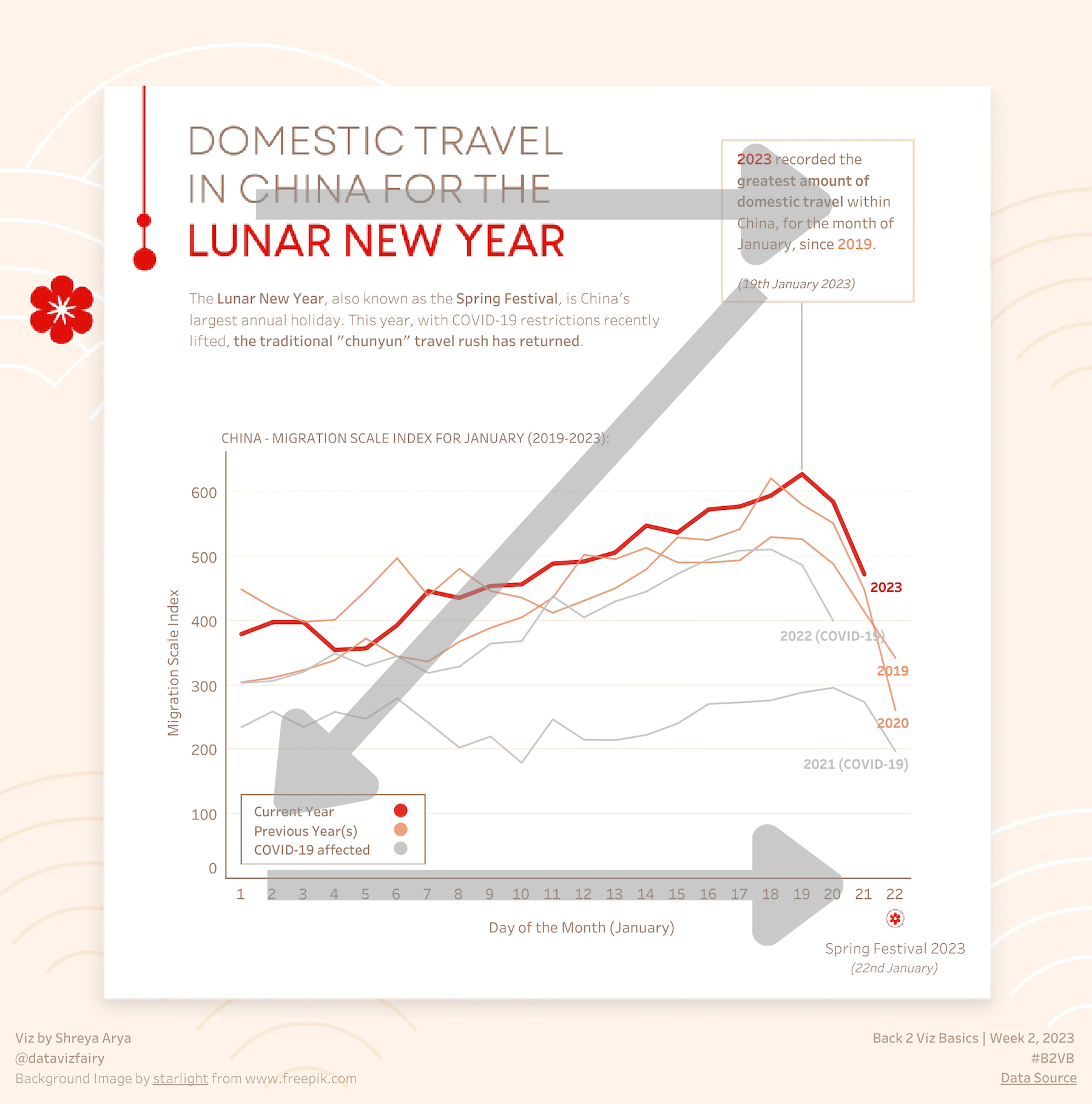
Look at the two images below.  Which catches your attention? Which do you think you are more likely to remember?

Edward Tufte and other data viz gurus have warned us against “chartjunk” which is anything that is not necessary to comprehend the information represented on a chart, map, or graph. The idea is to get rid of distractions and focus attention on the data.

But some research by Michelle Borkin and colleagues points in a different direction.  In an experiment, they showed participants charts with and without various elements that might be construed as chartjunk like photos and drawings. They found that such images not only did not hinder memory or understanding of visualizations, they appeared to serve as “visual hooks into memory.”  Such visual hooks are important because what we perceive is based, in part, on what we expect to perceive due past experiences.

The idea of not loading up a chart with a lot of junk competing for attention is still a good one. But some images, if they are closely related to the data and connect with what folks already know, can help viewers to focus on and absorb information.

For more on how to capture attention with data visualizations, check out this data tip.

Sources:

M. A. Borkin et al., "Beyond Memorability: Visualization Recognition and Recall," in IEEE Transactions on Visualization and Computer Graphics, vol. 22, no. 1, pp. 519-528, 31 Jan. 2016.

 P. Kok et al., “Associative Prediction of Visual Shape in the Hippocampus,” in Journal of Neuroscience 1 August 2018, 38 (31) 6888-6899.

 Photo by Nery Zarate on Unsplash


Let’s talk about YOUR data!

Got the feeling that you and your colleagues would use your data more effectively if you could see it better? Data Viz for Nonprofits (DVN) can help you get the ball rolling with an interactive data dashboard and beautiful charts, maps, and graphs for your next presentation, report, proposal, or webpage. Through a short-term consultation, we can help you to clarify the questions you want to answer and goals you want to track. DVN then visualizes your data to address those questions and track those goals.


Charts That Changed The World

This week’s tip is to check out this video from The Royal Society in which Adam Rutherford shares five data visualizations that have changed the world. Admittedly, this will take you more than 60 seconds to watch (it’s 6 minutes). But it’s worth it. Rutherford shares four classic charts. Two of them clarified a problem so well that they led to solutions. He also shares a chart that drives home the dangers of visualizing lies and thus making them look legitimate. If you’d like to learn more about these charts, I’ve included links below the video. Enjoy!


Let’s talk about YOUR data!

Got the feeling that you and your colleagues would use your data more effectively if you could see it better? Data Viz for Nonprofits (DVN) can help you get the ball rolling with an interactive data dashboard and beautiful charts, maps, and graphs for your next presentation, report, proposal, or webpage. Through a short-term consultation, we can help you to clarify the questions you want to answer and goals you want to track. DVN then visualizes your data to address those questions and track those goals.


How To Improve Your Organization’s Time Line

Reposted from March 2022

Here’s a simple data viz idea. Next time you make a time line showing your organization’s milestones, size those milestone markers (usually circles) according to some key measure. Voila! You are not only showing what happened but also your progress along the way.

The data for such a viz is super simple. Something like this:

Screen Shot 2021-08-24 at 9.01.48 AM.png

I connected the data shown above to Tableau Public (the free version of Tableau) to create the time line below. Vertical time lines not only suggest an upward progression but also work better on phone screens.

Dashboard 1 (3) (1).png

Let’s talk about YOUR data!

Got the feeling that you and your colleagues would use your data more effectively if you could see it better? Data Viz for Nonprofits (DVN) can help you get the ball rolling with an interactive data dashboard and beautiful charts, maps, and graphs for your next presentation, report, proposal, or webpage. Through a short-term consultation, we can help you to clarify the questions you want to answer and goals you want to track. DVN then visualizes your data to address those questions and track those goals.


How To Make Big Numbers Tangible

Reposted from March 2022

We’ve talked about the problem with big numbers before. Most recently, we considered the difficulty humans have digesting large numbers and how “perspectives” — simple sentences that relate a large number to something more familiar to us — can help us to understand, assess, and recall numbers. (For more on this, check out the data tip.)

I’m returning to the big number problem today and offering up some new tips for dealing with them. The inspiration for these tips came from the data-driven documentaries of Neil Halloran, specifically his first documentary called The Fallen of World War II. If you have a few more minutes to spare after reading this 60-second tip (and are not among the 13 million + who have viewed it already), I highly recommend that you check it out. It’s 18 minutes long, but the techniques listed below all appear in the first 7 minutes.

Halloran uses the following techniques to make large numbers understandable. And you don’t need to be a filmmaker to use them. You can apply them to simple data presentations on websites, reports, and PowerPoints.

  1. Use shapes or icons (rather than bars) to represent one or more people, programs, etc. Halloran uses a human figure shape to represent 1,000 people.

  2. Show an aggregate and then break it down by subgroups and time periods. Halloran shows aggregates, such as the total number of U.S. soldiers who died and then, using animation, redistributes the human figures to show how many soldiers died in the European and Pacific theaters and then how many died over time. The animation is cool but not necessary. You can do the same thing with a series of static images. See example below.

  3. Juxtapose photos and charts. To keep the discussion from becoming too abstract, Halloran reminds the audience what actual soldiers (rather than icons) look like by incorporating photos into his presentation. Again, animation is not necessary. Static photos can be placed alongside charts.

  4. Walk your audience through the data. To give the audience a sense of scale, the video progresses from smaller to larger numbers. Halloran first walks us through casualty stats for the U.S. and European countries. These numbers seem quite high so by the time Russian stats are shown, we are blown away.


Let’s talk about YOUR data!

Got the feeling that you and your colleagues would use your data more effectively if you could see it better? Data Viz for Nonprofits (DVN) can help you get the ball rolling with an interactive data dashboard and beautiful charts, maps, and graphs for your next presentation, report, proposal, or webpage. Through a short-term consultation, we can help you to clarify the questions you want to answer and goals you want to track. DVN then visualizes your data to address those questions and track those goals.


How To Visualize Cycles

Reposted from April 2022

Every organization experiences cyclical or seasonal patterns. Understanding how funding, participation, volunteering, and other factors change in predictable ways over time can help us to plan for the future. The problem is that we don’t always see these patterns. We get caught up in current issues and crises, and it’s hard to step back and see what’s coming next. Visualizing your data can reveal cyclical or seasonal patterns in helpful ways. This often involves aggregating data from multiple years by specific time periods such as season, quarter, or day of the week. Here are some examples.

Working with a statistician named William Farr in the 1800s, Florence Nightingale analyzed mortality rates during the Crimean War. She and Farr discovered that most of the soldiers who died in the conflict perished not in combat but as a result of “preventable diseases” caused by bad hygiene. Nightingale invented the polar area chart (shown below), a variant of the pie chart, meant “to affect thro’ the Eyes what we fail to convey to the public through their word-proof ears.” Each pie represented a twelve-month period of the war, with each slice showing the number of deaths per month, growing outward if the number increased, and color-coded to show the causes of death (blue: preventable, red: wounds, black: other). The New York Times showed the seasonal pattern of COVID cases using a somewhat similar chart.

Source: Wikipedia

In the dashboard below, Curtis Harris reveals not only patterns in taxi rides by time of day but also by day of the week. We can see, for example, that few people are using taxis between 2 and 3 am, particularly at the beginning of the week. (Click on this viz to see interactive version.)

Source: Curtis Harris on Tableau Public

This varsity-level viz (below) by Lindsay Betzendahl shows the seasonality of the flu. Each dot represents one week in a particular year. Each “ray” consists of dots for the same week of different years. So the ray at the 12:00 position represents the first week in January for each year between 2007 to 2018. The size of the dots show the number of influenza cases. So we can see that cases surge during the winter weeks, in general, but we also can see outbreaks during other seasons in particular years. Betzendahl explains how to create such a chart in Tableau here.

Source: Lindsay Betzendahl on Tableau Public


Let’s talk about YOUR data!

Got the feeling that you and your colleagues would use your data more effectively if you could see it better? Data Viz for Nonprofits (DVN) can help you get the ball rolling with an interactive data dashboard and beautiful charts, maps, and graphs for your next presentation, report, proposal, or webpage. Through a short-term consultation, we can help you to clarify the questions you want to answer and goals you want to track. DVN then visualizes your data to address those questions and track those goals.