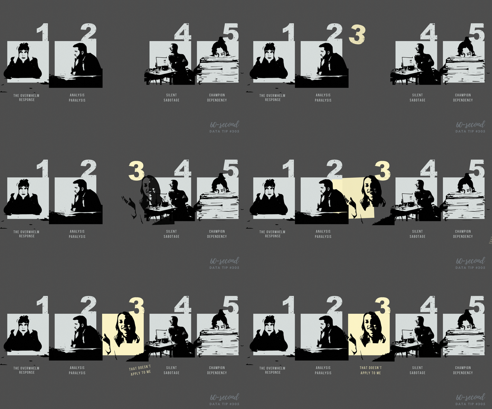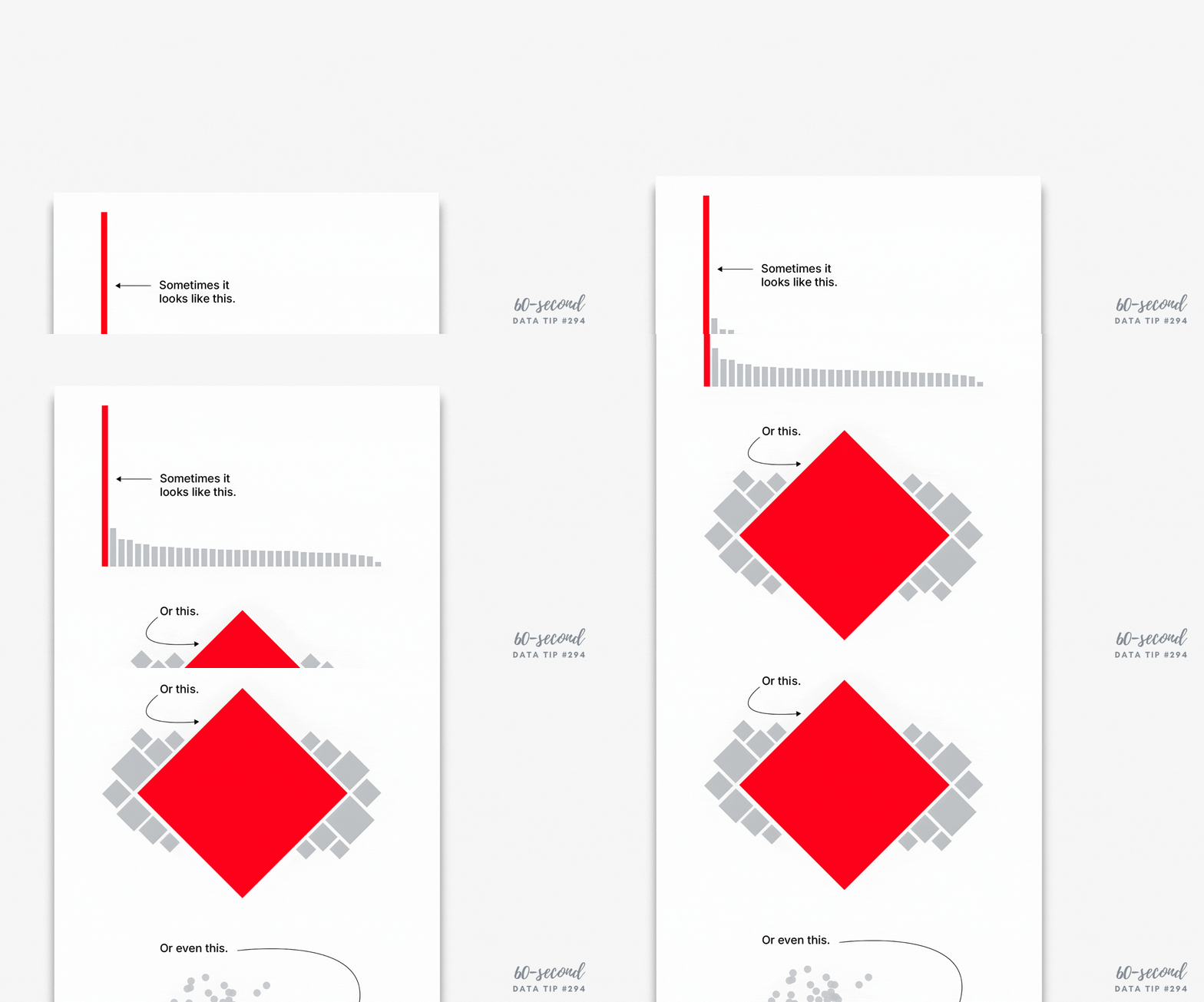
Here’s a sneak preview of a workshop I’m doing on September 26th. I’m sharing the first few slides below. Click on the right to advance through them.
To tell a story in a way that humans can understand and get behind, it helps to understand humans’ powers and challenges when it comes to consuming data. Then we can make better charts, maps, and graphs (aka data visualizations) and present them in a way that humans can absorb.
I hope you can join me on September 26th, 8:00 am - 9:00 am PT | 11:00 am - 12:00 pm ET. Click HERE to register.
Let’s talk about YOUR data!
Got the feeling that you and your colleagues would use your data more effectively if you could see it better? Data Viz for Nonprofits (DVN) can help you get the ball rolling with an interactive data dashboard and beautiful charts, maps, and graphs for your next presentation, report, proposal, or webpage. Through a short-term consultation, we can help you to clarify the questions you want to answer and goals you want to track. DVN then visualizes your data to address those questions and track those goals.


