
Today’s tip is to take inspiration from Chantilly Jaggernauth’s excellent diversity scoreboard displayed below. It shows diversity among employees in a company but can easily be applied to staff or participants in a nonprofit organization.
I suggest you steal the following ideas from Chantilly:
Metric Definitions. In a Tableau Conference session, Chantilly shares the pros and cons of the four metrics in the dashboard. See image of the slide below. None of the metrics are perfect. But together they provide an understanding of where an organization is in its diversity efforts. These definitions are not incorporated in the dashboard itself but could be added through a link or in a tooltip (scroll over) feature.*
Views of Diversity. The dashboard provides three views of diversity: overall, gender, and people of color (POC). By providing side-by-side charts with these three views, the dashboard allows users to see variations that overall diversity charts obscure.
Color Coding. Each type of diversity has its own color, which makes the comparison among overall, gender, and POC easy, even when you scroll down and can no longer see the column headers. Also the comparison groups (non-diversity, male, and non-POC) are represented by the same colors in lighter shades. This approach makes the dashboard easier to understand. Assigning three additional colors for the comparison groups could be confusing and require a color legend.
Simple Charts. These are all charts we all know how to read. So the scorecard is accessible immediately to anyone, even if they are not familiar with the data or the organization.
Also, note that the dashboard and the slide use different terms for two of the metrics.

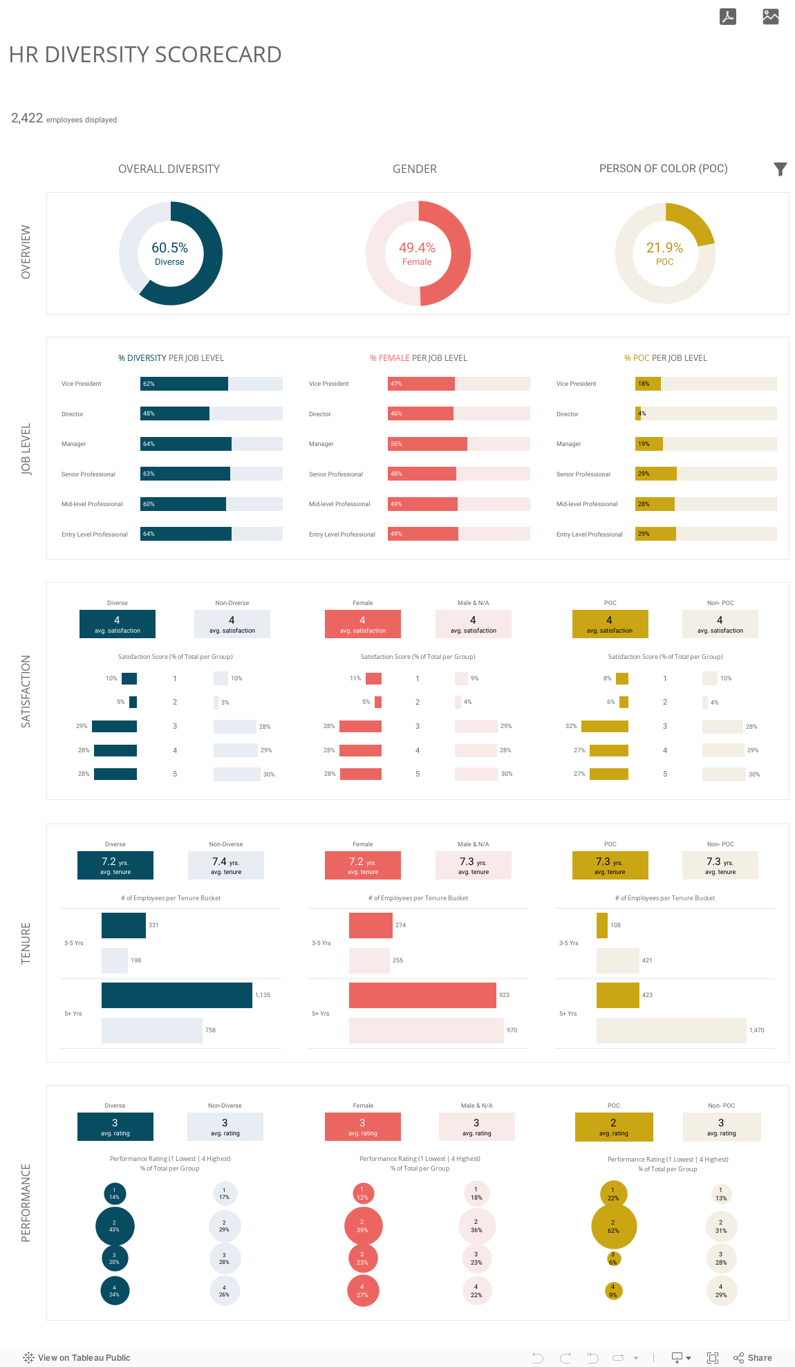
Source: HR Diversity Scorecard on Tableau Public by Lovelytics
Image above from Tableau Conference session called “Next Gen Analytics for Your New Normal” on 11/10/21.
Let’s talk about YOUR data!
Got the feeling that you and your colleagues would use your data more effectively if you could see it better? Data Viz for Nonprofits (DVN) can help you get the ball rolling with an interactive data dashboard and beautiful charts, maps, and graphs for your next presentation, report, proposal, or webpage. Through a short-term consultation, we can help you to clarify the questions you want to answer and goals you want to track. DVN then visualizes your data to address those questions and track those goals.


