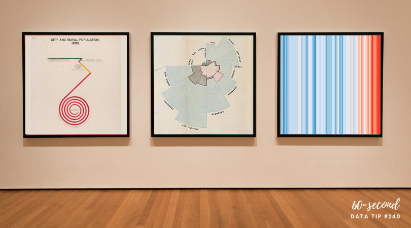
This week’s tip is to check out this video from The Royal Society in which Adam Rutherford shares five data visualizations that have changed the world. Admittedly, this will take you more than 60 seconds to watch (it’s 6 minutes). But it’s worth it. Rutherford shares four classic charts. Two of them clarified a problem so well that they led to solutions. He also shares a chart that drives home the dangers of visualizing lies and thus making them look legitimate. If you’d like to learn more about these charts, I’ve included links below the video. Enjoy!
To see past data tips, click HERE.
Let’s talk about YOUR data!
Got the feeling that you and your colleagues would use your data more effectively if you could see it better? Data Viz for Nonprofits (DVN) can help you get the ball rolling with an interactive data dashboard and beautiful charts, maps, and graphs for your next presentation, report, proposal, or webpage. Through a short-term consultation, we can help you to clarify the questions you want to answer and goals you want to track. DVN then visualizes your data to address those questions and track those goals.


