
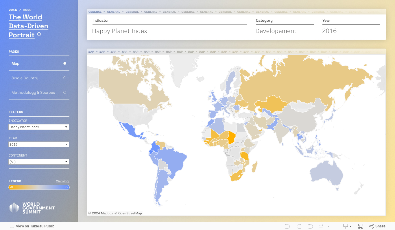
Here’s another steal-worthy viz to inspire you. There’s so much I like about this data dashboard created by Alessia Musìo on Tableau Public. In the Information is Beautiful Awards submission for this dashboard, Musìo notes: “Simplicity, coherence, and clarity are the words that have guided me in the development of the project.”
Here’s what I especially like and suggest you apply to your own dashboards:
User friendly: There’s no need for a user guide for this dashboard. The simple left-hand panel tells you all you need to know: how to navigate to other pages, how to filter the data, and how to interpret the color coding.
Limited views of data: There are only two ways of looking at the data contained in the dashboard: in a map which allows you to make comparisons across regions and countries or in a chart showing change over time. And there are limited ways to filter the data. This simplicity makes the dashboard more approachable and instantly usable.
Methodology and sources page: For those interested, the methods and sources are presented in an organized way with links.
Take the dashboard out for a spin. Be sure to hover over the circular elements on the single country charts to see comparisons with countries of the same continent.
Let’s talk about YOUR data!
Got the feeling that you and your colleagues would use your data more effectively if you could see it better? Data Viz for Nonprofits (DVN) can help you get the ball rolling with an interactive data dashboard and beautiful charts, maps, and graphs for your next presentation, report, proposal, or webpage. Through a short-term consultation, we can help you to clarify the questions you want to answer and goals you want to track. DVN then visualizes your data to address those questions and track those goals.


