
We have all seen icon charts that look like this (even if our grandmother didn’t create them):

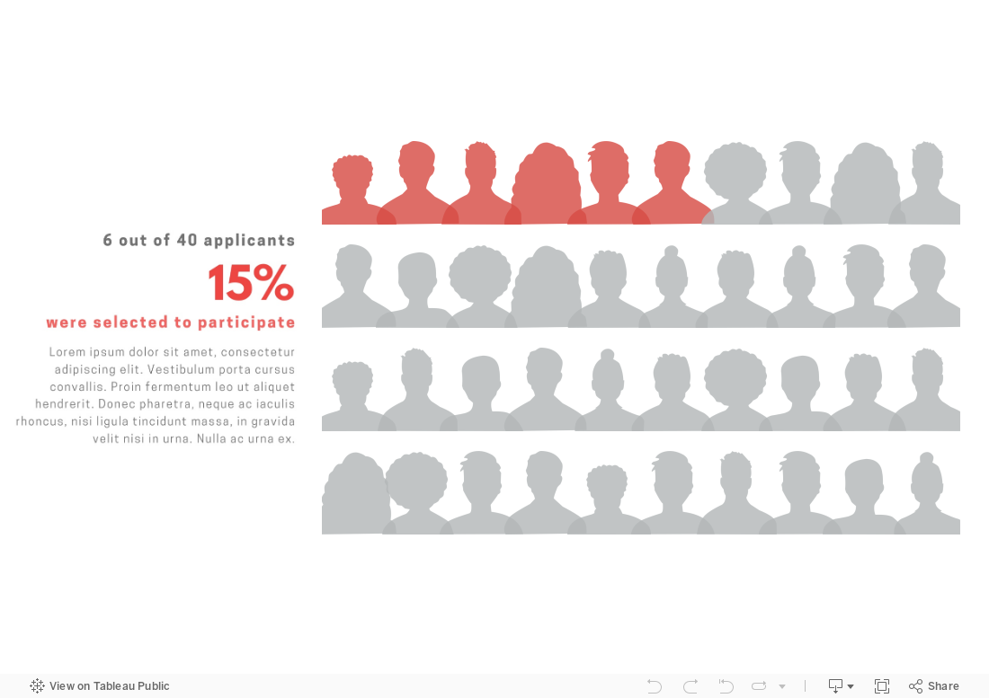
Want to make an icon chart that actually looks like real people as in the example below? Well, of course, you can just find some cool silhouette icons and use any graphic design program — such as Canva or Adobe Illustrator — to layout and color icons as you wish. However, if you want the chart to be interactive, you will need to use a program like Tableau or Power BI. I created the chart below in Tableau. It provides more information when you scroll over the icons. Scroll down for Tableau instructions.
Here’s how I did it:
(Note: These directions assume basic knowledge of Tableau. If you don’t have that knowledge, here’s a good video on Tableau basics.)
I selected 10 head silhouettes to use as icons. You can find great (free) icons on sites like flaticon , The Noun Project, or Canva. Be sure to save each icon as a separate PNG file with a transparent background.
I added the icons to the shapes folder in my Tableau Repository. Here’s a short video on how to do that.
I connected a data file (such as an Excel or CSV file) to Tableau Public (the free version of Tableau). The file included 40 rows, one for each applicant, and columns for: a unique identifier for applicants (such as an ID number), selection status (whether applicants was or wasn’t selected to be a participant, and 3) the silhouette image assigned to the applicant.
In Tableau, I started a new worksheet, changed the marks type to shape, and dragged:
The ID number to the columns shelf (note that ID number should be a dimension not a measure);
The selection status dimension to color on the marks card; and
The silhouette dimension to shape on the marks card.
I clicked on shape on the marks card, clicked on “Reload Shapes,” selected the shape palette that I added to my Tableau Repository in Step 2, assigned head shapes to the various values for the silhouette dimension., and then clicked “OK.”
I clicked on color on the marks card and adjusted the colors for the “selected” and “not selected” values.
I dragged ID number to the filters shelf and selected ten ID numbers to show.
I changed the view from standard to entire view and clicked on size on the marks card and adjusted the size of the heads as I preferred.
I hid the header and title, duplicated the worksheet, and selected different IDs using the filter. I then repeated this step to create two more worksheets.
I created a dashboard, added a vertical container, dragged the four worksheets into the container, clicked on the drop down menu for the container (in the upper right corner of the container) and selected to distribute contents evenly. I then adjusted the layout by adding outer padding and added in a text box.
To see past data tips, click HERE.
Let’s talk about YOUR data!
Got the feeling that you and your colleagues would use your data more effectively if you could see it better? Data Viz for Nonprofits (DVN) can help you get the ball rolling with an interactive data dashboard and beautiful charts, maps, and graphs for your next presentation, report, proposal, or webpage. Through a short-term consultation, we can help you to clarify the questions you want to answer and goals you want to track. DVN then visualizes your data to address those questions and track those goals.


