“All creative work builds on what came before.” —Austin Kleon in Steal Like An Artist.
Today I offer up another steal-worthy interactive viz that I came across in the Tableau Public Gallery.

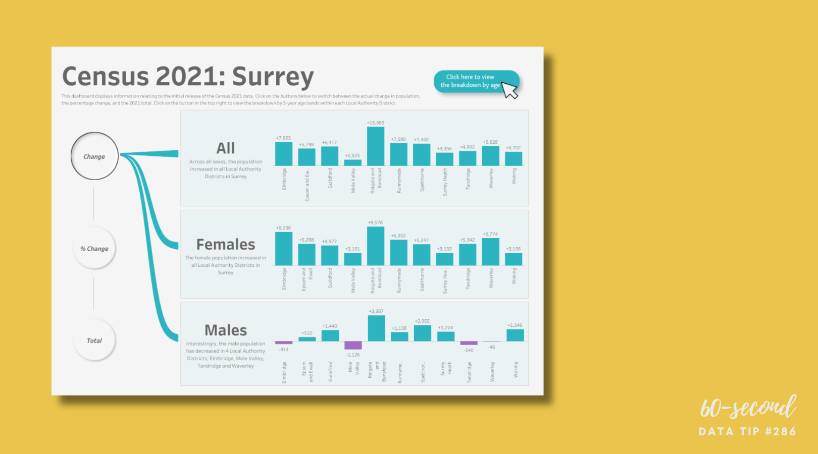
Source: James Goodall on Tableau Public
Here’s what I suggest you steal from this viz:
Three measures. This dashboard gets around the quandry of what to show: totals, change in totals, or percentage change by offering all three. The totals give you a sense of the relative size of the districts. The change gives you a sense of the relative size of the population change across districts (From 2020? The time period for the change is not indicated). And the percentage change give you a sense of the size of the change relative to the size of the district across districts.
Easy comparisons across subgroups. The bar charts allow for easy comparisons across both districts and gender groups.
Key finding captions. The dashboard includes some captions with key findings for each group: all, male, and female. The captions provide a summary of the data and thus a launching point for further exploration of the data.
To see past data tips, click HERE.
Let’s talk about YOUR data!
Got the feeling that you and your colleagues would use your data more effectively if you could see it better? Data Viz for Nonprofits (DVN) can help you get the ball rolling with an interactive data dashboard and beautiful charts, maps, and graphs for your next presentation, report, proposal, or webpage. Through a short-term consultation, we can help you to clarify the questions you want to answer and goals you want to track. DVN then visualizes your data to address those questions and track those goals.


