
“All creative work builds on what came before.” —Austin Kleon in Steal Like An Artist.
Today I offer up another steal-worthy interactive viz that I came across in the Tableau Public Gallery.
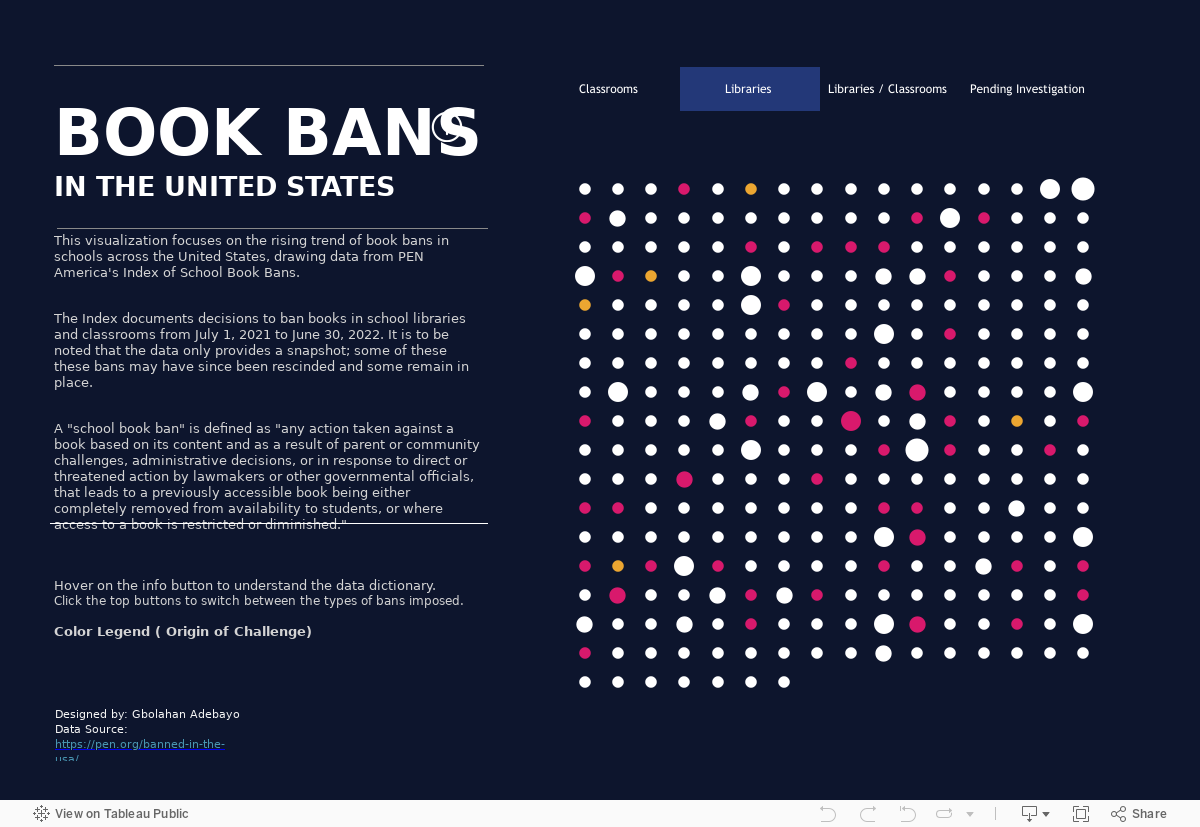
Here’s what I suggest you steal from this viz:
Dot Matrix Chart Type. Each dot in a dot matrix chart is colored to represent a category and sized to represent the magnitude of the category. Thus the chart provides an overview of the distribution and proportions of each category in the data set. By clicking through the ban categories at the top (classrooms, libraries, etc,), we get a quick sense of the magnitude and origin of book ban challenges.
Explanation/Directions. The text on the left tells us everything we need to know to extract meaning from the visualization without loading us down with unnecessary details.
Details on Demand. For those who want more information, details are available on demand by scrolling over the individual circles and the info button.
Source: Gbolahan Adebayo on Tableau Public
To see past data tips, click HERE.
Let’s talk about YOUR data!
Got the feeling that you and your colleagues would use your data more effectively if you could see it better? Data Viz for Nonprofits (DVN) can help you get the ball rolling with an interactive data dashboard and beautiful charts, maps, and graphs for your next presentation, report, proposal, or webpage. Through a short-term consultation, we can help you to clarify the questions you want to answer and goals you want to track. DVN then visualizes your data to address those questions and track those goals.


