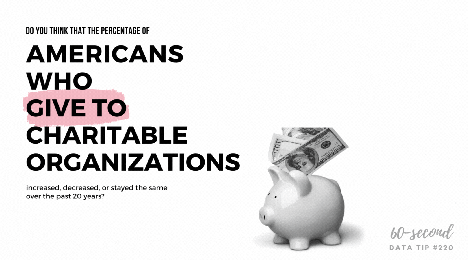
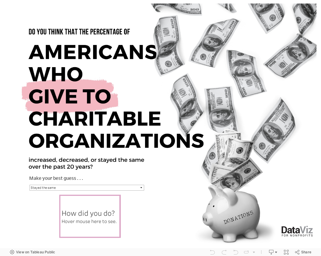
Free Interactive Viz For You: Giving in the U.S.

As we move into gifting season, I thought I’d toss out a gift to you. It’s a quick interactive viz that you can employ however you see fit. Use it in a website, presentation, or social media post to rightsize folks’ understanding about the state of charitable giving in the U.S. and, perhaps, help to turn the tide. For the link address or embed code, click on the share icon below.


Let’s talk about YOUR data!

Got the feeling that you and your colleagues would use your data more effectively if you could see it better? Data Viz for Nonprofits (DVN) can help you get the ball rolling with an interactive data dashboard and beautiful charts, maps, and graphs for your next presentation, report, proposal, or webpage. Through a short-term consultation, we can help you to clarify the questions you want to answer and goals you want to track. DVN then visualizes your data to address those questions and track those goals.


Nonprofits Need This Dashboard

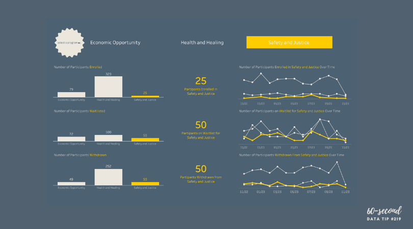
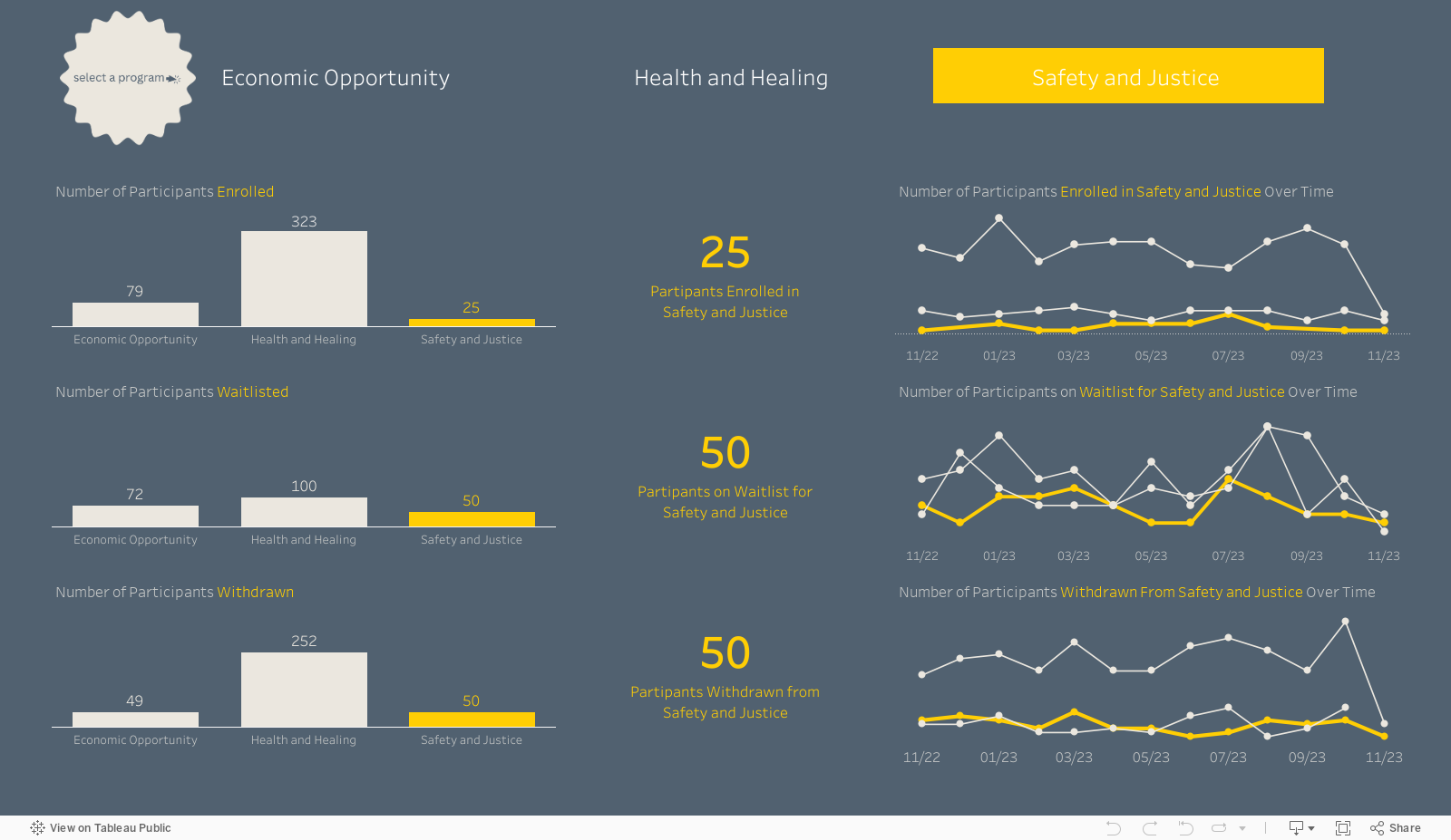
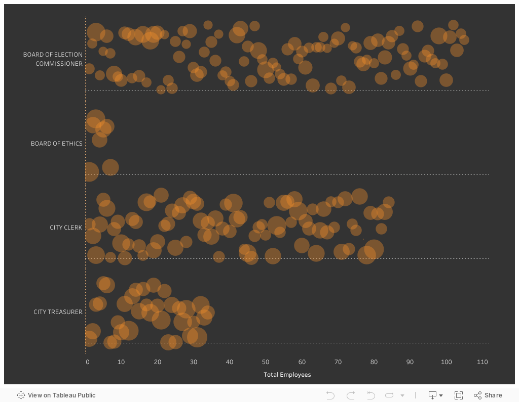
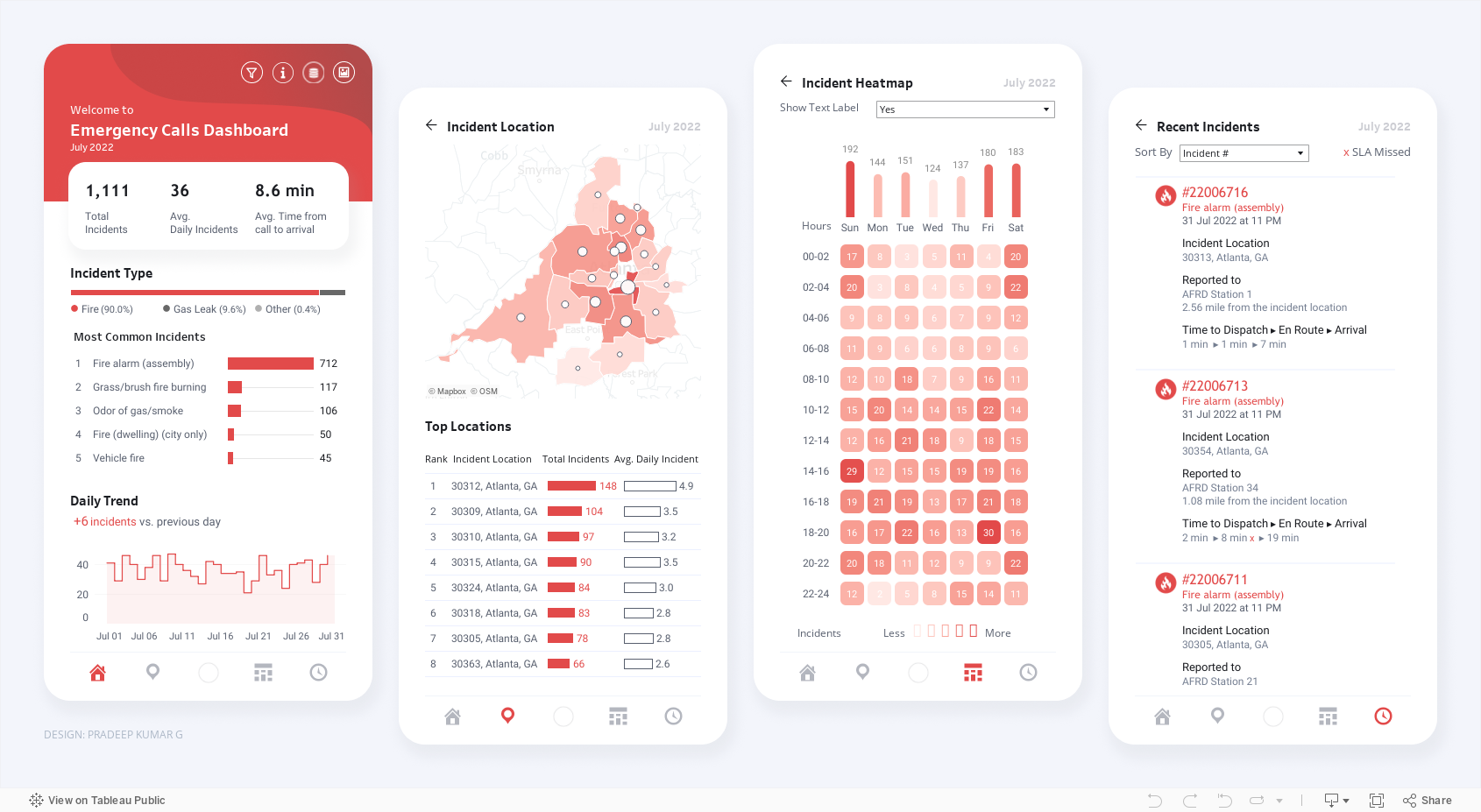
Does your nonprofit have participants (or volunteers or clients or human beings of another sort) in various programs? If so, you could benefit from a dashboard like this one (see below). Give it a spin. Select a program at the top to highlight participants in that program in the charts. This dashboard allows for easy comparisons across programs, across statuses (e.g. enrolled, waitlisted, and withdrawn), and across time. Scroll over charts to learn more.

My inspiration for this dashboard came from Eve Thomas at The Data School. Check out Eve’s article, which includes instructions for creating this type of dashboard with Tableau (assuming basic Tableau knowledge.)


Let’s talk about YOUR data!

Got the feeling that you and your colleagues would use your data more effectively if you could see it better? Data Viz for Nonprofits (DVN) can help you get the ball rolling with an interactive data dashboard and beautiful charts, maps, and graphs for your next presentation, report, proposal, or webpage. Through a short-term consultation, we can help you to clarify the questions you want to answer and goals you want to track. DVN then visualizes your data to address those questions and track those goals.


Jitter Your Charts

A jittered bar chart shows the individuals that make up the bar. In this example, each circle represents an employee within a given city department. Larger circles represent higher salaries and smaller circles lower salaries. You can scroll over each circle to learn more. It’s another great way to show the individuals within an aggregate. And it’s easy to create in Tableau (just watch this four-minute video) or in Excel (here are instructions).


Let’s talk about YOUR data!

Got the feeling that you and your colleagues would use your data more effectively if you could see it better? Data Viz for Nonprofits (DVN) can help you get the ball rolling with an interactive data dashboard and beautiful charts, maps, and graphs for your next presentation, report, proposal, or webpage. Through a short-term consultation, we can help you to clarify the questions you want to answer and goals you want to track. DVN then visualizes your data to address those questions and track those goals.


Bar Chart Hack #7: The Lollipop Chart

Reposted from February 2019

The lollipop chart provides a short and sweet addition to the 60-Second Data Tip series, “How to Hack a Bar Chart.”

A lollipop chart is nothing more than thin bars with circles on top. So why go to the trouble? Well, if you have a lot of bars of similar length, you should not go to the trouble. The circles will just make comparing the lengths of the bars more difficult.

But the lollipop chart can be helpful when you have a bunch of bars of varying lengths, and you want to set them apart in a visually interesting way. Also, you can use those circles as labels, as in the example above.

Check out these easy instructions for making lollipop charts in Tableau and Excel.

To see past data tips, click HERE.

Icons created by Ben Davis, Dinosoft Labs, and andrewcaliber from Noun Project.


Let’s talk about YOUR data!

Got the feeling that you and your colleagues would use your data more effectively if you could see it better? Data Viz for Nonprofits (DVN) can help you get the ball rolling with an interactive data dashboard and beautiful charts, maps, and graphs for your next presentation, report, proposal, or webpage. Through a short-term consultation, we can help you to clarify the questions you want to answer and goals you want to track. DVN then visualizes your data to address those questions and track those goals.


Bar Chart Hack #6: The Funnel Chart

Reposted from February 2019

Today we arrive at Episode 6 of the 60-Second Data Tip series, “How to Hack a Bar Chart.” As we have discussed, bar charts are user-friendly and familiar, but familiarity can breed contempt. So this week we consider yet another variation of the bar chart called the funnel chart.

The funnel chart is used to visualize a process and how the amount of something decreases as it progresses from one phase to another. You might think of it as a pipeline.

The example below shows the decreasing number of participants at each stage of a food service training program. We can see that few of those who attend orientation make it all the way to a job. And we can see where there is the most/least drop off. This funnel is also interactive. You can see the funnels for particularly subgroups by changing the filter at the top.

It looks cool and makes intuitive sense, but a funnel chart is just a bar chart on its side with a mirror image. Check out these easy instructions for making funnel charts in Tableau and Excel.


To see past data tips, click HERE.


Let’s talk about YOUR data!

Got the feeling that you and your colleagues would use your data more effectively if you could see it better? Data Viz for Nonprofits (DVN) can help you get the ball rolling with an interactive data dashboard and beautiful charts, maps, and graphs for your next presentation, report, proposal, or webpage. Through a short-term consultation, we can help you to clarify the questions you want to answer and goals you want to track. DVN then visualizes your data to address those questions and track those goals.


Bar Chart Hack #5: A Little Fine-Tuning Can Transform A Chart


Welcome back to the 60-Second Data Tip series, “How to Hack a Bar Chart.” This week we look at some graphical fine-tuning that can transform a traditional bar chart into something that’s more engaging and more informative.

First I’ll show. Then I’ll tell.

Take a look at Chart A below. Then take a look at Chart B.

large_small_data (version 1).jpg

Chart A

voices.png

Chart B


Both are bar charts showing the same data. But B wins, hands down. Why?

Chart A truncates the Y-axis making the difference between large and small counties look bigger than it actually is. Chart B, by contrast, fills in the whole bar and darkens the portion not attending school or employed, thus giving us a sense of the size of both groups (those who are in and out of school and work) in large and small counties.

Chart B points us to the main takeaway with the title and annotations.

Chart B doesn’t have unnecessary and distracting visual elements such as gridlines and axes labels.

Chart B provides images to further emphasize the contrast between large and small counties.

To see past data tips, click HERE.


Let’s talk about YOUR data!

Got the feeling that you and your colleagues would use your data more effectively if you could see it better? Data Viz for Nonprofits (DVN) can help you get the ball rolling with an interactive data dashboard and beautiful charts, maps, and graphs for your next presentation, report, proposal, or webpage. Through a short-term consultation, we can help you to clarify the questions you want to answer and goals you want to track. DVN then visualizes your data to address those questions and track those goals.


Bar Chart Hack #3: The Combo Chart

60-SECOND DATA TIP_3.png

Reposted from January 2019

Welcome to another episode in the 60-Second Data Tip series, “How to Hack a Bar Chart.” As we have discussed, bar charts are user-friendly and familiar, but like all things familiar, they can be boring and easy-to-ignore. This week we consider—in about 30 seconds— how to combine a bar chart with another type of chart to wake us up and engage us.

Consider the two charts below. Both show the same data: fundraising goals vs. actual funds raised. The one on top uses bars for both categories. The bottom one uses bars for the goals and lines for actual amounts.

Which works better? I vote for the bottom one. It makes comparing values between two different categories easier because it uses not only different colors to distinguish them but different “encodings” (bars and lines).  The bottom chart gives us a clear view of when we are exceeding or falling short of our goals in any given month.

combo chart image.png

To see past data tips, click HERE.


Let’s talk about YOUR data!

Got the feeling that you and your colleagues would use your data more effectively if you could see it better? Data Viz for Nonprofits (DVN) can help you get the ball rolling with an interactive data dashboard and beautiful charts, maps, and graphs for your next presentation, report, proposal, or webpage. Through a short-term consultation, we can help you to clarify the questions you want to answer and goals you want to track. DVN then visualizes your data to address those questions and track those goals.


Ideas You Should Steal From This Viz (Installment 7)

Today I offer up yet another steal-worthy viz: Emergency Calls Dashboard created with Tableau by Pradeep Kumar G. This one is genius. It seems to defy basic graphic design rules. It includes many charts and lots of small text and numbers and yet it’s readable and not overwhelming.

As you can see, the charts are contained within four rectangular views, each with the dimensions of a phone screen. Tableau dashboards can include layouts for different types of devices with varying screen sizes. When you publish these layouts, people viewing your dashboard experience a design optimized for their device (phone, tablet, or desktop.)

If you view the Emergency Calls Dashboard with a phone, you will see just one of the four views and can use the icons at the bottom of the screen to navigate to the other views, as shown in the image to the right.

Effective phone layouts usually:

  • Limit a dashboard’s focus and content (you can only get so much on this small canvas),

  • Reduce interactivity (dealing with filters on a phone can be annoying*), and

  • Use a vertical orientation (vertical scrolling is easier than horizontal scrolling).

The Emergency Calls Dashboard has all of these features, so the phone view works quite well. Indeed, these phone views are so effective that they also work when laid out side-by-side in the desktop view.

When building dashboards for multiple device types, dashboard designers often start with the desktop view and then simplify that larger, more detailed design for the phone view. The Emergency Calls Dashboard demonstrates the benefit of beginning with the phone view. If you design a simple, readable phone view that makes effective use of its limited canvas, you can use this design to fit more information in the desktop or tablet layout. Even if you aren’t designing for multiple screen sizes, following the tips for effective phone layouts will serve you well, opening up possibilities for including more data in one view without overwhelming the user.

I’ve embedded the dashboard below so that you can interact with it.

*The Tableau Mobile app optimises filters for phones, making them pop and easier to use. It also allows for logical scrolling, swiping, pinching, and zooming. However, some of your users may not use the app.


Let’s talk about YOUR data!

Got the feeling that you and your colleagues would use your data more effectively if you could see it better? Data Viz for Nonprofits (DVN) can help you get the ball rolling with an interactive data dashboard and beautiful charts, maps, and graphs for your next presentation, report, proposal, or webpage. Through a short-term consultation, we can help you to clarify the questions you want to answer and goals you want to track. DVN then visualizes your data to address those questions and track those goals.


Data Viz Resources You Should Know: Data Visualisation Catalogue

Here’s a new addition to my highly-curated resources list: the Data Visualisation Catalogue. I occasionally write a 60-second data tip describing a particular resource, including why I think it’s cool. And I link each of these tips to a resources list on my website.

What is it?

It’s simply a list of chart types with definitions. You can use it like you would a bird guide: you come across a chart you’ve never seen before in the wild and want to know more about it. In this case, you can review the chart icons in the “View by List” page to find one that looks like the one you’ve encountered. Or you can use it like you would a menu: you want a chart but are not sure what your options are. In this case, you can use the “Search by Function” page to find chart that best suits your purpose.

Who’s it for?

Anyone who wants to know more about charts.

Who’s behind it?

Severino Ribecca, a freelance designer in Poland, built and maintains the catalogue along with a blog on various data viz topics.

Why I think it’s cool

I love the simplicity of this site. There are other chart choosers online (easily found with a little Googling) but I find myself going back to this catalogue again and again when I need more information on a chart because it’s so user-friendly.


Let’s talk about YOUR data!

Got the feeling that you and your colleagues would use your data more effectively if you could see it better? Data Viz for Nonprofits (DVN) can help you get the ball rolling with an interactive data dashboard and beautiful charts, maps, and graphs for your next presentation, report, proposal, or webpage. Through a short-term consultation, we can help you to clarify the questions you want to answer and goals you want to track. DVN then visualizes your data to address those questions and track those goals.


How To Activate Board Member Fundraising With Visuals

I recently came across this excellent article by The Fundraising Authority. As promised in the title, it provides a “Simple, Step-by-Step Process for Getting Your Board to Refer New Prospects to Your Non-Profit.” In a nutshell, here are the four steps:

  1. Explain how referrals work and assure your board members that no one they refer will be asked for money until they indicate a desire to get involved.

  2. Show board members how many people they actually know through a mind mapping exercise.

  3. Ask board members for referrals usually in person.

  4. Bring referral success stories back to board meetings on a regular basis.

My tip is to enhance steps 2 and 4 with visuals.

Visuals for Step 2: For the mind map, the point is for board members to brainstorm all the people they know by considering people in different categories of their lives. You can use Canva whiteboards (or a similar tool) to create a mind map that the board member (pictured in the middle) can use to add the names of people in each category on virtual post-it notes.

Visuals for Step 4: The article claims that “this is a key step. Nothing will convince your board members to bring you more referrals than hearing from other board members that have done it successfully.” You can visualize the donors that various board members brought in using tools like Flourish to show their networks, as in this example. Scroll over the circles to interact with it and learn more. Some board members brought in donors who, in turn, brought in other donors. To make something similar, select one of the network graph templates on Flourish and fill in the data needed. (See snapshots of the data I added for the visual below.)

Links data

(used to show who is connected to whom)

Points data

(used to show groups by color, size points according to amount of donations, and add images for board members)

To see past data tips, click HERE.


Let’s talk about YOUR data!

Got the feeling that you and your colleagues would use your data more effectively if you could see it better? Data Viz for Nonprofits (DVN) can help you get the ball rolling with an interactive data dashboard and beautiful charts, maps, and graphs for your next presentation, report, proposal, or webpage. Through a short-term consultation, we can help you to clarify the questions you want to answer and goals you want to track. DVN then visualizes your data to address those questions and track those goals.