Reposted from February 2019
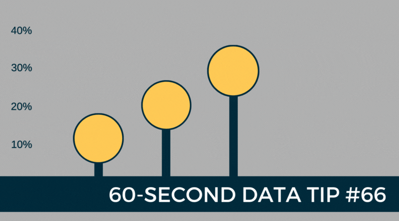
The lollipop chart provides a short and sweet addition to the 60-Second Data Tip series, “How to Hack a Bar Chart.”
A lollipop chart is nothing more than thin bars with circles on top. So why go to the trouble? Well, if you have a lot of bars of similar length, you should not go to the trouble. The circles will just make comparing the lengths of the bars more difficult.
But the lollipop chart can be helpful when you have a bunch of bars of varying lengths, and you want to set them apart in a visually interesting way. Also, you can use those circles as labels, as in the example above.
Check out these easy instructions for making lollipop charts in Tableau and Excel.
To see past data tips, click HERE.
Icons created by Ben Davis, Dinosoft Labs, and andrewcaliber from Noun Project.
Let’s talk about YOUR data!
Got the feeling that you and your colleagues would use your data more effectively if you could see it better? Data Viz for Nonprofits (DVN) can help you get the ball rolling with an interactive data dashboard and beautiful charts, maps, and graphs for your next presentation, report, proposal, or webpage. Through a short-term consultation, we can help you to clarify the questions you want to answer and goals you want to track. DVN then visualizes your data to address those questions and track those goals.


