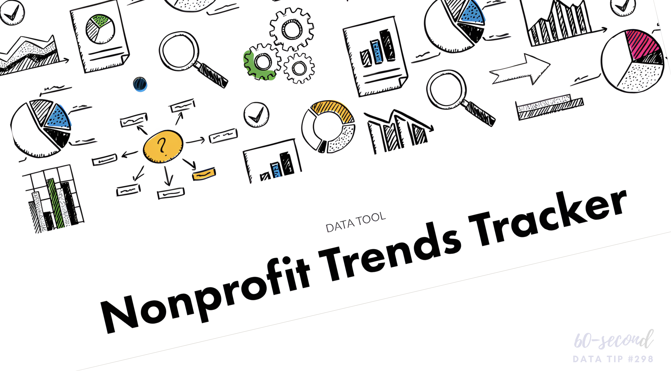
Data Viz Resources You Should Know: Data.gov

Here’s a new addition to my highly-curated resources list: Data.gov. I occasionally write a 60-second data tip describing a particular resource, including why I think it’s cool. And I link each of these tips to a resources list on my website.

What is it?

Data.gov is the United States government’s open data site. Open data is data that can be freely used, re-used, and redistributed by anyone - subject only, at most, to the requirement to attribute and sharealike. Data.gov is designed to “unleash the power of government open data to inform decisions by the public and policymakers, drive innovation and economic activity, achieve agency missions, and strengthen the foundation of an open and transparent government.”

Who’s it for?

It’s for the general public.

Who’s behind it?

The U.S. government. More specifically, The U.S. General Services Administration, working with the Office of Management and Budget and other agency partners, launched Data.gov in 2009. Government agencies compile metadata such as title, description, keywords, and links for accessing their datasets, and the Data.gov catalog automatically “harvests” that metadata to populate a continually updated catalog.

Why I think it’s cool

Unlike many other open data catalogs, you can find and download data quickly and visualize it. You can begin by searching for keywords in the search box. And there are helpful filters to narrow the results by, for example, topic categories, location, and agency. This is a great place to find data to show the need for your organization’s services and the problems you and your colleagues are working to address.


Let’s talk about YOUR data!

Got the feeling that you and your colleagues would use your data more effectively if you could see it better? Data Viz for Nonprofits (DVN) can help you get the ball rolling with an interactive data dashboard and beautiful charts, maps, and graphs for your next presentation, report, proposal, or webpage. Through a short-term consultation, we can help you to clarify the questions you want to answer and goals you want to track. DVN then visualizes your data to address those questions and track those goals.


Data Viz Resources You Should Know: Our World In Data

Our World in Data is a new addition to my highly-curated resources list. I occasionally write a 60-second data tip describing a particular resource, including why I think it’s cool. And I link each of these tips to a resources list on my website.

What is it?

Our World in Data is a collection of charts and articles on “the world’s largest problems”. They believe making knowledge, which “is often stored in inaccessible databases, locked away behind paywalls and buried under jargon in academic papers” more accessible to foster progress.

Who’s it for?

Anyone trying to better understand the world and how it’s changing including individuals, journalists, researchers, and policymakers. Our World in Data’s charts and data can be freely downloaded and embedded in others’ work.

Who’s behind it?

Our World in Data is a collaborative effort between researchers at the University of Oxford, who are the scientific editors of the website content, and the non-profit organization Global Change Data Lab (GCDL) which publishes and maintains the website. Max Roser is the founder and director of Our World in Data. He began the project in 2011 and for several years was the sole author until receiving funding for the formation of a team.

Why I think it’s cool

Their charts and articles help to correct our misperceptions that all global living conditions are getting worse. In their words, “historical data and research shows that it is possible to change the world. Historical research shows that until a few generations ago around half of all newborns died as children. Since then the health of children has rapidly improved around the world and life expectancy has doubled in all regions. . . . Progress is possible, but it is not a given. If we want to know how to reduce suffering and tackle the world’s problems we should learn from what was successful in the past.”


Let’s talk about YOUR data!

Got the feeling that you and your colleagues would use your data more effectively if you could see it better? Data Viz for Nonprofits (DVN) can help you get the ball rolling with an interactive data dashboard and beautiful charts, maps, and graphs for your next presentation, report, proposal, or webpage. Through a short-term consultation, we can help you to clarify the questions you want to answer and goals you want to track. DVN then visualizes your data to address those questions and track those goals.


Data Viz Resources You Should Know: Data Visualisation Catalogue

Here’s a new addition to my highly-curated resources list: the Data Visualisation Catalogue. I occasionally write a 60-second data tip describing a particular resource, including why I think it’s cool. And I link each of these tips to a resources list on my website.

What is it?

It’s simply a list of chart types with definitions. You can use it like you would a bird guide: you come across a chart you’ve never seen before in the wild and want to know more about it. In this case, you can review the chart icons in the “View by List” page to find one that looks like the one you’ve encountered. Or you can use it like you would a menu: you want a chart but are not sure what your options are. In this case, you can use the “Search by Function” page to find chart that best suits your purpose.

Who’s it for?

Anyone who wants to know more about charts.

Who’s behind it?

Severino Ribecca, a freelance designer in Poland, built and maintains the catalogue along with a blog on various data viz topics.

Why I think it’s cool

I love the simplicity of this site. There are other chart choosers online (easily found with a little Googling) but I find myself going back to this catalogue again and again when I need more information on a chart because it’s so user-friendly.


Let’s talk about YOUR data!

Got the feeling that you and your colleagues would use your data more effectively if you could see it better? Data Viz for Nonprofits (DVN) can help you get the ball rolling with an interactive data dashboard and beautiful charts, maps, and graphs for your next presentation, report, proposal, or webpage. Through a short-term consultation, we can help you to clarify the questions you want to answer and goals you want to track. DVN then visualizes your data to address those questions and track those goals.


Data Viz Resources You Should Know: Tableau Tim

Here’s a new addition to my highly-curated resources list: Tableau Tim. I occasionally write a 60-second data tip describing a particular resource, including why I think it’s cool. And I link each of these tips to a resources list on my website.

What is it?

Tableau Tim and Tableau Tim You Tube are treasure troves of videos on Tableau, a powerful tool for visualizing data in the form of interactive charts, graphs, and maps. These collections include how-tos, introductions to new functions in Tableau, quick tips, etc.

Who’s it for?

It’s really for anyone interested in learning more about Tableau, from the absolute beginner to the absolute veteran.

Who’s behind it?

Tim Ngwena is an analytics professional based at The Information Lab in the UK and a Tableau Ambassador from 2020-21.

Why I think it’s cool

Tim is what’s cool. He is an extremely good explainer. If you don’t know anything about Tableau, check out his video called Tableau explained in under 10 mins! And if you are looking for free Tableau training, you might check out his Tableau Desktop Crash Course which takes you for zero to a published dashboard in three hours.


Let’s talk about YOUR data!

Got the feeling that you and your colleagues would use your data more effectively if you could see it better? Data Viz for Nonprofits (DVN) can help you get the ball rolling with an interactive data dashboard and beautiful charts, maps, and graphs for your next presentation, report, proposal, or webpage. Through a short-term consultation, we can help you to clarify the questions you want to answer and goals you want to track. DVN then visualizes your data to address those questions and track those goals.


Data Viz Resources You Should Know: We All Count

In my IRL and virtual travels, I’ve come across many cool resources both for those wanting to stick their toes in data viz (and related topics) and those ready to dive into the deep end. So I’ve been thinking about creating a resource list on my website. The problem is: I sort of hate resource lists. They usually overwhelm me. They offer up too many resources which are poorly described or not described at all. And I end up hopping into a bunch of time-sucking rabbit holes and emerge cranky.

So I’m going to try slowly building a highly-curated resource list through 60-Second Data Tips. I will occassionally write a tip describing a particular resource, including why I think it’s cool. And I’ll link each of these tips to a resource list on my website. My first recommended resource is: We All Count.

What is it?

We All Count is a project to increase equity in data science. Data equity, according to We All Count, involves “principles of fairness, transparency, inclusion and justice regardless of who may be experiencing them. Overt or unintentional racism, sexism, classism, heteronormativity, colonialism, ableism, ageism, and religious intolerance are just a few factors that can skew the equity of any data project.” We All Count does its work through:

  1. A data equity community including a newsletter and community forum;

  2. Developing tools, case studies, practices, and systems to improve equity in data science including the Data Equity Framework which is a systematic way of looking at data projects;

  3. Training people in how to bring data equity to their work; and

  4. Consulting with organizations on data equity issues.

Who’s it for?

It’s mostly for data scientists looking for ways to collect and analyze data in a more equitable way. However, the site has some great tools for nonprofits concerned about using data more equitably including a Data Jargon Decoder. They also offer a series of free webinars about current issues in data science which sometimes include topics of interest to anyone dealing with data, not just data scientists. And you can ask questions about how to collect, interpret, and present data in an equitable way on their online forum.

Who’s behind it?

Heather Krause started We All Count. Heather is a mathematical statistician with experience working on complex data problems and producing real-world knowledge.

Why I think it’s cool

We All Count is focused on practical solutions to knotty data equity issues. They don’t just complain. They offer up real-world solutions to issues such as how to collect demographic data on surveys.


Let’s talk about YOUR data!

Got the feeling that you and your colleagues would use your data more effectively if you could see it better? Data Viz for Nonprofits (DVN) can help you get the ball rolling with an interactive data dashboard and beautiful charts, maps, and graphs for your next presentation, report, proposal, or webpage. Through a short-term consultation, we can help you to clarify the questions you want to answer and goals you want to track. DVN then visualizes your data to address those questions and track those goals.