Free Interactive Viz For You: Giving in the U.S.

As we move into gifting season, I thought I’d toss out a gift to you. It’s a quick interactive viz that you can employ however you see fit. Use it in a website, presentation, or social media post to rightsize folks’ understanding about the state of charitable giving in the U.S. and, perhaps, help to turn the tide. For the link address or embed code, click on the share icon below.


Let’s talk about YOUR data!

Got the feeling that you and your colleagues would use your data more effectively if you could see it better? Data Viz for Nonprofits (DVN) can help you get the ball rolling with an interactive data dashboard and beautiful charts, maps, and graphs for your next presentation, report, proposal, or webpage. Through a short-term consultation, we can help you to clarify the questions you want to answer and goals you want to track. DVN then visualizes your data to address those questions and track those goals.


Interesting Versus Actionable Data

60-SECOND DATA TIP_4 (3).gif

Reposted from October 2021

It’s easy to get lost in a sea of interesting data when what you really need is actionable data. As Oracle’s Nate Mayfield points out, you know when you’ve presented only interesting data when you get this type of response: “Oh, cool. Yeah, that's great to know.” On the other hand, if you hear “Oh, okay. I can definitely decide what to do now,” then you’ve presented actionable data.

The key to presenting actionable data is to ask specific—rather than broad—questions. And then design your charts, maps, and graphs to answer those narrower questions. Mayfield’s article focuses on the types of questions a business might ask. Let’s consider the types of questions a nonprofit might ask:

Interesting Questions.png

Mayfield notes that data dashboards that are designed for a wide range of users tend to address only interesting questions. “Because they are intended for a broad set of users, with a lot of filters, you can in theory answer a lot of questions with these sprawling dashboards,” says Mayfield. “The problem is people quickly get lost in them and don’t spend the time required to answer their questions.” Instead, Mayfield advises us to create simple dashboards that answer quite specific questions such as the actionable questions above. So consider a series of simple dashboards, each designed to provide answers that prompt action for a particular type of user.

To see past data tips, including tips on other types of pantry staple data, click HERE.


Let’s talk about YOUR data!

Got the feeling that you and your colleagues would use your data more effectively if you could see it better? Data Viz for Nonprofits (DVN) can help you get the ball rolling with an interactive data dashboard and beautiful charts, maps, and graphs for your next presentation, report, proposal, or webpage. Through a short-term consultation, we can help you to clarify the questions you want to answer and goals you want to track. DVN then visualizes your data to address those questions and track those goals.


Interesting Versus Actionable Data

60-SECOND DATA TIP_4 (3).gif

It’s easy to get lost in a sea of interesting data when what you really need is actionable data. As Oracle’s Nate Mayfield points out, you know when you’ve presented only interesting data when you get this type of response: “Oh, cool. Yeah, that's great to know.” On the other hand, if you hear “Oh, okay. I can definitely decide what to do now,” then you’ve presented actionable data.

The key to presenting actionable data is to ask specific—rather than broad—questions. And then design your charts, maps, and graphs to answer those narrower questions. Mayfield’s article focuses on the types of questions a business might ask. Let’s consider the types of questions a nonprofit might ask:

Interesting Questions.png

Mayfield notes that data dashboards that are designed for a wide range of users tend to address only interesting questions. “Because they are intended for a broad set of users, with a lot of filters, you can in theory answer a lot of questions with these sprawling dashboards,” says Mayfield. “The problem is people quickly get lost in them and don’t spend the time required to answer their questions.” Instead, Mayfield advises us to create simple dashboards that answer quite specific questions such as the actionable questions above. So consider a series of simple dashboards, each designed to provide answers that prompt action for a particular type of user.

To see past data tips, including tips on other types of pantry staple data, click HERE.


Let’s talk about YOUR data!

Got the feeling that you and your colleagues would use your data more effectively if you could see it better? Data Viz for Nonprofits (DVN) can help you get the ball rolling with an interactive data dashboard and beautiful charts, maps, and graphs for your next presentation, report, proposal, or webpage. Through a short-term consultation, we can help you to clarify the questions you want to answer and goals you want to track. DVN then visualizes your data to address those questions and track those goals.


Why Nonprofits Can Ditch Statistics

60-SECOND DATA TIP_4.gif

Today’s tip is to check out Maryfrances Porter and Alison Nagel’s excellent article Why Nonprofits Shouldn’t Use Statistics on the Depict Studio Blog. Here is a 60-second version with my two cents.

I agree with Porter and Nagel that you probably should not be worrying about statistics due to :

  1. Small numbers. Most nonprofit organizations are not serving thousands or millions, but rather tens and hundreds. It’s hard to draw scientifically defensible conclusions based on small numbers. Any individual in a small group has an outsized impact on the group as a whole.

  2. No reasonable comparison group. To make a scientifically defensible claim about the impact of your program, you usually need to compare your participants to a random group of people who do not participate in the program. And, as Porter and Nagel note, “we’ve never met a nonprofit so flush that they had money to track people they don’t serve.”

So how should nonprofits use all that data that they collect everyday? Porter and Nagel suggests that organizations:

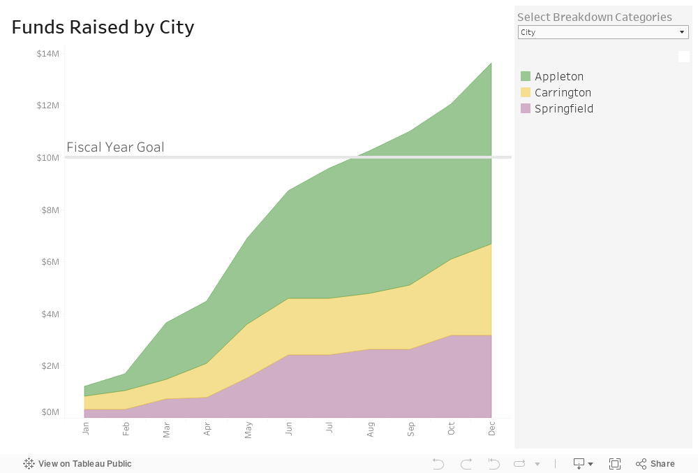
  1. Look for pattens, themes and trends. When considering data on participation, feedback from surveys and focus groups, and other data you may collect, look for themes and patterns. Then consider how those themes and patterns change over time and how they differ among subgroups. The best way to see patterns, themes, and trends is in the form of charts, maps, and graphs.

  2. Consider possible causes. Based on your experience, what might be the reasons behind the patterns, themes, and trends you see? Consideration of this question with your colleagues can lead to valuable hypotheses. You can use these hypotheses to make program changes and see if the data you subsequently collect suggest that those changes led to more positive outcomes. You are not demonstrating impact in a scientific way, but you are using data to inform your decisions.

I don’t agree with Porter and Nagel that you have to know what graphs you want before creating them in Tableau. Actually, I think Tableau provides a more nimble way of exploring your data in different visual formats than you can in Excel. But use whatever tool you are comfortable with. Or hire someone (like Data Viz for Nonprofits) to visualize your data for you. An interactive dashboard makes it easy to track your progress on a regular basis.

To see past data tips, including lots of tips on ways to visualize nonprofit data, click HERE.


Let’s talk about YOUR data!

Got the feeling that you and your colleagues would use your data more effectively if you could see it better? Data Viz for Nonprofits (DVN) can help you get the ball rolling with an interactive data dashboard and beautiful charts, maps, and graphs for your next presentation, report, proposal, or webpage. Through a short-term consultation, we can help you to clarify the questions you want to answer and goals you want to track. DVN then visualizes your data to address those questions and track those goals.


Understand Donations Using "Pantry Staple" Data

60-SECOND DATA TIP_3.gif

The vast majority of nonprofits have some type of list of donors and donations. Tell me that you don’t have a database or spreadsheet that looks something like this.

Screen Shot 2021-04-19 at 11.10.23 AM.png

Use Case: Tracking Progress to Goal

Now tell me that this data would not be way more useable in this interactive dashboard. Give it a try. You can see both how you are doing overall in relation to your goal and how different types of donors and donations are contributing to your progress. This dashboard can be created using Tableau Public, the free version of Tableau.

To see past data tips, including tips on other types of pantry staple data, click HERE.


Let’s talk about YOUR data!

Got the feeling that you and your colleagues would use your data more effectively if you could see it better? Data Viz for Nonprofits (DVN) can help you get the ball rolling with an interactive data dashboard and beautiful charts, maps, and graphs for your next presentation, report, proposal, or webpage. Through a short-term consultation, we can help you to clarify the questions you want to answer and goals you want to track. DVN then visualizes your data to address those questions and track those goals.