
The vast majority of nonprofits have some type of list of donors and donations. Tell me that you don’t have a database or spreadsheet that looks something like this.

Use Case: Tracking Progress to Goal
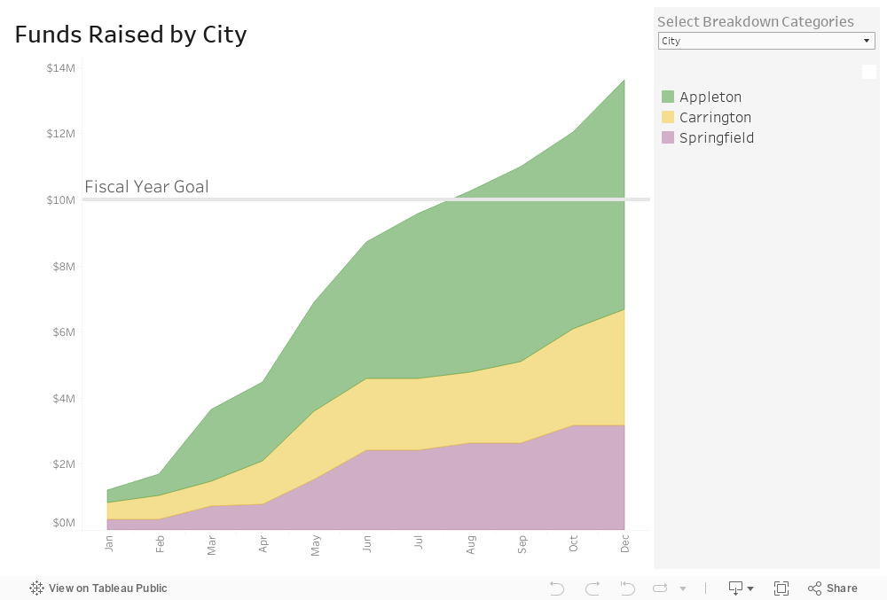
Now tell me that this data would not be way more useable in this interactive dashboard. Give it a try. You can see both how you are doing overall in relation to your goal and how different types of donors and donations are contributing to your progress. This dashboard can be created using Tableau Public, the free version of Tableau.
To see past data tips, including tips on other types of pantry staple data, click HERE.
Let’s talk about YOUR data!
Got the feeling that you and your colleagues would use your data more effectively if you could see it better? Data Viz for Nonprofits (DVN) can help you get the ball rolling with an interactive data dashboard and beautiful charts, maps, and graphs for your next presentation, report, proposal, or webpage. Through a short-term consultation, we can help you to clarify the questions you want to answer and goals you want to track. DVN then visualizes your data to address those questions and track those goals.


