Reposted from January 2024
Here’s a question for you. And don’t go Googling. Just make your best guess.
Have the number of people experiencing homelessness in the U.S. increased or decreased since 2007?
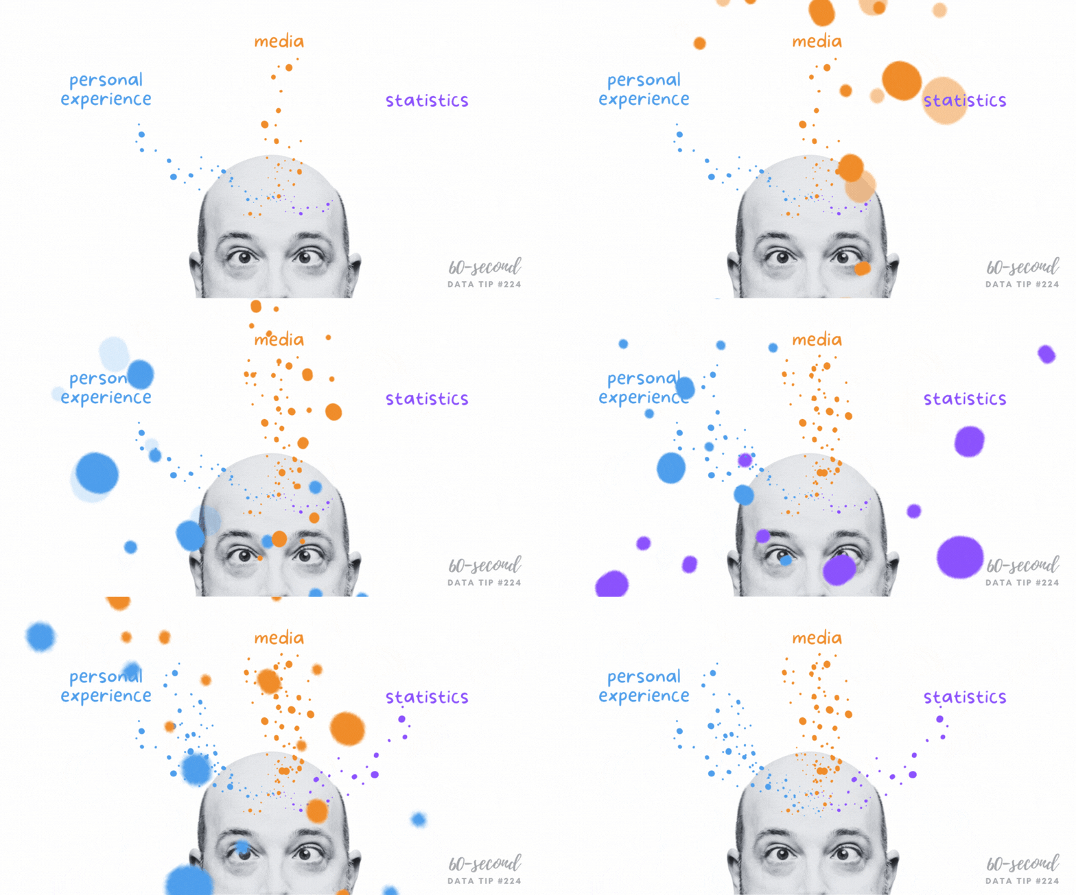
Whatever your answer, you likely drew on your own personal experience as well as images and information from the media when guessing at the answer. Perhaps you drew on some statistics too. But, unless you have expertise in this area, probably not. Stick with me for a minute, and I’ll not only provide an answer to the question but also some insight into how we consume information.
Personal experience, media, and statistics affect how we understand any issue, and there are limits to each of these inputs. So we would do well to understand those limits before acting on our understanding by voting, donating, or making decisions about programs that our organizations operate. Max Roser’s article in Our World in Data (The limits of our personal experience and the value of statistics) walks us through some of those limitations:
Personal Experience
“The world is large, and we can experience only very little of it personally,” Roser notes. “For every person you know, there are ten million people you do not know.” Even the most social and well-traveled among us can have only a limited understanding of the world through personal experience. I, for example, do not know anyone personally who has been unhoused, and most of my interactions with people in this situation occur on the street when someone asks me for money. This experience provides no information about the breadth of the problem or the range of experiences with this issue over time.
Media
“This fact is so obvious that it is easy to miss how important it is: everything you hear about anyone who is more than a few dozen meters away, you know through some form of media,” Roser points out. “The news reports on the unusual things that happen on a particular day, but the things that happen every day never get mentioned. This gives us a biased and incomplete picture of the world; we are inundated with detailed news on terrorism but hardly ever hear of everyday tragedies like the fact that 16,000 children die every single day.” If I recently heard a story about a city clearing homeless encampments, I may assess the problem as larger, and if I haven’t heard about anything on the issue in awhile, I may assess it as smaller.
Statistics
“The collection and production of good statistics is a major challenge,” writes Roser. “Data might be unrepresentative in some ways, it might be mismeasured, and some data might be missing entirely.” But, unlike personal experience and the media, it provides a way of assessing the full range of an issue. So it’s important to add statistics, along with personal experience and the media, to our information diet.
To add some statistics to your understanding of homelessness, the number of people experiencing homelessness in the U.S. decreased from about 650,000 in 2007 to about 580,000 (about 18 of every 10,000 people) in 2022 according to The 2022 Annual Homelessness Assessment Report to Congress.
We should not discount personal experience, the media, or statistics because of their limitations. But we should appreciate their limitations when forming opinions and taking actions based on them. As Roser notes: “Each way of learning about the world has its value. It’s about how we bring them together: the in-depth understanding that only personal interaction can give us, the focus on the powerful and unusual that the news offers, and the statistical view that gives us the opportunity to see everyone.” As described in many tips in this blog, well-designed charts make data/statistics more accessible to everyone and thus allow everyone to see everyone.
Let’s talk about YOUR data!
Got the feeling that you and your colleagues would use your data more effectively if you could see it better? Data Viz for Nonprofits (DVN) can help you get the ball rolling with an interactive data dashboard and beautiful charts, maps, and graphs for your next presentation, report, proposal, or webpage. Through a short-term consultation, we can help you to clarify the questions you want to answer and goals you want to track. DVN then visualizes your data to address those questions and track those goals.


