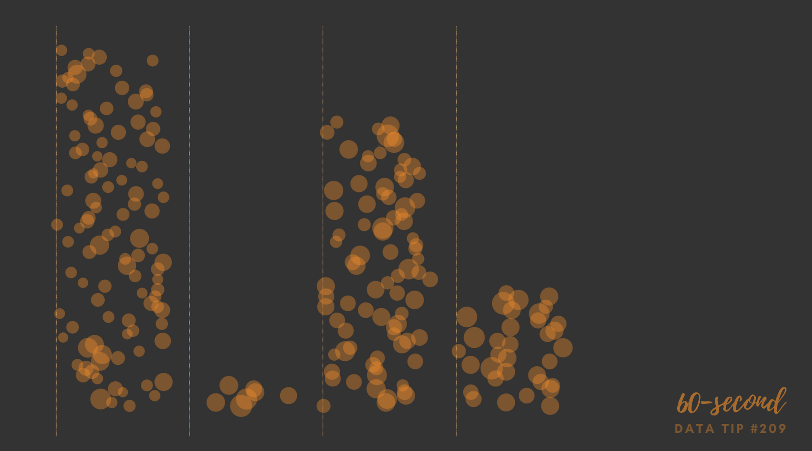
A jittered bar chart shows the individuals that make up the bar. In this example, each circle represents an employee within a given city department. Larger circles represent higher salaries and smaller circles lower salaries. You can scroll over each circle to learn more. It’s another great way to show the individuals within an aggregate. And it’s easy to create in Tableau (just watch this four-minute video) or in Excel (here are instructions).
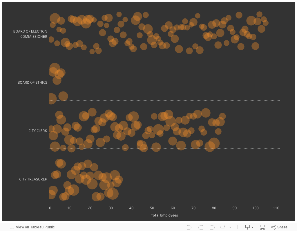
Data Source: Chicago Data Portal (Current Employee Names, Salaries, and Position Titles, 2023)
To see past data tips, click HERE.
Let’s talk about YOUR data!
Got the feeling that you and your colleagues would use your data more effectively if you could see it better? Data Viz for Nonprofits (DVN) can help you get the ball rolling with an interactive data dashboard and beautiful charts, maps, and graphs for your next presentation, report, proposal, or webpage. Through a short-term consultation, we can help you to clarify the questions you want to answer and goals you want to track. DVN then visualizes your data to address those questions and track those goals.


