
Reposted from February 2019
Welcome to Episode 3 of “How to Hack a Bar Chart.” This time we consider two bar chart subspecies that recast the regular bar chart in circular form. They may be eye-catching but be careful how you use them.
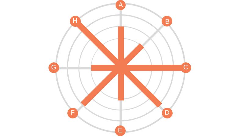
Radial Column Chart: (aka Circular Column Graph or Star Graph). As you can see in the example above, the bars on this chart are plotted on a grid of concentric circles, each representing a value on a scale. Usually, the inner circles represent lower values and values increase as you move outward. Sometimes each bar is further divided using color to show subgroups within each category. Because we are better at assessing length along a common scale, this type of chart isn’t ideal if you want viewers to accurately compare the lengths of each bar. However, these charts are great at showing cyclical patterns. Florence Nightingale used this type of chart (which she called a “polar area chart”) to show a cyclical pattern in the number and causes of death in the Crimean War.
This work is in the public domain in its country of origin and other countries and areas where the copyright term is the author's life plus 70 years or less.

Radial Bar Chart (aka Circular Bar Chart) is simply a bar chart in which the bars curve around a circle, like runners on a circular track. As you may recall, races on circular or oval running tracks include staggered starting lines so that runners on the outer (longer) tracks run the same distance as those on the inner (shorter) tracks. But the bars on a radial chart have the same starting line making it difficult to compare lengths. So skip the radial bar chart. Not worth the effort.
To see past data tips, click HERE.
Let’s talk about YOUR data!
Got the feeling that you and your colleagues would use your data more effectively if you could see it better? Data Viz for Nonprofits (DVN) can help you get the ball rolling with an interactive data dashboard and beautiful charts, maps, and graphs for your next presentation, report, proposal, or webpage. Through a short-term consultation, we can help you to clarify the questions you want to answer and goals you want to track. DVN then visualizes your data to address those questions and track those goals.


