Want to see patterns in participation, fundraising, volunteering, or social media measures across an entire year? A calendar heat map might do the trick.
This is a new addition to a series of tips on different chart types. In each tip, l give you need-to-know information in a format akin to the “Drug Facts” on the back of medication boxes: active ingredients (what the chart is), uses (when to use it), and warnings (what to look out for when creating the chart). The idea is to fill up your toolbox with a variety of tools for making sense of data. And the calendar heat map is a simple tool you can put to good use!
Active Ingredients (What is a calendar heat map?)
As in the example above, a calendar heat map shows a measure across days on a calendar. The measure might be the number of participants, dollars raised, volunteers recruited, social media engagement, etc.
Uses
Calendar heat maps provide a great way to see patterns in a measure over time, particularly if month and day of the week are important factors. For example, such a chart can help you detect whether participation is lagging on Mondays during summer months. In the example above, you can scroll over dates for more information and use the program filter to see participation for the selected program. Here are instructions for creating an interactive calendar heat map with Tableau and in Excel.
Warnings
Depending on your needs, other charts that show change over time may be more useful to you. For example, if you need to more clearly see the amount of change over time, a line graph might serve you better. For other chart types that show change over time, see below.
Fun Fact
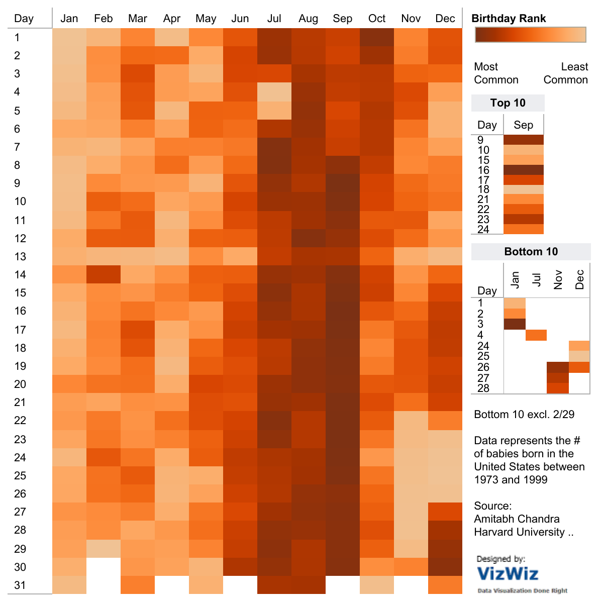
Here’s a fun calendar heat map showing more/less common birth dates.
Source: Amitabh Chandra on Tableau Public
To see past data tips, including those about other chart types, scroll down or click HERE.
Source: Visual Vocabulary by Andy Kriebel on Tableau Public
Let’s talk about YOUR data!
Got the feeling that you and your colleagues would use your data more effectively if you could see it better? Data Viz for Nonprofits (DVN) can help you get the ball rolling with an interactive data dashboard and beautiful charts, maps, and graphs for your next presentation, report, proposal, or webpage. Through a short-term consultation, we can help you to clarify the questions you want to answer and goals you want to track. DVN then visualizes your data to address those questions and track those goals.


